New-Better Icon for Baldur's Gate 2
 geminibruni
Member Posts: 276
geminibruni
Member Posts: 276
Hi,
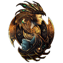
I am a sufferer of perfectionism and would like to make some proposals to improve the icon of Baldur's Gate 2 EE:
(I have Used the White background to give a better ideas of the changes)
The Standard Icon:
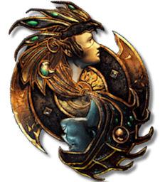
- Add shading like BG1EE icon:

- Rotate slightly the icon to get a better use of space
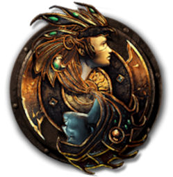
Adding the base of BG1EE Icon on the back:
I am a sufferer of perfectionism and would like to make some proposals to improve the icon of Baldur's Gate 2 EE:
(I have Used the White background to give a better ideas of the changes)
The Standard Icon:
- Add shading like BG1EE icon:
- Rotate slightly the icon to get a better use of space
Adding the base of BG1EE Icon on the back:
Post edited by geminibruni on
0
Comments
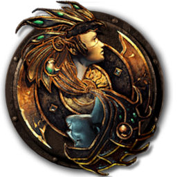
Taking a cue that the devs have done in beautiful BG1EE icon you see clearly that lacks of the shading, I also proposed to add a common basis between the two...
The tilt si only for make a better use of the 256x256 pixel space, not for a personal liking...
@Dee, These are not proposals to disqualify your work but to perfect it yet