Suggestion: New layout of the chat menu for the single-user pod.
 Victorixxx
Member Posts: 20
Victorixxx
Member Posts: 20
Our community has written an open letter
Dear Trent Oster and the Beamdog Team
This is a proposal for improving NWN!
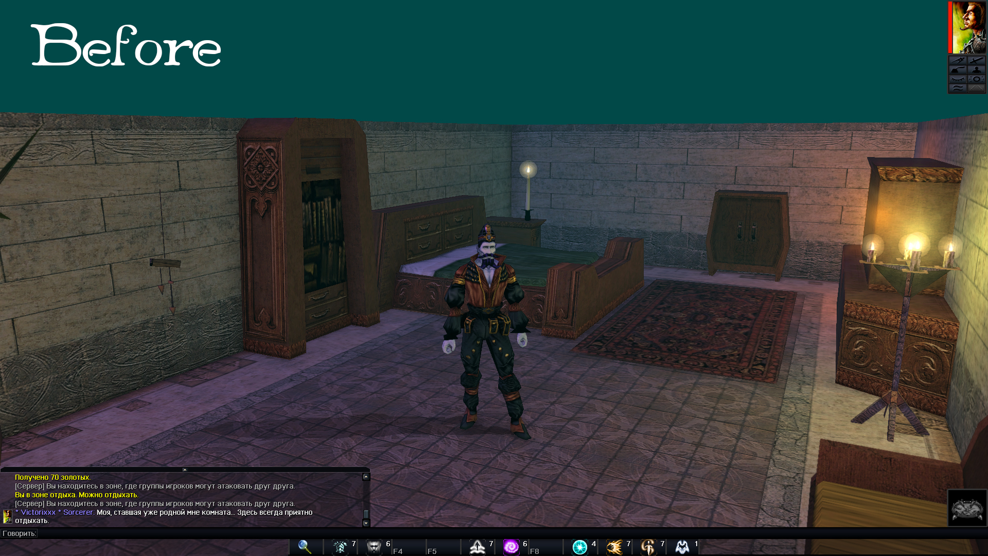
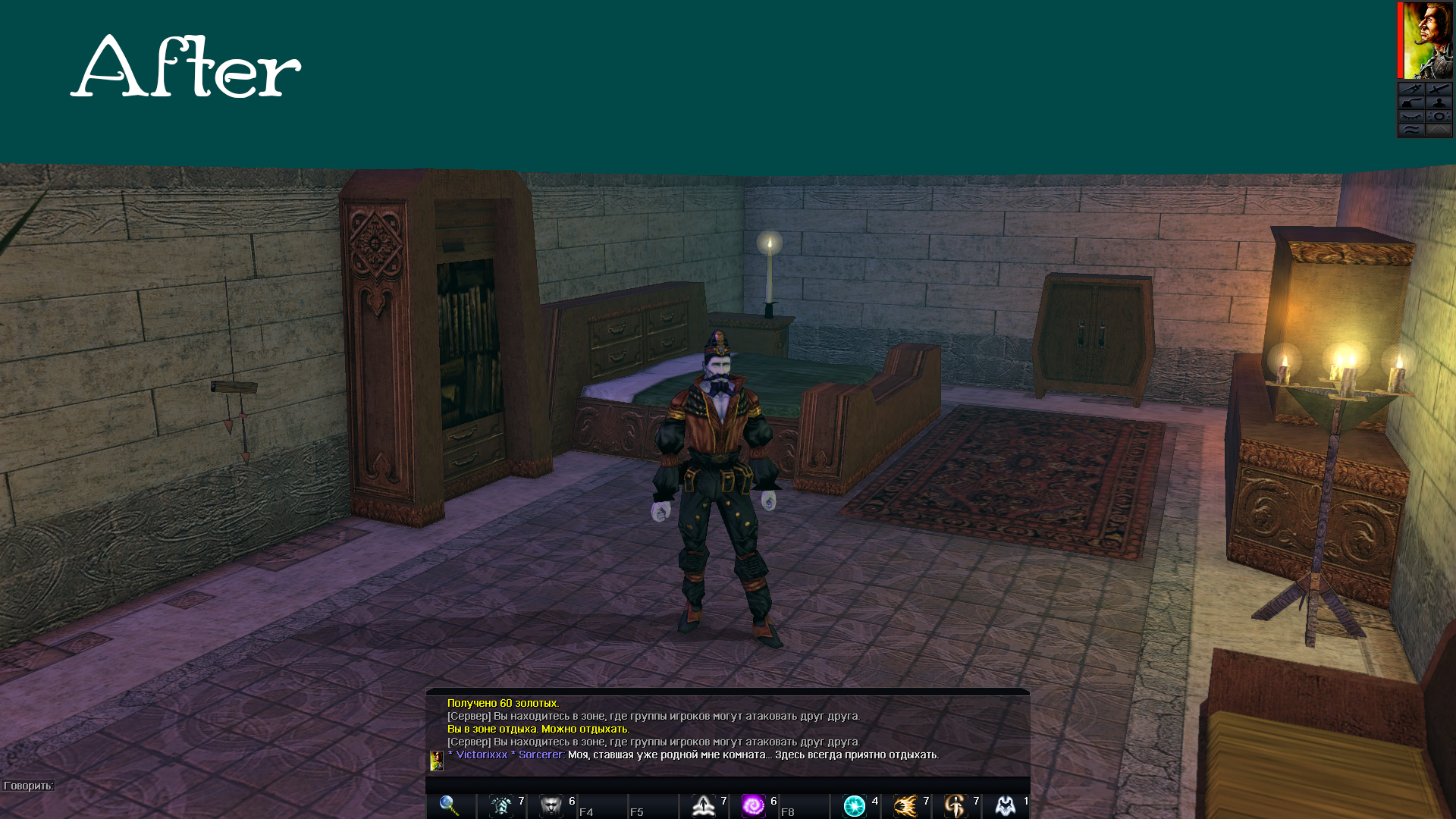
New layout of the chat menu for the single-user module. It will be much more convenient for the player to see it in the center, without the separator that limited the view.
The original layout can be left for multiplayer mode.
What are your thoughts on the new look for the chat menu?
Dear Trent Oster and the Beamdog Team
This is a proposal for improving NWN!
New layout of the chat menu for the single-user module. It will be much more convenient for the player to see it in the center, without the separator that limited the view.
The original layout can be left for multiplayer mode.
What are your thoughts on the new look for the chat menu?
0
Comments
I think the developers will never do this. The change in the game engine, judging by the development trend ЕЕ of the edition, is not what they want to do