New UI is a step back
 Sliceofhell
Member Posts: 85
Sliceofhell
Member Posts: 85
It is incredibly annoying. You can't see when the ability is ready again.
Post edited by Sliceofhell on
22
Comments
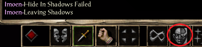
Seriously though, not being able to tell if the icon is active or not is bothersome, I hope next patch will bring back some contrast to BG1:EE UI.
But the icons on the bottom panel, the ones we need the most, are all 'dead'. If the inactive icons stayed the dark gray color, but the active ones were off-white like 'character record' and 'AI' buttons on the screencap above, I think that would be just enough.
But as I'm only a participant, all I can do is complain and complain about that one step back, that could be so easily* kicked into a leap forward.
* I assume that the look already used in sidebars could be easily implemented in the bottom bar. I could be dead wrong about it, as I don't know the first thing about programming.
When I have my display settings on 'Game Mode' or 'Movie Mode' I can spot the difference. In comparison the 'Eco' and 'Standard' settings provide more of a challenge. That said, it is more the outline of the icon - the square border - that signifies the change, from grey/white to the dull gold/brown. The icon itself - the skull or the stars - look effectively the same.
As for the active/inactive buttons, there is a difference from the side bar buttons. When the bottom bar button is inactive, it gets automatically greyed out. It's hard-coded. Side bar buttons don't get inactive, they are grey by the artist's choice.
Works a treat for my cleric/thief