Thoughts on patch 2.0 and changes on the User Interface and aesthetic style of the game.
 mbernadas
Member Posts: 5
mbernadas
Member Posts: 5
First of all, I want to say that English is not my native language and there might some grammatical errors in this discussion. Also, my observations are based in Baldur's Gate Enhanced Edition patch 2.0, 2.1 and 2.2., played in Windows 8.1 at 1920x1200 pixels with the interface both scaled and non-scaled. As a side note, I have also played the original Icewind Dale and his Enhanced Edition and the original Baldur's Gate saga.
______________________________
In my opinion, the top priority of an Enhanced version of any game is to improve the base game graphics, interface, gameplay and make it stable for newer systems, without losing the spirit and style of the original games.
I consider myself kind of a "purist", but I liked how the Enhanced Editions from Beamdog improved the user interface, style, and general aesthetics (except skins of course) towards an updated version of the original Baldur's Gate 2 interface, achieving a seamless experience between the Baldur's Gate saga and Icewind Dale (for me at least).
The best improvements are those that blend so well with game, that gives the feeling they have been there since the late 90's, without breaking the theme and style of old infinity engine games set up in the Forgotten Realms universe. Some of my favorites are the quick loot button, the transparent dialog window, added windows with information regarding hit points (HP), armor class (AC), THAC0 and damage in both the inventory and record (character sheet).
I feel these updates treat the original content with respect and make the game better, adding functionality without hurting the overall style and aesthetics of the game. Nevertheless, in my opinion, I would say patch 2.0 changed too many things, in such way that it disrespects the original content and hurts the overall game experience. Here is a brief overview of some of this changes
- The starting menu of Siege of Dragonspear does not match the style of classic ones (the game logo centered with the different options build around it). I thought Beamdog was going towards a seamless experience and similar menu looks between the different games. Also, the fonts in several menus and windows in the DLC are completely wrong, out of theme and feel in accordance to the other games.
*I have not purchased the DLC, so this opinion is based from screenshots and youtube videos I've seen.
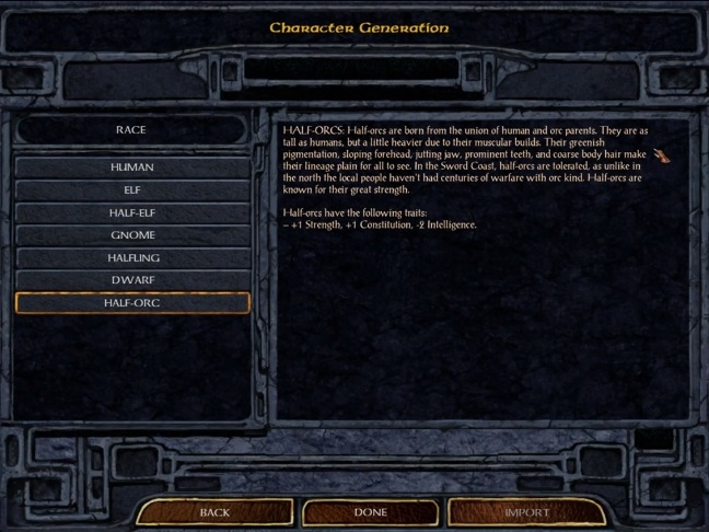
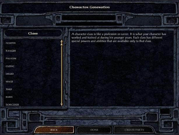
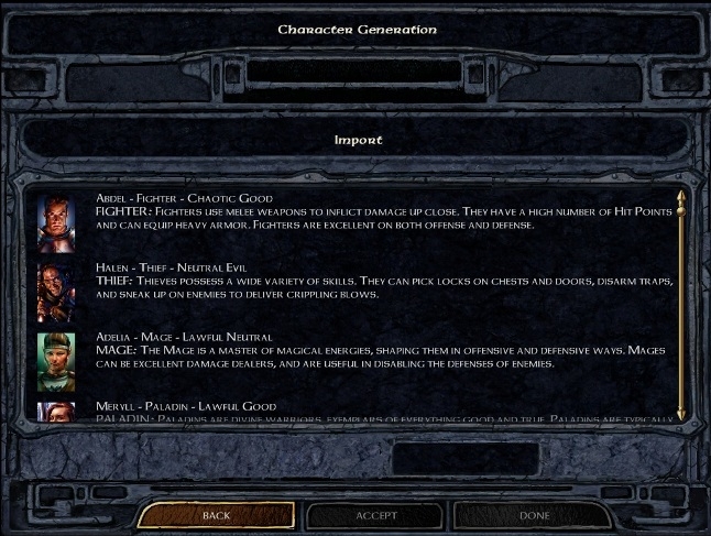
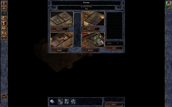
- Most of the character creation process (and even selecting pre-generated ones) is missing the previous square-like boxy look and is replaced with boring and bland lists (including the spell selection), with lack of depth and texture. Is way too simple and bland (this also happens with merchant shops, menu options, among others).
Enhanced Edition (previous version)

Enhanced Edition v2.0
*most of the titles on the top of the windows of the game is a little small, and also, why change its color to white?
- I find really hard to assign a color scheme to my character with the new colored bar, some spaces between tones are too small.
- Although I like the new pop-up journal, the one you access by pressing the J key (by default) is terrible. It's missing the done quests tab. Also, you can only access it from the main game window.
- The ever changing window on the right side of the inventory that show stat changes according to the picked item (maybe useful for new players) can get really annoying/distracting when you transfer a ton of items to other party members.
- The inventory window is missing the shortcut to select/see the "major color" of the selected party member.
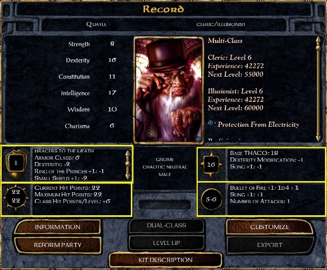
- The new character sheet (record) is terrible. It eliminates the information windows for hit points (HP), armor class (AC), THAC0 and damage in both the inventory and record (character sheet). The HP and AC were easy to see since the first Baldur's Gate game released in 1998.
Enhanced Edition (previous version)
- The character portrait is no longer centered in patch 2.0. This is another aesthetic design that has been used since the first Baldur's Gate game released in 1998, that gives symmetry and balance to the interface.
- In the character record, the large left window may be useful to watch the character information tab, but for other categories like as skills and abilities, is way too big and the window seems empty and bland.
Enhacend Edition v2.0

- The new record window is full of buttons, way overloaded, it does not have the clean, square like, symmetrical look of the original/previous interface. I understand they were trying to make certain information more accessible, but do you really need direct access to stats and biography?
- If you do not scale the interface, the merchant shop interface is broken. Please keep it centered.
Enhanced Edition v2.0
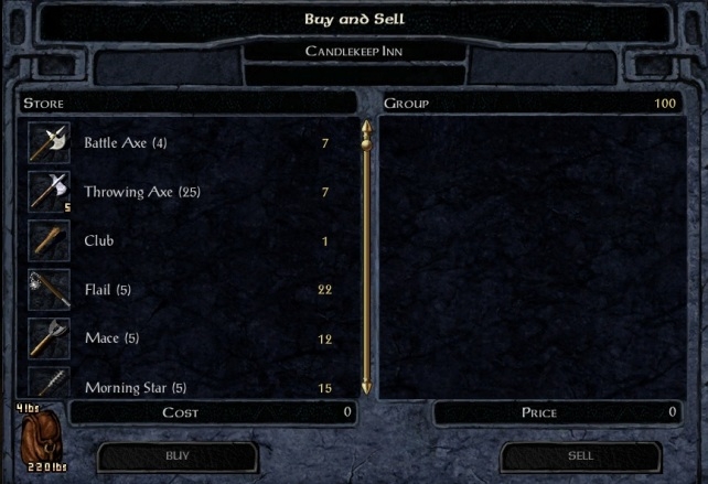
- Also, I have to point out that items in shops are no longer separated with nice borders.
Enhanced Edition (previous version)

Enhanced Edition v2.0
- The arrows to expand or compress the dialog window to predetermined values is missing.
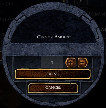
- There is something wrong with one texture in the window that appears when you choose how many of items of one kind you desire to purchase. It also happens when you assign the protagonist name, among other places.
Enhanced Edition v2.0
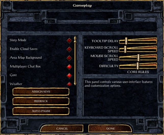
- The scrolling bars in the sound option menu and gameplay menu are in different places. Keep order among different menus (although I would prefer the earlier version). Also, I have to point out that the overall design seems unbalanced, and is copy/pasted in many menus without thinking about aesthetics or functionality.
Enhanced Edition v2.0

- The savegames are accompanied with the name of the protagonist in a humongous font (even bigger than the window title), which adds a lot of dead space and virtually nothing to the interface functionality. I'm sorry but is hideous, I hate this new "feature". What is it for? I simply don't get it.
Enhanced Edition v2.0
I found most of these changes to be theme/style breakers and give a very different feel from the original games, which was very square like, clean, symmetrical and balanced, with plenty of textures. I know I am a "nobody" but I would like to leave some suggestions for a future patch regarding this issues, although I don't know if the developers could implement them or not, I am not a modder/developer to know engine limitations.
- There should be dedicated options menu regarding everything new with the Enhanced Edition, with three options for the gameplay experience, like Enhanced Edition, Classic, and Custom. This should allow every player to customize their game and enjoy the game the way they want it.
- Keep the starting menus and sub-menus homogenous between games to keep a seamless experience.
- Bring the old character sheet with few minor improvements. Maybe enlarge the lower center window and put the name and class of the character, along with gender, race and alignment. Or perhaps put the name on top of the character portrait, just like the original Baldur's Gate 2 interface.
- If you want to simplify/categorize the information displayed in the previous record interface, you could add little tabs near (on top?) of the right window and then, when you hover over them, it pops a text with the name of the category, or maybe add a representative logo in the tab, for example a sword for combat stats. Once you click on them, the right window displays the desired information in a resumed way.
- Change the font used in Siege of Dragonspear, it does not fit the theme. Use the same font for all the series of games (the font in Baldur's Gate Enhanced Edition fits the theme of the game a lot better, in my opinion).
- Bring back the square look and buttons for each step of the character creation process, for the shops and others things, instead of the bland lists. These new lists lack the style and character from the original games.
- Bring back the previous square arrange of colors, and put some arrows on the top to swap between mattes, metallics and grayscale, or something like that. But If you plan to keep the bar for selecting the color scheme for a character, make it possible to operate the scrolling bar with the arrow keys.
- Bring back the old scroll pop up for the tooltips, for everything.
- There should be a way to "minimize" and "maximize" the journal window. Toggle between the old big window and the new version in patch 2.0.
- Fix the shortcut path for the journal. It should be accessible from every window.
- Some sort of gradual interface scaling instead of an on and off option.
All of these suggestions are with the intention to keep the spirit and aesthetic of the game pure to his roots, but still getting an Enhanced experience with "quality of life" modifications.
But anyway, these are just a few thoughts about the 2.0 patch and some of its features, and fixes I would like to see in a future patch (think of it as a "wishlist" perhaps). I think maybe other players would also like these modifications. But if anyone thinks differently, or maybe would like to add something I missed, speak! Let's discuss about it and hope the developers read some of our inquiries/petitions/suggestions.
______________________________
In my opinion, the top priority of an Enhanced version of any game is to improve the base game graphics, interface, gameplay and make it stable for newer systems, without losing the spirit and style of the original games.
I consider myself kind of a "purist", but I liked how the Enhanced Editions from Beamdog improved the user interface, style, and general aesthetics (except skins of course) towards an updated version of the original Baldur's Gate 2 interface, achieving a seamless experience between the Baldur's Gate saga and Icewind Dale (for me at least).
The best improvements are those that blend so well with game, that gives the feeling they have been there since the late 90's, without breaking the theme and style of old infinity engine games set up in the Forgotten Realms universe. Some of my favorites are the quick loot button, the transparent dialog window, added windows with information regarding hit points (HP), armor class (AC), THAC0 and damage in both the inventory and record (character sheet).
I feel these updates treat the original content with respect and make the game better, adding functionality without hurting the overall style and aesthetics of the game. Nevertheless, in my opinion, I would say patch 2.0 changed too many things, in such way that it disrespects the original content and hurts the overall game experience. Here is a brief overview of some of this changes
- The starting menu of Siege of Dragonspear does not match the style of classic ones (the game logo centered with the different options build around it). I thought Beamdog was going towards a seamless experience and similar menu looks between the different games. Also, the fonts in several menus and windows in the DLC are completely wrong, out of theme and feel in accordance to the other games.
*I have not purchased the DLC, so this opinion is based from screenshots and youtube videos I've seen.
- Most of the character creation process (and even selecting pre-generated ones) is missing the previous square-like boxy look and is replaced with boring and bland lists (including the spell selection), with lack of depth and texture. Is way too simple and bland (this also happens with merchant shops, menu options, among others).
Enhanced Edition (previous version)
Enhanced Edition v2.0
*most of the titles on the top of the windows of the game is a little small, and also, why change its color to white?
- I find really hard to assign a color scheme to my character with the new colored bar, some spaces between tones are too small.
- Although I like the new pop-up journal, the one you access by pressing the J key (by default) is terrible. It's missing the done quests tab. Also, you can only access it from the main game window.
- The ever changing window on the right side of the inventory that show stat changes according to the picked item (maybe useful for new players) can get really annoying/distracting when you transfer a ton of items to other party members.
- The inventory window is missing the shortcut to select/see the "major color" of the selected party member.
- The new character sheet (record) is terrible. It eliminates the information windows for hit points (HP), armor class (AC), THAC0 and damage in both the inventory and record (character sheet). The HP and AC were easy to see since the first Baldur's Gate game released in 1998.
Enhanced Edition (previous version)
- The character portrait is no longer centered in patch 2.0. This is another aesthetic design that has been used since the first Baldur's Gate game released in 1998, that gives symmetry and balance to the interface.
- In the character record, the large left window may be useful to watch the character information tab, but for other categories like as skills and abilities, is way too big and the window seems empty and bland.
Enhacend Edition v2.0
- The new record window is full of buttons, way overloaded, it does not have the clean, square like, symmetrical look of the original/previous interface. I understand they were trying to make certain information more accessible, but do you really need direct access to stats and biography?
- If you do not scale the interface, the merchant shop interface is broken. Please keep it centered.
Enhanced Edition v2.0
- Also, I have to point out that items in shops are no longer separated with nice borders.
Enhanced Edition (previous version)
Enhanced Edition v2.0
- The arrows to expand or compress the dialog window to predetermined values is missing.
- There is something wrong with one texture in the window that appears when you choose how many of items of one kind you desire to purchase. It also happens when you assign the protagonist name, among other places.
Enhanced Edition v2.0
- The scrolling bars in the sound option menu and gameplay menu are in different places. Keep order among different menus (although I would prefer the earlier version). Also, I have to point out that the overall design seems unbalanced, and is copy/pasted in many menus without thinking about aesthetics or functionality.
Enhanced Edition v2.0
- The savegames are accompanied with the name of the protagonist in a humongous font (even bigger than the window title), which adds a lot of dead space and virtually nothing to the interface functionality. I'm sorry but is hideous, I hate this new "feature". What is it for? I simply don't get it.
Enhanced Edition v2.0
I found most of these changes to be theme/style breakers and give a very different feel from the original games, which was very square like, clean, symmetrical and balanced, with plenty of textures. I know I am a "nobody" but I would like to leave some suggestions for a future patch regarding this issues, although I don't know if the developers could implement them or not, I am not a modder/developer to know engine limitations.
- There should be dedicated options menu regarding everything new with the Enhanced Edition, with three options for the gameplay experience, like Enhanced Edition, Classic, and Custom. This should allow every player to customize their game and enjoy the game the way they want it.
- Keep the starting menus and sub-menus homogenous between games to keep a seamless experience.
- Bring the old character sheet with few minor improvements. Maybe enlarge the lower center window and put the name and class of the character, along with gender, race and alignment. Or perhaps put the name on top of the character portrait, just like the original Baldur's Gate 2 interface.
- If you want to simplify/categorize the information displayed in the previous record interface, you could add little tabs near (on top?) of the right window and then, when you hover over them, it pops a text with the name of the category, or maybe add a representative logo in the tab, for example a sword for combat stats. Once you click on them, the right window displays the desired information in a resumed way.
- Change the font used in Siege of Dragonspear, it does not fit the theme. Use the same font for all the series of games (the font in Baldur's Gate Enhanced Edition fits the theme of the game a lot better, in my opinion).
- Bring back the square look and buttons for each step of the character creation process, for the shops and others things, instead of the bland lists. These new lists lack the style and character from the original games.
- Bring back the previous square arrange of colors, and put some arrows on the top to swap between mattes, metallics and grayscale, or something like that. But If you plan to keep the bar for selecting the color scheme for a character, make it possible to operate the scrolling bar with the arrow keys.
- Bring back the old scroll pop up for the tooltips, for everything.
- There should be a way to "minimize" and "maximize" the journal window. Toggle between the old big window and the new version in patch 2.0.
- Fix the shortcut path for the journal. It should be accessible from every window.
- Some sort of gradual interface scaling instead of an on and off option.
All of these suggestions are with the intention to keep the spirit and aesthetic of the game pure to his roots, but still getting an Enhanced experience with "quality of life" modifications.
But anyway, these are just a few thoughts about the 2.0 patch and some of its features, and fixes I would like to see in a future patch (think of it as a "wishlist" perhaps). I think maybe other players would also like these modifications. But if anyone thinks differently, or maybe would like to add something I missed, speak! Let's discuss about it and hope the developers read some of our inquiries/petitions/suggestions.
Post edited by mbernadas on
8
Comments
The good news is that a lot of these changes can be easily modded by tweaking the UI... It's still early days and people are still getting to grips with it but it's likely you will see more and more mods that add new features and change the look and feel of the interface.
As an example, check out what @Pecca has been doing with his widescreen mod for SOD here.
"the top priority of an Enhanced version of any game is to improve the base game graphics, interface, gameplay and make it stable for newer systems, without losing the spirit and style of the original games."
In my mind, an Enhanced Edition does not have much space to make big changes, and much less in such an old game like Baldur's Gate. After all I have heard the CEO of Beamdog Trent Oster, calling themselves curators, restorers, or something along those lines, and a restorer brings back to life a masterpiece, preserving the artistic/aesthetic feeling.
But anyway, I think Pecca is doing a great job. I like a lot what he is doing with the UI. I will be checking his progress and maybe download a mod if I am not happy with future official patches.
"If it ain't broke, don't fix it."
I share many of the same thoughts and feelings that you do concerning the new UI and the changes that have been made.
Just one woman’s opinion here of course, but I feel that it has gone to far. It no longer feels like a carefully curated version of the classic game. I would dearly love a toggle for a Classic UI option.
It is wonderful that the UI can now be modded, but this leaves players having to hope that there will be a modder interested in making a mod that very closely resembles the old UI, in all areas.
Each modder has his/her own likes and dislikes and will, understandably, incorporate into their mod the things that they find appealing, perhaps leaving out or changing other things that they find less important.
I’ve not seen many comments from other players saying that they don’t like the new transparency of the dialog window, so I guess I’m in the minority here. But it’s just one more of those little things that I miss from the old UI. Depending on what area I am in it can make it more difficult to read. I really miss the solid dialog window.
Beamdog has shown that they listen to their players feedback. I have faith that they are still listening.
I have been watching both Pecca and Kerozevok’s mods and there is much that I like about both. Of course each has a different vision and puts emphasis on modding different aspects of the UI. I have been thinking to myself that I would be happy if I could combine the two of them.
For instance, I like the look and feel of Kerozevok’s mod, with the familiar artwork and tones of brown and gold. Pecca’s spell book feels the most familiar at the moment. No doubt just the right mod will eventually be completed. Sigh… I must be patient.
However, I honestly don’t understand why such a drastically different look and feel was chosen for the current official version of the game. If a modder like Kerozevok can come up with a UI that feels so much closer to the original games in such a short time, then surely the developers can. Perhaps they will give us the option to toggle into a more classic look in the future. I hope so.
The one thing I wish I could do is to use different styles of character sheets for different classes. I would like to have certain things in certain places on the character sheet for the different classes, fighters obviously are different than thieves so I would place things differently.
Re: other comments. I don't think BeamDog are making changes "just because they can". This is a clear attempt to make a better game, modern and relevant for the current generation of gamers, who are used to playing games that have learned a lot from the BG series in the years that followed. I thin the 'form follows function' ideal is something that the team are actively applying.
However, I don't buy that particular ideal myself. Form follows function is great for utilities and tools, where the tool is a means to an ends, rather than the ends in itself. A computer game is more in the realm of art, where the whole point is the experience of the thing itself. You could clean up the interface considerably by rendering all fonts in Helvetica (or something similar) but I don't think you would improve the game experience - we look for a more flavorful font as we enter the fantasy world of Faerun.
In general, it seems that since Apple ditched it textured UI in favor of a deliberately spartan and plain 2D look-and-feel, that is what everyone else is aspiring to too. That might work well for tools, where the goal is not to be aware of the tool you are using. It is completely the wrong choice for a game UI, where as I said, the spectacle is the point.
Thankfully, I don't think BeamDog have bought into plain and flat yet, but the screenshots do feel lost somewhere between the two design languages, and sometimes looking a little lost. The shop UI above is a classic example, where the loss of separators between items loses an important visual guide connecting the price to the item - as for many items the name is short, and the dialog just wide enough that keeping both the item and the price in my field of focus at the same time is tricky.