[BG:EE UI] Sobstitute old BGEE blue UI whit the new BG2EE brown UI...
Hi,
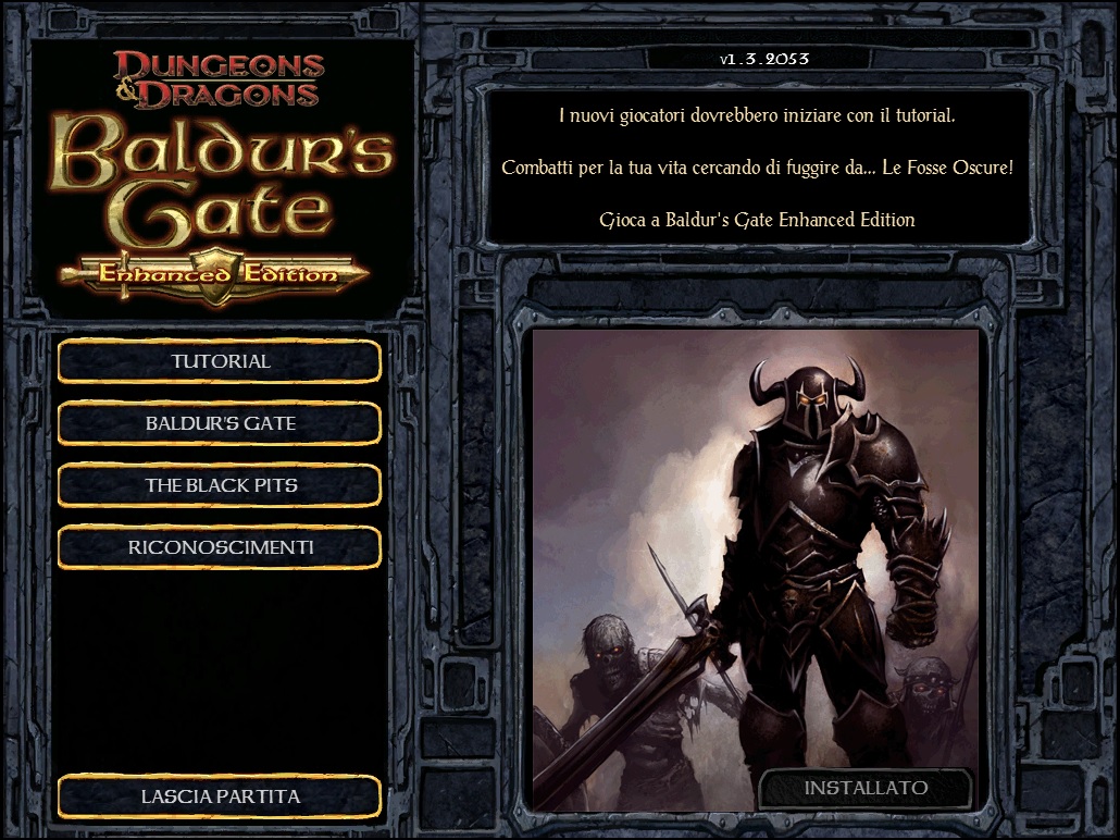
I really appreciate the work made by the developers originally BGEE in the design of the UI, but I think that after the release of BG2EE this has become objectively "outclassed" in all and for all.
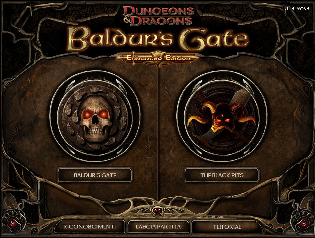
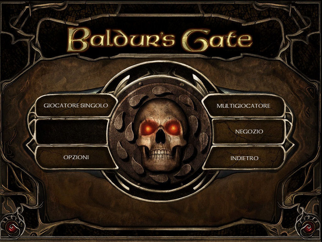
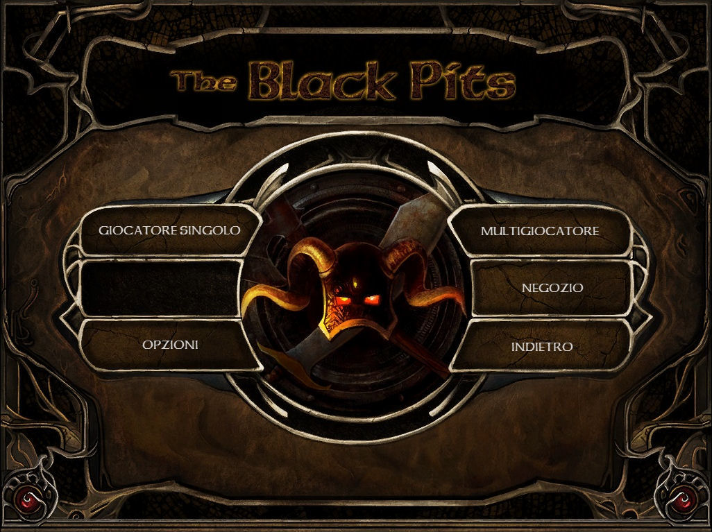
A few months ago a talented modder (@Pecca) has made available for BG: EE a beautiful mod that takes the brown IU of BG2: EE modifying it where necessary in order to adapt better to its predecessor, a work of such quality that I think deserves to take the place of the old blue interface.
It is not my intention to belittle the work made by designers, but only to see how the work done with BG2: EE is a completely other quality, and if it is true that the intention of the developers is to make BG: EE a game ever best, and at the same time reward the work of the community this could be a chance to prove it in practice ..
This small fix that would not cost any difficulty or problem, but that would actually improve playing this immortal masterpiece for all players, not just those who know how to apply this beautiful mod.
PS: before opening this thread I asked the modders permission to make this request, and I got a positive response ..
Mod Link: http://forum.baldursgate.com/discussion/31069/gui-mod-bg2-ee-gui-in-bg-ee/p1
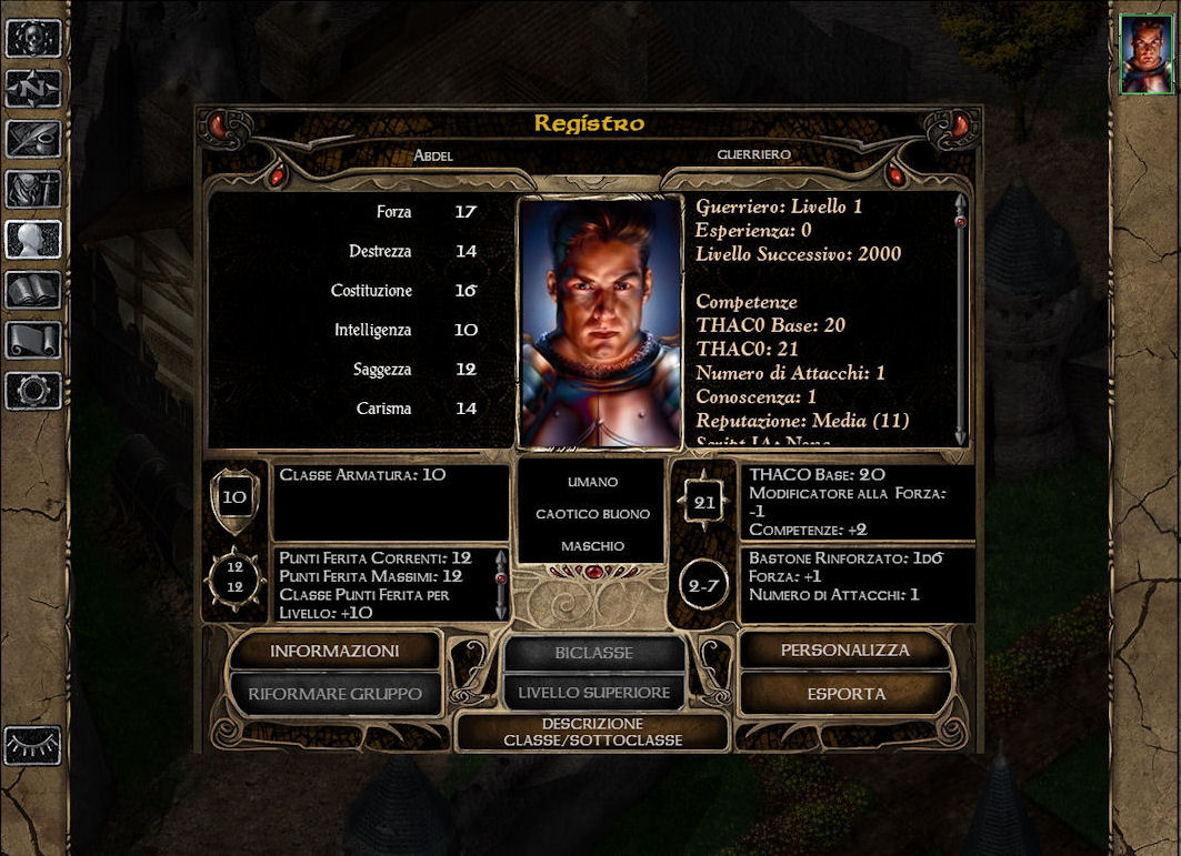
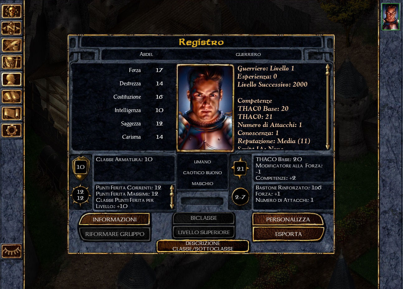
Now some images to show what I mean:
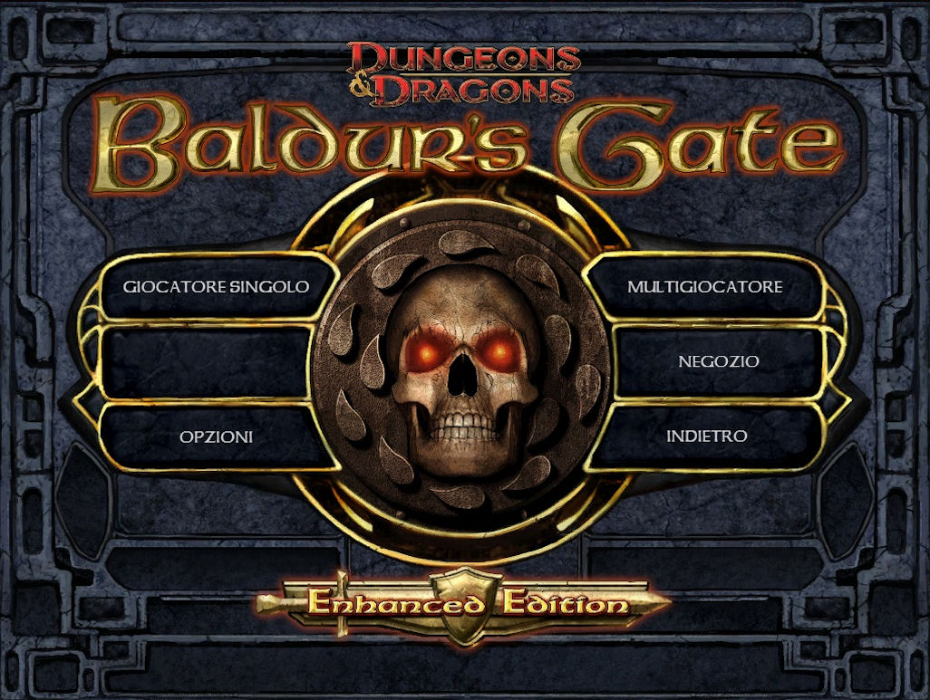
*In the blue UI this screen it does not change for Baldur's Gate or Black Pits section.
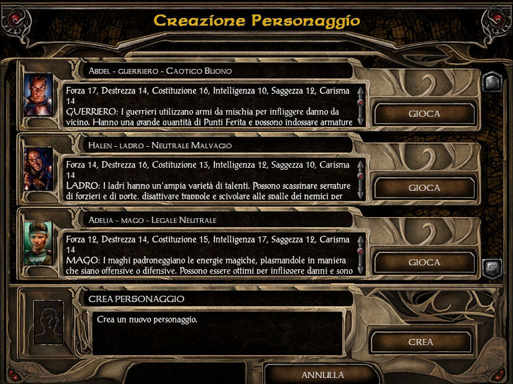
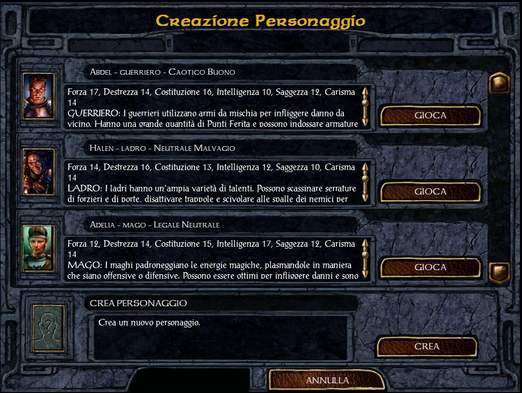

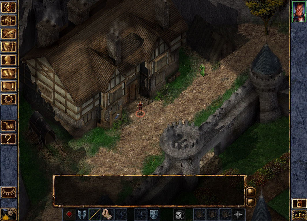
I really appreciate the work made by the developers originally BGEE in the design of the UI, but I think that after the release of BG2EE this has become objectively "outclassed" in all and for all.
A few months ago a talented modder (@Pecca) has made available for BG: EE a beautiful mod that takes the brown IU of BG2: EE modifying it where necessary in order to adapt better to its predecessor, a work of such quality that I think deserves to take the place of the old blue interface.
It is not my intention to belittle the work made by designers, but only to see how the work done with BG2: EE is a completely other quality, and if it is true that the intention of the developers is to make BG: EE a game ever best, and at the same time reward the work of the community this could be a chance to prove it in practice ..
This small fix that would not cost any difficulty or problem, but that would actually improve playing this immortal masterpiece for all players, not just those who know how to apply this beautiful mod.
PS: before opening this thread I asked the modders permission to make this request, and I got a positive response ..
Mod Link: http://forum.baldursgate.com/discussion/31069/gui-mod-bg2-ee-gui-in-bg-ee/p1
Now some images to show what I mean:


*In the blue UI this screen it does not change for Baldur's Gate or Black Pits section.


Post edited by geminibruni on
0
