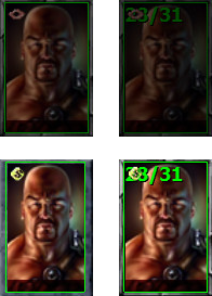
Hit points on portraits conflict with talk and store icon
 Hurricane
Member, Translator (NDA) Posts: 734
The beta introduced the option to display a character's hit points in the top left corner of the portrait. This feature was carried over from IWD:EE. However, this is a problem because the top left corner is also the place for showing the talk icon and the store icon. If both the hit points and the icon are displayed together, they overlap, so you can't recognize either and it looks ugly and wrong. See screenshots: left images are from v1.2, right images are from the beta.

Solution: If the option to display the hit points is enabled, shift the talk and store icon down a few pixels. If the option is disabled, the icons should appear in the corner as always.

Solution: If the option to display the hit points is enabled, shift the talk and store icon down a few pixels. If the option is disabled, the icons should appear in the corner as always.
3

Comments
Furthermore, I realize that the hit points also get covered by the icon showing the character's current action:
Not neat at all. I hope the devs find a better solution for this. Maybe display the action icons to the left of the portraits, hovering along the edge of the Gameplay screen? Something like this (GIMPed):