UI woes: Seriously, Beamdog? You call this 2.0?
 klatu
Member Posts: 108

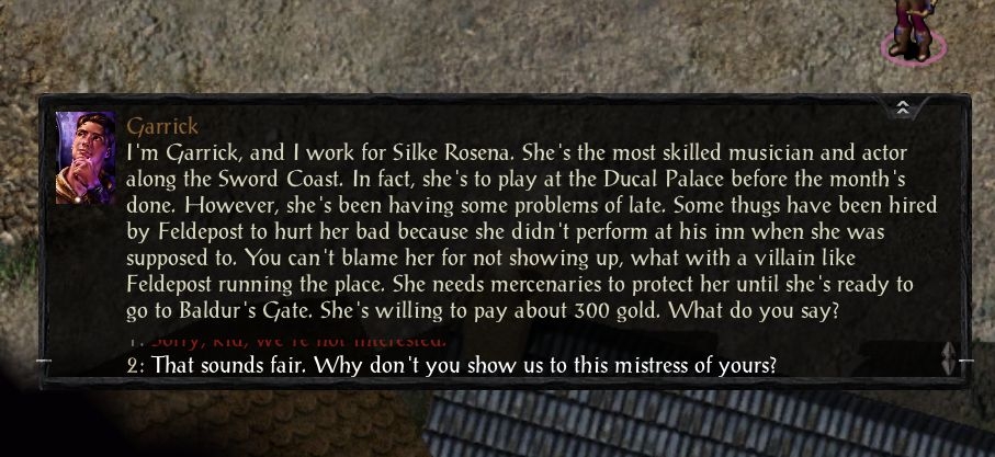
I have to scroll for two responses? Really?!
If there is a way to adjust this, I haven't found it, and I have to wonder why this would be the standard setting.
If there isn't, then I have to wonder if you ever tried playing your own games.
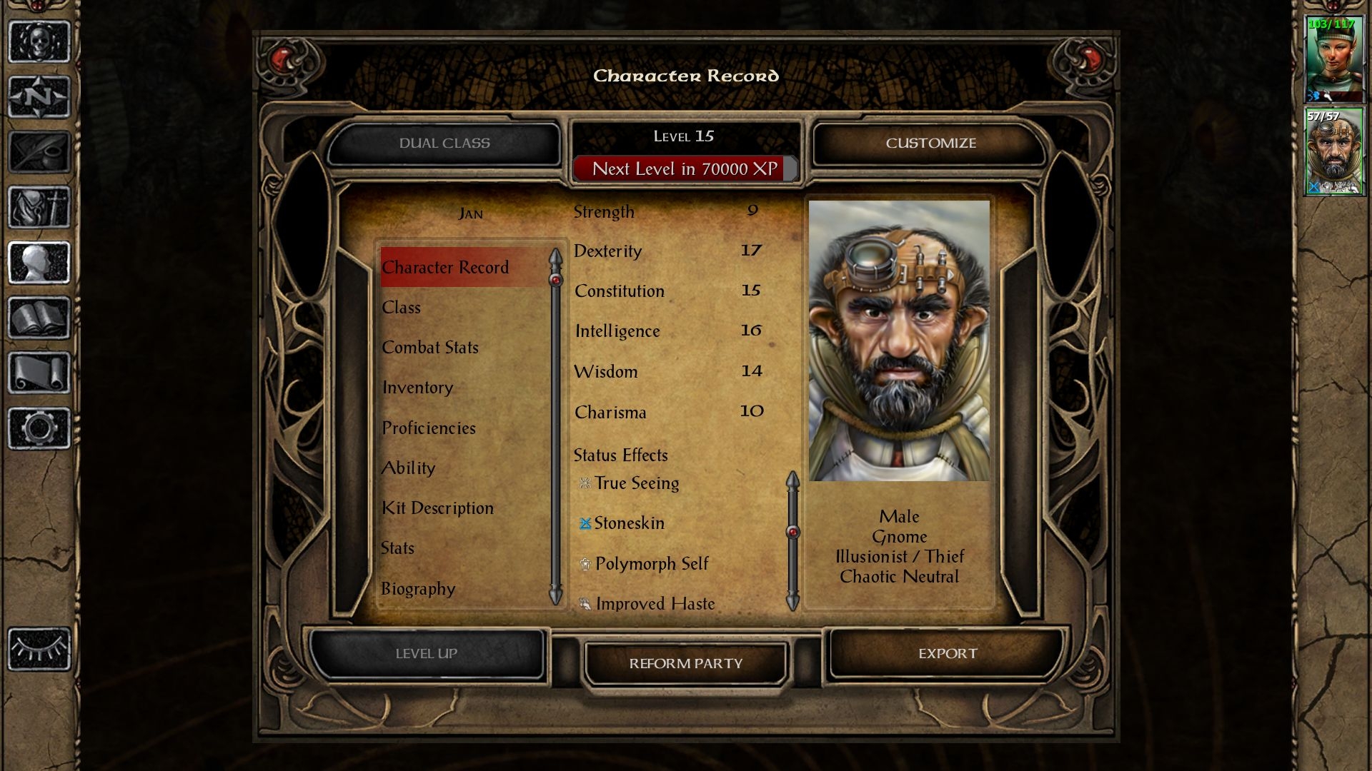
And what the ever is this?

There is an almost tangible dearth of information on this page. The list of active effects has another tiny scrolling area, with huge spacing between the items. The attributes take up the majority of the page, when they arguably contain the least interesting information.

Why would you even set up a page for this? I have to go through three or four pages to get the same information I could previously see on one page. Progress this is not.
Btw, this isn't the case in BGEE and SoD, so why is it different here?

Why can I scroll the attributes here? Huh? In no universe is this a sound design decision. Again, not the case in the other games.
Could you at least try to make the games consistent in their overall behaviour?
Do your design choices not seem strange to you, Beamdog?
Clearly you can do better, so why this? WHY?!
1
