[MOD] Swankified HUD v1.0 [SoD GUI Overhaul]
 Dameon2
Member Posts: 46
Swankified HUD Redesign

A Mod for Pecca's SOD GUI Overhaul
Requirments:
SOD GUI Overhaul - This amazing UI mod by @Pecca is required. You can learn all about it, and download it here:https://forums.beamdog.com/discussion/50357/mod-sod-gui-overhaul-v2-03/p1
Alternatively you can leave a message letting me know you want this new HUD for the vanilla UI and if a few people ask I'll go ahead and make it for you!
Minor Npc Portraits - This mod does not technically require this absolutely beautiful mod by @smeagolheart , but it is HIGHLY recommended as the portrait size for speaking characters has been increased substantially. You can find it right here:
https://forums.beamdog.com/discussion/55237/mod-minor-npc-portraits-for-bgee#latest
Description:
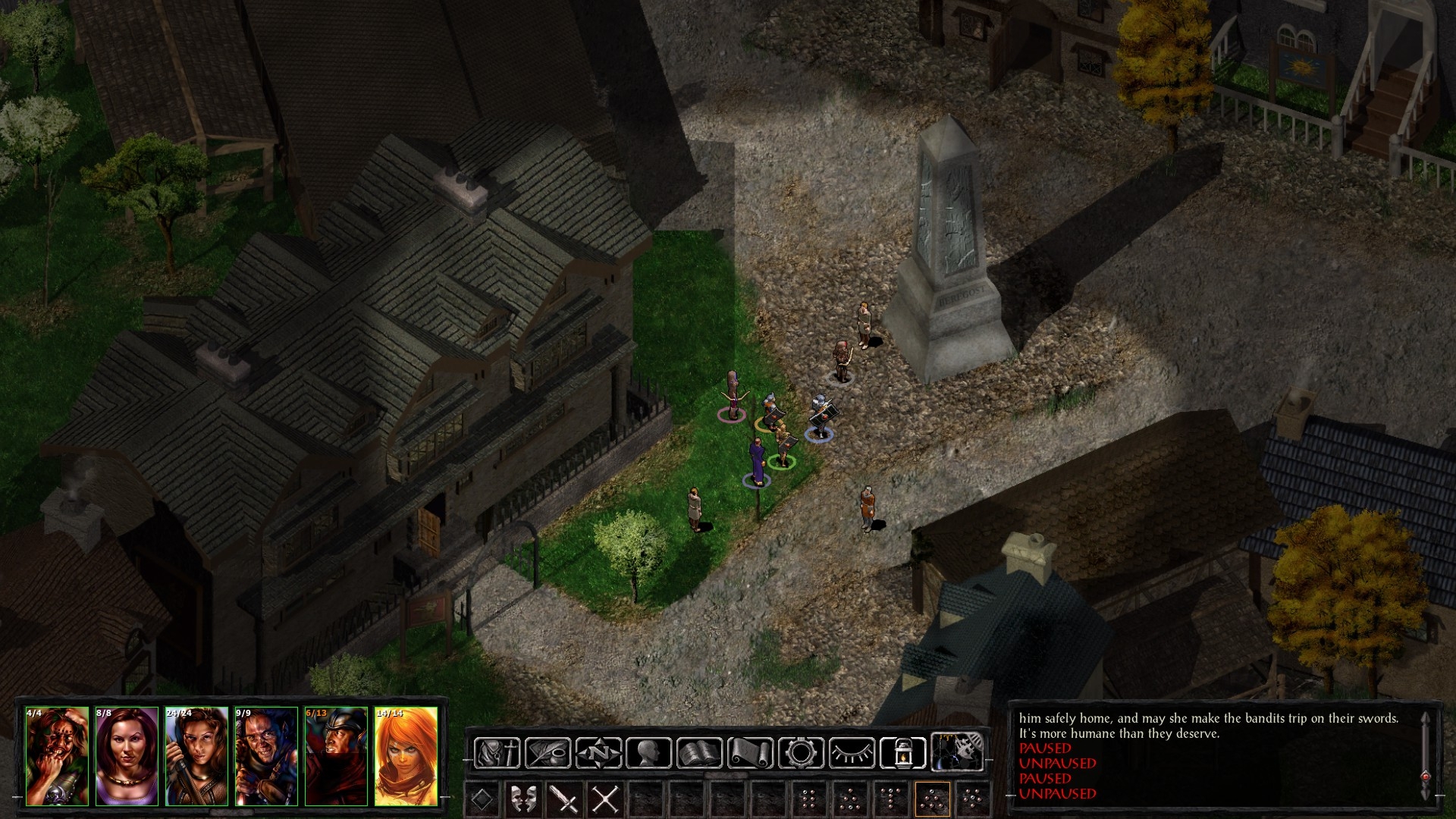
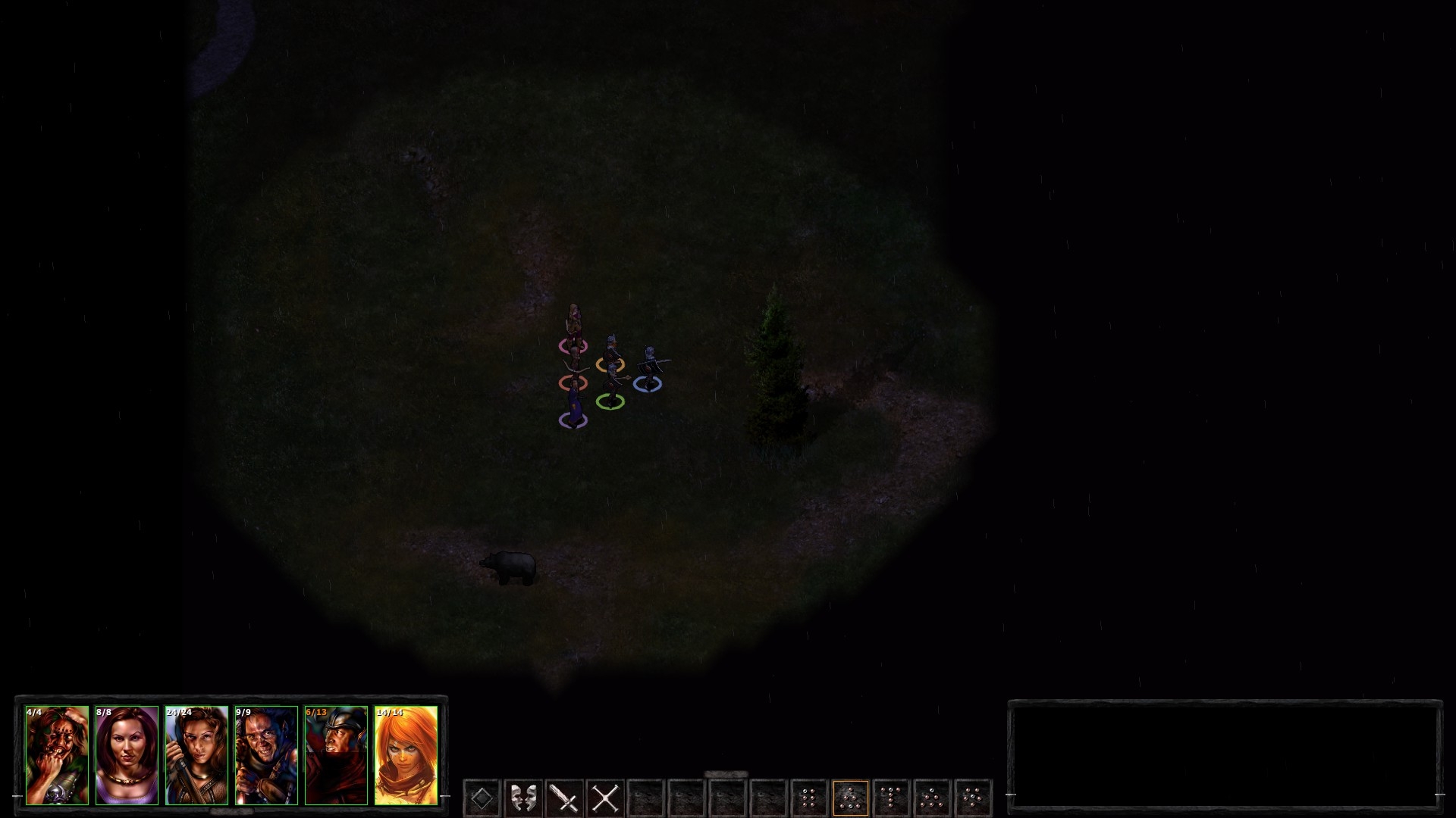
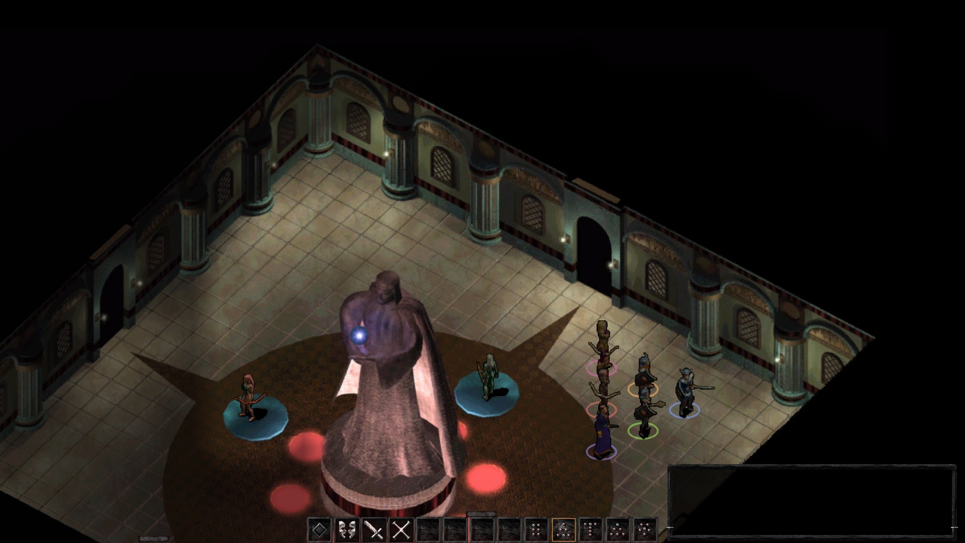
I love Pecca's Overhaul, but I wanted a slicker feel for the main game play UI. Also I tried to go for a more modern approach, getting all the UI on the same level, easy access. Hopefully this will be good for old players, and new players who have a hard time getting used to the old school setup.Portraits - The portrait row now sits horizontally along the left side, bottom of the screen.
Combat/Message Log - Along the other side you'll fine the combat/messages box for a nice symmetrical feel.
Shortcut Buttons - All the menu shortcuts can now be found horizontally above the hot-bar along with the clock.
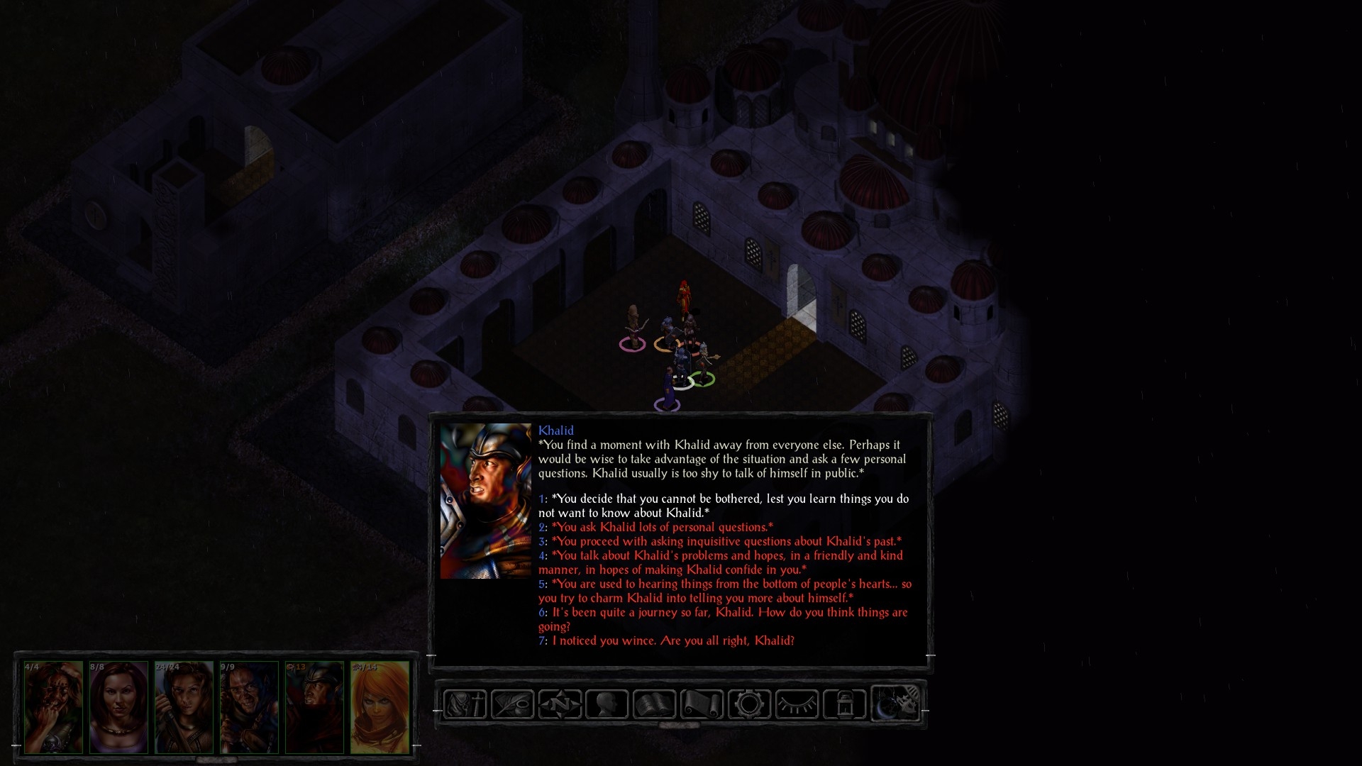
Dialogue Box - The Dialogue box itself is in the same position as before, but it has been resized, and any portraits will appear nice and large so you can see who you're talking too.
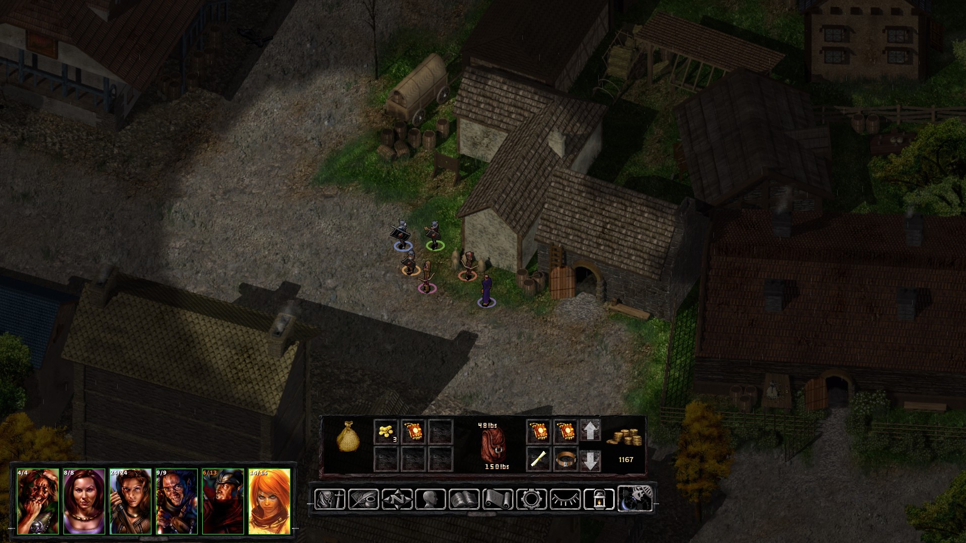
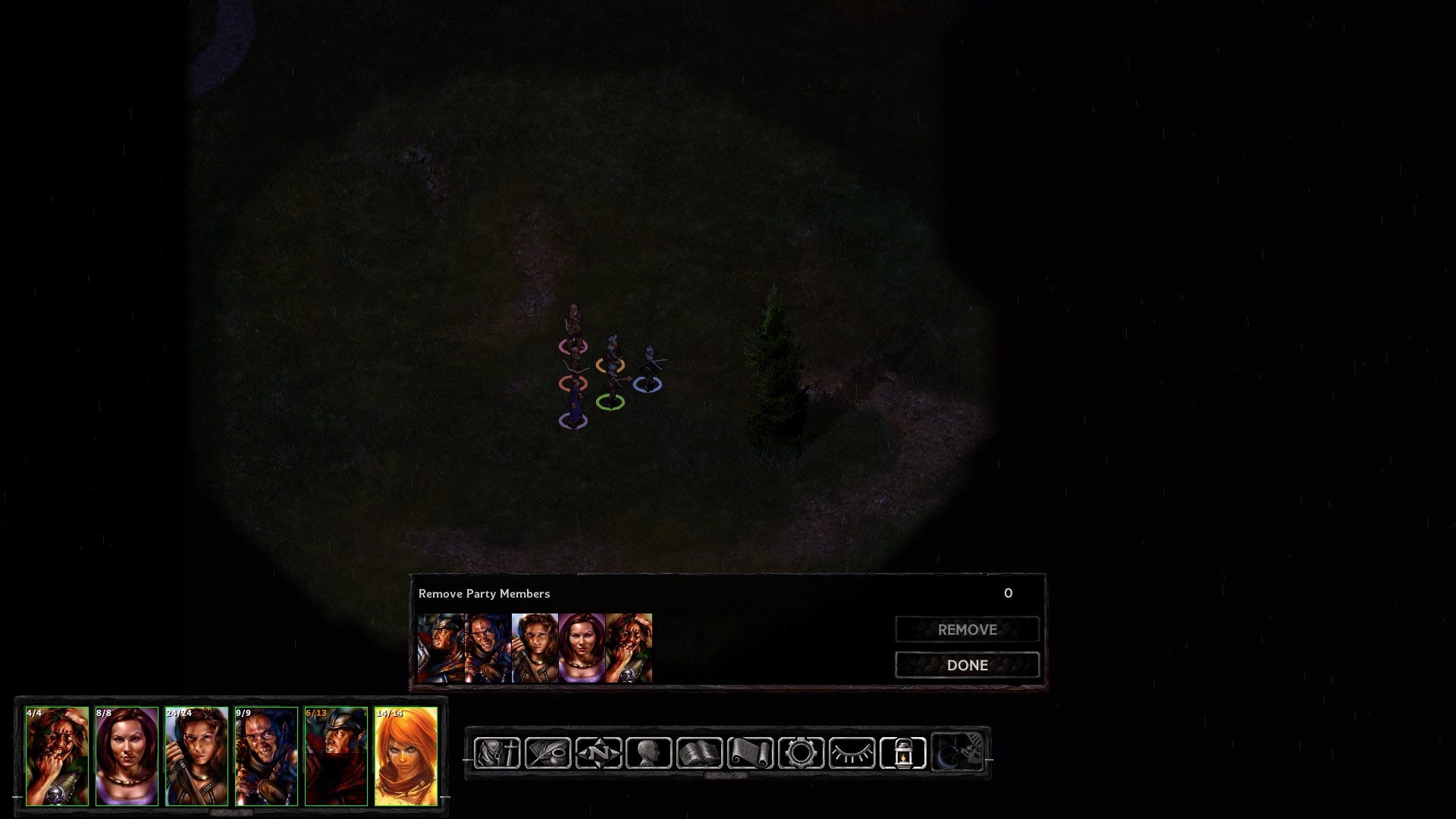
Other - All other relevant UI elements such as the Dialogue Box, Loot Interface, Reform Party Tab ect have been adjusted accordingly to appear slightly higher. This was done so they don't overlap the shortcut buttons.
Everything Else [The Actual Good Stuff] - Was all made by @Pecca ..... cause Pecca em very muchly smarterer and coolerist and many talent
ScreenShots:
Main HUD:
Dialogue Box:
Loot Window:
Reform Party:
"Right Side" UI Elements Hidden:
Both Sides Hidden:
Installation:
1. Back Up the 'UI.Menu' file in your 'Baldur's Gate Enhanced Edition\override' folder2. Download Swankified HUD v1.0.zip
3. Extract 'UI.Menu' from the Swanky HUD zip file into the override folder and overwrite
4. Enjoy!
5. Come back to yell at me for broken stuff cause I suck
Multiplayer Note: I personally do not play Multiplayer but will be working towards a version compatible with it. For now, Swankified HUD works with single player, but Multiplayer may have issues.
Changelog:
v1.1 - Fixed a bug with the cursor when using the inventory screen
Post edited by Dameon2 on
15

Comments
I was wondering whether easier spell access functionality might ever be implemented? Kind of like pillars of eternity where the char is selected then you highlight the school level and that shows you the relevant spells from that school?
It crashes for me with a clean BG2EE 2.6 install + latest Dragonspear UI
or is it BG1EE exclusive?
Edit:
Tried it with BG1EE 2.6 - it didn't crash but the ui is all over the place