Skip to content

GS - Glowing Staff

IcecreamtubIcecreamtub Member Posts: 547
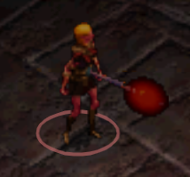
Is there any possible way to remove the glowing part of this?

(Staf11 uses it and I noticed it's a totally new model?)

I really like how this Quarterstave looks but the glowing 'bulb' just looks really weird with certain colors...

Comments

  • The user and all related content has been deleted.
  • IcecreamtubIcecreamtub Member Posts: 547
    :0 My Master commented on my post dun dun dun!

    Ah, I was hoping that wouldn't be the case... Fingers crossed x___x
  • The user and all related content has been deleted.
  • argent77argent77 Member Posts: 3,478
    Probably not possible without some artistic skills, the right tools (and a LOT of patience) since you'd have to manipulate animations directly. The animations in question are WQxGSyy.BAM (where x = L/M/N/S, and yy = A2/A4/A6/G1) if you want to take a look.
  • IcecreamtubIcecreamtub Member Posts: 547
    I believe I am definitely not levelled to be touching such things >.<
    Thanks anyways guys, great help as always<3 Hope you have a great day & Weekend!
  • PeccaPecca Member Posts: 2,215
    As argent77 says, you would need to manually edit the animation files, so it's not very likely to happen. But you can make it look better. As you noticed, some colors look weird, the trick is to pick colors with low "contrast". If you edit the color attribute of the bulb in near infinity, you see the scale of the particular color. If you pick a color that ranges from very light to very dark, you will have a dark border of the light bulb, which doesn't look well. But if you pick a color that doesn't range that much, it will look much better.

    As for where did the animation come from, IIRC, it was from the 1pp mod, which EE incorporated.
  • IcecreamtubIcecreamtub Member Posts: 547
    Uhh... I'm really sorry, I'm trying very hard to understand everything you just said @Pecca... But I just can't, I kept reading it for several days and I'm just lost... ;w;

    God dammit I'm a Modbaby
  • PeccaPecca Member Posts: 2,215
    Hmm, thinking about it, perhaps I remember it wrong, it's been some time. The trick however still is to pick a "right" color for the bulb, because some look bad (having black borders), and some look much better. In Near Infinity, if you find the staff and double-click the "Set color" effect of "weapon head/ blade minor" and select "color index", then you see the color range of that index. You can change that and experiment. If the color is too dark on the right side of the range, the border of the bulb will be dark, you should avoid that.
  • IcecreamtubIcecreamtub Member Posts: 547
    Yeah that's how I got it to be this dark red, went over a couple of the reds and this seemed to be most "realistic" looking red to use and after moving around for a while, the aura itself started to looking increasingly more bizarre and didn't quite catch the original feel and look of the Magistaff... D:
Sign In or Register to comment.