Other mmos whose gfx/atmosphere you admire/ which you feel NWN EE/3? could aspire to
For a long time, after I left nwn many years ago, i hunted around for an mmo or rpger which progressed all the things i loved about nwn: the atmosphere, multiplayer, team pvp, combat mechanics. i could not hope for toolset, but i really hoped for seamless world travel (non tileset), jump etc. mosto f the time i found mmos with beautiful gfx, but really bad spatial awareness (ie: most with over shoulder view only or bad top down view).
in terms of gfx, i love nwn art and hoped for something.. i dont know, similarly mystical?
I was wondering if anyone else would like to post pics of mmos whose gfx/art meet the minimum which you might hope for, if NWN EE were to have a full gfx engine revamp. That is right, so it wont be NWN EE, as ee is using the same basic gfx engine. I'm talking about the next evolution (nwn 3?) but at a minimum level. I call it minimum, because actually, i dont like florid overacted overadorned gfx. And Im hoping its cheaper to implement.
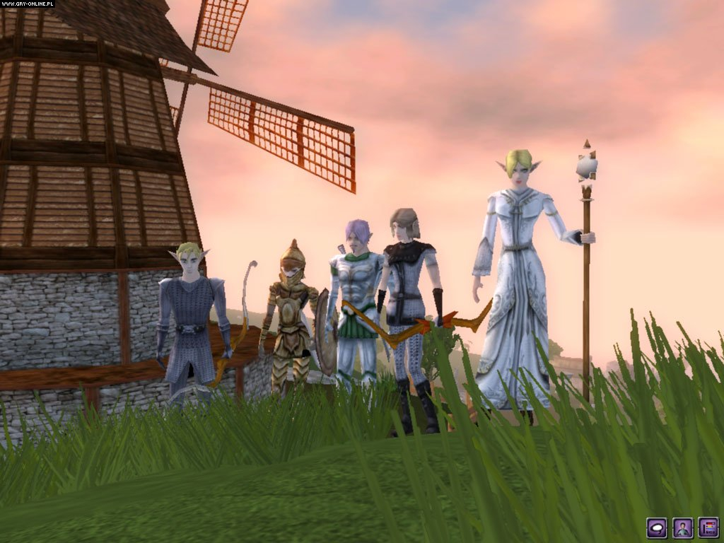
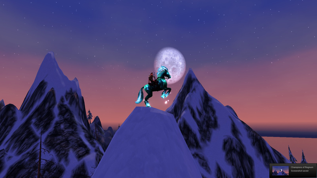
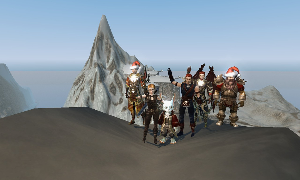
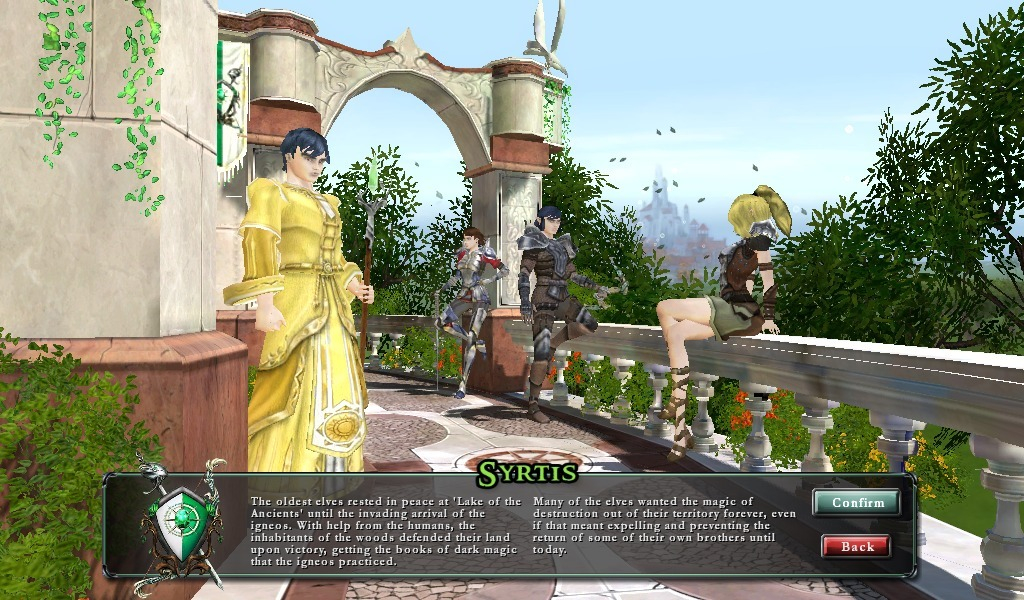
Anyway, here's pics from an mmo i enjoyed after nwn, and whose engine, gfx/combat etc were very close to nwn. (you can see combat formulas). Its called Champions of regnum, and if nwn 3 had a revamp, i would hope to see nice (to me) gfx like this ><


0

Comments
It could be an absolutely breathtaking game.
Here's some screenshots - https://imgur.com/a/AWCBz
i like the guildwars look. i also liked the Dungeon Lords look (heck, i think DL has a really epic deep fantasy gameset, a bit like Runequest from decades ago, a competitor for DnD).
edit: I also like the look of Fable the game, and Torchlight.
if we had a tileset that let us build Guildwars look (or Regnums, which could be cheaper to do, im not sure), that would be brilliant :P
edit: i wanted to say -- for the user interface, as beautiful as it is to have floaty interfaces, i make three caveats:
1) Even with a bigger screen, i think the interface needs to be able to take up the same proportion of screen scpace. That means the font size needs to be able to be as large, proportionally, as if it was on the smaller 17 inch CRTs nwn used to be played on years ago. I'm serious about this. Otherwise it's impossible to play. One reason I left Regnum is that the font size is unscalable. It's impossible on the eyes. And many dedicated nwn players will end up with presbyopia or worse. small text is impossible to play with.
2) It's nice to have floaty, but I still love the surrounding gfx of the nwn interface. The compass, the ascrollwork and miniwindows framing, the right hand side party interface, the top right map and scrollwork too. So I would prefer to keep all of it.
3) NWN always had the option to turn off all interfaces so that the beautiful big screen view can be enjoyed in its uncluttered glory For me, that is all thatis needed.
But, since everything seems to heavily interconnected and such, maybe there's only so much they can do with this stuff, without scrapping entire swathes of stuff and starting afresh, something I hardly think they'll entertain. It's tricky. I think any enhancements they do will be things they can slot in relatively easily. Let's see what that ends up like.
It should look like what it sorta is: living tabletop miniatures on graph paper cleverly disguised with scenery but still basically graph paper, as you play D&D with your friends.