BG2 weapon icons are terrible, how should I change them?
 Baptor
Member Posts: 351
in BGII:EE Mods
BG 2 Weapon Icons are Terrible
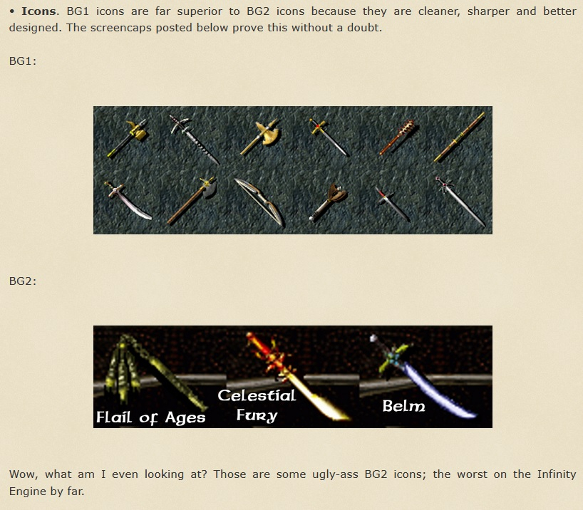
One thing that's bugged me since the original release over 20 years ago are the weapon icons in BG2. Unlike BG1 and Icewind Dale icons, which keep to the "fantasy medieval" theme - the BG2 icons range from the merely unrealistic "how would I wield this?" to the "is that even a sword?" level.
I've found out that I am not alone in this opinion and that even big fans of BG2 don't like the weapon icons very much, but what I haven't found is anyone who has ever done anything about it. For example, check out this comparison @Lilura did of BG1 and BG2 icons on their website. I laugh at it every time I read it Lilura.

If anyone's done a BAM swap and fixed this, let me know. For now I've been working on it myself and I can't quite decide what icons to change it to.
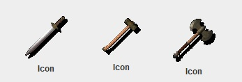
1st - The Lazy Method: Change the wacky icons to generic icons similar to the generic weapons in Baldur's Gate 1 (i.e. all magic longswords use the "+1 longsword" icon).
Example:

2nd - The Icewind Dale Method: Change the wacky icons into the very realistic weapon icons from Icewind Dale.
Example:

3rd - The IWD2 Method: Change the wacky icons into the colorful but still grounded icons from Icewind Dale 2.
Example:

I have good things and bad things to say about each method, so I'm curious what you all think. Any additional input is welcome!
One thing that's bugged me since the original release over 20 years ago are the weapon icons in BG2. Unlike BG1 and Icewind Dale icons, which keep to the "fantasy medieval" theme - the BG2 icons range from the merely unrealistic "how would I wield this?" to the "is that even a sword?" level.
I've found out that I am not alone in this opinion and that even big fans of BG2 don't like the weapon icons very much, but what I haven't found is anyone who has ever done anything about it. For example, check out this comparison @Lilura did of BG1 and BG2 icons on their website. I laugh at it every time I read it Lilura.

If anyone's done a BAM swap and fixed this, let me know. For now I've been working on it myself and I can't quite decide what icons to change it to.
1st - The Lazy Method: Change the wacky icons to generic icons similar to the generic weapons in Baldur's Gate 1 (i.e. all magic longswords use the "+1 longsword" icon).
Example:

2nd - The Icewind Dale Method: Change the wacky icons into the very realistic weapon icons from Icewind Dale.
Example:

3rd - The IWD2 Method: Change the wacky icons into the colorful but still grounded icons from Icewind Dale 2.
Example:

I have good things and bad things to say about each method, so I'm curious what you all think. Any additional input is welcome!
- BG2 weapon icons are terrible, how should I change them?5 votes
- Lazy: Make all wacky BG2 weapons look like generic BG1 weapons20.00%
- IWD1: Make all wacky BG2 weapons look like the very realistic IWD 1 weapons40.00%
- IDW2: Make all wacky BG2 weapons look like the colorful IWD 2 weapons40.00%
0

Comments
Yeah the more I work on this the more I agree with #1 too. I tried using IWD and IWD 2 icons and played around and it didn't feel right at all.
I did find out there are quite a few unused BG icons in BG2EE, so I've got a few more to play with than I thought.
go figure eh?