Blurry spell BAMs in my UI
G'day all. Was watching a playthrough earlier and noted that his spell book symbols were crisp and clear compared to mine. I messed around with the graffic settings and interface scaling but the best I can do is make everything on screen tiny and unplayable (but crisp).
Im I missing some MOD that I should know about.
Just some basic info, using 2.5 edition, but that isn't the issue because the playthrough is using 1.3. Have the UI Mod Le UI to return 2.5 to a more 1.3 look.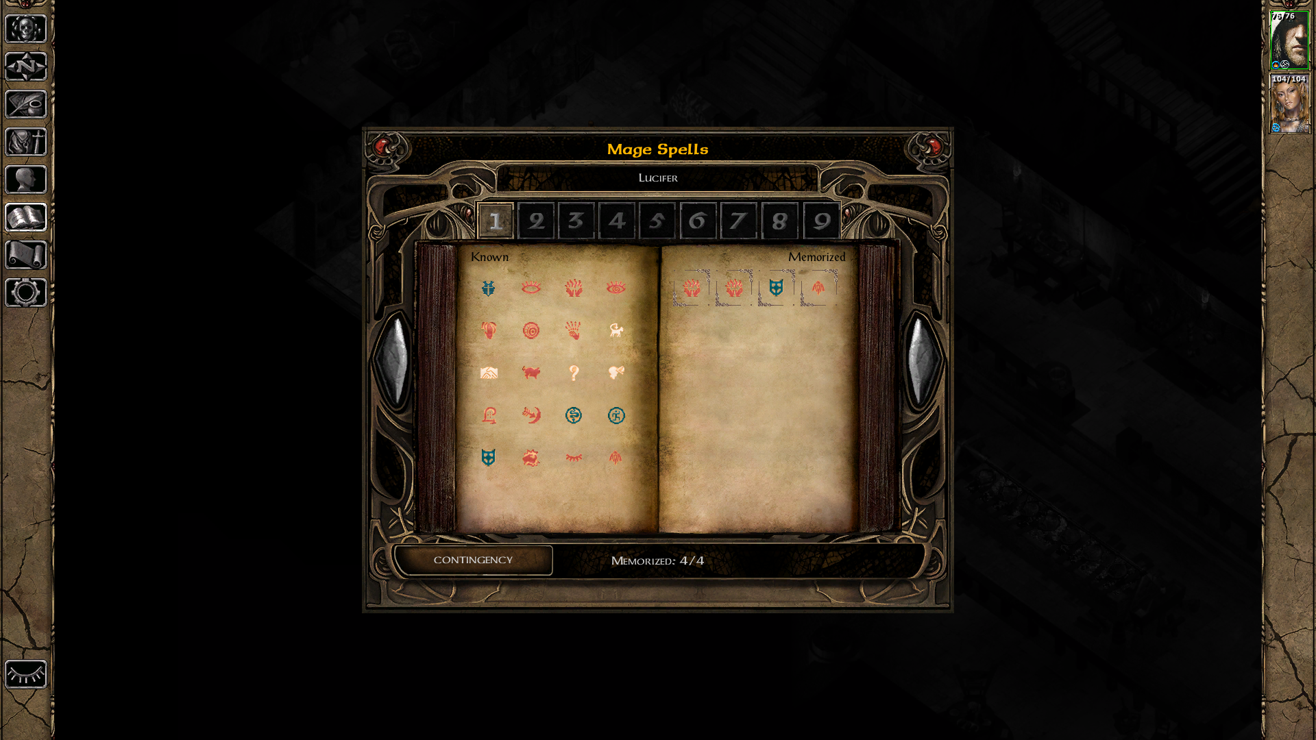
Im I missing some MOD that I should know about.
Just some basic info, using 2.5 edition, but that isn't the issue because the playthrough is using 1.3. Have the UI Mod Le UI to return 2.5 to a more 1.3 look.


0

Comments
The top one is the spell book looking nice and sharp, but everything including the spell symbols and characher portraites are really tiny.
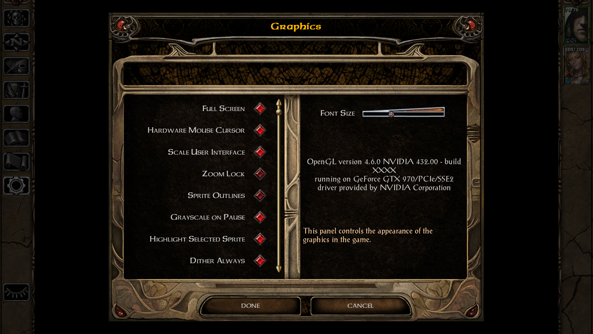
The next shows that I've put Scale UI on.
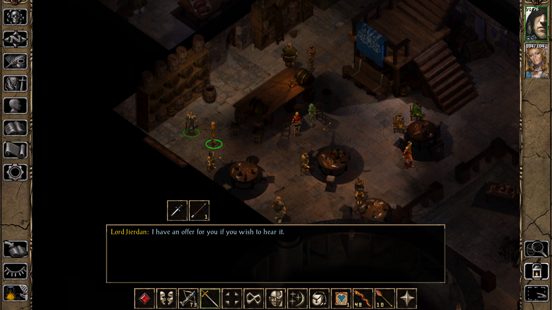
The third shows the scaled UI look like normal BG, well spaced and sized.
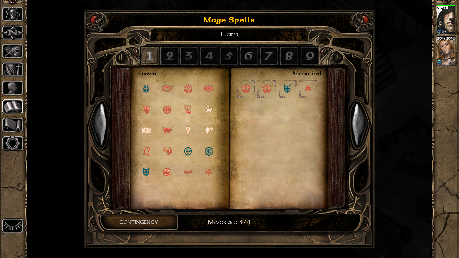
Fourth pic is of the spell book in Scaled UI. Oddly it looks ok at the small resolution of the comment page.
Fifth pic is of the unscaled UI again. Tiny character images and buttons.
Also, is this with Nearest Neighbour scaling or with whatever is the default scaling?
Bilinear (...sigh...)
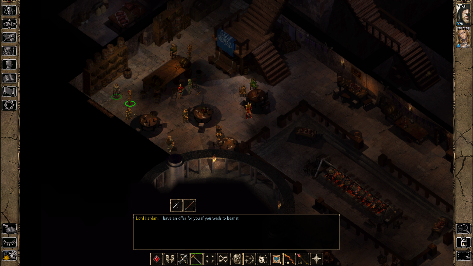
Firstly regarding the comment 'an unplayable mess.' May I refer you to the Figure 3 verses Figure 5. Look at the size of the player potraites on the side. How can you see status effects on those? So yes I am saying that the unscaled UI is unplayable.
Secondly, what is Nearset Neighbour scaling? I just click the option in the graphics section of the game and hope it will be competently implemented. I don't expect to learn to code as well, I already have a 12 hour day.
G'day Graion,
I just tried that button you spoke of, 'Nearest Neighbour scaling.' It did two things, one; made the BAMS slightly worse if that was possible and two; made the normal screen avatars blocky and pixilated. Never seen that effect before. I won't say it looks bad, but different.
I wonder if there is a hidden setting inside the .ini file. In a separate thread I asked about spell effect markers and was told that there is a coded switch in there that you can activate for the spell effect. Might be one for the spell book as well.
Thanks for trying anyway.