Skip to content

What background do you want for the main menu screen???

geminibrunigeminibruni Member Posts: 276
edited October 2013 in The Road to v1.2
Ok Ok, I know, this space is reserved to the reporting of errors of the Beta version of BG:EE, but I think that since the subject refers to a change introduced with the beta we are not off topic:

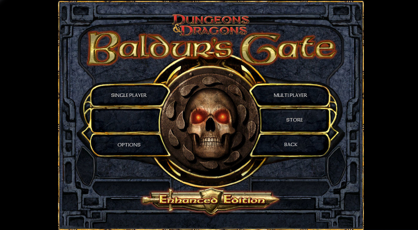
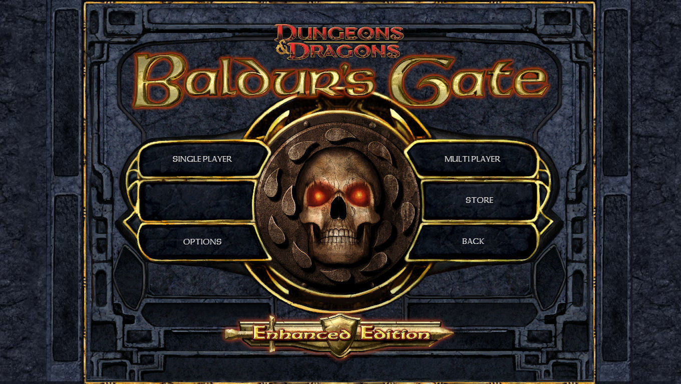
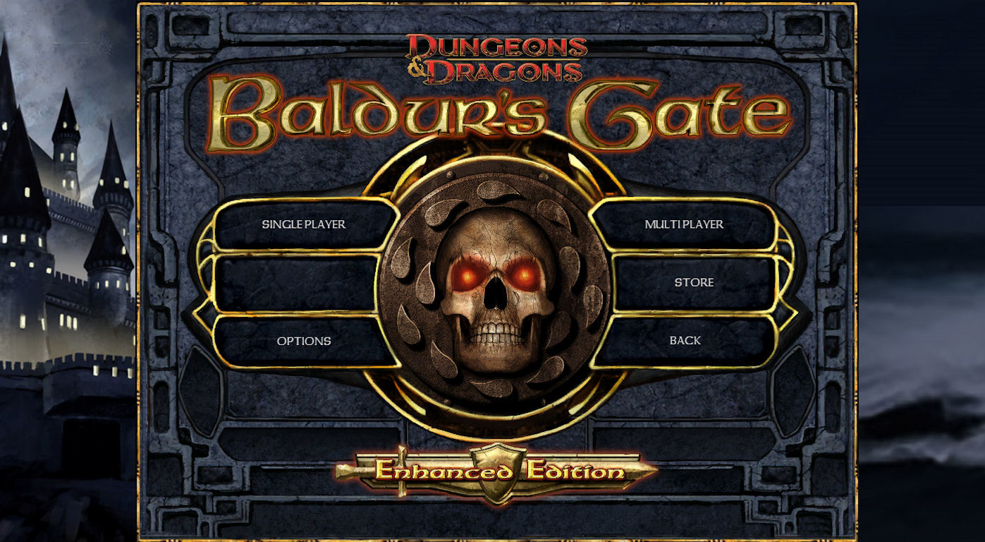
All of us surely have noticed that the background of the main menu was changed, and even if the solution is not bad, I think it is at least questionable, and for this it seems right consult users to know what they think about...

image
image
image
  1. What background do you want for the main menu screen???111 votes
    1. Black Background
        2.70%
    2. Stone Background
      27.03%
    3. Wallpaper Background
      58.56%
    4. All three, but be able to choose one from graphical menu section
      11.71%

Comments

  • elminsterelminster Member, Developer Posts: 16,315
    edited October 2013
    Is there supposed to be a difference between these images?

    Edit. Woops I see now its on the sides.
  • geminibrunigeminibruni Member Posts: 276
    The third option is of course my proposal, for those interested about being in the right thread: http://forum.baldursgate.com/discussion/22012/updated-small-and-big-graphical-improvements#latest

    I have voted for have the possibility of choice, definitely the best possible solution that would make everyone happy.
  • geminibrunigeminibruni Member Posts: 276
    elminster said:

    Is there supposed to be a difference between these images?

    Edit. Woops I see now its on the sides.

    In this images I have used a scaled graphical option, and the background was visible only to the sides, but using high resolutions and the unscaled UI the background occupies most of the screen...

    I hope that the images are clear enough
  • sarevok57sarevok57 Member Posts: 5,975
    what about just having the 6 buttons/skull head icon thingy/ dnd Baldur's gate title/ and enhanced edition only, get rid of all this blue stone jargon and just replace it with the wall paper < so you can see more wall paper if you know what I mean>
  • geminibrunigeminibruni Member Posts: 276
    @Sylvus_Moonbow, the new BG:EE Black Wallpaper is the first option, I'm sorry if the image that I used are not clarifying....

    PS: The menu is slightly different because I have a little changed for my other discussion, Graphical Improvements...
  • geminibrunigeminibruni Member Posts: 276
    @sarevok57, what you propose would be nice but it requires too many changes to the interface, think the best way is to take small steps forward...
  • RedGuardRedGuard Member Posts: 672
    Third one looks the best I believe. Though I wouldn't be against it being an option players could toggle to their preferred setting or wallpaper.
  • elminsterelminster Member, Developer Posts: 16,315
    edited October 2013
    Total = 81 votes

    Black Background
    2% (2 votes)

    Stone Background
    25% (21 votes)

    Wallpaper Background
    59% (48 votes)

    All three, but be able to choose one from graphical menu section
    12% (10 votes)

    Edit: Updated
    Post edited by elminster on
  • elementelement Member Posts: 833
    would it be to much to ask for some original art work in the background?
  • sarevok57sarevok57 Member Posts: 5,975
    @geminibruni ah I seeeeeeeeeeeeeeeeeeeeees, fair enough, anything would be fine for me, because I only see if for mere micro seconds anyway :)
  • The_Guilty_PartyThe_Guilty_Party Member Posts: 44
    I very much like how the wallpaper looks in the background, but a splash screen/background that you see for the entirety of 5 seconds does not deserve the time and effort it would take to make an option/setting for this. Spruce it up if it's easy, otherwise ... I'd rather see gameplay bugs and/or new content.
  • SalkSalk Member Posts: 62
    The wallpaper background is my least favorite option but I see it's the most liked.
  • barbarabarbara Member Posts: 30
    I'm no fan of the "All three" option. Having options for all small, not that important, possible changes would just confuse new players. A good developer can make design choices that are good enough for everyone.

    @geminibruni
    Don't get me wrong, I do like the work you put down, and it would be awesome if some of the graphical improvements you've made ended up in the game (perhaps they already have).
  • BasillicumBasillicum Member, Translator (NDA) Posts: 400
    I've seen devs and others comment that the idea of a main menu background like these is most likely not feasible, and it would really be too bad if that's the case.

    Now, I'm certainly no graphic designer and definitely not a programmer, so my suggestion here is more a question than anything: in the current beta patch the different pages (record, mage book, journal, etc) are "windowed" or layered in front of the game that I'm playing. To me and my hopeful imagination it seems like it just might somehow be feasible to use a simplified version of the same setup to insert a background behind the main menu.

    Does that make sense?
  • ItomonItomon Member Posts: 187
    edited October 2013
    Actually everytime i open a menu page in beta, I try to click on a possible [X] mark on top-right of that "window" to close it. I tried even to move it as we do with windows' windows. I wonder if that would be possible/feasible at all?

    EDIT: and I must repeat and agree with this:
    sarevok57 said:

    what about just having the 6 buttons/skull head icon thingy/ dnd Baldur's gate title/ and enhanced edition only, get rid of all this blue stone jargon and just replace it with the wall paper < so you can see more wall paper if you know what I mean>

  • O_BruceO_Bruce Member Posts: 2,790
    I like wallpaper one the most, but I don't see a reason why we shouldn't be able to choose variant we like the most.
  • knowwheretorunknowwheretorun Member Posts: 30
    I miss the original stone design and color. I dislike the blue stone.

    For a bit of extravagance how about an interactive wallpaper/background instead of the same menu style seen throughout each game. The home screen is a picture of Candlekeep, click on it to start a single player game. Off in the distance is the Friendly Arm Inn, click on it for a multiplayer game. Somewhere else off in the distance is the Black Pits. Each picture is a daytime portrait and as you adjust the difficulty setting it changes to night. Whichever one you choose flies the view to the entrance of the locale and as the door opens a bright light breaks through enveloping the screen.

    Just daydreaming of course.
  • EdvinEdvin Member, Translator (NDA) Posts: 3,244

    I miss the original stone design and color. I dislike the blue stone.

    A man can dream...

    image
  • SilverstarSilverstar Member Posts: 2,207
    Edvin said:

    A man can dream...

    Gimme now!
  • etaglocetagloc Member Posts: 349
    Edvin said:

    I miss the original stone design and color. I dislike the blue stone.

    A man can dream...

    image
    looks like the colors they will use for bg2ee

Sign In or Register to comment.