Skip to content

What do you think about the dialogue screen now?

JuliusBorisovJuliusBorisov Member, Administrator, Moderator, Developer Posts: 22,724
edited March 2016 in The Road to v2.0
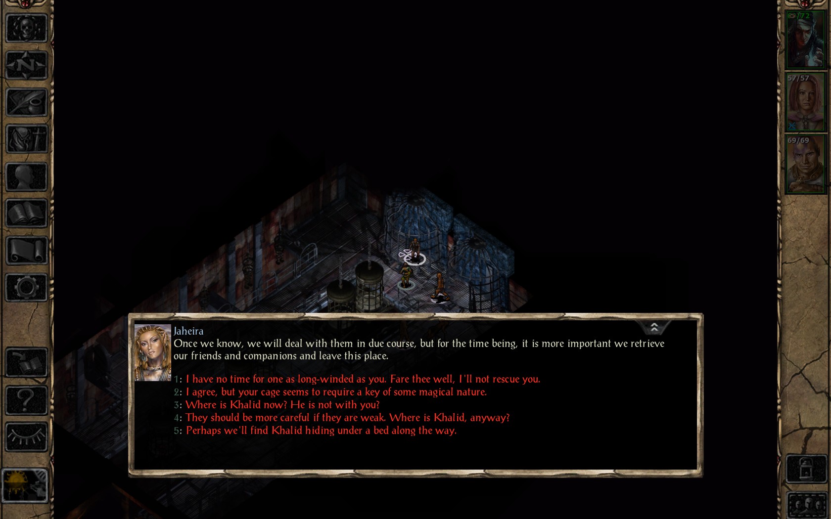
This is how it looked pre-beta:

image

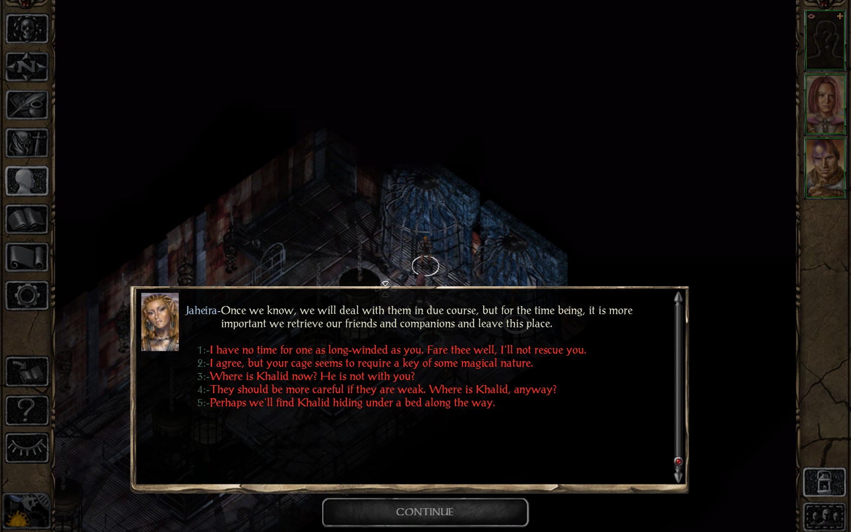
This is how it lookes in the BG2EE beta:
image

As you can see, now the overlook of the whole text of NPC name-his phrase-your answer options has been changed a bit.

Am I wrong in thinking that the new version lacks that space between the NPC portrait and their phrase, as well as the answer options? Or is it a habit of mine?
Comments

  • 00zim0000zim00 Member Posts: 267
    It is missing the space however I think it dosnt hurt the look if anything enhances it imo.

    It gives that little bit of extra space for the text to display which could reduce text warping and in turn reduce the overall need of scrolling though the displayed text in the larger conversations. Also having the name at the top helps to separate the lines of text from each character to the next so when/if you want to scroll back though the conversation its easier to pick out each topic/conversation.

    I know you didn't specifically ask if it was better or not but it felt like that's where the conversation may have been going :P hehe
  • DoubledimasDoubledimas Member, Mobile Tester Posts: 1,286
    I had the idea that due to the text actually starting on the next line there were many more scroll moments necessary to see all your response options (at least during the first 10+ encounters in BG:EE)
  • DeeDee Member Posts: 10,447

    I had the idea that due to the text actually starting on the next line there were many more scroll moments necessary to see all your response options (at least during the first 10+ encounters in BG:EE)

    The dialogue window should be resizing now to fit longer dialogues. If it's not doing that, let us know.
  • XKalXKal Member Posts: 58
    I wouldn't mind a slightly larger space between the portrait and text, but I do like all the text being left justified.
  • agrisagris Member Posts: 581
    Dee said:

    There definitely needs to be a little bit more space between the portrait and the text (and also between the portrait and the border of the window). Go ahead and write up a ticket in Redmine; I'd count this as a bug.

    Done.
  • DeeDee Member Posts: 10,447
    agris said:

    Dee said:

    There definitely needs to be a little bit more space between the portrait and the text (and also between the portrait and the border of the window). Go ahead and write up a ticket in Redmine; I'd count this as a bug.

    Done.
    Bhaaler.
  • agrisagris Member Posts: 581
    Oooof. That was bad.
  • SirBatinceSirBatince Member Posts: 882
    I'm staring at the old format and I'm just looking for the flaws that made beamdog go "This isn't right and needs a change".

    Got to admit it's not an easy task :worried:
  • cdxcdx Member Posts: 90
    @SirBatince, imagine the dialogue box is very narrow, say 5 times the size of the picture.
    You can see in the original that there is empty space between the picture and the second line of the NPC text, just under their name. With a smaller text box the text goes into many more rows and the empty space under the name gets much bigger. When the name is above this is taken care of.
  • agrisagris Member Posts: 581
    Yea, the name above is an improvement, the formatting of everything else just needs to match the v1.3 screenshot.
  • agrisagris Member Posts: 581
    @bengoshi I just realized that, in the screenshots you posted, the screen shading effect that is applied when in dialogue mode is only affecting portraits and buttons, not the base UI textures. @Dee is this a known issue?
  • DeeDee Member Posts: 10,447
    @agris When in doubt, do a quick search on Redmine and then report it.

    (We'll make paranoid bug hunters out of you yet!)
  • agrisagris Member Posts: 581
    Dee said:

    @agris When in doubt, do a quick search on Redmine and then report it.

    (We'll make paranoid bug hunters out of you yet!)

    What's the etiquette on redmine for this kind of thing. Modify my original dialogue bug report, or create a new one?
  • DeeDee Member Posts: 10,447
    We treat each separate issue as a new bug. So I would create a new ticket.
  • FlashburnFlashburn Member Posts: 1,847
    I miss having the "CLACK" sound when you select a dialog choice.
  • IthualIthual Member Posts: 136
    Dee said:

    There definitely needs to be a little bit more space between the portrait and the text (and also between the portrait and the border of the window). Go ahead and write up a ticket in Redmine; I'd count this as a bug.

    Also, maybe drop a line between Jeheira's name and the start of her dialogue. So the first line of text is not directly under the speaker's name, but rather have a small gap inbetween?
  • DanathionDanathion Member Posts: 173
    what I don't like is having to scroll through my dialogue options when there is a lot of text above. I would *much* prefer to scroll through what's being said to me, and have all my dialogue options visible at a glance.
  • SirBatinceSirBatince Member Posts: 882
    It's pretty useful to just roll my mousewheel up to read again something the person told me if I wasn't careful. I don't understand why they locked that feature under a specific button. No ease-of-use here.
  • SurvivorSurvivor Member Posts: 68
    @Adul: You nicely summarised my experience with the new dialogue window. Especially your first point annoys me a lot because it sometimes leads to accidental clicking of wrong answers.
  • cmk24cmk24 Member Posts: 605
    The new dialog system also break when the font size is increased too far:

    image

    The game should be playable for every front size the options allow.
  • DurenasDurenas Member Posts: 508
    Just as soon as I can get the time, I'm gonna see if I can widen the dialog to fill the empty space to the sides.
  • FranpaFranpa Member Posts: 637
    Adul said:

    Originally I was fine with the new dialog window, and the freely resizable panel is an improvement for sure. However, the longer I keep using it, the more the usability issues become apparent.

    First off, dialog responses are cut off with longer dialog lines. This is awful. The responses should either be displayed on a single screen, or they should scroll along with the NPC's line. There shouldn't be a separate scrolling area just for the responses, because that's incredibly unintuitive.

    Second, now I cannot scroll up easily to access dialog and message history. In v1.3, accessing message history was as easy as scrolling up with the mouse wheel. Now I need to press a small button, then resize the default small history panel that opens up, and then I can scroll up. This makes the whole process needlessly difficult. How it used to be in v1.3 was perfectly fine.

    Third, pressing space now skips forward in the dialog. As a BG player, I've learned to press space by instinct whenever something sudden happens. So when an NPC talks to me and a dialog window opens up that I didn't initiate, I almost always skip the first part of the dialog by pressing space to pause. This, of course, leads to even further annoyance when I have to open up the dialog history to see what I had skipped by accident.

    Other than the freely resizable dialog panel, every single change to the dialog window has been a frustrating step backwards, in my opinion.

    While they did tweak it at my request, I can see where you're coming from and agree with you. I didn't really think about it much before and didn't really realize just how big of an impact it has on things.
  • VasculioVasculio Member Posts: 469
    The pre beta is way better!
Sign In or Register to comment.