Skip to content

High Contrast and Vibrance making areas ugly?

numosnumos Member Posts: 14
Has anyone else had issues with he new High Contrast and Vibrance settings making their areas look a little bit unappealing? I understand its the default setting, so I'd certainly want to build around it, though the notion of having to 'go back' and fix each area is a bit daunting. Has anyone else had to redo a lot of their ambiances to accommodate these new settings? Are you recommending players turn them off, or just letting it slide?

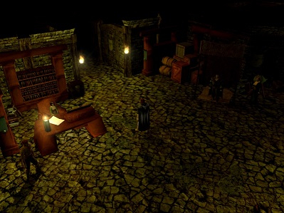
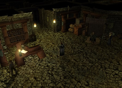
I think the second image, attached below, looks substantially better. But maybe I'm just crazy?


ZwerkulesGrymlordevirusmanTheAmethystDragon

Comments

  • PhantomizerPhantomizer Member Posts: 76
    Really depends on personal opinion/taste. I feel like the first Image stands out much more than the second, but that's just me.
  • FreshLemonBunFreshLemonBun Member Posts: 909
    I don't think you're crazy. I personally don't like those filters and I think they make the overall quality look worse as well as give the palette a dated appearance with fewer colors most of which are highly saturated.
  • [Deleted User][Deleted User] Posts: 0
    edited March 2018
    The user and all related content has been deleted.
  • GrymlordeGrymlorde Member Posts: 121
    @numos I don't use any of the new graphic filters for the same reason. I suspect that because none of the tilesets were built with those filters enabled is the reason they look better without. If you're concerned about your users, just tell them in the module/PW description and ReadMe to turn off those filters. That's what I'm going to do.
  • numosnumos Member Posts: 14
    I suppose a little message on joining might be best! Its still disappointing to make people go that extra step to get the most out of my efforts.

    High contrast seems to be the bigger problem. I'm very accustomed to leaving indoor areas largely dark and using torches and candles for light. On that note: Is it me or do the torch brackets from 1.69 no longer emit light?
  • 1varangian1varangian Member Posts: 367
    I've found vibrance to be too much in every scene so far.

    High contrast on the other hand seems to be a universal improvement.

    As a builder, I would want the player to see the areas as close to my design as possible without options that can fundamentally change the design, like vibrance.

    If it was up to me high contrast would be always on and vibrance would be an option in the toolset only.

    Depth of field could be up to the player, but forced on or off during cutscenes.
  • 1varangian1varangian Member Posts: 367
    edited April 2018
    Turns out that while High Contrast makes day scenes look more punchy, it does ruin night scenes. The darker tones just disappear completely.

    So, unfortunately, all the new options save for DoF aren't really an improvement in their current state and need tweaking.

    I hope Beamdog will tweak the values so that everything just looks better, and then remove the option of making it look worse.
    Grymlorde
  • Sylvus_MoonbowSylvus_Moonbow Member Posts: 1,085
    edited April 2018
    It looks like anyone can just make their own shader and put it in the override file so there must be information about it because there is a custom shader pack I just saw on Neverwinter Vault so tweaking is possible it seems for more custom styles and preferences. Link So if you want your pw or module to have a specific look just make your own shader file and dump it into a hak so the players will experience exactly the same look you want.
    Grymlordevirusman
  • 1varangian1varangian Member Posts: 367
    The base game still needs to look great without having to mod it though.
    dTd
Sign In or Register to comment.