[UPDATED] Small and Big Graphical Improvements
Hi, I would like to help you devs, to make even better the overall look of the game, If a few of my ideas will be taken inspiration from developers I would be really very happy  ...
...
If you have comments and suggestions do not hesitate to make them!!!!
Also if you enjoy my ideas please click on "like" button in order to get noticed by developers!!
TANKS..
Improvements for the Baldur's Gate Start Screen, I believe that the black background on either side of the menu is not very nice to look at and then I thought it would be better to use a wallpaper, Also it would be nice to have in these screens the gold outer edge. Finally there are to fix some graphical glitches at the border of some buttons: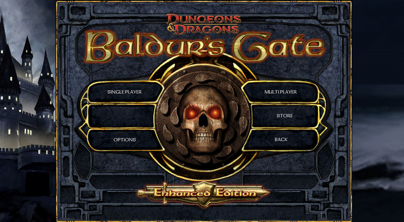 Original:https://forums.beamdog.com/uploads/FileUpload/23/6da546a95ed178d5fe5eee4988f431.jpg
___________________________________
Why don't make a separated Black Pits Main Menù?: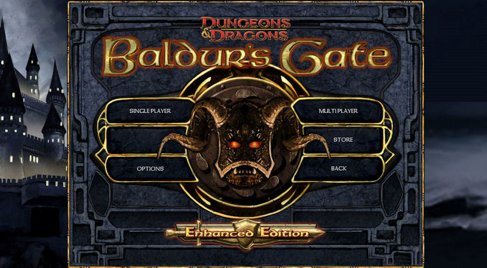
___________________________________
GameStart Screen improvements: i'm a great lover of the Archaic's work Made on the Archaic GUI mod, and I personally find that one of the best improvements he's done was his beautiful Start Screen, so i took his idea using a dev style: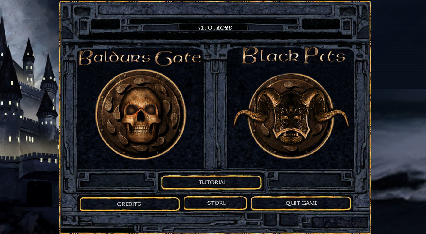 Original:http://i.imgur.com/7mlkxAh.jpg
___________________________________
When you press the button of Baldur's Gate
___________________________________
When you press the button of Black Pits (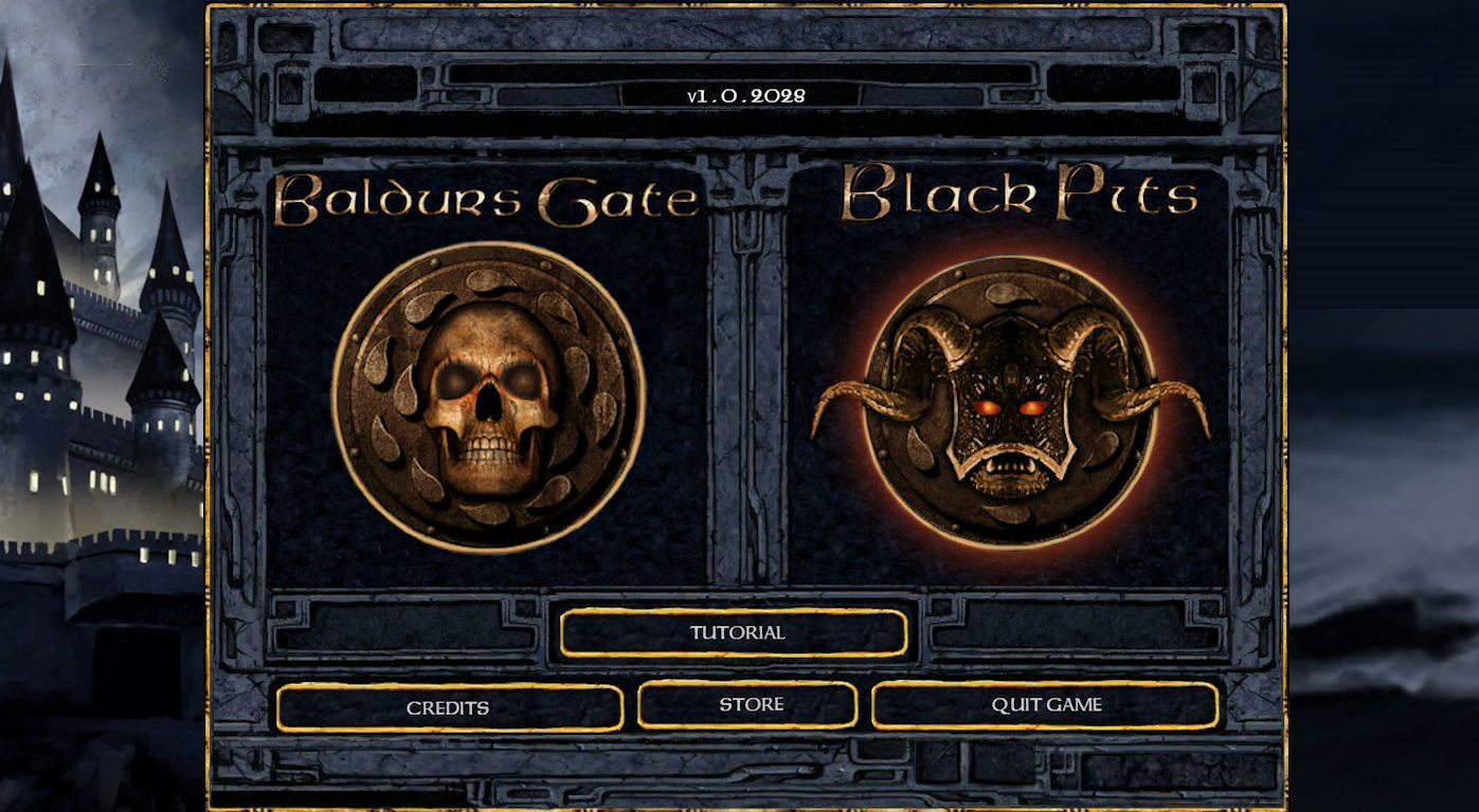
___________________________________
Other some improvements to the general design for the various menu ingame:
- The main idea is to make more colorful and consistent the various screens, adding some gold edges and rearranging the various buttons. Be noted that many menus have had problems with the latest patch, in fact the new gold border often ends above the original design of the cells, the results are not lovely
- The my improved World Map, in the standard version was missing the golden edge, and I added the ui that inexplicably disappears when you enter this screen, not a good stuff...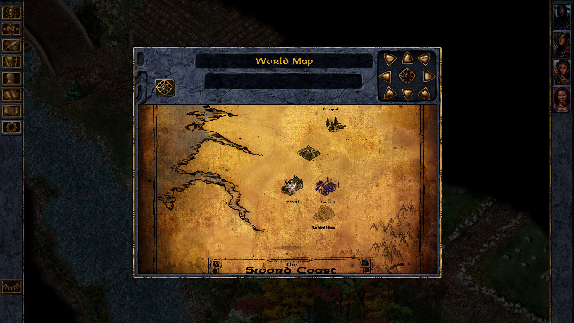 Original: https://forums.beamdog.com/uploads/FileUpload/47/c7d89d1bafb5c53a58ea9fdea5810d.bmp
__________________________________
Detail Improvements for the World Map: I think the main problem is the scrolling compass that in addition to being very large (and unnecessary) has a very questionable design, after, are necessary some miscellaneous trim
Tiny solution:
__________________________________
The my Improved Area Map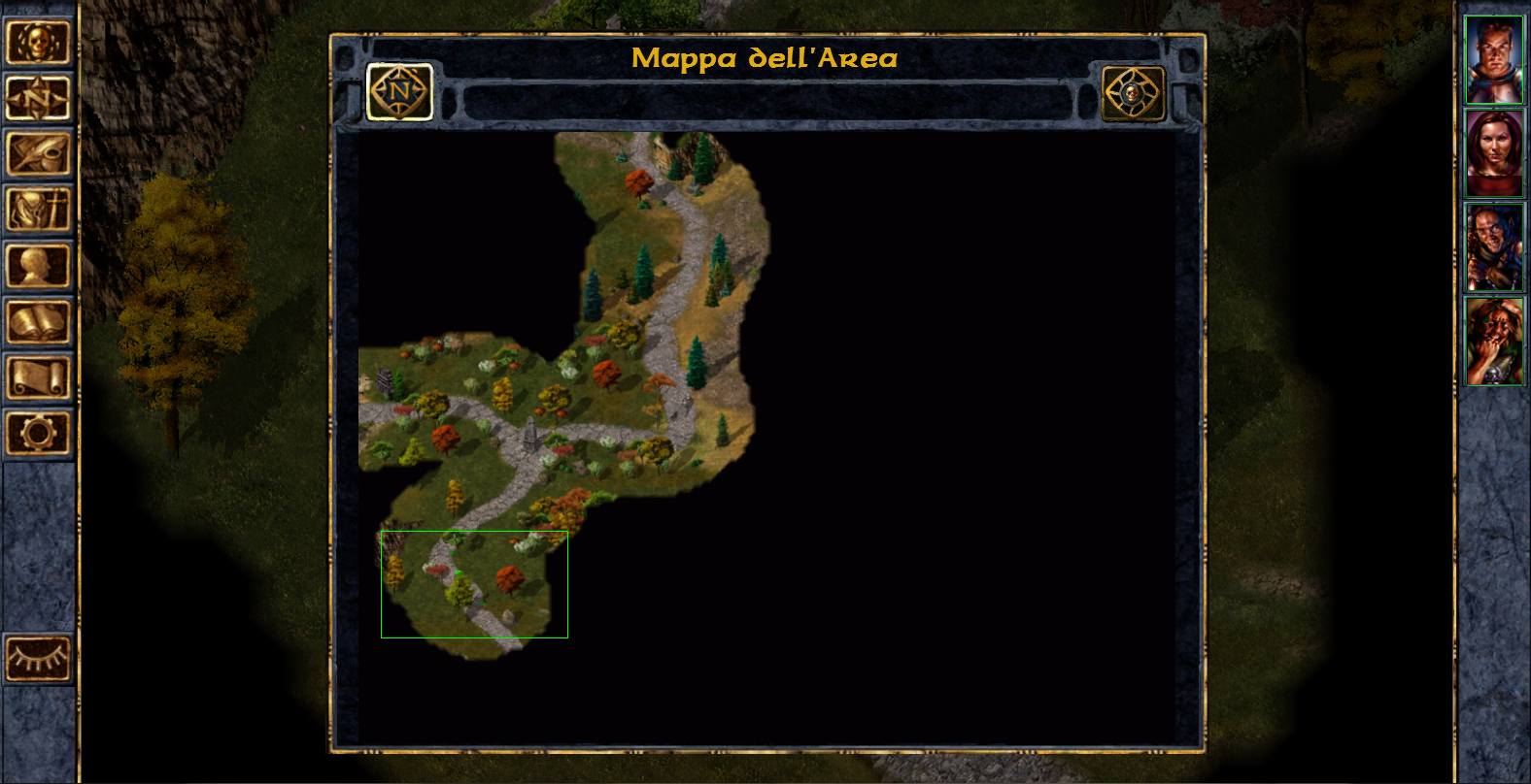 Original:https://forums.beamdog.com/uploads/FileUpload/47/9078fb5d0067be97dd1eb67b237b7c.png
___________________________________
The my Improved Statisctics Menu: Original:https://forums.beamdog.com/uploads/FileUpload/c2/1c0792bc0c931464851c7083468322.png
___________________________________
The my Improved Inventory screen: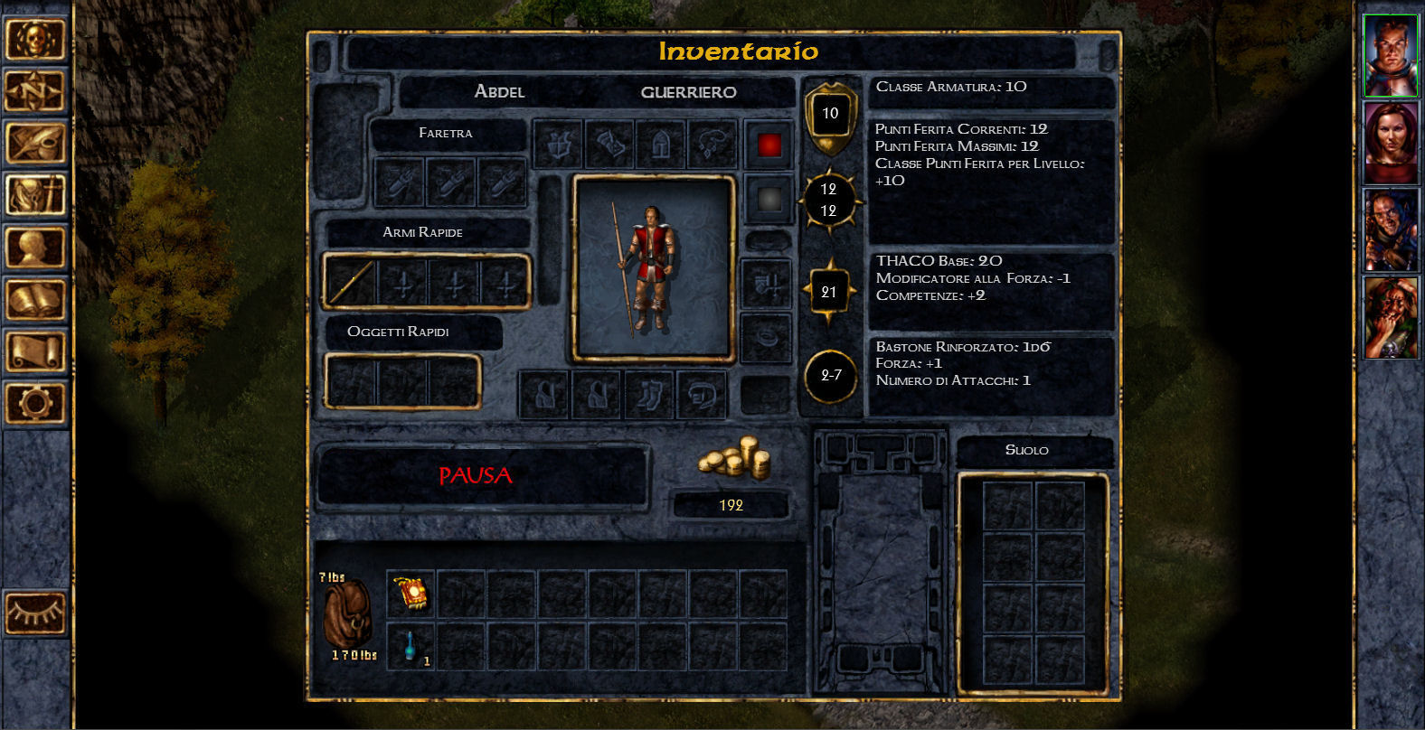 Original:https://forums.beamdog.com/uploads/FileUpload/a0/2a5471426b893ec785467aab2abb2e.jpg
If you have comments and suggestions do not hesitate to make them!!!!
Also if you enjoy my ideas please click on "like" button in order to get noticed by developers!!
TANKS..
Improvements for the Baldur's Gate Start Screen, I believe that the black background on either side of the menu is not very nice to look at and then I thought it would be better to use a wallpaper, Also it would be nice to have in these screens the gold outer edge. Finally there are to fix some graphical glitches at the border of some buttons:
 Original:https://forums.beamdog.com/uploads/FileUpload/23/6da546a95ed178d5fe5eee4988f431.jpg
___________________________________
Why don't make a separated Black Pits Main Menù?:

___________________________________
GameStart Screen improvements: i'm a great lover of the Archaic's work Made on the Archaic GUI mod, and I personally find that one of the best improvements he's done was his beautiful Start Screen, so i took his idea using a dev style:
 Original:http://i.imgur.com/7mlkxAh.jpg
___________________________________
When you press the button of Baldur's Gate

___________________________________
When you press the button of Black Pits (

___________________________________
Other some improvements to the general design for the various menu ingame:
- The main idea is to make more colorful and consistent the various screens, adding some gold edges and rearranging the various buttons. Be noted that many menus have had problems with the latest patch, in fact the new gold border often ends above the original design of the cells, the results are not lovely
- The my improved World Map, in the standard version was missing the golden edge, and I added the ui that inexplicably disappears when you enter this screen, not a good stuff...
 Original: https://forums.beamdog.com/uploads/FileUpload/47/c7d89d1bafb5c53a58ea9fdea5810d.bmp
__________________________________
Detail Improvements for the World Map: I think the main problem is the scrolling compass that in addition to being very large (and unnecessary) has a very questionable design, after, are necessary some miscellaneous trim
Tiny solution:

__________________________________
The my Improved Area Map
 Original:https://forums.beamdog.com/uploads/FileUpload/47/9078fb5d0067be97dd1eb67b237b7c.png
___________________________________
The my Improved Statisctics Menu:
 Original:https://forums.beamdog.com/uploads/FileUpload/c2/1c0792bc0c931464851c7083468322.png
___________________________________
The my Improved Inventory screen:
 Original:https://forums.beamdog.com/uploads/FileUpload/a0/2a5471426b893ec785467aab2abb2e.jpg
 Post edited by geminibruni on
14

Comments
After:
I think that while keeping your current style, you might consider moving towards this design direction , as the Archaic solution is clearly better and much more stylish!!
Your actual Start Screen:
That said, I wont be looking at the start screen much anyway.
I do like this, with the background. However, for the background (and I'm just thinking outside the box here), what if it used a faded in/out slideshow of the images used for the chapter dream/narration? Either transitioning as you watch, or a different one every time the game loaded (perhaps tied to how far you are in the campaign).
If someone has dual monitor, I think the right-hand side should be tileable.