Skip to content

Don't the spell icons shown in the Mage book and/or Priest Scroll in the beta look bad?

JuliusBorisovJuliusBorisov Member, Administrator, Moderator, Developer Posts: 22,725
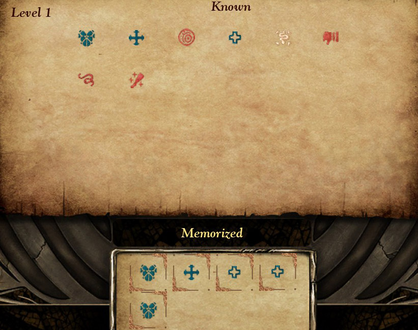
This is how the spell icons in the Mage book and/or Priest Scroll look pre-beta:

image

image

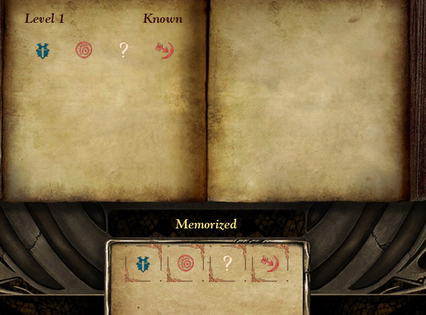
This is how the spell icons in the Mage book and/or Priest Scroll look in the beta:

image

image

I think the new version look worse, a lot less clear. Just look at those icons, an icon of the Cure Light Wounds for example.

What do others think?

Comments

  • 00zim0000zim00 Member Posts: 267
    Looks like image alphas are messed up. I have a feeling alot of the assets in 2.0 have been run though an automated filter to crisp them up and fix things like color balance. That could explain what changed them. Or if the icons have been resized in game and auto scaled that can also alter them.

    I suspect tho its mostly a bug to do with the new UI. I would report it if its not already.
  • DeeDee Member Posts: 10,447
    it's been reported. Thanks for bringing it up, though!
  • GreenWarlockGreenWarlock Member Posts: 1,354
    What I have not seen from these screenshots is what happens after the first column is filled - do we sprout scroll-bars with buckets of white space (bad) or fill in the second column before sprouting some scrolling feature (better).

    While I think I prefer the old UI here, if the new interface is providing a clearer spell choice, the icons are fixed up, and the UI is not crazy with whitespace, I am happy to believe I am just reacting badly to change, rather than this specific change being automatically for the worse ;) That is quite a chain of 'ifs' though...
  • DeeDee Member Posts: 10,447

    What I have not seen from these screenshots is what happens after the first column is filled - do we sprout scroll-bars with buckets of white space (bad) or fill in the second column before sprouting some scrolling feature (better).

    While I think I prefer the old UI here, if the new interface is providing a clearer spell choice, the icons are fixed up, and the UI is not crazy with whitespace, I am happy to believe I am just reacting badly to change, rather than this specific change being automatically for the worse ;) That is quite a chain of 'ifs' though...

    You get a scrollbar. But the space on the right isn't wasted; selecting a spell's name brings up its description on the right.
  • 00zim0000zim00 Member Posts: 267
    edited March 2016
    In regards to the spell area since we are on the topic :p.

    Are we able to or can we get the ability to 'right click' a memorized spell icon to automatically make that spells name highlighted in the main left list which in turn would bring up the spell description?

    Just saves some time scrolling though the list to match up the icons with the spells whenever im reorganizing my book :)


    I was going to make a topic for it but didn't seem thread worthy haha

    Edit: Just occurred to me I should just make a feature request on redmine instead lol.
  • GreenWarlockGreenWarlock Member Posts: 1,354
    Thanks @Dee, that makes sense. My main concern with this change is that we have gone from a simple system that was direct, involving no scrolling, to a scheme with hidden information that must be scrolled to be discovered, and then chosen. It is a step backwards for regular players of the game, but probably a step forward for new-comers learning all the spells. The latter is probably more relevant for someone who had not been playing this game for almost 20 years PnP before the first BG shipped :) It is just a shame we can't have both (mix and match UI sounds great, but the complexity is often worse than picking one answer and making it work).
  • agrisagris Member Posts: 581

    My main concern with this change is that we have gone from a simple system that was direct, involving no scrolling, to a scheme with hidden information that must be scrolled to be discovered, and then chosen. It is a step backwards for regular players of the game, but probably a step forward for new-comers learning all the spells.

    Exactly.

  • SirBatinceSirBatince Member Posts: 882
    I must admit I was too busy understanding what the heck was going on in my spellbook to notice the icons.
Sign In or Register to comment.