Skip to content

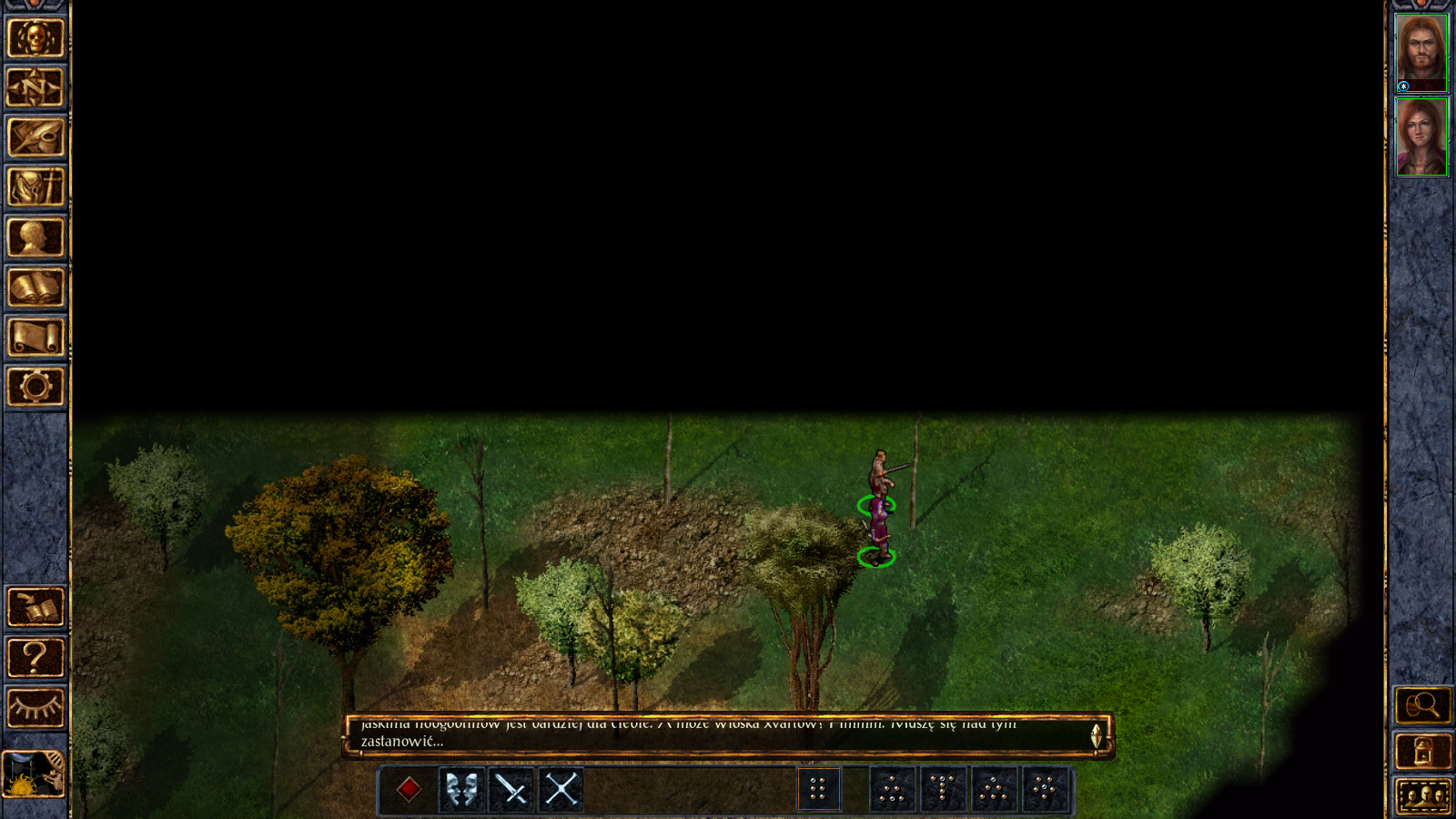
Black border around map

EtaminEtamin Member Posts: 830
Is it intentional or a bug?

For me it's the ugliest thing i have found in 2.0. Breaking immersion like hell. Hope it will be fixes in next patch.
BelegCuthalionnonlinearcoastdibUlbIthualXKal

Comments

  • FranpaFranpa Member Posts: 637
    edited April 2016
    It is intentional, but hopefully they'll reconsider this change.
    XKal
  • EtaminEtamin Member Posts: 830
    Can't imagine any single reason for implementing it. I will wait with my playthrough till this will be gone.
    GodKaiserHell
  • BelegCuthalionBelegCuthalion Member, Mobile Tester Posts: 453
    i'd say this is a unconsidered side effect of the new zoom-out-to-map / live map feature, as this needs a different container/content relation regarding coordinates. it can be compensated easily but it needs a small portion of math present. (i do this all the time with touch-draggable maps in web interfaces).

    that said, this is just visually disturbing and immersion breaking, and needs indeed to be fixed.
    UlbIthual
  • bleusteelbleusteel Member Posts: 523
    I like it. I don't have to disable the quick loot to leave a map anymore.

    Maybe it doesn't need to be so thick?
  • BelegCuthalionBelegCuthalion Member, Mobile Tester Posts: 453
    Yes, a small band and only at the bottom of the screen where the loot bar resides would be enough (Icewind dale 1.4 has it that way).
    bleusteelXKal
  • NatregNatreg Member Posts: 100
    edited April 2016
    I would like to know if the developers are really looking into this issue or they are going to leave it as is.

    I'm waiting for this issue to be corrected in a not so distant future patch before starting my playthrough.

    The thing that annoys me here is that I pre-ordered the game and now I'm waiting to play it because it has several issues that were not part of the previous version.

    I hope we get some answer from the developers, because I want to know if I'm waiting for nothing.


    I do like some of the new things they have added and all, but in the end I would probably have prefered they just did the new content and bug fixes and left everything as it was, at least for this release.
    Ithual
  • bleusteelbleusteel Member Posts: 523
    I like that they are trying new things. They also listen to feedback - prior to release, the v2.0 BGEE and SoD character records looked like the v2.0 BG2EE record. *shudder*

    After lots of discussion, Beamdog used a customer designed UI for the SoD and v2.0 BGEE character record.

    If you don't like something, enter a feature request on their Redmine site (http://Redmine.beamdog.com). I bet they will consider it.
  • FranpaFranpa Member Posts: 637
    edited April 2016
    bleusteel said:

    I like it. I don't have to disable the quick loot to leave a map anymore.

    Maybe it doesn't need to be so thick?

    In IWD EE v1.4 and BG1 EE & BG2 EE v1.3 the game will always align the camera edge with the edges of the map so the left edge of the camera can't scroll past the left edge of the map for example. This function took in to account the visibility status of of any of the HUD Panels. If you have panned all the way to the edge of the map and enable a HUD Panel the game will bump the camera across/forcibly re-align the camera to prevent the edge of the map being hidden behind the HUD Panel.

    The bottom panel and dialog window used to be opaque on their left and right sides, covering the entire bottom side of the display so you couldn't see blank space along the bottom of the map (Map aligned to the top of this UI), however the Enhanced Edition made the space on either side of these UI's transparent so now you will see blank space on either side of these HUD Panels (The functionality didn't change, they simply removed some portions of the UI that originally covered the blank space).

    The issue preventing you from clicking the bottom of the screen was because Beamdog developers mistakenly didn't code the game to align the map edge to the top edge of the Quick Loot Bar when it was active, so the game continued to align to the top of the Dialog Window which meant the Quick Loot Bar was now in the way of the bottom edge of the screen! So all beamdog had to do was adjust the game engine to align the map edge to the top edge of the Quick Loot Bar when it is active and bam, problem solved!

    Basically there was no reason for Beamdog letting us pan the camera beyond the edges of the map. It is an incredibly crude solution to a problem that they introduced. The original devs already solved this issue when developing their GUI, Beamdog just didn't follow their solution when adding the Quick Loot Bar.

    Tl;Dr?
    Original Devs made it impossible to see blank space/beyond the edges of the map except in areas where everything fitted on screen. Beamdog made parts of the UI transparent making blank space visible along the bottom edge of the display regardless of what area you're in (Normally the blank space is covered by the UI), this let you see more of the playing field when not near the bottom edge of the map which is a good thing. Beamdog then (in v2.0) made it possible to scroll willy nilly past the edges of the map for no reason that I consider to be good, afaik this is the first time in the history of this game that you can scroll past the edges of the map.
    Ithual
  • 00zim0000zim00 Member Posts: 267
    I think it was added for a few reasons, one so that the Zoom in/out could work correctly. Two because the area maps are now just a super zoomed out version of your map and not a separate image. And three because with the lower menu bar on screen it could block a lot of the lower section of the map. Im also guessing this was also added to help with people playing it on tablets.

    Imo tho i dont mind it :/ It makes it easier to keep my party on the center of the screen when im fighting stuff. Unless there is other reasons people dont like it besides its different then original BG or because they think the black area makes the map look strange with a black space. I think its fine. I know not everyone thinks this and that's why there is a thread but that's my opinion.
    illathid
  • BelegCuthalionBelegCuthalion Member, Mobile Tester Posts: 453
    edited April 2016
    bleusteel said:

    prior to release, the v2.0 BGEE and SoD character records looked like the v2.0 BG2EE record. *shudder* After lots of discussion, Beamdog used a customer designed UI for the SoD and v2.0 BGEE character record.

    I've been discussing this in the beta too, and somewhat was pleased by the compromise put in rather last minute for the looks, assuming i'd prefer that ... But now actually using it, v2.0 BG2EE is so much more logical to use than 1.3 was, or even the compromise in v2.0 BG1EE is. It needs more polish and stile definitely, but logical structure, hierarchy and predictability of what is happening when i click somewhere is so much improved in the current BG2 interface, i wish they follow that path as a basis and improve style and detail.

    On Topic:
    i think i've seen the request on redmine already, so the devs are aware someone does not like the black borders (and not only one). So this should be adressed, and looking on how IWD 1.4 handles it is somewhat a proof it can be done without losing usability in the lower part of the screen.
    This is something that bugged me a lot in 1.3 interface actually, so it's a solution to me now, but an ugly one (and potentially not done to solve the actual problem, but a side effect of the map feature).
    Its resolvable with coordinate limits though ... i could give them the general math, but i guess it won't help them much to implement in their environment (mine is web developement context) and they are very capable to do this on their own, if not they would not have re-written the engine that far :wink:
    Ithual
  • EtaminEtamin Member Posts: 830
    I heard Beamdog will not fix this "feature": http://redmine.beamdog.com/issues/21011 (History)
    Is it true @Dee, you are not going to touch this?
  • FranpaFranpa Member Posts: 637
    I've made a new report since then: http://redmine.beamdog.com/issues/22299
  • switswit Member, Translator (NDA) Posts: 495
    edited April 2016
    there is also this topic with more feedback/criticism regarding this new patch 2.0 feature: https://forums.beamdog.com/discussion/48859/is-the-black-space-that-you-can-see-an-intended-look-of-the-end-of-the-map
    Completely unacceptable to me.

    edit: also some opinions from SHS users about it (one player refunded the game on steam after seeing this problem): http://www.shsforums.net/topic/54271-comments-on-bgee-bg2ee-news/page-58
    Ulb
  • illathidillathid Member Posts: 320
    I love the black border. I always try to keep the camera centered on my party and this lets me do it at all times, no matter where they are on the map.
    cmk24BelgarathMTH
  • vanatosvanatos Member Posts: 876
    Please tell me its a joke they think this is a feature.
    Ithual
  • dibdib Member Posts: 384
    Looks pretty awful. Hope they'll change this back to the previous behavior.
    bpmayerGodKaiserHell
  • PhælinPhælin Member Posts: 316
    Horrific.
    bpmayerGodKaiserHell
  • NatregNatreg Member Posts: 100
    Nothing official yet regarding if this is going to be fixed.

    The Feature on redmine has not even been submited.

    As I said before, this is one of the issues that I would like to see fixed before starting my playthrough.
  • DanathionDanathion Member Posts: 173
    edited April 2016
    I'm pretty sure it has to be like that for the zoomed out map to work - that's the feature.
  • illathidillathid Member Posts: 320
    For everyone who dislikes the black borders on exterior maps? Did you hate black borders around interior maps too? I'm genuinely curious.
  • modestvoltamodestvolta Member Posts: 107
    edited April 2016
    @illathid For me, I'm not bothered by interior maps because interiors (and thus their maps) are finite in size. Interior maps already have borders built in with their walls, which let you know you've reached the end of explorable area. So, a black border on top of the existing walls doesn't affect the way I see interiors.

    Exterior maps should feel infinite in size. The black border being the same color as the fog of war gives the impression that there's still more area to explore. This breaks immersion when you get to the edge and see more fog of war but no more explorable area.

    Obviously this isn't practical, but for me the only way adding the border would work is if the current black border was replaced by new art work showing the map fading into the nonclickable distance (so instead of a black border, the maps would be updated to show what's happening in the black border). I'm not sure if that makes perfect sense as typed but hopefully the idea gets through. Again, not a practical idea.

    Another thing I haven't seen comments on: the new map feature broke the ability to drag the viewer. Instead, you have to click on the map to move the viewer. (Right? Or am I misremembering the original?)

    Note: Typed on my phone so probably the least comprehensible comment I could leave.
    PhælinNatregGodKaiserHellIthual
Sign In or Register to comment.