[MOD] GUI for BG2:EE (IWD2 theme) v1.3
 trinit
Member Posts: 710
here is my second UI reskin inspired by icewind dale 2 design. i modified existing resources from iwd2 to fit bg2:ee design. take a look at the screenshots and see if you like it.
installation- download .rar files at the bottom of this post. download TWO parts and unrar them (this will make one unified folder). copy the content of folder into "override" folder in your bg2:ee installation folder. overwrite if prompted.
that's it.
to uninstall, simply delete all the files you've copied. (fastest way to uninstall would be to make a backup of your override folder before installing the mod and simply replace override folder with backup version)
two warnings-
1. mod was made for 1920x1080 display with "scale UI" turned off in graphical settings. weird things could happen if you use this mod scaled or with different resolutions, but it might work for you, i don't know.
2. since UI is not scaled, i tried to compensate for microscopic small portraits by enlarging portraits in sidebar and conversations. in order for this to work, you have to install high-res-portraits mod found here :
shsforums.net/files/file/1126-bgee-bgsod-and-bg2ee-high-resolution-portraits/
let me know if the mod worked for you and if you like it!
oh, and have a link to my previous iwd themed gui- https://forums.beamdog.com/discussion/62974/mod-iwd-gui-for-bg2-ee-and-bg-ee#latest
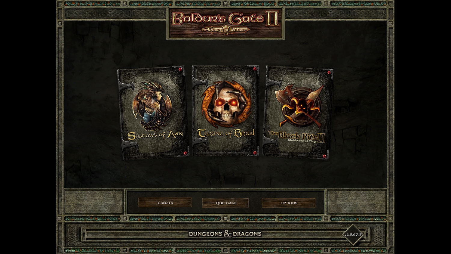
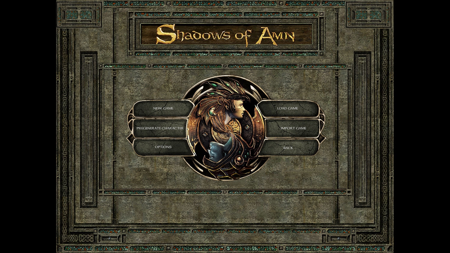
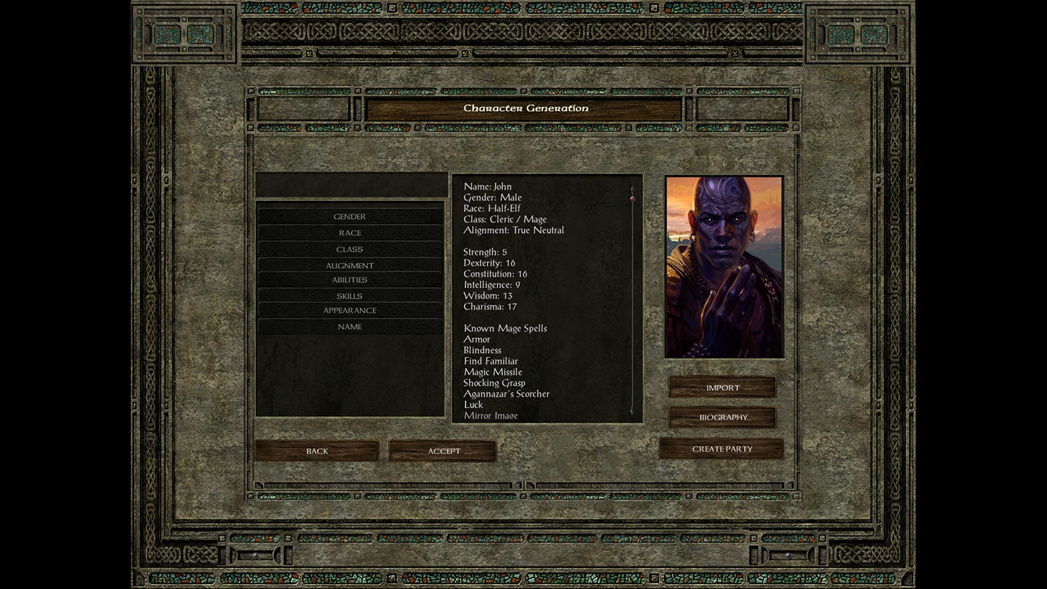
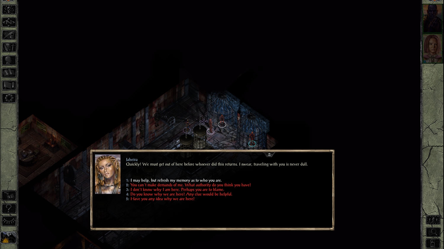
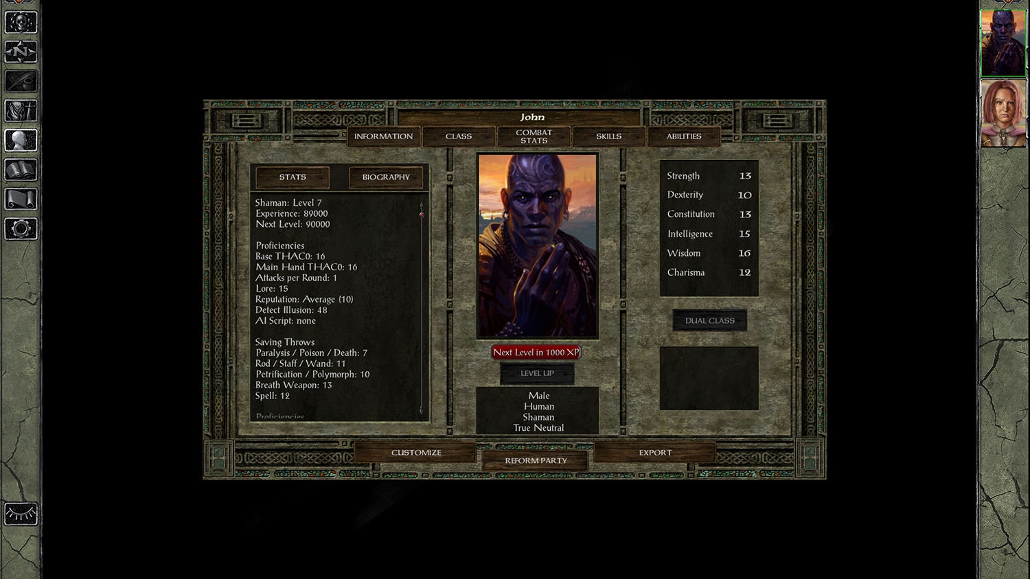
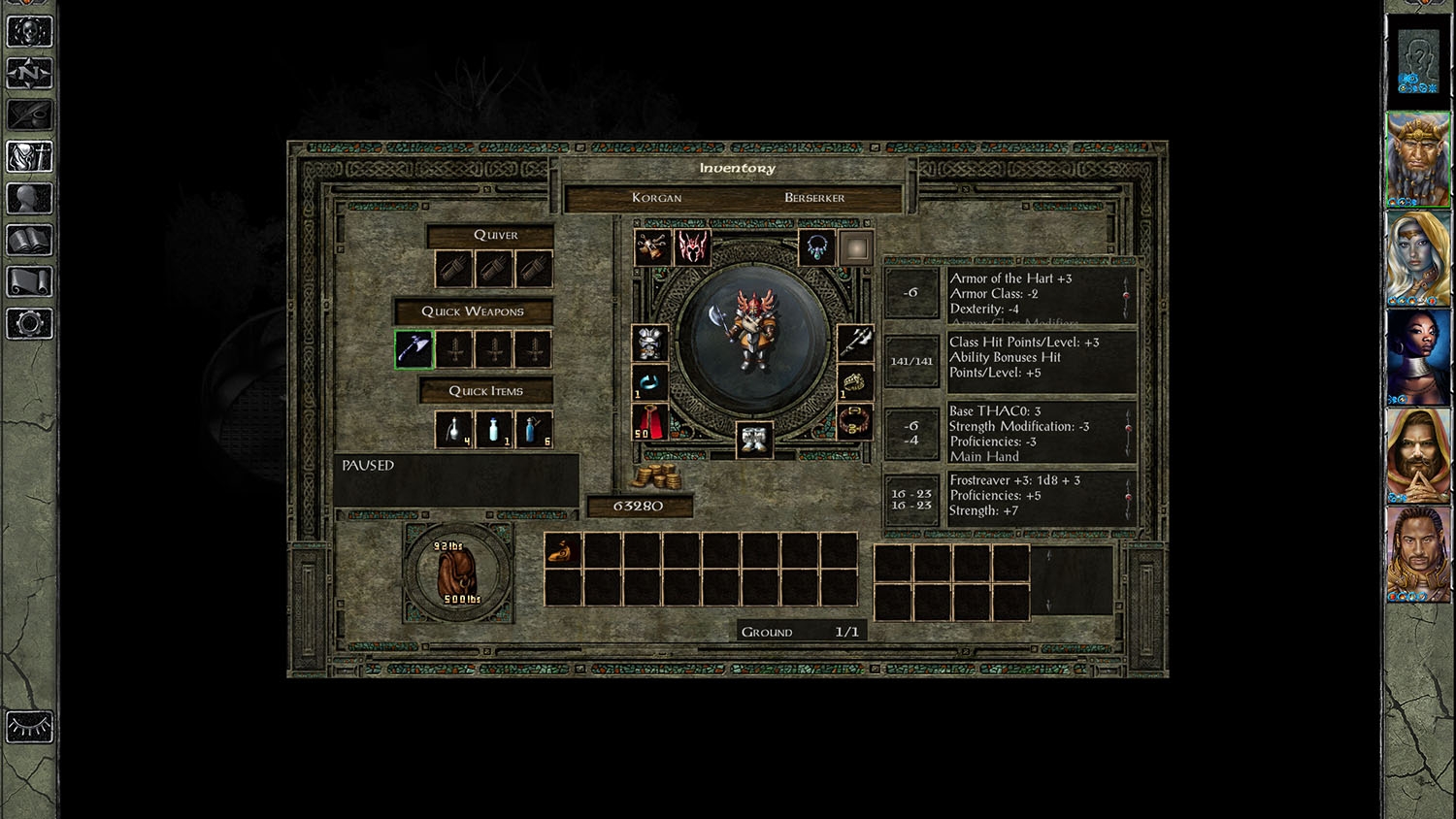
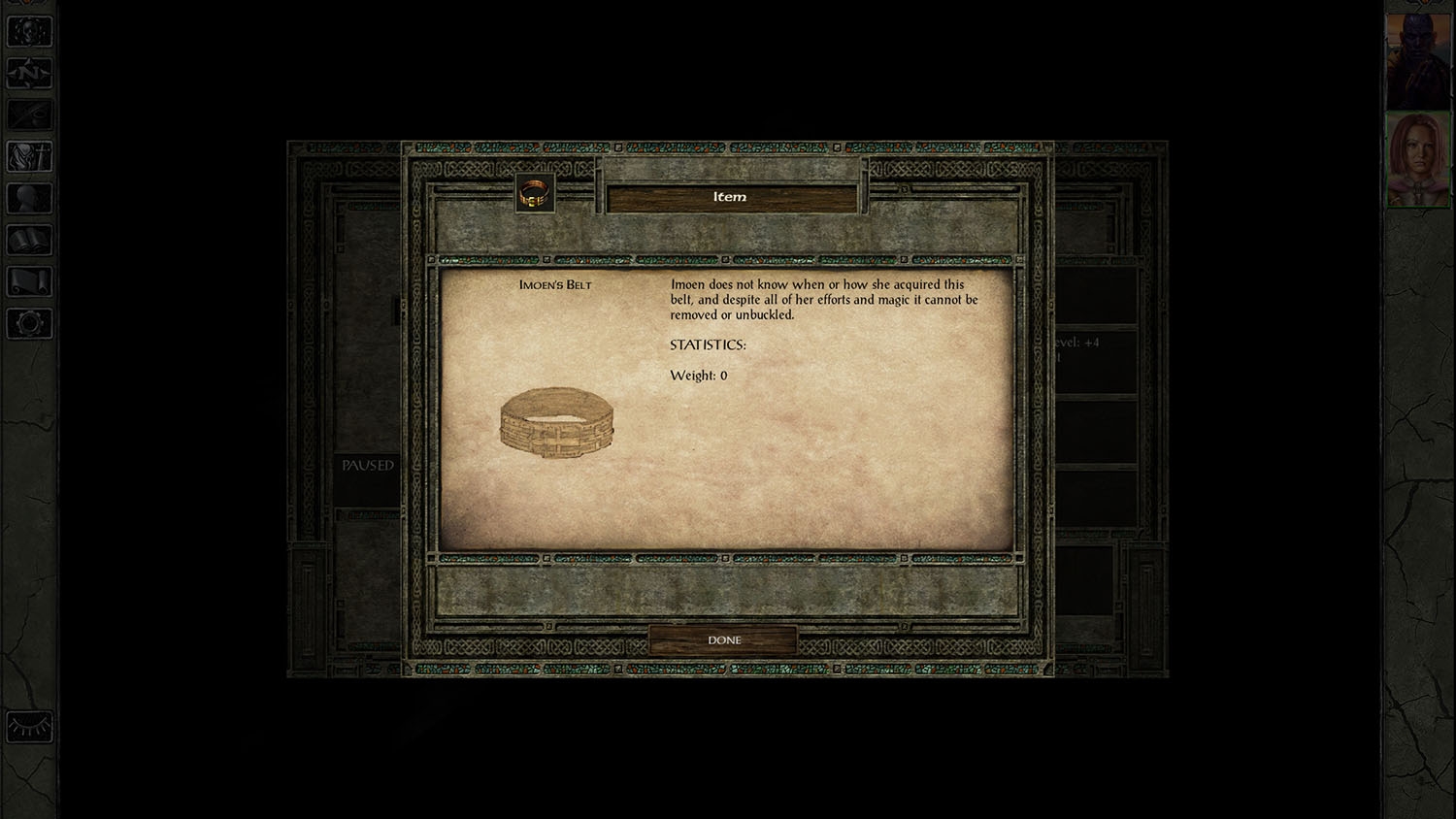
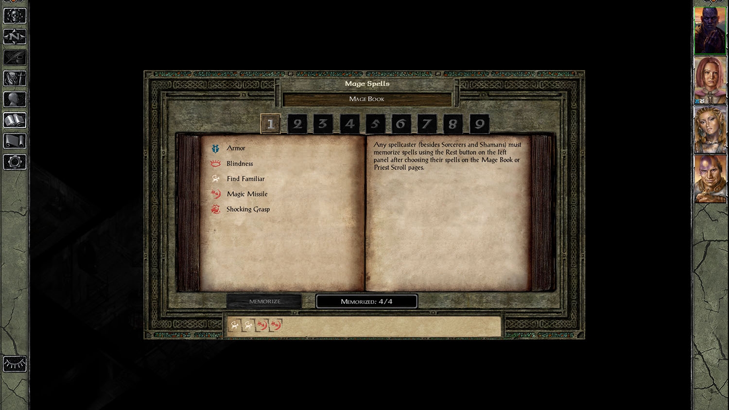
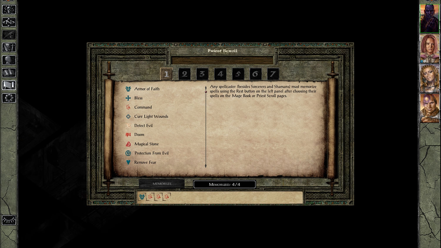
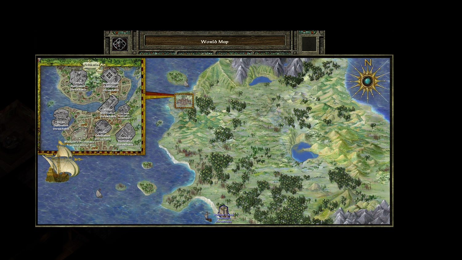


Post edited by trinit on
16

Comments
i rectified that mistake, the archives now contain "guiiwd2dummy" png file!
(minor correction- also fixed weird cut-off on the vertical left edge in the stats screen, it is now symmetrical with the right edge, but screenshot is not updated)
MANY thanks to @AncientCowboy for discovering this bug!
if not playing in 1920x1080 resolution but still want to use the mod, i recommend you download this mod, install, (set the resolution to match that of your phone if playing on android), start the game. check there are no weird glitches or cuttoffs and then manually correct all alignments with UI editing mode enabled (look up the instructions in the forum). all changes are saved in UI.menu file of the game automatically in the override folder.
if changes made for android- copy the UI.menu file from override into the mod folder and then copy all of the files to your phone override. that's it.
it can be tedious aligning the elements of UI but it's a workable solution if you want to use this mod but cannot play in 1920x 1080 resolution.
Maybe you can make this IWD2 theme of interface available for IWDEE?
Due to the fact that there are almost no UI mods with an alternative interface for IWDEE.
Edit: i couldnt use this mod, i got a black screen in-game and before that the icons of baldur's gate main game and siege of dragonspear were missing.