Do you like the new cinematic?
As far as I'm concerned the new intro has traits which are enjoyable, the art style is quite comical in a way and I think if it were used in the right functions (e.g. GUI, background, portraits), it would be a great 'asset' to the game. Ha, source artwork joke I am hilarious.
In fact I think the art is great and seemed to be quite let down by execution.
The issue is that, BGEE's intro is clearly rushed. The art style is attractive in the appropiate context, but not only does BGEE's intro recycle old sounds which don't match the video properly, but they cut out the most important line ("There are others, I can show you.").
They also remove the quote from the beginning. which is spine chilling epic goodness really.
The animation is very poorly executed. The first part where Sarevok plunges the unknown Bhaalspawn through the door of the Iron Throne is epic, but it's followed by stills with minor animation and is very underwhelming from there.
This intro reminds me of the lazy SH3 animations.
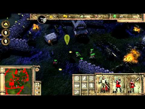 http://www.youtube.com/watch?v=kM_Vh0tzWGk
The way the Baldur's Gate logo phases into the screen is very cool, though.
Camera angles of the first intro allow you to feel the Bhaalspawn's hopelessness and pain. The way the camera shows you him through Sarevok's eyes, as he backs away to the iron rail. That gives you a sense of dread there.
The other thing is that the way Sarevok kills him does not allow you to feel the sympathy that you once have, because his death is quick and you aren't given time to hope that Sarevok lets go of his grip and lets the Bhaalspawn live. It's not dramatic or saddening in the slightest.
It's creepy really. Although the original was hugely more graphic, his new facial expressions are too morbid and don't portray his agony in a way that makes you regret his inevitable death.
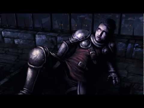 http://www.youtube.com/watch?v=egfgFZATd5E
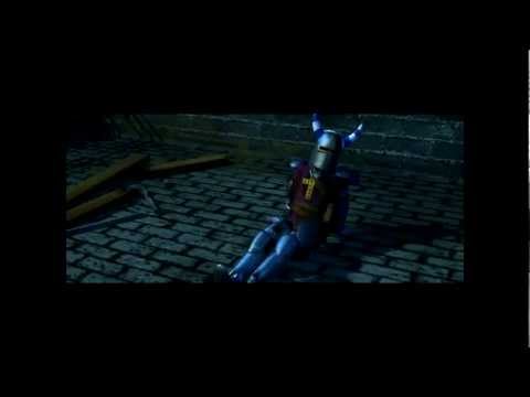 http://www.youtube.com/watch?v=hoSqDtky0pU (skip to 0:50)
In fact I think the art is great and seemed to be quite let down by execution.
The issue is that, BGEE's intro is clearly rushed. The art style is attractive in the appropiate context, but not only does BGEE's intro recycle old sounds which don't match the video properly, but they cut out the most important line ("There are others, I can show you.").
They also remove the quote from the beginning. which is spine chilling epic goodness really.
The animation is very poorly executed. The first part where Sarevok plunges the unknown Bhaalspawn through the door of the Iron Throne is epic, but it's followed by stills with minor animation and is very underwhelming from there.
This intro reminds me of the lazy SH3 animations.
 http://www.youtube.com/watch?v=kM_Vh0tzWGk
The way the Baldur's Gate logo phases into the screen is very cool, though.
Camera angles of the first intro allow you to feel the Bhaalspawn's hopelessness and pain. The way the camera shows you him through Sarevok's eyes, as he backs away to the iron rail. That gives you a sense of dread there.
The other thing is that the way Sarevok kills him does not allow you to feel the sympathy that you once have, because his death is quick and you aren't given time to hope that Sarevok lets go of his grip and lets the Bhaalspawn live. It's not dramatic or saddening in the slightest.
It's creepy really. Although the original was hugely more graphic, his new facial expressions are too morbid and don't portray his agony in a way that makes you regret his inevitable death.
 http://www.youtube.com/watch?v=egfgFZATd5E
 http://www.youtube.com/watch?v=hoSqDtky0pU (skip to 0:50)
 - Do you like the new cinematic?126 votes
- BG:161.90%
- BG1:EE27.78%
- I don't want to vote10.32%
3


Comments
Instead of spending time making new cinematics they should of just upscaled the old ones. You can't tell me it's impossible to degrain the originals and just give it a bit of life. I'm sure it could of been done and it would of been a very good compromise to just leaving them the way they are.
However, the removal of the quote, the removal of the panicky fence-yanking of the knight as well as his "there are others" line and futile attempt of trying to stop Sarevok from throttling him and the giant round pile of blood kind of kill it for me.
I see what they were trying to do and I understand the need for a new cinematic; the old one (while freakin' awesome) had dated graphics, a ridiculous outfit for the knight, it might put off new players. However, it had a lot of nice details, Sarevok's eyes narrowing as he chuckled and broke the knight's neck, shoving the knight through the metal fence and seeing only a portion of the corpse with a little blood trickling towards the logo was a lot more subtle than the almost cartoonesque bloodpool he's in now.
If they had paid that much attention to detail, I would've loved it in the new art style, it would be a massive improvement. But the way it is now, with things cut out, it turns into a more generic murder (The "there are others" line is half the mystery of this cutscene) ending with an oversized bloodsplatter reminding people of Dragon Age 2.
And really, nobody wants that.
Late 13th C. great helm (fully enclosed).
Horns (a tournament crest, odd that he'd be using them here).
Mantle (now THAT's detail, mantling down the back is used in tournaments and the Crusades, which probably copied from the locals there to keep the sun off them).
Ailettes (funny shoulder pads, those are used in tournaments briefly in the high Middle Ages).
Maille haubergeon
Tunic (may not be a tunic, looks thick and quilted so it might be an arming jack, which goes over the top of maille).
Plate vambs and greaves.
He is even wearing a quilted arming cap underneath his helmet. What epic detail. In modern medieval games they think a knight is just a person in maille with fancy hair.
Here's an image from the Codex Manesse with striped horns:
http://25.media.tumblr.com/tumblr_lz3tejeD0I1qzxr5oo1_1280.jpg
That said, ridiculous is perhaps too strong a word for what I meant to say, you're right about that. The helmet with the happy blue striped horns were my main point of contention, coupled with the red shirt. He seemed a bit too cartoon coloured for a dark intro.
While on the other hand, BG-1 really has that sense of dread that comes with the unknown. Really scary after your own fridge logic steps in, and you realize that is the same guy who kills your foster father.
So, I would say the original for now.
Fantasy is based on reality. The armour meeting real life standards does not distinguish the game's ability to feel like a fantasy game. Unless you think the armour should be like Final Fantasy, in which case you're no longer playing a medieval based fantasy game like Baldur's Gate and instead a game with glowing massive swords.
The great thing about Baldur's Gate is we get a medieval based game that is a fantasy game but isn't really TOO fantasy to feel like an entirely unrelatable world. I don't enjoy PS:T because I can't relate to it, although most people enjoy it anyway. I like to be able to relate.
::::begin nerd rage::::
This is evident by the fact that they had to trash 50% of the original movies. Scrapping 50% of the original movies doesn't seem 'enhanced' to me. If they couldn't afford to include ALL clips, what was the point? They could have implemented a more cost effective method of updating the original videos, or come up with another innovative solution to get all the originals in there. It's like Lucas cutting out footage from the original star wars, just so he could save a few bucks to render in some superfluous cgi background characters as eye-candy.
:::end nerd rage::::
What really got me was the lack of the Nietzsche quote. GARGH! For anyone who's studied the origins of that line and it's implications, it's quite profound both in its existence and as it applies to this particular work. DAMN it sucks that it's missing.
I'd like to see an option to restore the original cutscenes, if possible, just to have it.
On the other hand, the cutscene (only other one I remember) of the orcs or gnolls or whatever they are strolling around later was really too cartoony and not my favorite. I'm interested to see what they've done with that but I'm not that far in the game yet.
Please check.
Sure, the animation style is different. That's a matter of preference. But the curtailing of information? Sloppy.
Man, this game is worse day by day, as the players find all the "Enhancements. not advertised for a reason.
First screen outside of candlekeep usually had some packs of 4-6 Gibberlings, a group of 2 wolves, a troupe of 2-3 bears. Those appear to be gone, I haven't seen more than a single gibberling per encounter. This kind of dampens the threats of the wilderness, making it more a happy playground than a threatening area.
Especially when most of what it is hinting to happens late in this game and chiefly in Throne of Bhaal. I would have preferred a cold opening tbh, one where you literally get thrust into the game with no foreknowledge of the game's events. You begin the game as someone caught up in the midst of this massive unknown conspiracy, that I feel the Nietzsche quote and Sarevok dialogue works against that by prejudicing the player somewhat. It puts such a great deal of focus on Sarevok that you instantly know he is the final boss or a big player to the story. I just wonder what I would have thought about his ambush outside of Candlekeep if it weren't for the intro prepping my expectations.
My preferred idea of an intro would be a bit of backstory provided by Gorion. Nothing deep and nothing related to the Bhaalspawn saga, but just his wish to flee with you away from Candlekeep. Just a very vague outline of where you are at the start of the game. Then canvas the grounds of Candlekeep ending outside of Winthrop's Inn where you begin your journey.
I voted for the new intro just because the animation of the original is so dated and out of step when it comes to bulk of 2D visuals that actually make up the game. The EE version isn't perfect but it's on the right path visually though I'm disappointed that it is just emulating the original intro. The most successful part of the EE intro really is the storybook visual, I would have loved it if it was just a series of illustrations that canvas Gorion's last days. It really didn't need to try to aim for some action packed grand intro.
I'm always going to support 2D visuals over CGI for a game like Baldur's Gate. There's a coherence in using 2D visuals, rather than interrupting the game with CGI cutscenes. But honestly I spend most of my time trying to skip through the cutscenes, I just see them as interrupting the real storytelling. I'm honestly surprised at the reaction towards the removal of the Nietzsche quote when considering it is such a minor part of the game, it's probably a good illustration of just how difficult the tightrope Overhaul is straddling.
All that said, I actually kind of dig the graphic novel style of the new cinematics. They fit in well with the aura of refurbishment the game has gotten. They definitely contribute to the feeling of the gameplay experience getting refreshed and updated.
I suspect that the new movies were rushed. And I can appreciate that in order to meet the release deadline many are now missing. But I hope that they will replace all of the old movies in the new style post-release. And make a couple of them more dynamic, with more motion (eg, Bandit Camp is too static. And no more head slap delivered with fiendish hyena cackle?).
Finally, unless it's a non-starter technically I don't really see how it would hurt to offer both original and new cinematics. Maybe a new button could be added to the UI that provides the option to select original cinematics versus new? Unless that is truly just too much of a pain for Beamdog to do.
I really loved the style but as Lemernis pointed out they were just FAR too static.
I agree the BG1 intro movie is far more morbid and disturbing. Chills.
The problem is Overhaul is just too small of a company right now to do anything super awesome with such cinematics, which is a damn shame.
I'm going to take my time and re-live this epic game at my own pace.
I agree however that it's a bit lazy if you compare it with each other. Classic opening has much more going on and has much more effort put into it, but hey I bet BioWare had much larger budget too!