Neverwinter Nights PC Version's Graphic No Match for The PS4?
 kingnight
Member Posts: 54
Hi there, @JuliusBorisov , I think I have a little problem here.
I take a look on the PS4 version, and it looks so gorgeous, the reflection is shining, the lighting is great, it even looks like it has RTX effects. And I don't understand why the PC version's graphic looks so flat. I have a video card better than the PS Pro, so I think the performance is not my issue, than why I can't even match the console on graphics?
Please just take a look on the following captures, then we all know the differences are quite obvious.
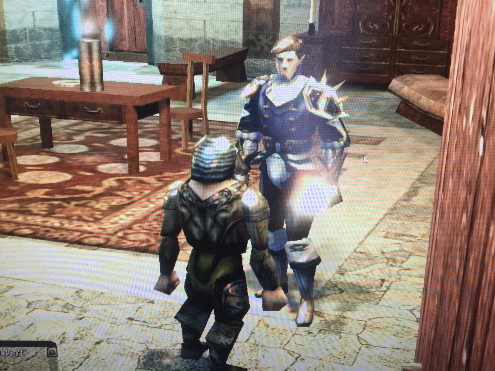
The capture below is from PS4, from Youtube video:

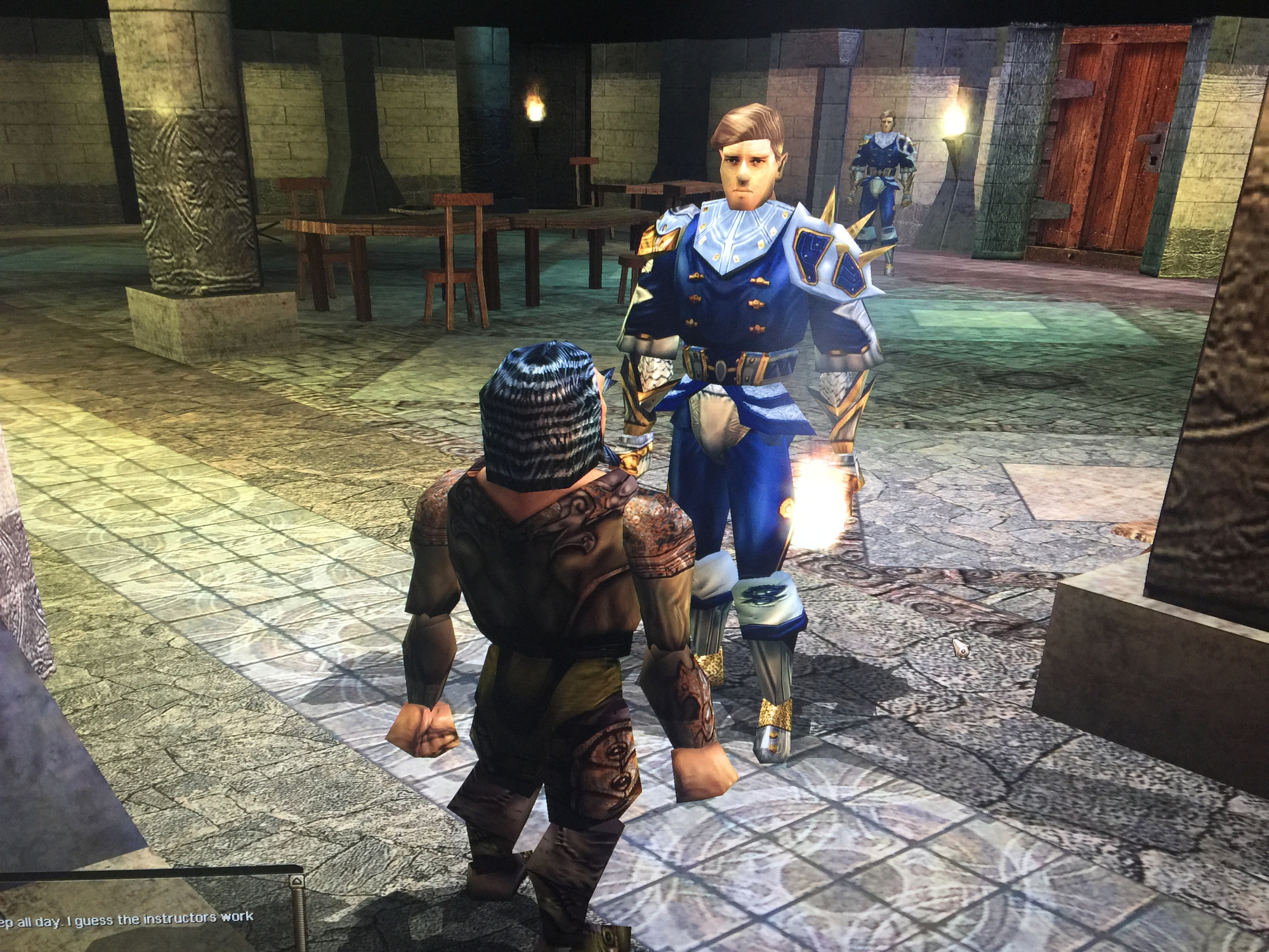
And the capture below is from my PC:

It's obvious the armor's reflection is shining on console version, while the PC version have no reflection at all.
PS: I have updated the game to the latest version on steam.
I take a look on the PS4 version, and it looks so gorgeous, the reflection is shining, the lighting is great, it even looks like it has RTX effects. And I don't understand why the PC version's graphic looks so flat. I have a video card better than the PS Pro, so I think the performance is not my issue, than why I can't even match the console on graphics?
Please just take a look on the following captures, then we all know the differences are quite obvious.
The capture below is from PS4, from Youtube video:

And the capture below is from my PC:

It's obvious the armor's reflection is shining on console version, while the PC version have no reflection at all.
PS: I have updated the game to the latest version on steam.
0

Comments
on the other side, i see "maybe" a better lightning on the scene - as mentioned by JuliusBorisov - as the scenes not full identical and the quality from the YT screenshot is so low ...
To "no reflection" on PC version .... here an nice video (4k) just maked, where i see clearly reflections on the dwarfen armor (on metall parts..) and on the sword :
https://youtu.be/aylmX2X_-Yo
(as example - as seen on the video [maybe] - i have decrased the DOF effect a little - i like it more subtile..)
My fault, I mean no reflecting lights. With close look, the armor do have reflections, and it's good enough, just as the video you have shown.
Although it's unnatural to see hair blooming, but the effects on body armors are really great! Please just take a look at the PS4 trailer below, it cheats me that the PS4 version really looks like a 8th generation title, and I wish I have the same experience on PC as well.
https://store.playstation.com/en-us/product/UP0346-CUSA15670_00-NWNEEONCOLSOLEPS
Besides, the video link for the previous capture is below:
From the video, it seems the game do run at 1080p , I wonder if the game can hit a 4k resolution on PS4 Pro version, so I better leave this question to @JuliusBorisov.
Check out the improved lighting on PC coming in the next update.
mpf - i have realy tryed to get not to harsh with the console look
but the good is - al user can self adjust the visual apearance to here liking ... where like it ultra shiny and vfx elsewear ........
There is a streamer called Neberski that uses Diamond Edition still except compared to vanilla NWNEE it sounds better (EAX enabled) and looks better because shaders are applied in meaningful ways and some custom content is used. That's not to say NWNEE can't hope to be better but just turning up the bloom and saturation isn't going to do it.
as you maybe see in my example Video - i use NWNCQ and Issig_Kurairyu's - Hands for Phenos - so it is still improvements from this over 6 year old overrides for NWN:EE .... (and new models for the weapon for better reflection)
more to show "sadly" that i still need this 6+ years old assets to get a better gfx/overall-look in the brand new NWN:EE .... (and this is for new player still not easy to found/install/use on top of the criticism)
I tried it out on the Switch and i didn't like the controls, the visuals i didn't care about.
Some games i just can't play on a controller well.
I personally was just looking at the color being displayed. Compared for example with the color values of games for a google search of "2019 rpg" such as Sekiro, Outward, Disco Elysium. They show better use of colors, not that saturated colors are completely absent but they stand out from the rest of the colors used. What I meant was that it seems NWNEE's changes do more to push NWN to the color space of 90s Mario and Sonic than to modern games.
Also note the PS4 gameplay video posted, at various points texture detail is completely lost due to the light sources melting everything away. This is an indoor scene mind you, so essentially it's a nearly impossible illusion in the absence of sunlight or powerful magic. Hopefully that kind of stuff is also addressed in their lighting update.
Better (imho) as BG3 - more D&D feeling - very nice and immersive char generation - good gfx - D&D 5.1 ruleset - only the turn based game play i dislike ... and it is singleplayer only ... but the base game engine give me an incredible D&D feeling i have long time not have ..