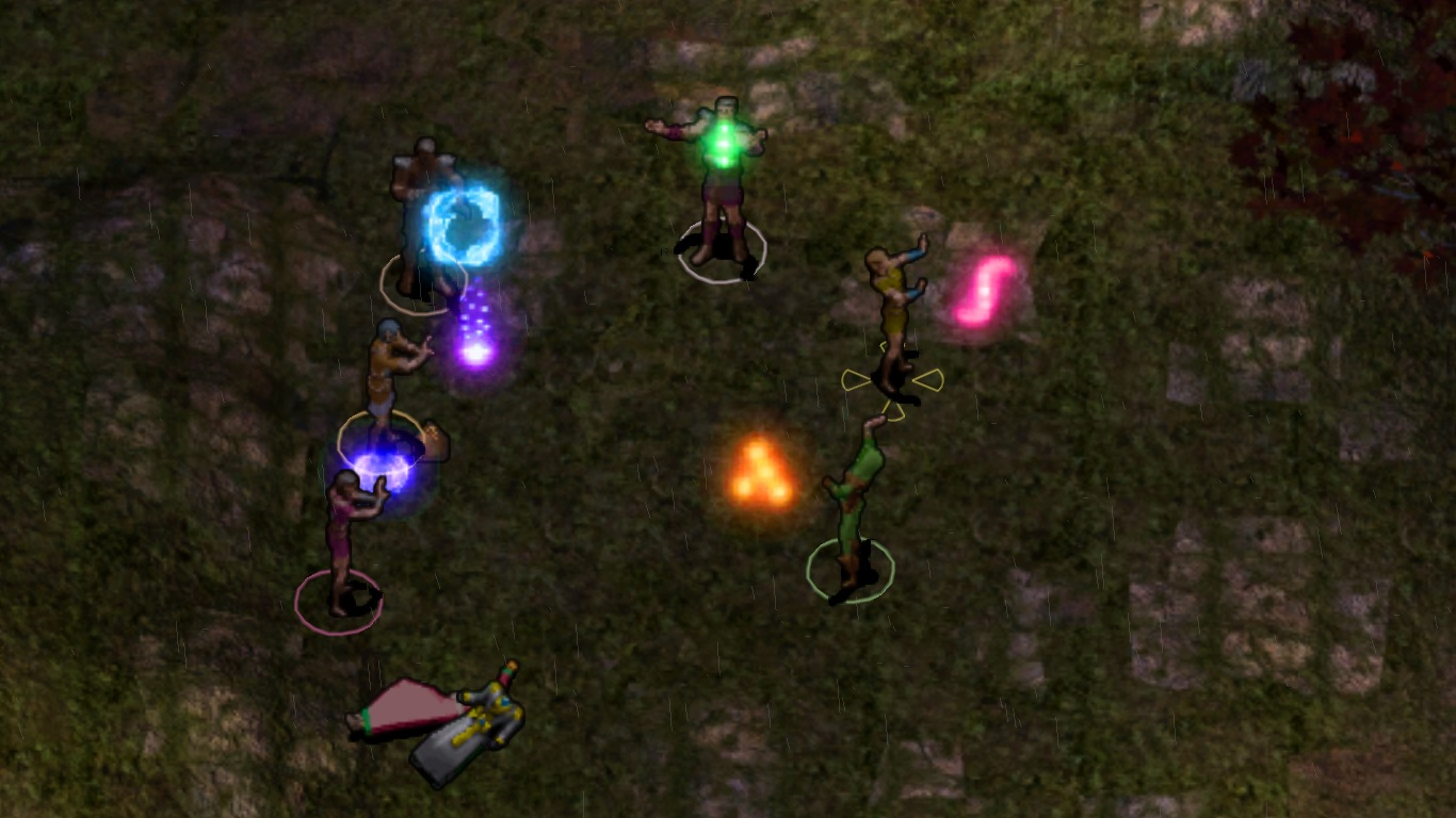
Shiny casting glows for bg2
 lunar
Member Posts: 3,469
I took the better casting glows from iwd, edited and tweaked heavily and wanted to share. I gave each school a distinct and shiny color, alteration-serious blue, evocation-fiery orange, illusion-playful pink, necromancy-icy blue, conjuration-mysterios purple, enchantment-vibrant green, abjuration-tinted yellow, divination-multi colored. They look beautiful and truly magical, in my opinion.
Simply drop the contents of the rar file (bam files) into your override. Delete them later if you want to uninstall.

(abjuration and divination not shown)
Simply drop the contents of the rar file (bam files) into your override. Delete them later if you want to uninstall.

(abjuration and divination not shown)
Post edited by lunar on
4

Comments
To clarify, is this mod EET compatible? Is it compatible with other mods that alter casting graphics?
Thankee!
Should be compatible with eet, Bg1, and SoD. And ofcourse bg2+tob. Not with iwd, iwd requires to chane the names of files like cgabjura to abjuracg or something like that. Iwd uses a different naming algorithm for casting glow bam files, for some reason.
This replaces casting glow graphics, so not compatible with other mods like tweaks ANTHOLOGY which put iwd casting glows to the game, they look too big and not translucent/shiny enough to my eyes. These look better. Ofcourse, tastes may vary.
One thing I'd note is that yes, those are the IWD animations as they were and during IWDEE development these got updated to feel less crude and have more translucency. The next build of IWDification (aimed to be RC2) will port over the IWDEE animations to the other games, fixing the translucency and shininess.
I like your colorcodes but this looks way too vibrant to me. Cool recolors, still, and I like how you ensured that no details got lost.
I like that school casting graphics are better color-coded. May we get an option to determine what school gets what graphic/color, and how bright it is? I felt concerned the casting graphics were too bright to the point of being distracting: Adding options for 75% and 50% brightness is useful.
This is how I mentally saw each school:
-Abjuration: Gray
-Conjuration: Blue
-Divination: Gold
-Enchantment: Pink
-Evocation: Orange
-Illusion: Purple
-Necromancy: Red
-Transmutation/Alteration: Green
-Multi-School/Universal (wish, limited wish...): White OR Rainbow
Thankee!
The color scheme depicted here is close, though not 100% consistent with that used by other resources in the game:
- Conjuration = Purple
- Divination = "Stone" (White/Yellow/Orange)
- Enchantment = Gold
- Illusion = Magenta
- Invocation = Red
- Necromancy = "Ice" (Cyan/Light Blue)
- Transmutation = Blue