Pausing shows too much info? HOW TO UNDO?
 MWO
Member Posts: 214
MWO
Member Posts: 214
Heya!
After the recent patch there has been many bugfixes etc. which is a job well done. However, when I pause the game it shows annoylingly much info, e.g. what time it is, year etc. instead of the usual "paused". Is there any way to "get rid of that" extra information? I find it very annoying - it's just too much info and kinda wasted in the middle of a battle. I've attached a file for you to understand what I mean :-)
Regards!
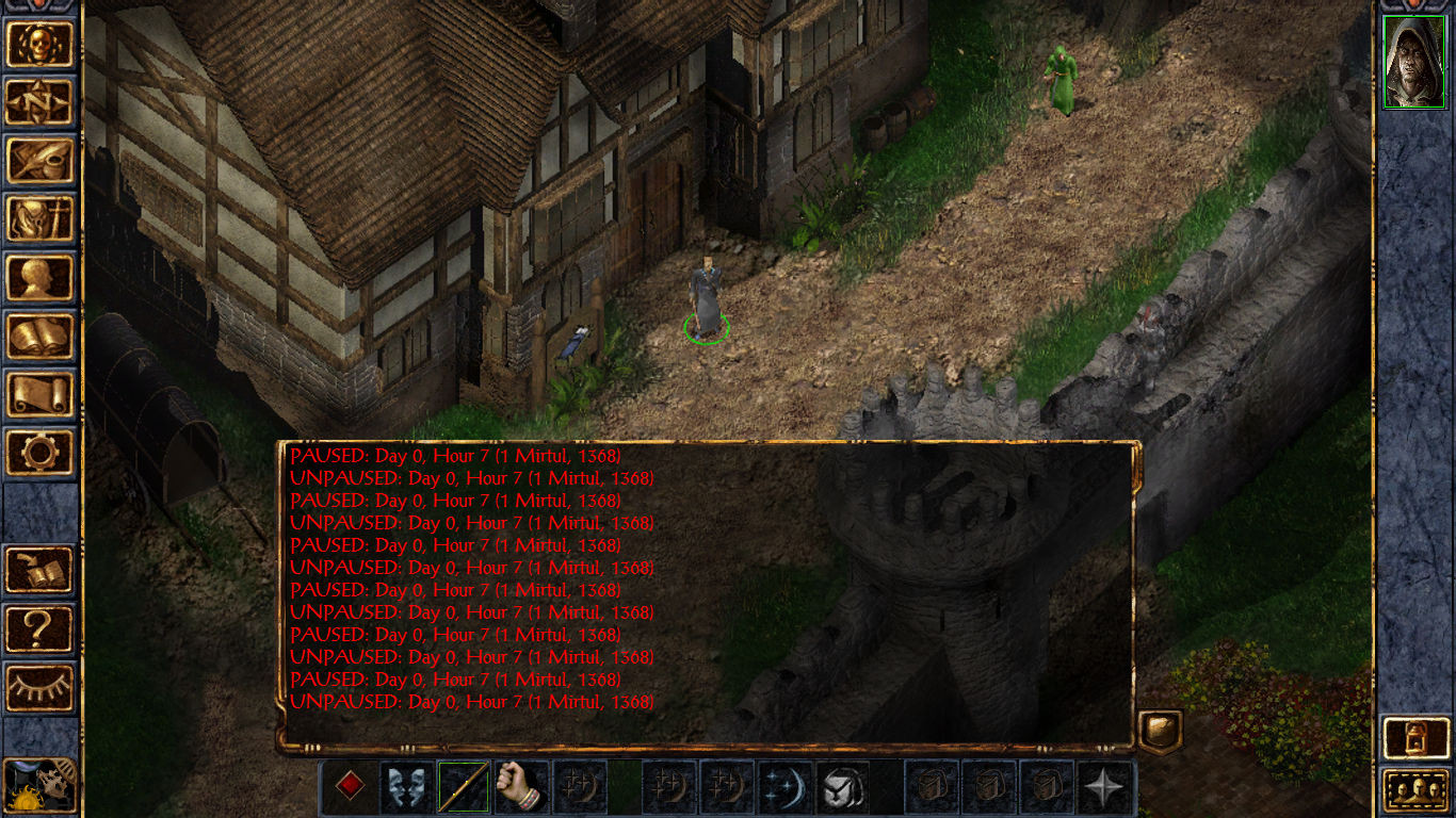
3
Comments
According to @Jalily 's answer here: http://forum.baldursgate.com/discussion/comment/559753/#Comment_559753
there's no way to turn this change, made by the patch, off.
Although the pause messages aren't new, the date mentioning in the pause messages IS new.
There seem to be quite a lot of people who don't like this change (as the quoted thread shows), so there's a hope we can get an option to hide the date mentioning in the pause messages.
Let's see if it will be the same in IWDEE and the BG2EE patch (personally, I think that this date mentioning is excessive).
It would be cool to have an option in the game options to change the pause message details, I think.
You can delete it in dialog.tlk file with NI or DLTCEP, but the colon after PAUSED is hardcoded, so it looks weird. So I just deleted everything except of hour information. It's somewhat useful but doesn't clutter the dialog window. You can see which strings you need to edit by typing console command C:StrrefOn().