Question: Character Sheet vs Record ?
 00zim00
Member Posts: 267
00zim00
Member Posts: 267
I was going to make a bug report on this and let the devs decide but was curious about peoples opinions. In the original BG and even in 1.3 the Record page (R) was called 'Record' now its called Character sheet which I guess is fine.
However the bug I was going to post was that when you hover over the now Character Sheet interface button on the left or have the help option on it says 'Record (R)'
So my questions are:
1) Should the left interface button be changed to say Character Sheet (R) from Record (R)?
2) Or should the menu itself be changed back to being called Record?
3) Likewise the hotkey is (R) for Record so wouldn't that defeat the purpose of having it hot-keyed to (R) if its now called Character sheet instead?.
4) Would any of this be confusing for new players?
Personally its hard to have an opinion on changing it as I always remember it as R for record. So maybe the solution is to just keep everything as it is and dont think about it. But was curious about peoples thoughts either way seeing as the menus have been a hot topic lately.
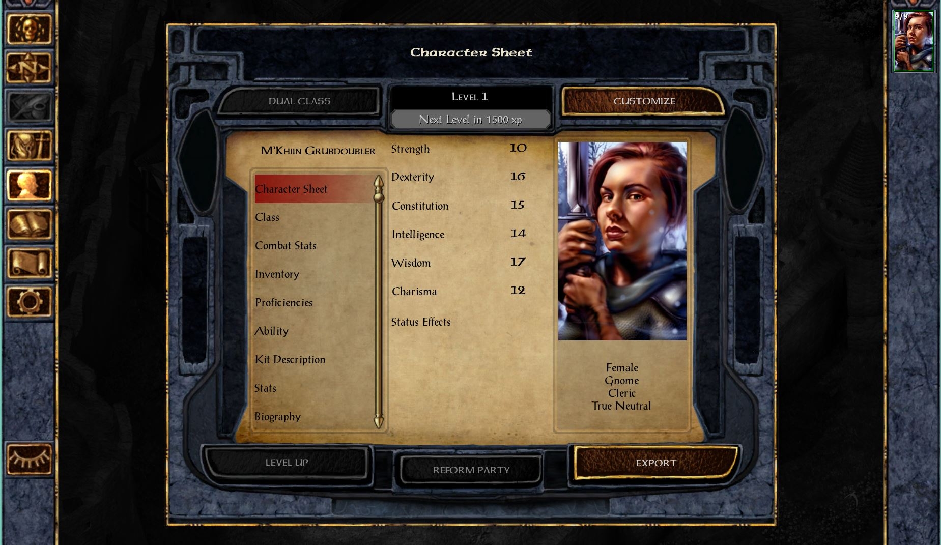
Old and New UI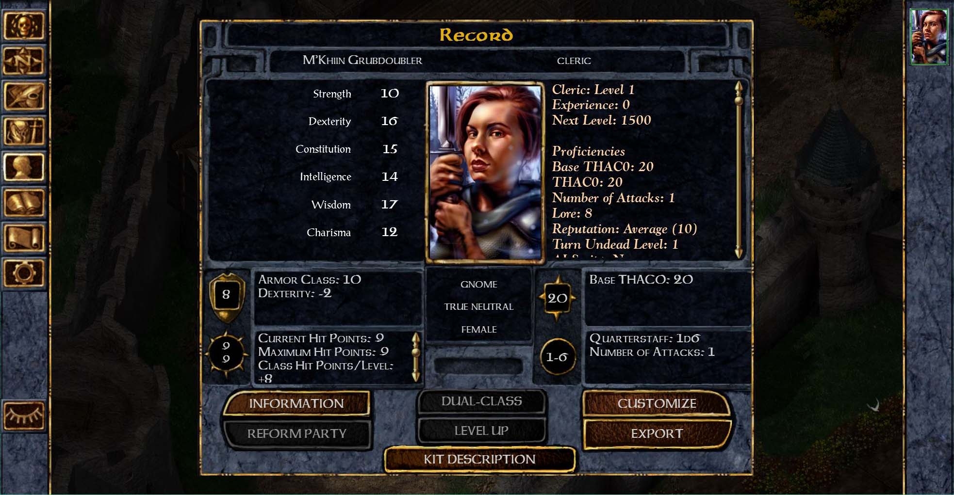
However the bug I was going to post was that when you hover over the now Character Sheet interface button on the left or have the help option on it says 'Record (R)'
So my questions are:
1) Should the left interface button be changed to say Character Sheet (R) from Record (R)?
2) Or should the menu itself be changed back to being called Record?
3) Likewise the hotkey is (R) for Record so wouldn't that defeat the purpose of having it hot-keyed to (R) if its now called Character sheet instead?.
4) Would any of this be confusing for new players?
Personally its hard to have an opinion on changing it as I always remember it as R for record. So maybe the solution is to just keep everything as it is and dont think about it. But was curious about peoples thoughts either way seeing as the menus have been a hot topic lately.
Old and New UI
1
Comments
1) Consistency is good. Button tooltip should be same as whatever the particular menu is called, so "character sheet" now apparently.
2) Doesn't really matter to me personally.
3) I'm used to hitting R in the BGs, so it's okay if it stays that way. But I'm equally used to hitting C in just about every other rpg, so either one works for me. Long-time players probably prefer it not to be changed, but since we can set the hotkey ourselves anyway, it shouldn't matter much.
4) R hotkey is probably less intuitive than C. Whether it's called character sheet or record probably doesn't matter.
(Changing hot-keys is generally a bad idea, so it's likely that the hot-key would remain R even though the screen's name is different. That being said, if you feel strongly about it, definitely share your thoughts.)
Good catch, @00zim00 !
I don't actually see much sense in changing it to "Character Sheet".
For some reason, I don't like the word "Sheet".
Maybe call it Character Record?
If the menu name should be changed to something else or not I think is something people can discuss here then a feature request can be made if need be.
Bug # 21756 BG:EE
http://redmine.beamdog.com/issues/21756
Bug # 21757 BG2:EE
http://redmine.beamdog.com/issues/21757
This has been discussed extensively the last weeks here, and while opinions are diverse, saying the ui was not broken at all is just plain ignoring the bad parts it had. Oh there will be such a wave of anger here from non regulars when the patch actually hits the ground ... As bengoshi proposed in another thread, a good(!) Patch note is a real necessity.
For those who are interested in modding the game's UI, I've posted a guide that goes through some of the basics: The New UI System: How to Use It
I'll be updating the guide in the next day or so (I'm still working on the section that goes through the more intense parts of UI modding), but check it out and let me know if you have any questions.
All the info I really wanted or needed was right there in the original. Just required some scrolling for certain things. The new one just has it all hidden in different sub menus.
As someone else pointed out, it's been discussed to death so I hope there's at least an option to revert some of these changes. But I doubt it'd happen because of the work involved.
At least the Journal is good
I am looking through the stuff Dee is providing and it is a little more than I thought but I see huge potential. I don't think it will be more than a week or two before a few people put out character sheets which are much improved over the original. You will be able to pick between a number of styles. Much better than a revert.
With the current v2.0 Character Sheet you must select a item from the horizontal tabs along the top, select a item from the vertical list of tabs on the left and sometimes move the mouse courser to a big box on the right and scroll the mouse wheel. Often you'll be switching between tabs on the left or along the top as you'll want access to multiple kinds of information. There is no location that can tell you everything, information is only available in piece-meal format.
v1.3 isn't the best when it comes to comparing information between multiple characters (It always scrolls to the top when switching characters and differences in gear will cause information to be shuffled around on to different lines), v2.00 is better in this regard.
I would've preferred v1.3's version of the character sheet with buttons that scroll to the start of specific sections of information within the big box of info like a button that, when clicked, scrolls the big box of text up or down until Proficiencies is displayed at the top of the box (Can still manually scroll up/down to see other info) and a button that, when clicked, scrolls the big box of text up or down until Ability Bonuses is displayed at the top of the box etc. The UI could even memorize which section the player was looking at and automatically scroll to it when switching characters, this would've facilitated easy comparisons between characters without any need for such drastic overhauling of the UI layout while retaining a place that shows everything in one place so you can easily obtain a full picture of your characters.
This change would also negate a "requirement" to move the mouse or click it more often in order to access information (You can still just scroll the scroll wheel to access everything). You're simply adding "optional" ease-of-use functionality (that may require more mouse clicking or moving the mouse courser more often to take advantage of) without eliminating the core aspect of the character sheet, to provide detailed party member information.