A thread by artists for artists..
 EntropyXII
Member Posts: 656
EntropyXII
Member Posts: 656
Hi everyone,
I've created this thread so that artists - non-digital and digital - may share technique and advice on various aspects of fantasy artwork. I have a particular interest in what software and hardware others use and which they prefer for different styles of art.
I personally use Corel Paint X5 Ultimate Edition and ArtRage 2 for my choice of software. I chose Corel for the simple reason in that it is what I was used to. I began digital painting 6 years ago (also stopped for about 5 years) using this software and I find it difficult to get used to other programs. Photoshop is something I have tried but could never fully get used to, but would give it another shot with the right advice.
If you are a non-digital artist, wanting to give the digital art world a try, I recommend ArtRage. It is a useful tool which replicates real artistic techniques with an easy to use interface. Great for digital oil canvassing (very realistic). It is also extremely responsive (much more so than Photoshop and Corel Paint - even though you can do more with these programs).
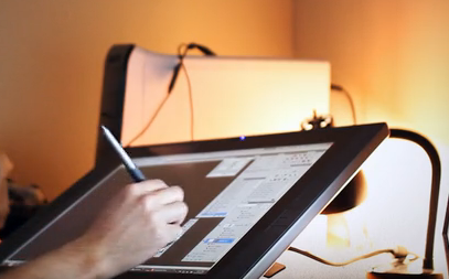
For hardware I use Wacom's Bamboo digital pen and tablet. I have never ventured over to different tablets so I wouldn't be able to compare.
However if anybody can tell me what this is, where I can get one and how much it costs, I would be very grateful. It looks amazing and I can slowly feel my eyes going square staring at a screen for hours with my current tablet & laptop:
I am also keen to learn how to use Vue, or how 'rendering' works in general if anybody has any tips. Give me a pencil and i'm at my best, but I am keen to learn new things.
So as I am the creator of this thread, I will try to give some advice to those artists or budding artists who would like to learn new techniques.
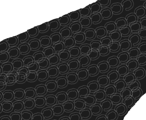
Chainmail Tutorial
Chainmail is one of those annoying parts of painting that most people dread. It can be tedious and time consuming. I have noticed a number of people mentioning to me in the past that they find it difficult to draw and paint armour. I have come to the conclusion that many people struggle with it because they do not enjoy it or do not have the patience for it. Many revert to photo-manipulated chainmail from images found on Google, which lets face it - always look like photo manipulations. I am guilty of this myself.
Here I will teach those that wish to learn an easier, fun and satisfying way of painting chainmail. I self taught myself this method some time ago with the help of some 'How to' videos. Before this I used to do it the slow and painful way that never ends up looking right.
Step 1) The trick with chainmail is consistency. Each link has to be the same size or it does not look right. The trick is to create your own brush. This can be done easily on Photoshop and Corel Paint - I am not to sure about other programs.
Now on a simply white background, paint a C shape in bubble writing using a standard paintbrush. For example:

To make your C into a brush, select the square 'selection tool' and wrap it around your C. Then go to Effects -> Edge Effects -> Trace Contour.
Now that you have your edged C, click on your standard paintbrush tool and click on brush options. From this screen there should be an option named "Create brush tip from selection". Voila - You have your new C brush.
Step 2) Start a new image. For this example I used the 'Freehand Selection' tool to create a section of armor that would be covered with chainmail. I used a filler colour of dark grey as it would have a more prominent effect on silver chain link.
Taking your new C brush, pick a lighter colour. For this example I chose light grey. Next go to 'Palettes -> Brush variance -> Rotation. Change the option to: Direction. This will allow your new C brush to follow the direction of your pen/mouse cursor. Change the 'Step' option of your brush to 75, and turn the opacity and density to 100. With your section of armour still 'selected' by the freehand tool, begin painting in strips and in one direction to start with. Like so:
And then follow the link back in the other direction - try to keep your links between the links going the opposite way. Like so:
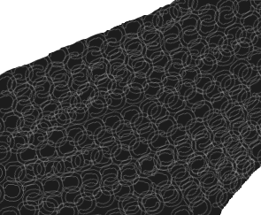
Now this may look a little messy at the moment, so let's fix this.
Step 3) Select the Burn/shadow tool and use it over the chain link. Don't take the pressure off your pen/finger off the mouse whilst doing this, or you will end up with huge chunks of dark 'splodge' all over your lovely chain link. This helps give your chain link depth and definition. Darkness and shadows are your best friend.
Step 4) For this particular example, select the 'Lighten' tool. Now start going over the chain link in your armor, lightening each link up as you go along. To add 'shine' and 'reflection' go over some over the links multiple times. Do this erratically yet clustered to add a realistic effect. I did this without removing my pen from the tablet, applying my 'shine' effect at the end on certain sections of the chain link:
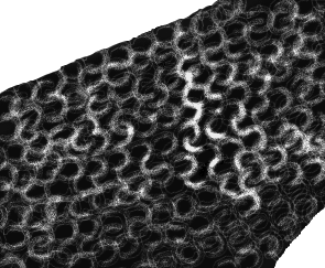
Now you may wish to do this individually and with much more detail than the image above, but for the purpose of this tutorial I have only done a quick/rough example. The drawings for this took less than five minutes and goes to show how simple it can be to do this once time consuming and tedious chore. I actually have fun with it nowadays. Try using different colours to add different effects. Elven chainmail = greens, Gold = yellows/oranges. Don't forget to add 'shine' and 'burn' though!
Anyhow, I am guessing many of you may know this trick already but for those that don't I hope it helps!
@Troodon80 @Seldar @Syntia13 @krax @Nixxi @Jakaminski @Sylph @artastrophe @serabiet - Feel free to join in if you wish") (sorry if I missed anybody out, i'm tired and struggling to think straight.)
(sorry if I missed anybody out, i'm tired and struggling to think straight.)
I've created this thread so that artists - non-digital and digital - may share technique and advice on various aspects of fantasy artwork. I have a particular interest in what software and hardware others use and which they prefer for different styles of art.
I personally use Corel Paint X5 Ultimate Edition and ArtRage 2 for my choice of software. I chose Corel for the simple reason in that it is what I was used to. I began digital painting 6 years ago (also stopped for about 5 years) using this software and I find it difficult to get used to other programs. Photoshop is something I have tried but could never fully get used to, but would give it another shot with the right advice.
If you are a non-digital artist, wanting to give the digital art world a try, I recommend ArtRage. It is a useful tool which replicates real artistic techniques with an easy to use interface. Great for digital oil canvassing (very realistic). It is also extremely responsive (much more so than Photoshop and Corel Paint - even though you can do more with these programs).
For hardware I use Wacom's Bamboo digital pen and tablet. I have never ventured over to different tablets so I wouldn't be able to compare.
However if anybody can tell me what this is, where I can get one and how much it costs, I would be very grateful. It looks amazing and I can slowly feel my eyes going square staring at a screen for hours with my current tablet & laptop:
I am also keen to learn how to use Vue, or how 'rendering' works in general if anybody has any tips. Give me a pencil and i'm at my best, but I am keen to learn new things.
So as I am the creator of this thread, I will try to give some advice to those artists or budding artists who would like to learn new techniques.
Chainmail Tutorial
Chainmail is one of those annoying parts of painting that most people dread. It can be tedious and time consuming. I have noticed a number of people mentioning to me in the past that they find it difficult to draw and paint armour. I have come to the conclusion that many people struggle with it because they do not enjoy it or do not have the patience for it. Many revert to photo-manipulated chainmail from images found on Google, which lets face it - always look like photo manipulations. I am guilty of this myself.
Here I will teach those that wish to learn an easier, fun and satisfying way of painting chainmail. I self taught myself this method some time ago with the help of some 'How to' videos. Before this I used to do it the slow and painful way that never ends up looking right.
Step 1) The trick with chainmail is consistency. Each link has to be the same size or it does not look right. The trick is to create your own brush. This can be done easily on Photoshop and Corel Paint - I am not to sure about other programs.
Now on a simply white background, paint a C shape in bubble writing using a standard paintbrush. For example:
To make your C into a brush, select the square 'selection tool' and wrap it around your C. Then go to Effects -> Edge Effects -> Trace Contour.
Now that you have your edged C, click on your standard paintbrush tool and click on brush options. From this screen there should be an option named "Create brush tip from selection". Voila - You have your new C brush.
Step 2) Start a new image. For this example I used the 'Freehand Selection' tool to create a section of armor that would be covered with chainmail. I used a filler colour of dark grey as it would have a more prominent effect on silver chain link.
Taking your new C brush, pick a lighter colour. For this example I chose light grey. Next go to 'Palettes -> Brush variance -> Rotation. Change the option to: Direction. This will allow your new C brush to follow the direction of your pen/mouse cursor. Change the 'Step' option of your brush to 75, and turn the opacity and density to 100. With your section of armour still 'selected' by the freehand tool, begin painting in strips and in one direction to start with. Like so:
And then follow the link back in the other direction - try to keep your links between the links going the opposite way. Like so:
Now this may look a little messy at the moment, so let's fix this.
Step 3) Select the Burn/shadow tool and use it over the chain link. Don't take the pressure off your pen/finger off the mouse whilst doing this, or you will end up with huge chunks of dark 'splodge' all over your lovely chain link. This helps give your chain link depth and definition. Darkness and shadows are your best friend.
Step 4) For this particular example, select the 'Lighten' tool. Now start going over the chain link in your armor, lightening each link up as you go along. To add 'shine' and 'reflection' go over some over the links multiple times. Do this erratically yet clustered to add a realistic effect. I did this without removing my pen from the tablet, applying my 'shine' effect at the end on certain sections of the chain link:
Now you may wish to do this individually and with much more detail than the image above, but for the purpose of this tutorial I have only done a quick/rough example. The drawings for this took less than five minutes and goes to show how simple it can be to do this once time consuming and tedious chore. I actually have fun with it nowadays. Try using different colours to add different effects. Elven chainmail = greens, Gold = yellows/oranges. Don't forget to add 'shine' and 'burn' though!
Anyhow, I am guessing many of you may know this trick already but for those that don't I hope it helps!
@Troodon80 @Seldar @Syntia13 @krax @Nixxi @Jakaminski @Sylph @artastrophe @serabiet - Feel free to join in if you wish
Post edited by EntropyXII on
10
Comments
That chainmail trick works pretty well traditionally as well, just takes a lot longer and is a lot more tedious :P One good piece of advice I got for it was to make sure you curve it around the form and not just make straight lines, otherwise it just looks like chainmail hanging on a wall
Here a tutorial about water (the best accroding to me) :
http://photoshopcontest.com/tutorials/26/displacement-water.html
and if you need textures, go to cgtextures.com, a MILLION of textures for free (15mb per day)
There are a lot of video of speedpainting on Youtube, it's not like a tutorial (but there are too) but you can learn with that. It is how I did, I learned everything by myself. Of course I don't know my soft at 100% and there are alot of stuff that I don't know use, I don't know how they work. But I practice.
I use photoshop and I think that brushes are a big part of a realistic painting. Yes you can paint a castle with basic brush, but well, you will have a "bad" result (simply grey walls, brown doors etc...). Brushes help you to add textures and soft colours variation which will give you the feeling of stones, wood, clouds and more.
This how looks like a painting when I start :
http://img4.hostingpics.net/pics/261968mine.jpg
and as Bob Ross said : "You can do everything you want, everything !!! As long as you believe"
I grew up as an ink artist, and thus I tend to draw in dark lines and shadow first, before adding colour and detail.
Adding shadows is an incredible way of giving your work a touch of realism. Start with finding a light source (as you become more advanced - multiple light sources). Shadows can come from a number of directions. If you are planning on creating people/portraits then you may find it easier to practice digitally painting in black and white first (like a sketch). This can help give your painting definition, shadow and depth, before you have even begun adding colour. Afterwards, multiple coloured layers can be dropped over your digital sketch (decreasing opacity on merge) and sooner or later you will end up with a coloured portrait that has depth and definition. The original BG portraits were done using this method.
I prefer using my own palettes to paint in colour but in general, it is each to their own. If you would like an easy transition from pencil and paper into digital, then I recommend picking up a Wacom tablet (or something similar) as soon as possible. Mine cost about £50 and I wouldn't know what i'd do without it.
If you have any questions about certain aspects of digital painting and would like a tutorial in detail, let me know and i'll put something together for you
@Seldar - Thanks for that great webpage mate! This will be incredibly useful.
Also... does nobody have any idea what that tablet is in my OP? I saw it on the Project Eternity kickstarter video and I have been looking for one since!
Thanks dude.... Found it. http://www.ebuyer.com/391713-cintiq-24hd-touch-dth-2400?utm_source=google&utm_medium=products&gclid=CJ6dksTl0bcCFQ3KtAodzHcAjg
THREE GRAND!? what is this!? With this kind of money I could buy a robot and then program it to build this tablet for me! :-O
Cintiq 12WX @ 1280x800
Asus VK266H @ 1920x1200
GTX690 (2x2GB internal SLI)
32GB RAM @ O.C. 2133MHz (11-11-11-30)
250GB SSD, 2x3TB HDDs
Core i7-3960X (6 core) @ 3.30GHz
For software, I typically use a range of 3D software such as Vue, 3DS Max and ZBrush, as well as drawing software like Photoshop, GIMP, PaintTool SAI, and PhotoFiltre.
As a quick walk through for this picture:
First thing to do is model the gate house and bridge. Need to get a shot from the game for that:
Then we need to go into 3D Max, drag a cube into into the viewport and model it.
This is pretty easy and required minimal editing. Cut out the front and back, bridge the now-open faces, extrude (inwards) the edges around the entrance and use symmetry so that it will be the same on the back as it is on the front. Other basic modifications include extruding portions of the sides for the buttresses and, again, using symmetry so the two sides will be the same.
Then add another primitive. This new one will be the head or lintel above the arch. This only needs to be resized, so no modification to the basics (aside from adding a texture).
The next bit is adding and shaping the iron around the gate entrance. For ease, I did one side and then selected to create a symmetry layer.
Then the chains. This was incredibly boring, but basically created one single shape and copied it multiple times to line them up and create the chain.
Then export as 3DS.
Next, import into Vue. Create an infinite terrain and a procedural terrain. Then position the procedural terrain and edit it. Once you get it looking decent, you can position your imported gatehouse.
You can get down close to it and view it to make sure it is how you want it. Then you can add rocks and other objects around it.
My scene isn't complete yet, and won't be for some time. So the textures are only placeholders.
It has its pros and cons of course. It uses a glass frame, which while does make it sturdier, it adds a bit of space between the tip of the pen, and what you're painting. But for a Bamboo user, that shouldn't be a problem. The driver support isn't great, but custom work-arounds can rectify that.
Its biggest "flaw", compared to a Cintiq, is that it has a VGA output, instead of HDMI, which basically means I couldn't use my main PC for it. You could always get a converter if needed of course, but I'm not a fan of those.
Other than that, it's great, and will truly change how you paint digitally.
It has incresed a bit in price since, but is still extremely cheap all things considered. Your best bet will probably be Amazon.
http://www.amazon.com/Yiynova-MSP19U-Monitor-Windows-Solution/dp/B009QQ7BG0
@Troodon80 - Also very helpful. I have never digitally sculpted 3D before - it is something I will look at.
@Seldar - Nevermind a real pro. I am sure I saw Captain James Kirk using one of those Cintiq's to take out a few Klingons! Starfleet Academy Standard Issue Tablet!
And I suck so badly at inking or any kind of commitment to single/clean lines; I'm definitely a sketch artist.
But thank you so much for the chainmail tutorial; if I ever try to do detailed chainmail, that will definitely come in handy!! I wish I had some cool technique to share... I guess I usually start with darker colors and then dab in more saturated/brighter spots, but that's probably not helpful. ^^; I've been trying to put together a tutorial (or my process at least, I'm not sure it qualifies as a tutorial), but I keep having to reference so many other things, that it's become a long unwieldy rambling mess, sigh.
((I use a Wacom Intuos 3... it's lasted me like seven years at least, woo! and I recently got a backup one (Intuos 5) in anticipation of its inevitable demise, but I forgot to register it for the warranty, and then the cord stopped working... so I bought another Intuos 3 lol since I liked it better anyway. x) ))
I will be checking this out for some good ideas for sure.
I am just a hobby artist, so I have no real ideas or tutorials for people honestly.
But I can say from my personal perspective that practice makes perfect!
All the stuff that I am currently working on can be found HERE!
Would anyone have any advice, or be able to put forward a tutorial for fabric, up-close? I'm never happy with the clothing for my portraits. I have tried 'cross-stitch' brushes which I made, but it never ends up looking the way I want it to.
It's not a tutorial per se, but 'Color and Light: A Guide for the Realist Painter' by James Gurney is a fantastic and insightful book on the subject
I know I should be learning digital art 'cause there are more opportunities, but lately I've been mostly drawing and painting (illustrations and canvas paintings), which tend to be more "art gallery" potential , but should people require it, I'd be glad to post tutorials.
Do you have any examples of your work you could show us? The way I do it is at first:
Choose a selection of pencils you wish to use for the skin tone. Make sure your pencils are always sharp. After lightly colouring in a 'base' tone to the skin, take a slightly darker pencil and begin sketching out typical features:
Face: Eye lines, smile lines, nostrils, ears, facial structure, IE: Cheek bones? Brow?
Body: Muscle definition, bone definition, joints, etc.
After this begin applying darker tones to the area which would be the deepest point of definition. I personally like to use black - but sparingly.
After shadows are applied, begin adding lighter colours - whites etc - between the shadowed points. For example: If I am drawing cheek bones - my darkest areas would be around the cheek to give it depth. The lightest area would be central on the cheek bone and thus I would apply lighter shades/white accordingly but sparingly. Remember, where there is shadow there is also light. ALL faces have wrinkles and lines - even kids faces. A nice effect I like to use is by applying lighter shades on the edges of eye lids. Check out my portrait pack in 'Fan Creations' to see what I mean.
Sorry if this sounds a bit difficult to follow - it is hard to explain this without any examples on hand.
Remember, always keep your pencils sharp and hold the pencil almost 'vertical' to the paper when drawing. No sideways pencil drawing please - very bad technique. This would take longer, but it allows you to keep full control of the pencil and add detail, shadow and light to an excellent effect. It shouldn't take long to pick it up at all.
Without much spare time on my hands for testing it out I have started on remaking an old image.
Old Version
And here is the work so far
New version
I made a Head shot of the same creature last year, and I was very happy with it.
Lets see how this goes
The Alpha Transparency.
Basically, allows you to treat a drawing as if you had done it on a transparent sheet, even if that was not originally the case.
I've often needed to clean up pen drawings, change the paper they were originally drawn on or edit and arrange them in various ways, for which I've found this tool very useful. It's very basic, but I still find it very confusing, here is the tutorial (link, above) which I continue to find the most useful (ignore the bit at the beginning about generating clouds.)
Example.
Small, pen drawing that I did after reading The Wendigo, by Algernon Blackwood.
The new background I think is from the same paper stock, but enlarged and with exaggerated texture. Also there was not enough space around the original to drop it at the bottom of the page.
The Wendigo always creeped me out.
Can I just ask if anybody has an experience painting on the iPad? I have been hovering over the download button for 'Layers' on the iPad for a few days now, but whereas I have heard great reviews... I just don't know. Will my Wacom tablet pen work for it or will I have to buy the erm.... 'iPen?'
@Zzidolfas86: That 'old' picture looks awesome! I also often redraw drawings, tho, and the result's often slightly better. Best of luck!
@Moomintroll: Hmm, might give this application a try...
I love the affect you get on this: http://img4.hostingpics.net/pics/261968mine.jpg
@Kitteh_On_A_Cloud - I love anime so feel free to post what you want
in the video description. I'm not the painter in this video, but this guy is very talented and his brush pack is free to use. There are a lot of good things in this pack. I use only 6 or 8 of them, very helpful to give textures.
Also I use the Mike Nash's brush pack :
http://www.mike-nash.com/HOME.html
at the bottom
This guy is THE master of painting (see Dryad digital art process on youtube)
Same thing, I use 3 or 4 of them