Skip to content

Thoughts on the journal popup

cmk24cmk24 Member Posts: 605
For the most part I really like the new journal popup system, there are just a few things that I think could be improved:
- When you click on the popup it opens up the journal (as you would expect), but it would be nice if it also automatically expanded the quest that caused the popup. Many times I clicked on the popup (usually to finishing reading it) just to find out I had no idea where that particular quest was in my journal.
- Let the user configure how long the popup is open. Many times the popup has closed before I have finished reading it. Although, I recently found out by accident that pausing the game will keep the popup from dismissing.
- The popup could be a bit wider. If a quest update is long (see below) the font size becomes so small it can't be read. I think it could be just as wide as the main dialog box without looking out of place.
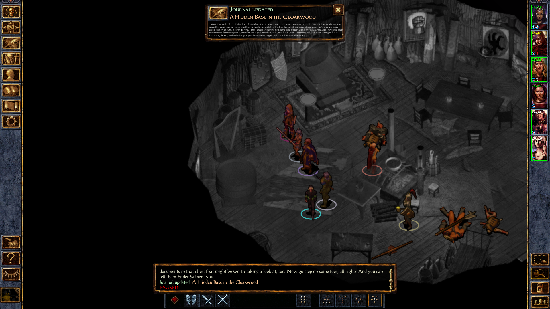
image

What are other people's thoughts on the new popups?

Comments

  • SilverstarSilverstar Member Posts: 2,207
    I mostly agree. I'm not sure the popup being as wide as the dialogue box is a good idea. On smaller screens and resolutions, that might be too much. As for controlling how long it's on the screen, a slider toggle like the tooltip delay one would be neat.
  • KilivitzKilivitz Member Posts: 1,459
    I believe the pop-up height and not the font size should be dependent on the entry length.
  • BelegCuthalionBelegCuthalion Member, Mobile Tester Posts: 454
    Adjusting hight to the content may lead to situations on some screens where the journal popup and the log window could overlap. it would have to be truncated at some point with a "read the whole entry" button to the journal. the alternative to truncate it after x characters / words would be to create short excerpts of each entry with limited string length, but creating that of each entry is too much work to do in all languages, doubling wrong spelling and the like. can of worms better stay closed.
  • byrne20byrne20 Member Posts: 503
    I really like the new journal system. I think it is a vast improvement on the old one. But I do agree with your first point. It would be nice if clicking on the pop up would then direct you to its entry in the new Journal. Other than that I'm very impressed with the overall layout of the journal and how it works. Great stuff
  • PaladinPaladin Member Posts: 335
    I agree that the text being too small to read renders the popup sort of pointless. At that point, you might as well just have the header for the entry, and not the subtext. Thanks for bringing this up.
  • PaladinPaladin Member Posts: 335
    Off topic, but I still can't get over the impact that those black outlines make on the character sprites. It's neat, it sort of reminds me of what Nintendo did with Smash Brothers on the handheld.

    I can't decide if I like it or not. Need to get into the beta and try!
  • DurenasDurenas Member Posts: 508
    It's like a pseudo cell-shading effect. Kind of like Borderlands or Wind Waker.
  • DonRadkosDonRadkos Member Posts: 3
    Is there an option to turn them off?
    Forever prefferably.
  • cmk24cmk24 Member Posts: 605
    DonRadkos said:

    Is there an option to turn them off?
    Forever prefferably.

    Yes there is, it is the gameplay options menu.
  • DonRadkosDonRadkos Member Posts: 3
    Tooltip Delay is that it?
  • AncientCowboyAncientCowboy Member Posts: 199
    Gameplay/Feedback/Journal Popups
  • FranpaFranpa Member Posts: 637
    DonRadkos said:

    Tooltip Delay is that it?

    No, it's listed in Feedback settings.
  • DurenasDurenas Member Posts: 508
    It's not up long enough for me to read the popup text - maybe it should only be the title?
  • OrangemooseOrangemoose Member Posts: 83
    I thought that we were told that the journal popups were going to be a sort of quick summary of what the journal entry itself was going to be so when I found out it was a word for word thing and something I sometimes didn't even have the time to actually read anyway I was pretty disappointed.
    That coupled with how buggy it is and that you have to close your item/stat pages to open the journal has just put me off of it completely.
    I honestly don't see how it's any better than what it was before.
    The pop-ups if fixed would be a nice addition but the journal itself doesn't really add anything.
  • FranpaFranpa Member Posts: 637
    edited April 2016
    They either need to extend how long their displayed for (With an X or Continue button to quickly dismiss them) or have them stay on screen and require us to click a button to dismiss them. As it is, I just turn off the functionality.

    Ideally they'll implement my suggestion to display quest information like it did in v1.3 (When journal popup is disabled): https://forums.beamdog.com/discussion/49831/presentation-of-journal-quest-updates?new=1
  • cmk24cmk24 Member Posts: 605
    Given that the new UI modding is very easy I just modded my game to make the journal popup larger so the text can be read easily for long entries. I do like that the popup is the same as the journal entry, before I never actually took the time to read the journal, so the popup has makes it so I do.
    Amberion said:

    It's not up long enough for me to read the popup text - maybe it should only be the title?

    As I said in the first post, pausing the game prevents the popup from going away, so there is a way for people to choose how long it stays up.

Sign In or Register to comment.