Comparing the old and new character record UI. Is it final ?
 00zim00
Member Posts: 267
00zim00
Member Posts: 267
Edit Thread Moved: I know there is a new thread similar to this one already here but as Dee said, "It's gone a little far away from the SoD UI" so it has been moved here ")
Edit: So apparently there is a 2.0 beta patch for bg:ee and bg2:ee i had no idea about which has relevant information.. guess the feedback would have been better posted there if i knew about it lol. Still, i think my points are still valid.
Please know I have been a huge fan of the baldurs Gate series and beamdog for many years and I am in no way trying to belittle their amazing work. But one thing caught my eye that i had to bring up.
On one of the recent streams we were show what the new UI for the character record screen looks like. My question for the devs or anyone who might know. Is this the final design or was it a temporary place holder screen that still had work to be done?
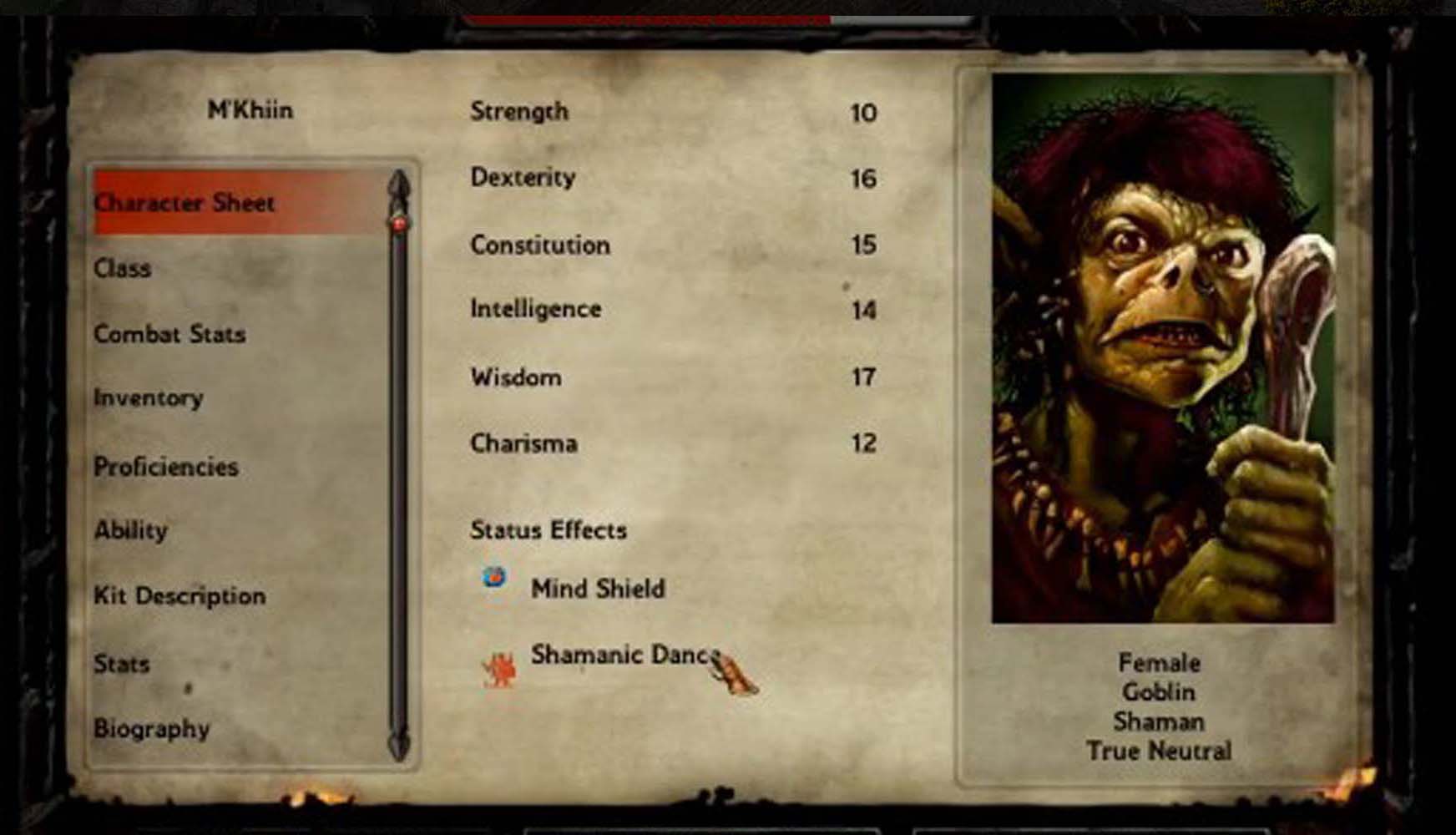
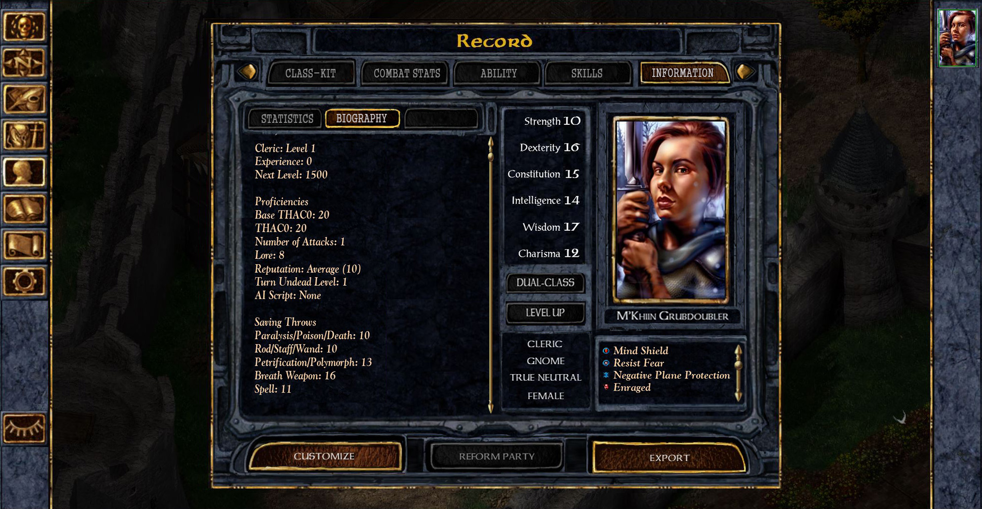
The first image below is showing M’Khiin Grubdoubler with the new UI. The reason I ask is it the final version is because it seems to be lacking character and is kinda bland compared to the original BG. Most noticeable is the lack of visual flavor the old menus had.
(New UI)
http://imgur.com/z3mIioU
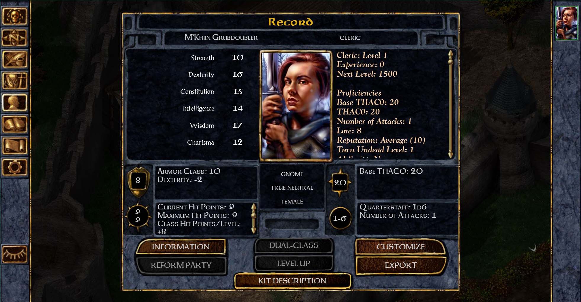
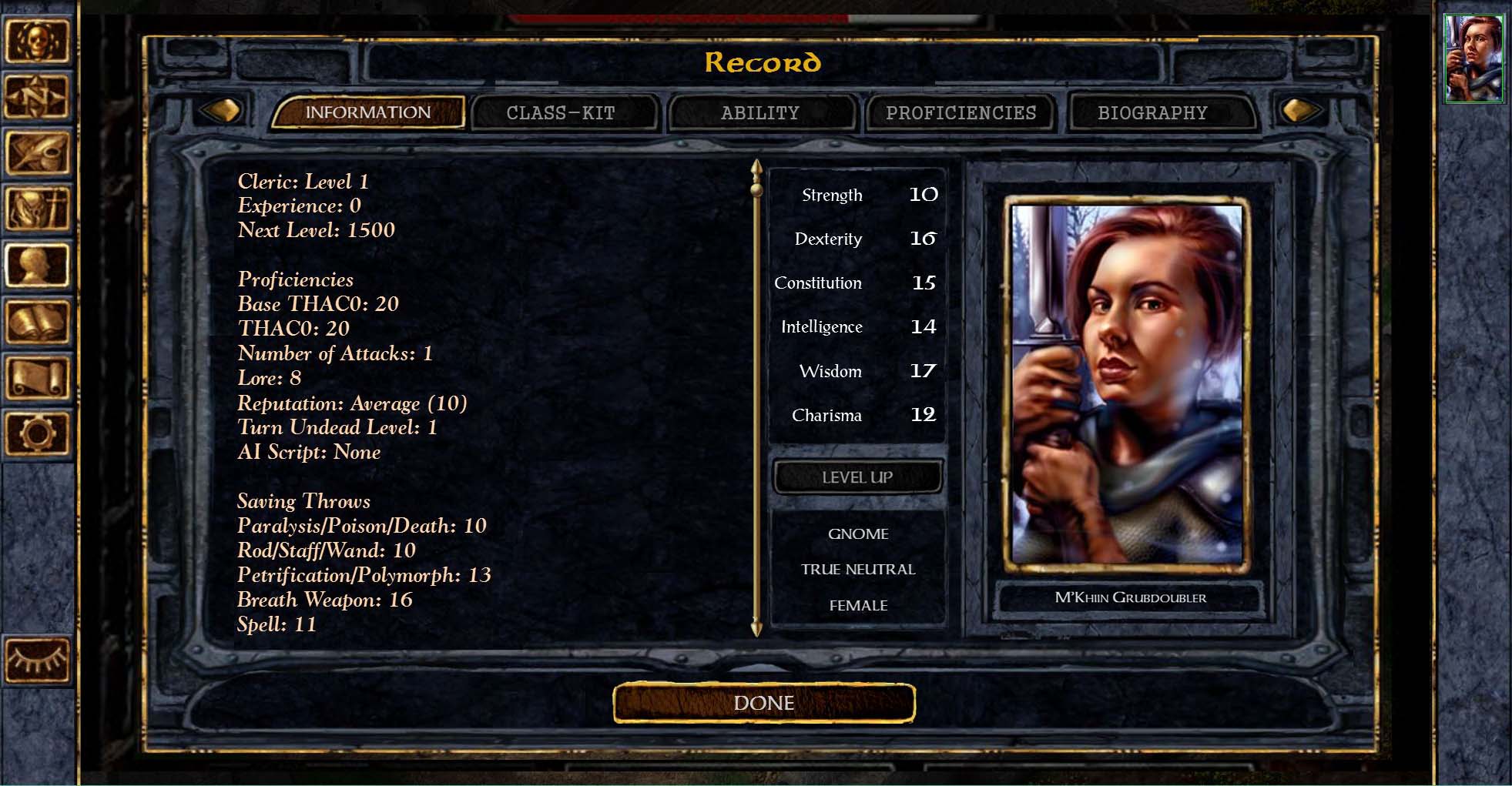
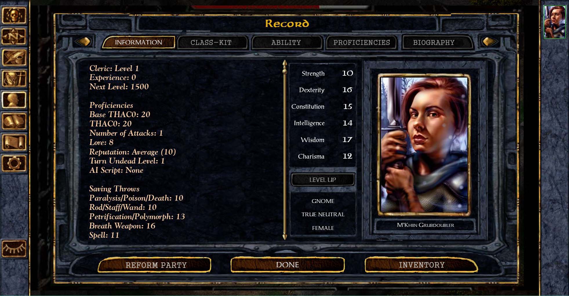
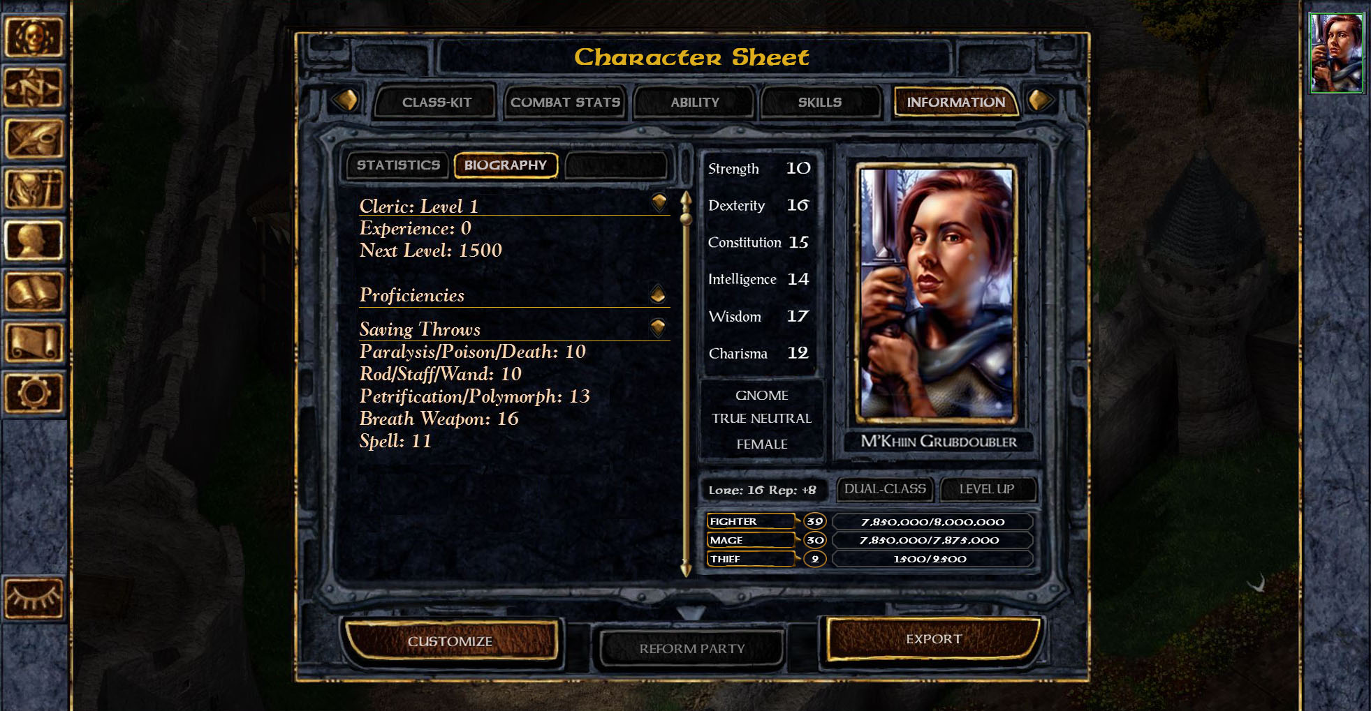
(Original UI)
http://imgur.com/HTgawB6
I dont want to go to much into it unless its confirmed to be the final version otherwise im bringing something up irrelevant. But it feels to me almost streamlined in order to better suit the tablet market. It also has confusing elements that don't make sense such as why is there an inventory tab? There is normally a inventory button on the side panel so its doubling it up. And why are class and kit description separate buttons/categories? It also feels that overall your getting less information at a glance now.
Of course until I play the game I have no idea if that is a good choice or a bad choice. So im going to focus on what i think is the main reason im making this post. The original UI visual design is clearly imo superior to the new UI. Your losing so many of the iconic elements its staring to look like a spreadsheet.
In order to properly compare what i think the UI could look like vs what it currently seems to have changed to I have made my own quick mock-up design to show my point of view. Assuming they are wanting more buttons/categories and a larger area where you can read text. My design is a mix of both the new and old elements. It has a similar layout of the new design but dosnt remove the information people want at a glance. Please also ignore the button names as I just picked whatever to fill in the design and not all information is there but as i said it was a quick design. Also to note with some of what I consider "important" elements missing I have not added them as i assume Beamdog would want those in each of the button categories, even if i might not agree with it.
(My compromising design)
http://imgur.com/Q8Nrbgl
(My design with extra buttons if they are needed)
http://imgur.com/bcDlPRr
Now i know my design far from perfect and im not claiming it to be. Neither am i saying "I hate the new design and will never buy the game without the change!" or something like that. But if it is the final design im just going to be honest and say ill be disappointed.
Thanks for reading
EDIT: New Mock-Up #2 . Details in a few posts below if your interested
EDIT: New Mock-Up #3. Details in first post on second page.
Edit: So apparently there is a 2.0 beta patch for bg:ee and bg2:ee i had no idea about which has relevant information.. guess the feedback would have been better posted there if i knew about it lol. Still, i think my points are still valid.
Please know I have been a huge fan of the baldurs Gate series and beamdog for many years and I am in no way trying to belittle their amazing work. But one thing caught my eye that i had to bring up.
On one of the recent streams we were show what the new UI for the character record screen looks like. My question for the devs or anyone who might know. Is this the final design or was it a temporary place holder screen that still had work to be done?
The first image below is showing M’Khiin Grubdoubler with the new UI. The reason I ask is it the final version is because it seems to be lacking character and is kinda bland compared to the original BG. Most noticeable is the lack of visual flavor the old menus had.
(New UI)
http://imgur.com/z3mIioU
(Original UI)
http://imgur.com/HTgawB6
I dont want to go to much into it unless its confirmed to be the final version otherwise im bringing something up irrelevant. But it feels to me almost streamlined in order to better suit the tablet market. It also has confusing elements that don't make sense such as why is there an inventory tab? There is normally a inventory button on the side panel so its doubling it up. And why are class and kit description separate buttons/categories? It also feels that overall your getting less information at a glance now.
Of course until I play the game I have no idea if that is a good choice or a bad choice. So im going to focus on what i think is the main reason im making this post. The original UI visual design is clearly imo superior to the new UI. Your losing so many of the iconic elements its staring to look like a spreadsheet.
In order to properly compare what i think the UI could look like vs what it currently seems to have changed to I have made my own quick mock-up design to show my point of view. Assuming they are wanting more buttons/categories and a larger area where you can read text. My design is a mix of both the new and old elements. It has a similar layout of the new design but dosnt remove the information people want at a glance. Please also ignore the button names as I just picked whatever to fill in the design and not all information is there but as i said it was a quick design. Also to note with some of what I consider "important" elements missing I have not added them as i assume Beamdog would want those in each of the button categories, even if i might not agree with it.
(My compromising design)
http://imgur.com/Q8Nrbgl
(My design with extra buttons if they are needed)
http://imgur.com/bcDlPRr
Now i know my design far from perfect and im not claiming it to be. Neither am i saying "I hate the new design and will never buy the game without the change!" or something like that. But if it is the final design im just going to be honest and say ill be disappointed.
Thanks for reading
EDIT: New Mock-Up #2 . Details in a few posts below if your interested
EDIT: New Mock-Up #3. Details in first post on second page.
Post edited by 00zim00 on
14
Comments
As for fitting on non-wide screens, the image i made is extra wide and there is alot of empty space where the main text is, as well as the button sizes can easily be reduced to fit the non wide screen monitors if it ever came to that. But i do understand your point
The new UI is a disaster. Mixing skeuomorphic and minimalistic UI elements detracts from the charm that the original UI had.
It's not about nostalgia. It's about good aesthetics and functionality. Rectangular crimson highlights look like they belong on a PDA interface, same for the new black rectangular popup windows (that replaced animated parchment scrolls... why?). There's too much 'whitespace' in between all of the menu entries. Why is there a scroll bar for like 5 pixels below 'Biography'? Why does the 'Character Sheet' screen have the same information as the 'Stats' screen, and why doesn't it display all of the information like any PnP player would expect it to? Why do some menus (main menu, save/load, inventory, gameplay interface) use purely skeuomorphic UI elements with depressed buttons and then other menus (character creation, character sheet) replace buttons with highlighting? Why in Bhaal's sinister name do we need gigantic vector selection circles?
It's madness!
It's obvious that the current rendition is intended for tablet users, and obviously the UI was not Beamdog's top priority. That still doesn't excuse the awful new appearance. At the very least they could have made a second interface for PC users assuming, of course, the UI is as easy to mod as Beamdog claims. Or hell, they could have just added the new modability and kept the old layout and assets.
If I have to put up with the new UI in order to play SoD I will, but it's only a hindrance to my enjoyment. I dread the thought of having the UI changes permanently alter BG:EE.
Hopefully modders will fix this eyesore.
I hope it doesn't seem like I'm being unduly harsh. I fell in love with this franchise many years ago, and I want to make sure that SoD is the best possible experience for myself, other BG veterans, and new players alike.
I'll have more to say on this and several other topics next weekend.
Dee made a strong post over in a thread in the Road To V2 Forum, which seems to be relevant here. Source: https://forums.beamdog.com/discussion/48317/i-do-not-like-the-simplification-of-character-details-in-inventory-ui/p3
I don't think it's fair to say that this was done with a tablet-first approach. We don't know that. I think Beamdog knows that their primary user base are fans from the PC-game. Alienating them wouldn't make good business sense. All that said, I do prefer the original UI, too. I like the ideas that Beamdog has put forth with these updates, but not the execution. I would prefer something with a bit more character. But, this is all just personal preference.
Thanks,
~Pally
I think most of the choices i made are self explanatory as to why they are better then the current menu. But because I am planing to make a larger post with my thoughts over on the 2.0 beta forums which will explains things outs. I thought it better not to double up a post as there is a main feedback post there to do with the menu UI. So ill post a link to there once i finish writing it but i still wanting to continue the discussion here.
Below is the new mock-up, ill go into some of the basics as to why I think something like this would have been a better approach. The second image is numbered to make it easier.
1) Combined similar categories. The names are just examples but the basic principle is you pick the option that best suits the information your looking for.
2) These buttons change based on what button on the first line is selected. Eg: Combat Stats adds Combat Stats + proficiency and perhaps things like Skills. It all depend on what information is closely related and what information deserves its own main button.
3) This is where the information is displayed
4) Arrow buttons that move the main options back and forth. Mostly there for aesthetics.
5) Main important information there at a glance, not everything is there but it helps to bring the feel back to the original Baldurs gate.
(New Mock-Up - All names and information shown are just examples to show the design)
Any and all feedback would be welcome
As for the look i prefer the original baldurs gate design or my first mockup but it was my attempt of merging the look of the old with the elements of the new such as all the extra categories and extra viewing space but without having to scroll though a dozen things in a list to find the information you wanted.
Curious if you think its better then the new UI and is there any elements of this new mock-up you dont like in particulate? Feedback is helpful
Try at least using a font without serifs.
Only good thing is that it's going to be more moddable, looking forward for that.
@00zim00 Your mockup looks really nice. I don't know how needed that #2 menu is. Also would considering getting exp info onto the info screen.
But I am positive that beamdog will review any feedback you may have to improve their gui to please the players. Just.... This topic should be in the v2 forum....
Also, if any of you have checked out the public beta and experienced the UI changes first-hand, I encourage you to fill out our feedback survey. There's a link in the Road to v2.0 forum.
I absolutely hate the unnecessary and arbitrary changes that Beamdog are proposing to the character sheet in the current beta. Looks so crap and out of place and wasn't even requested or wanted in the first place. Not to mention it removes loads of functionality and easy-to-glance-at information hidden behind more navigation and sub categories.
This idea here and these mock-ups is a compromise I would be fine with that should make everyone happy, if the character sheet 'must' be changed by Beamdog for whatever reason.
Im going to wait maybe another day or so depending on how inspired I am but mostly to get more feedback then ill make another Mock-up with as many of the suggestions included. I know Beamdog may not even be considering using my designs but i find its the most effective way for me personally to express my ideas!
So keep the feedback coming
My only piece of feedback is I don't like that the main left side panel still contains what amounts to a text dump. It just need a tweak, though. Personally, I think if the "headings" (like Class, Proficiencies, Saving Throws, etc) were somehow bolded and turned into clickables that toggled the details sliding out beneath them, that would take care of it. That would kind of turn it into a hybrid between the 1.3 and current 2.0 UIs, and I think it would hit a sweet spot. Add a hide/show all button, and people who like the 1.3 could even play with all categories shown and get roughly the same effect.
The reason I like this mock-up is that it's the best of both worlds with that text dump still intact, while at the same time allowing for others to use those newer category buttons at the top if they so desire.