Is the black space that you can see an intended look of the end of the map?
 JuliusBorisov
Member, Administrator, Moderator, Developer Posts: 22,974
JuliusBorisov
Member, Administrator, Moderator, Developer Posts: 22,974
This is how the end of a map looks in the BGEE beta (the black space):
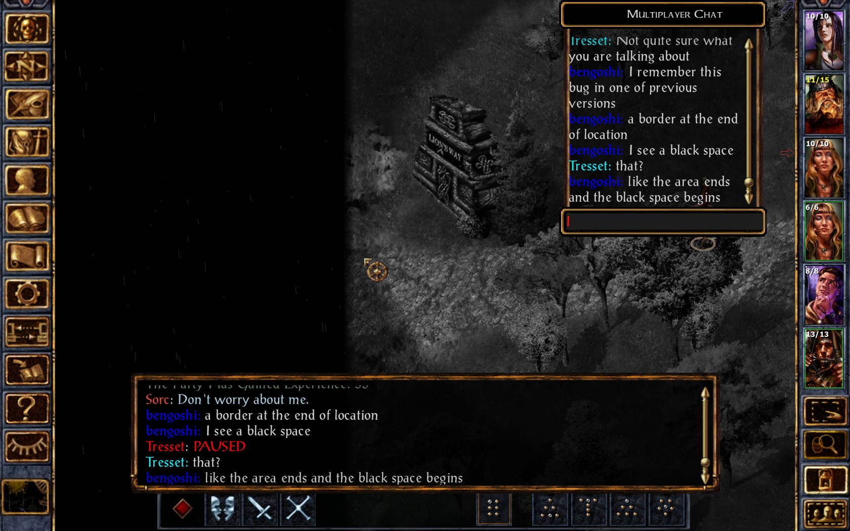
It wasn't like that pre-beta, but maybe it's a part of the new UI?
It wasn't like that pre-beta, but maybe it's a part of the new UI?
2
Comments
You can't believe that this is ok?
Please change this back. I have always been happy with Beamdog's additions up till v2.0
@Dee Maybe you could move those edge-of-the-map signs so that they are not obstructed, or reduce the border in size (possibly to just an inch, no more) instead of half screen!!
I can understand some parts, such as the UI elements, which were really outdated, originally designed for a fixed resolution, though the red selections really irk me, and would look a lot better as buttons, or at least have something matching the theme more closer.
But other parts like these and the "default on" black outlines start to make me wonder.
Honestly, the blue highlight outlines seem useful, but from what I understood, you can only have that functionality if the black outlines are on, so it doesn't seem like I'll get to enjoy them.
If this is needed for the markers to show up well, why not only add this when zooming out instead of also during gameplay.
This feels like a really cheap fix for that, though. Making it optional so those that have problems with the Quick Loot bar would help out a lot, though even in those situations, they should be able to do it so that it only works on the bottom of the map, and only up to the quickbar, similar to how it only works up to the bottom UI bar as well.
I think it is the lesser of two evils.
Big black borders, or having to close the quickloot bar on area transition. I know what I'd pick
They already have dynamic adjustment of how far you can scroll in to the void, they just need to implement finer grained control over it (1 pixel increment/decrements when adjusting dialog box height, with additional fixed amount of distance if Quick Loot Bar is enabled/disabled). Oh and adjust how far out of bounds you can scroll sidewards if the sidebars are collapsed or expanded and don't allow scrolling upwards out of bounds.
Basically they've already accomplished all of this in Ice Wind Dale, the dialog window height controls how far you can scroll in to the void at the bottom of the screen and the state of the side bars (collapsed or expanded) determines how far you can scroll sidewards. Just add support for the Quick Loot Bar to affect how far downwards you can scroll in to the void and bam, no more issue of it blocking you from progressing south!
Example of their current Ice Wind Dale v1.4.0 implementation:
Basically just implement Ice Wind Dale's system with the height flexibility of the Baldur's Gate system and take the Quick Loot Bar height in to account while you're at it.
When I clicked this thread I was expecting this to be a discussion on said glitch. I'm very surprised to see this is an intended feature...
Hopefully Beamdog can implement this in the BG series.
It breaks immersion for me. Especially when the eagle gets stuck in that black space.
There are some good things about this patch but I would traded all of them for more content or an earlier release date.