[Mod] Improved inventory screen (BG1EE/SOD/BG2EE)
 lefreut
Member Posts: 1,462
lefreut
Member Posts: 1,462
Hello,
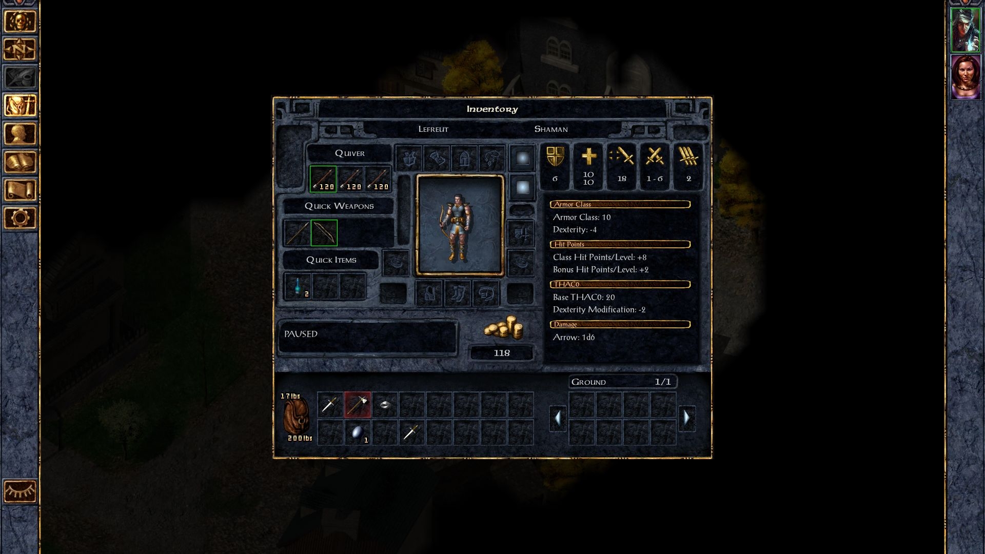
This tweak implements the improved inventory screen (see the discussion here).
I have fixed the issues reported by @Mr2150 and I have made a version for all 3 games so I decided to post everything in a new topic.
Here is what it looks like in game:
Installation:
Each archives contain a full UI.menu if you want to quickly test or if you don't have any other UI modifications. Otherwise, the text file contains the code. You need to replace the code for your UI.menu file from these lines
to before these lines
The UI.menu and the 3 pngs must be copied in the override folder of the game.
If you don't want the item comparison feature, you only have to change this line
Changelog:
v0.3: Add scrollbar to ground items. Reduce png size.
v0.2: Add version for all 3 games. Fix item comparison when the average damage is the same.
v0.1: Initial release
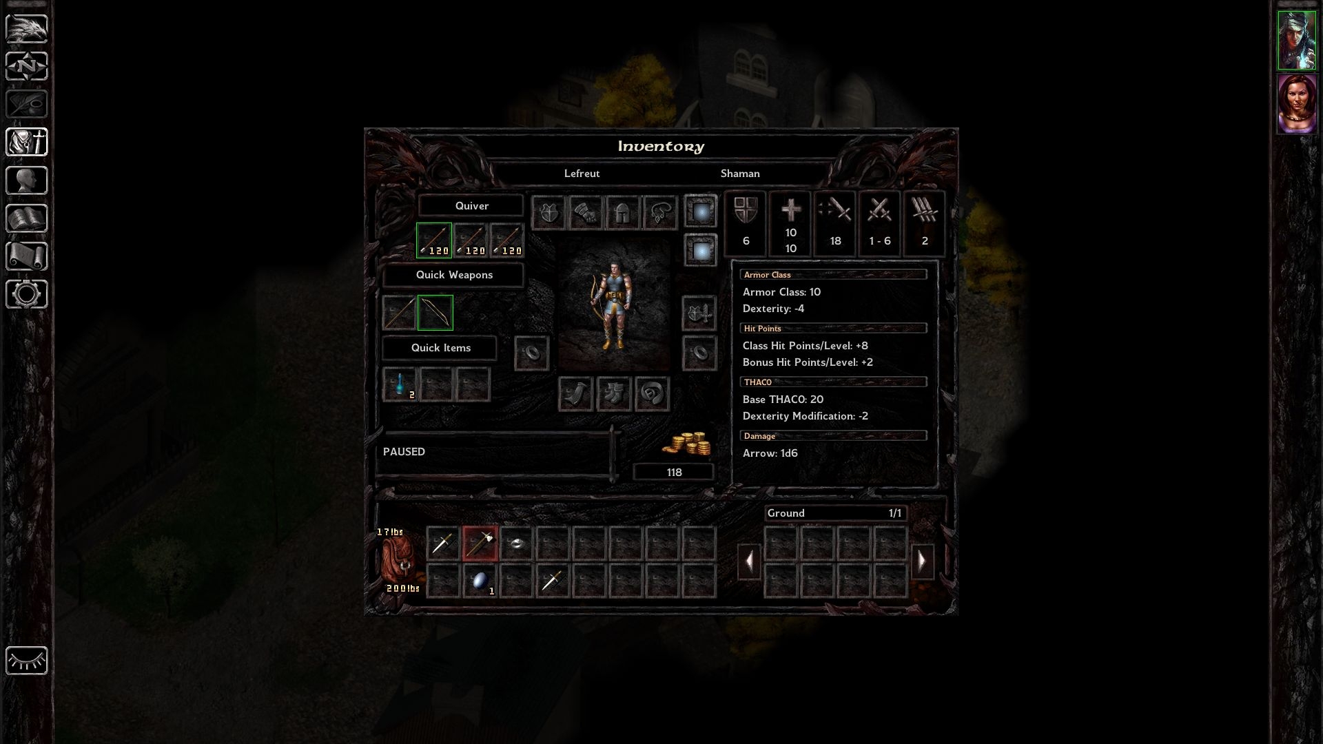
This tweak implements the improved inventory screen (see the discussion here).
I have fixed the issues reported by @Mr2150 and I have made a version for all 3 games so I decided to post everything in a new topic.
Here is what it looks like in game:
Installation:
Each archives contain a full UI.menu if you want to quickly test or if you don't have any other UI modifications. Otherwise, the text file contains the code. You need to replace the code for your UI.menu file from these lines
`
TEXT_inventoryError = ""
to before these lines
`
SLIDER_color_hair_start = 1
The UI.menu and the 3 pngs must be copied in the override folder of the game.
If you don't want the item comparison feature, you only have to change this line
itemComparison = trueto thisitemComparison = falseChangelog:
v0.3: Add scrollbar to ground items. Reduce png size.
v0.2: Add version for all 3 games. Fix item comparison when the average damage is the same.
v0.1: Initial release
Post edited by lefreut on
16
Comments
Thanks for the mod
You should use Inventory-SOD. But Dragonspear UI++ also change the inventory screen, both tweaks are not really compatible.
Yes UI.menu is a text file, you can edit it with any text editor.
Thanks for answering, gonna sugest to @Pecca something similar for his mod. Many thanks.
Thank you for your continued work with this!
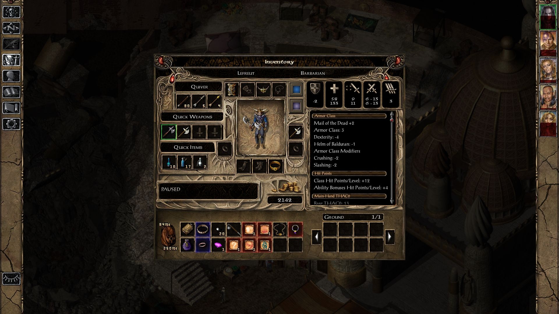
I do have to add though that, for me personally, I still don’t like it nearly as well as the ver. 1.3 layout. There is still a lot of text jumping around leaving me feeling very distracted. It all emphasizes the feeling of a stat sheet, instead of an inventory.
I really wish they would give us the option of a version 1.3 inventory screen.
This takes nothing away from your work on this though, which is wonderful.
When the text does change it only changes in the stationary fields, nothing jumps around. Of course some people like having more information available on that page, which is why there was so much discussion involved in coming up with the suggestions that you have duplicated.
For me, all this extra information is not necessary for the quick reference that I need on my inventory page. I have always just right clicked the item for more information if needed, sometimes consulting the record screen as well.
Trying to fit that fifth icon and much more information all into the same inventory screen ends up making it feel cumbersome and distracting for me. The most distracting part being when the different fields jump in and out of existence as you move your inventory items around.
For years now I have enjoyed managing my inventory in what felt to me like a back pack. I pay attention to the stats on items but as a role player I don’t dwell on them. I start loosing that feeling of emersion when the stats start becoming the dominate part of any one screen.
I hope that in the end everyone will have an option that they enjoy playing. And I know many will love this new screen. I just hope that those of us who have generally loved this game the way it was set up before will have that option as well.
For instance wearing studded leather.
Current patch
Version 1.3
And then of course as you take things off and on the information and headers for those fields jump in and out.
Having said that, I didn’t know the item comparison could be edited off yet. I thought that required a patch. Would you mind explaining how that is done?
Thank you for your patience.
OMFG I LOVE THIS MOD! DUDE, YOU'RE THE BEST!
The # of attacks in the upper-right corner is my favorite feature of it!
Can that be turned off so that it just stays the same as not picking it up?
I’m not saying that you should do that in your mod, I’m only wondering if that option is possible.
I tried doing that, but it only disables the item comparison part (ie., the +/- numbers), not the portrait yellow highlighting (which is what irritates me the most).
Thank you again for your work and taking the time to answer my questions.
Loading didn't fix the issue (I tried that first since loading does fix the odd issues I'm having with the dialogue box), but quitting the game entirely fixed it for now. I'm not sure what caused it, though I'll keep an eye out for it happening again.
However, there is a feature request in Redmine that seems to summarize it. Is that feature request an accurate description of your mod?