[MOD] Lefreut's enhanced UI for IWDEE
 lefreut
Member Posts: 1,462
Hello,
I'm glad to release the fourth mod from my enhanced UI mods trilogy This time for IWD:EE.
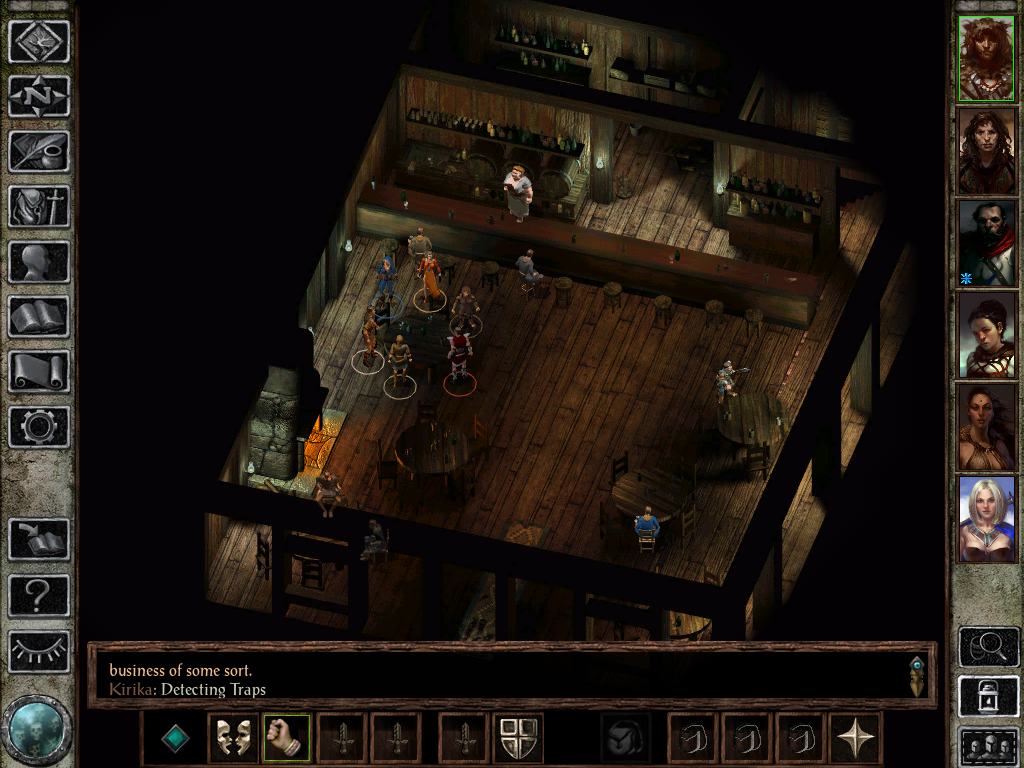
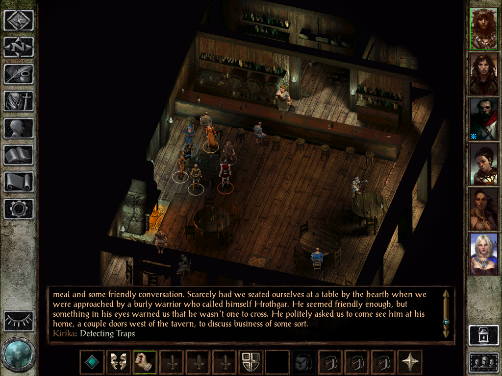
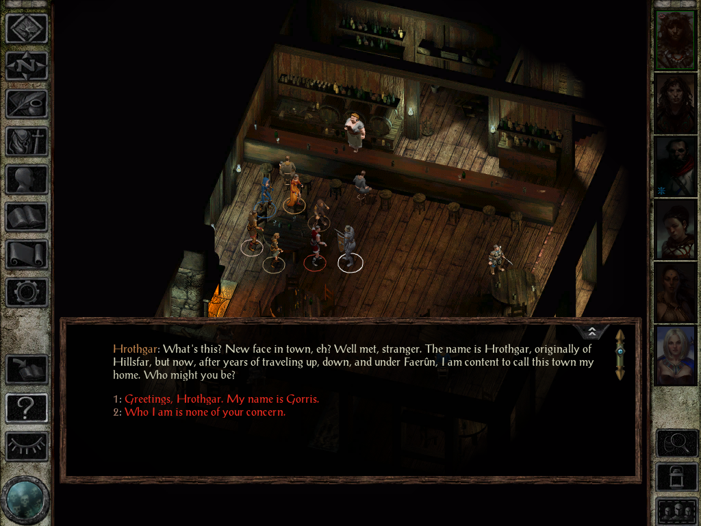
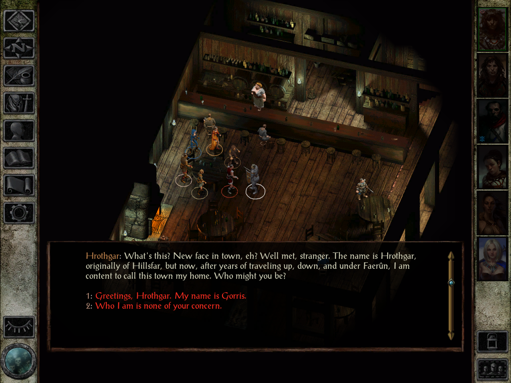
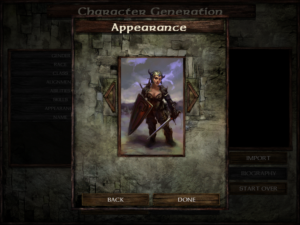
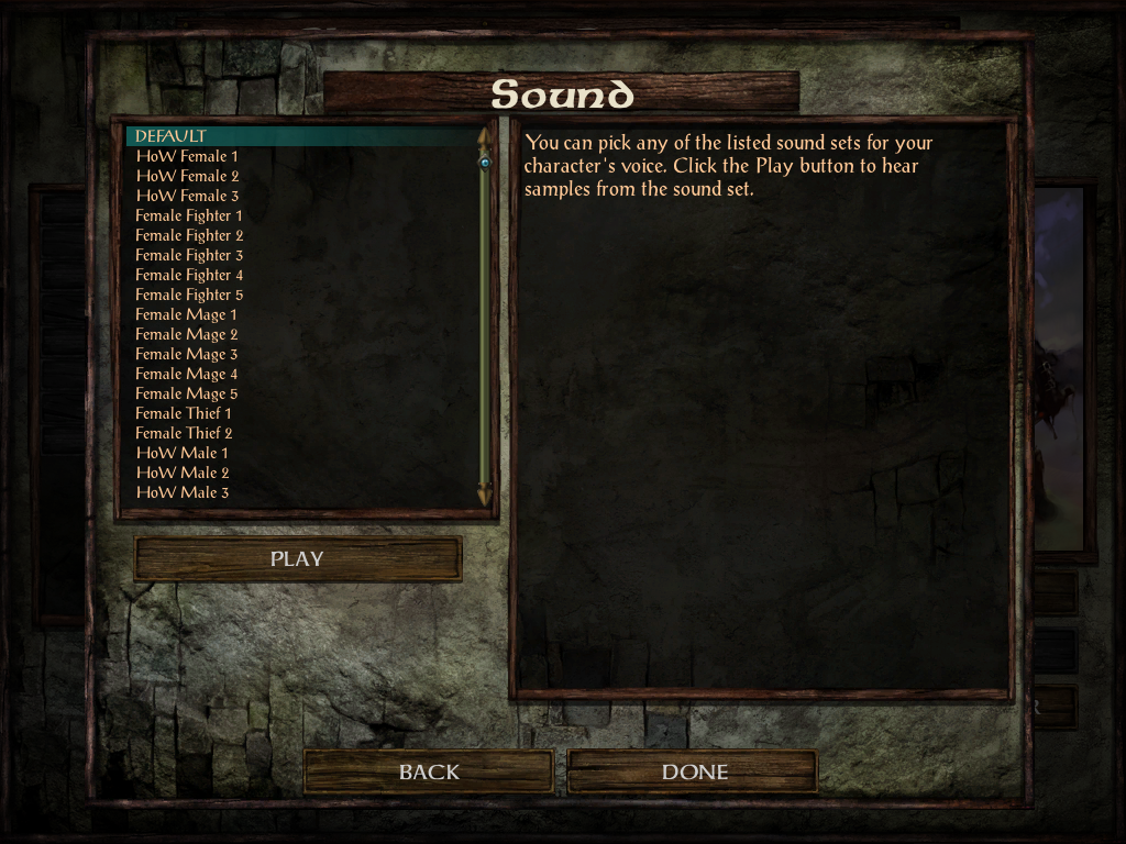
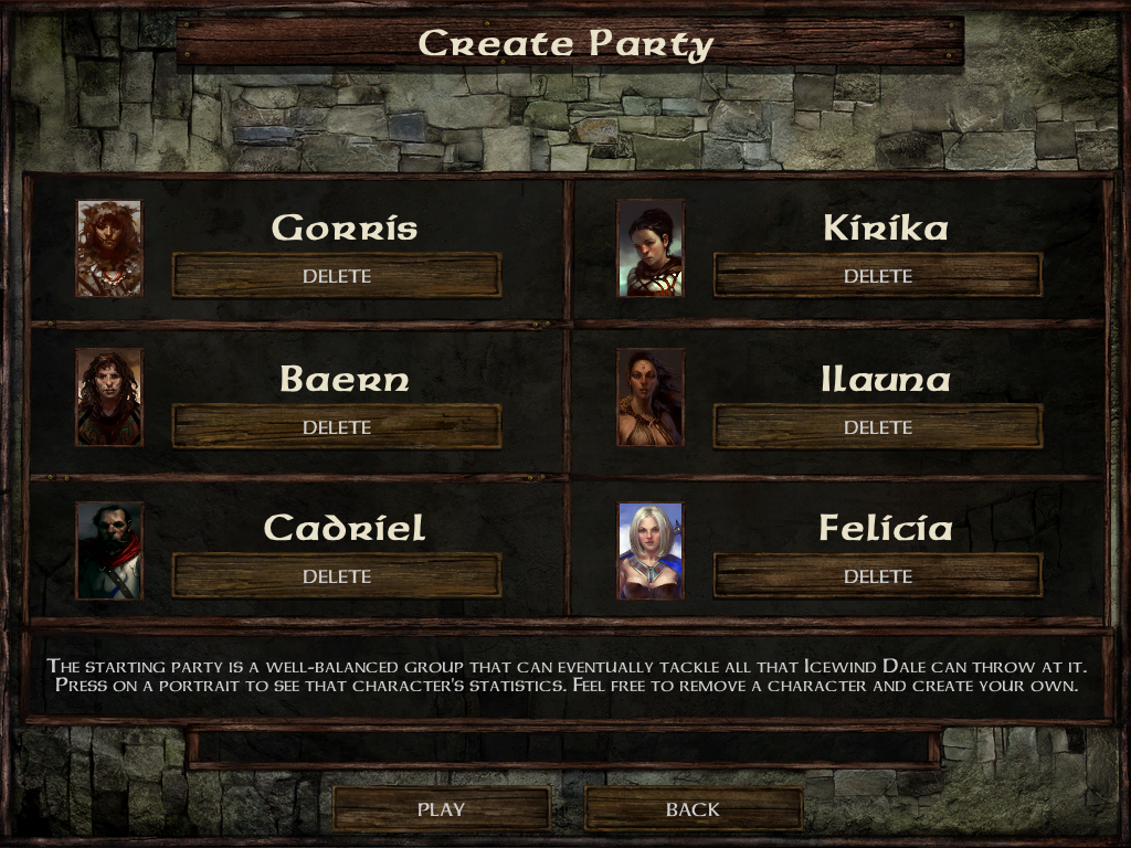
This UI mod contains mostly the same features and tweaks as my other enhanced UI mods so if you're already familiar with them you should like it Otherwise, there are some screenshots in this post so you can see the changes I made.
The record screen is not done because I'm not sure if I want to do it or not, the dialog code is completely new, let my know if it's better than the old code and some other things might differ.
This mod contains the full UI.menu (and resources) and should be used only if you don't have any other UI modifications.
This mod is compatible with IWD:EE v2.5 only.
Extract the contents of the archive into your game folder (the folder which contains the chitin.key file) and then double-click setup-LeUI-IWDEE.exe and follow the instructions on screen.
Modded:
Modded:
Modded:
Modded:
Modded:
Modded:
Modded:
Modded:
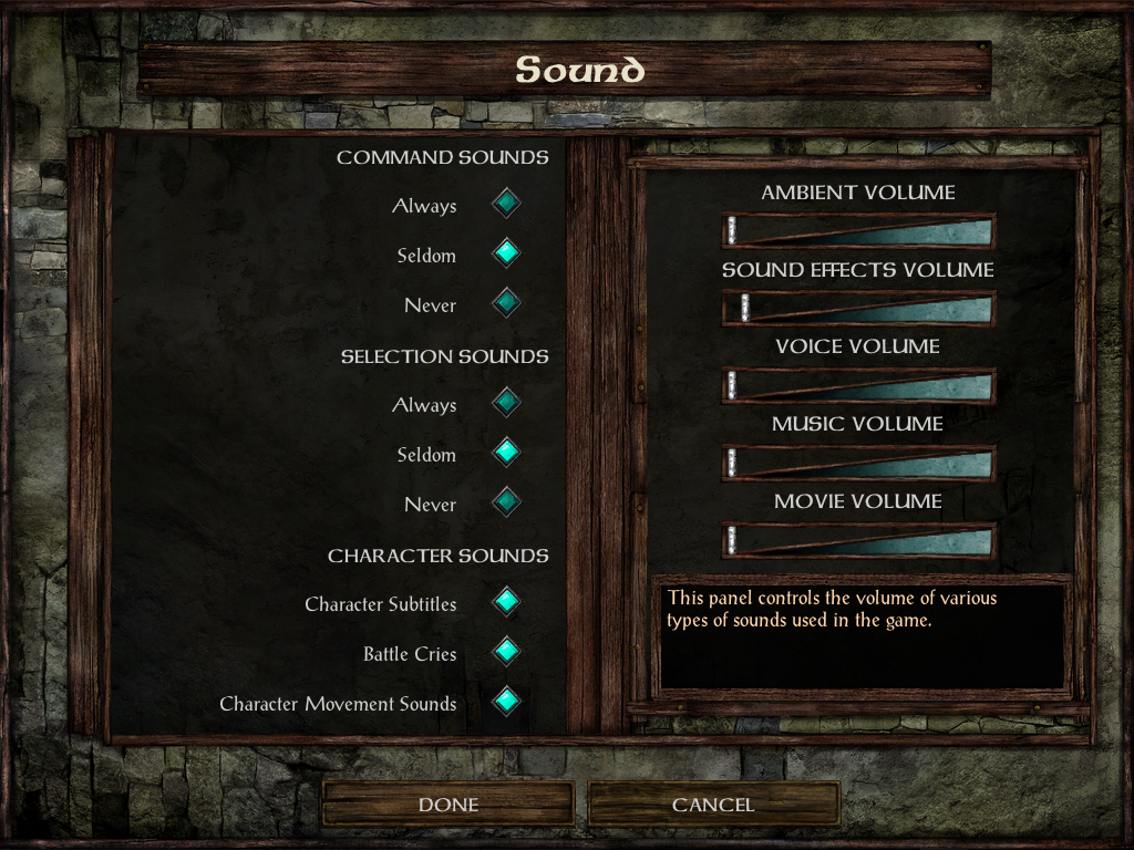
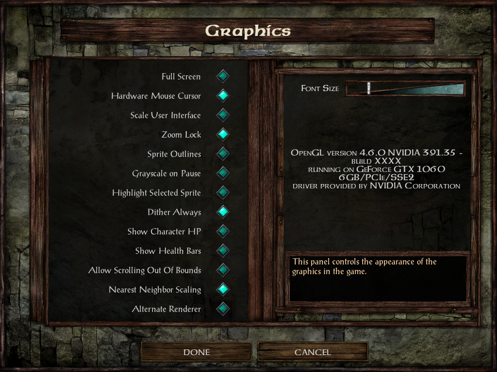
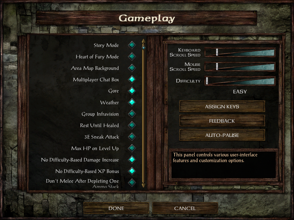
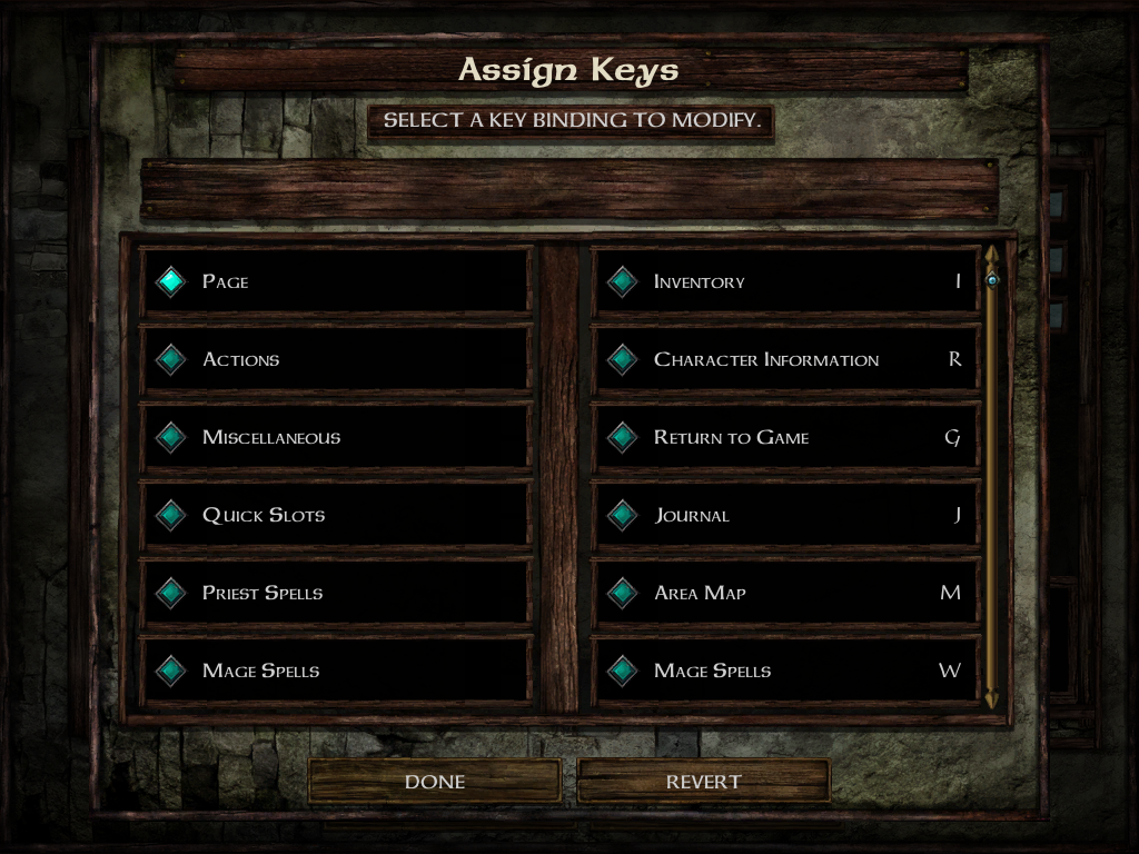
v1.4: Show item name when identifying item in store. Take 'More Confirmation Prompts' into account when removing memorized spells. Tweak text scroll speed in chapter and dream. New dialog code by Adul.
v1.3.1: Update to IWDEE 2.5.17.
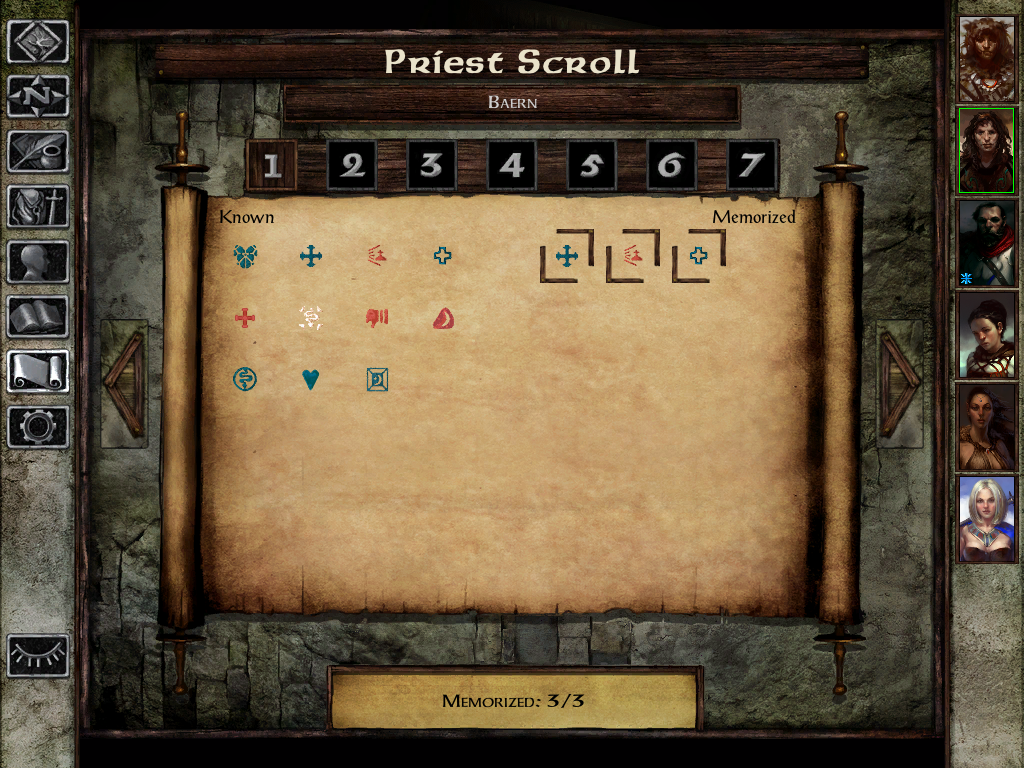
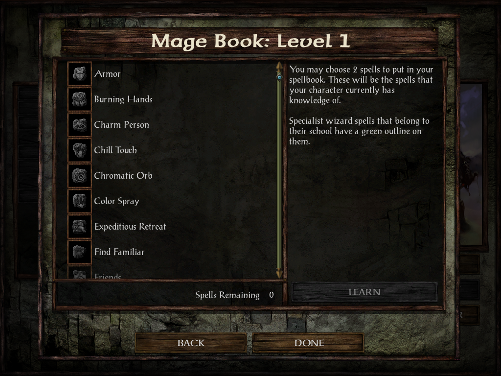
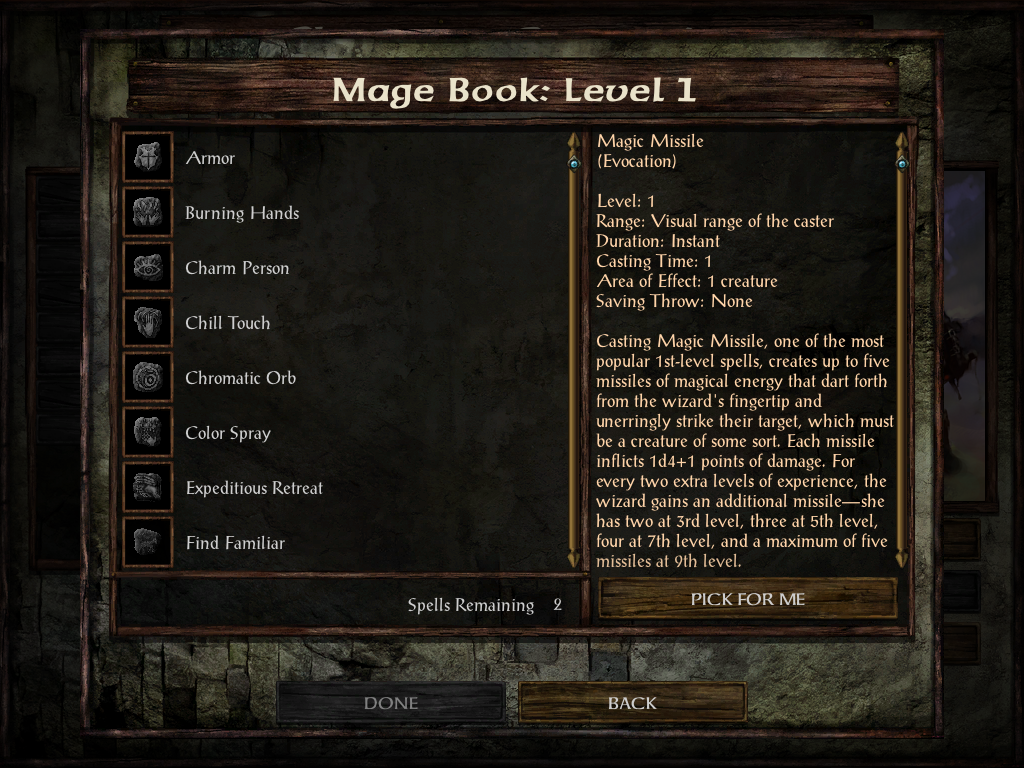
v1.3: Add scrollbar when needed in Mage Book and Priest Scroll screens.
v1.2: Fix HLA screen.
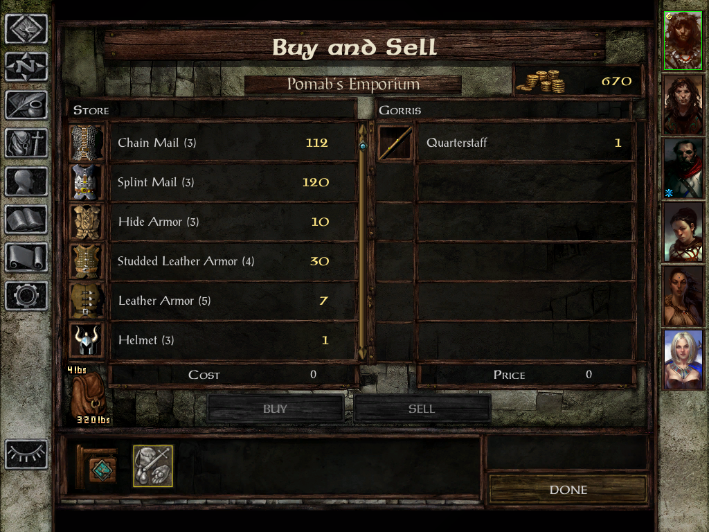
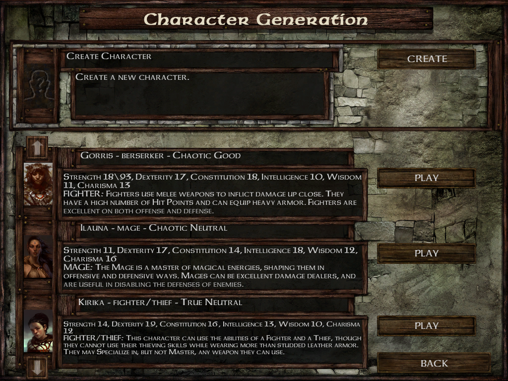
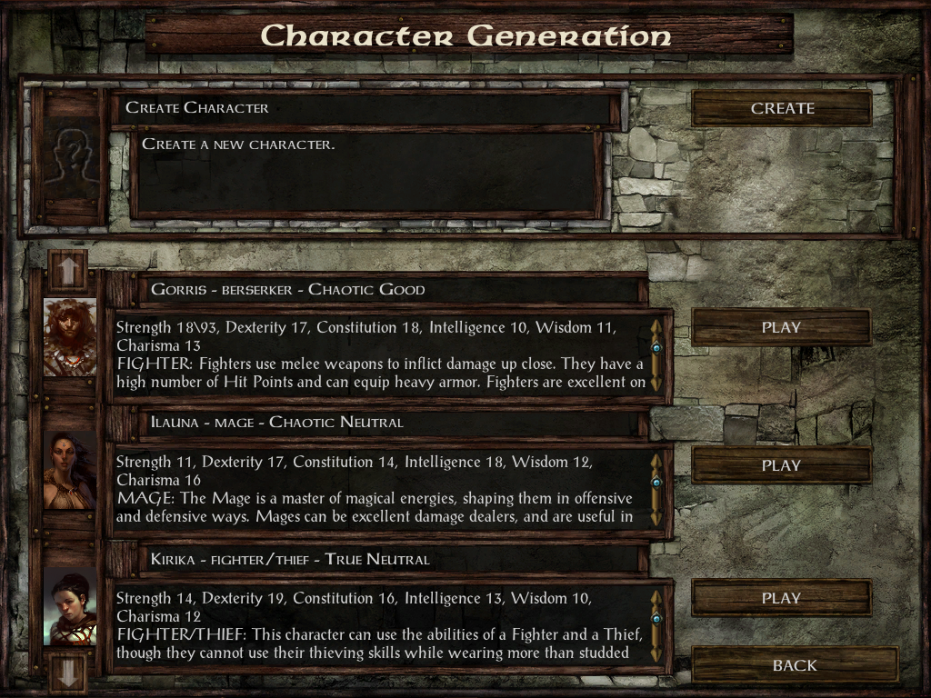
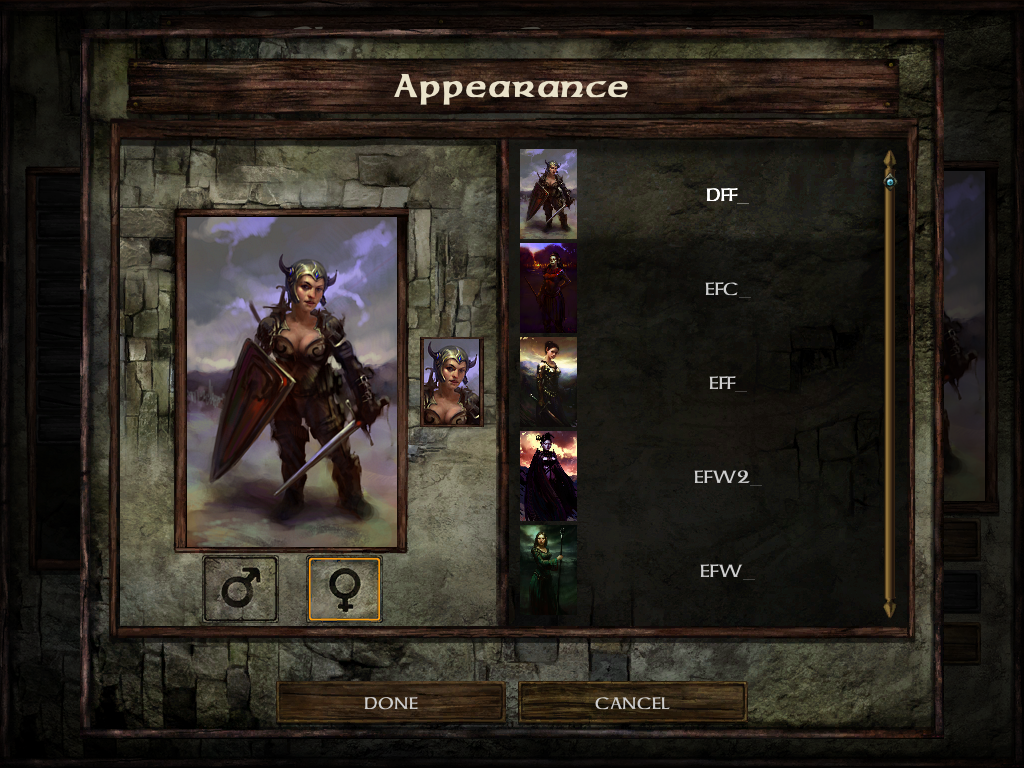
v1.1: Tweak Gender and Portrait screen. Add Select All button in Store and Container screens. Add install option to Show Sidebar toggle button, Quicksave button, Help button and Highlight button.
v1.0: Initial release.
I'm glad to release the fourth mod from my enhanced UI mods trilogy
This UI mod contains mostly the same features and tweaks as my other enhanced UI mods so if you're already familiar with them you should like it
The record screen is not done because I'm not sure if I want to do it or not, the dialog code is completely new, let my know if it's better than the old code and some other things might differ.
This mod contains the full UI.menu (and resources) and should be used only if you don't have any other UI modifications.
Installation:
Download the archive here.This mod is compatible with IWD:EE v2.5 only.
Extract the contents of the archive into your game folder (the folder which contains the chitin.key file) and then double-click setup-LeUI-IWDEE.exe and follow the instructions on screen.
Screenshots:
Here are some comparisons between the default UI and the mod.Main screen
Vanilla:
Modded:

Dialog
Vanilla:
Modded:

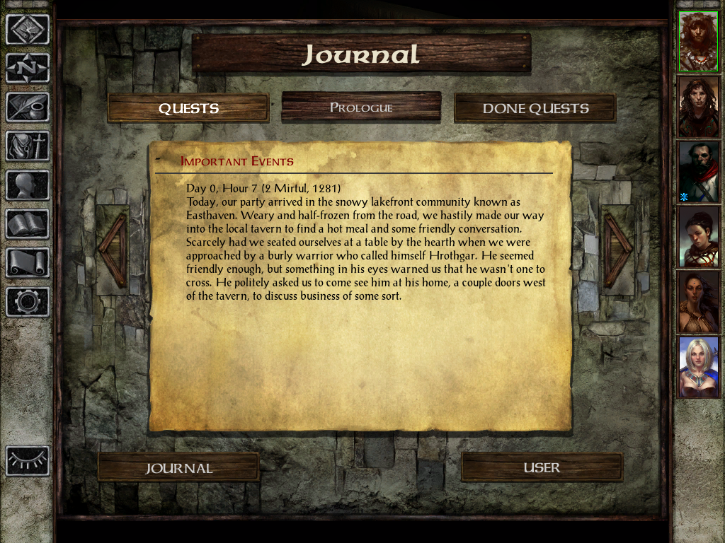
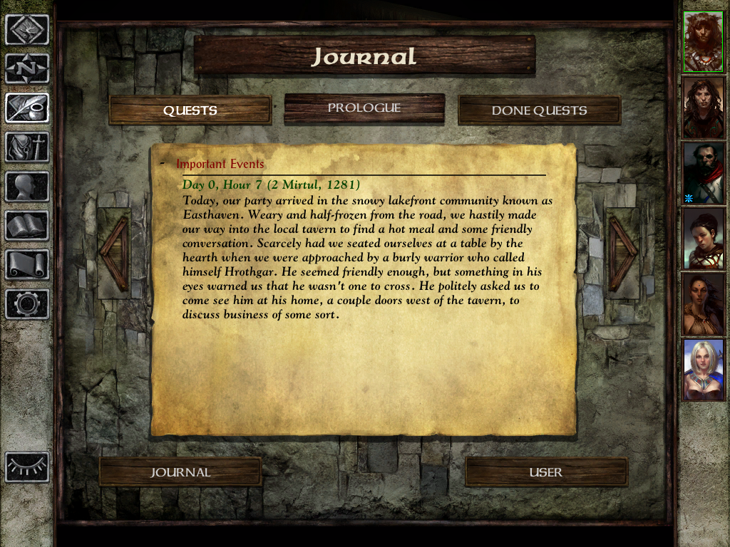
Journal
Vanilla:
Modded:

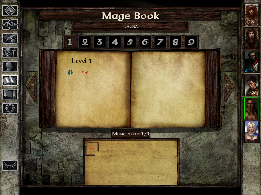
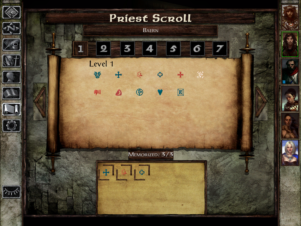
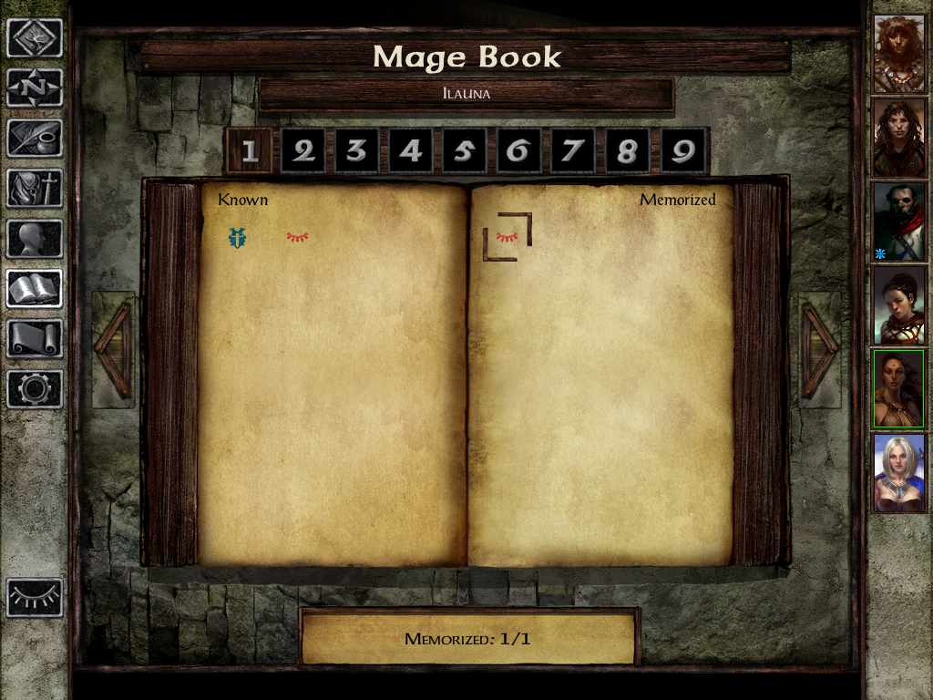
Spells book
Vanilla:

Modded:


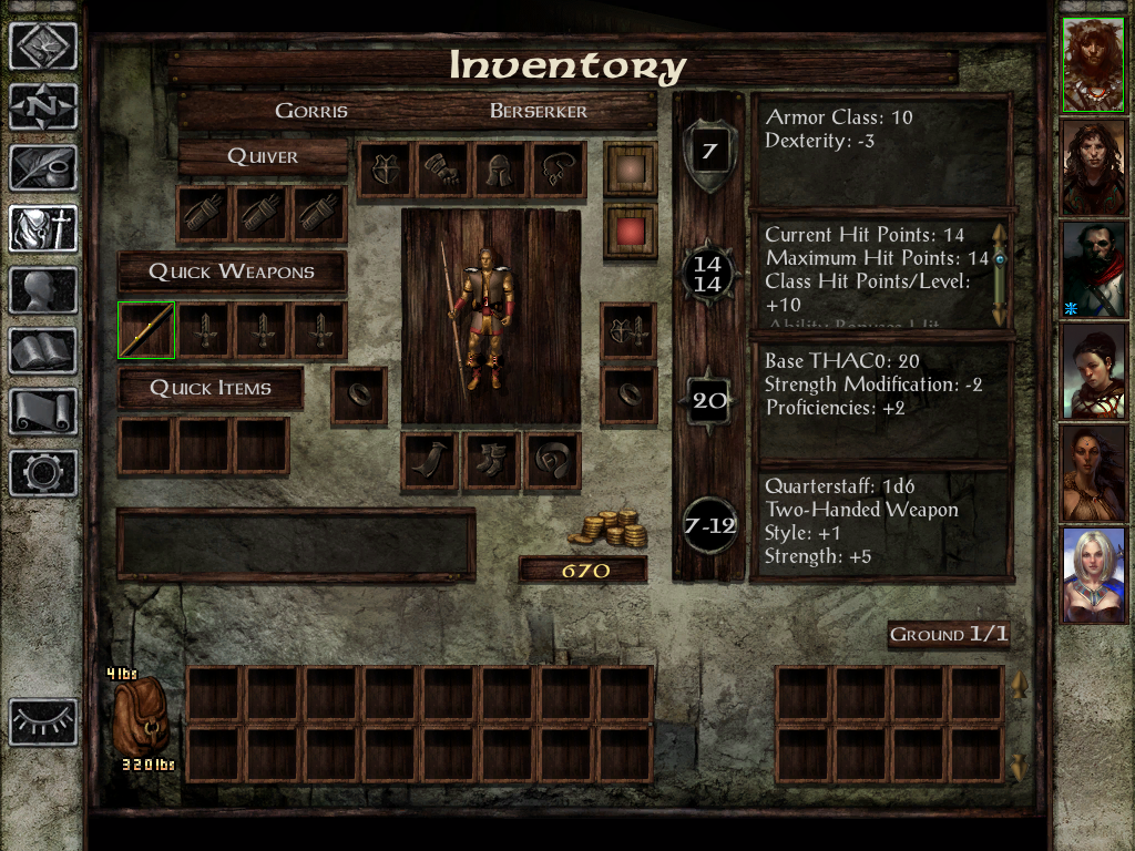
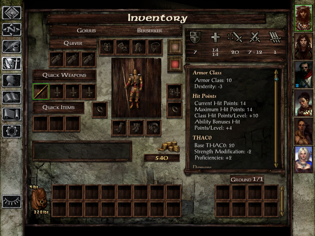
Inventory
Vanilla:
Modded:

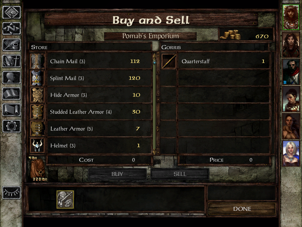
Stores
Vanilla:
Modded:

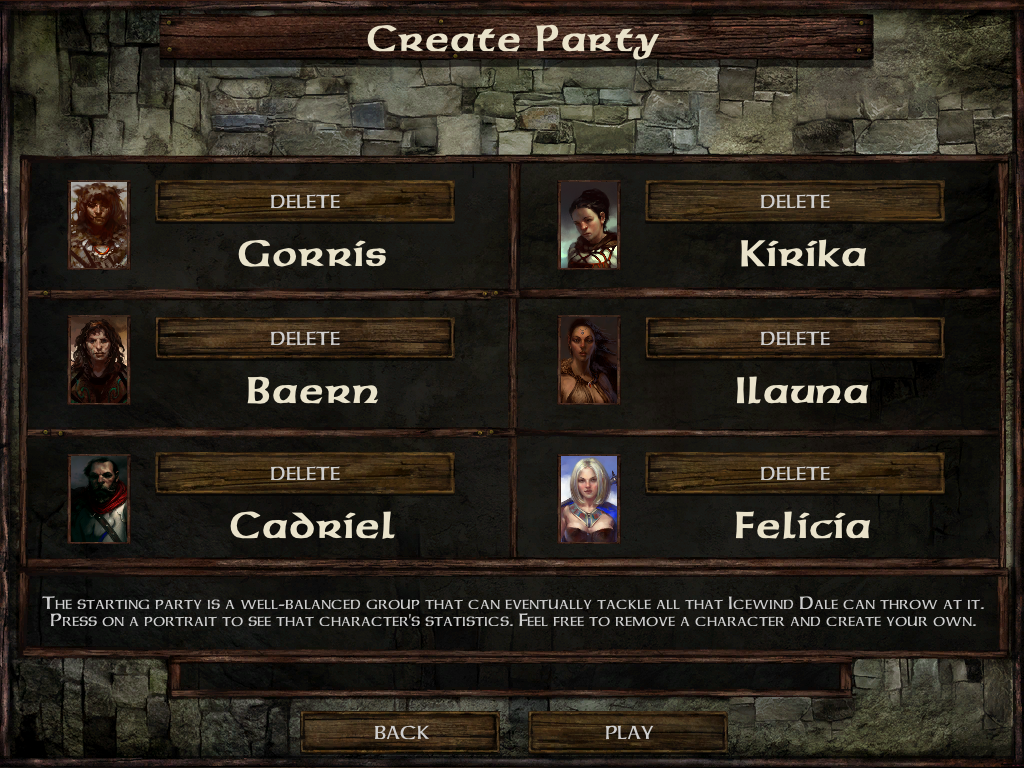
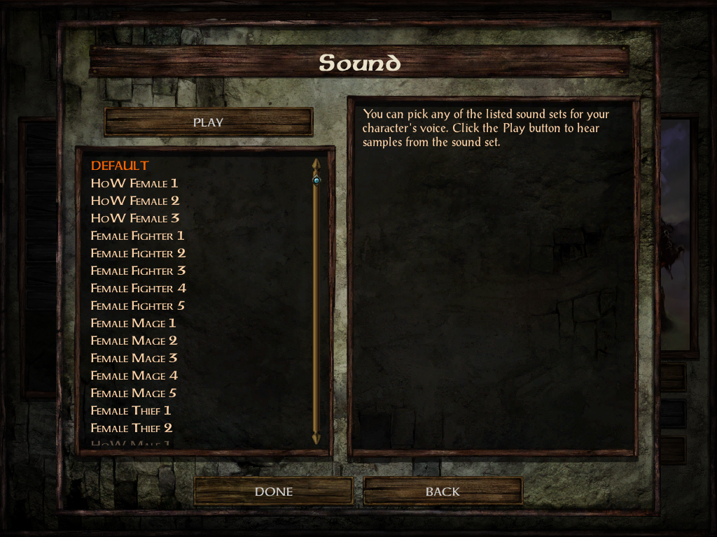
Character generation
Vanilla:


Modded:


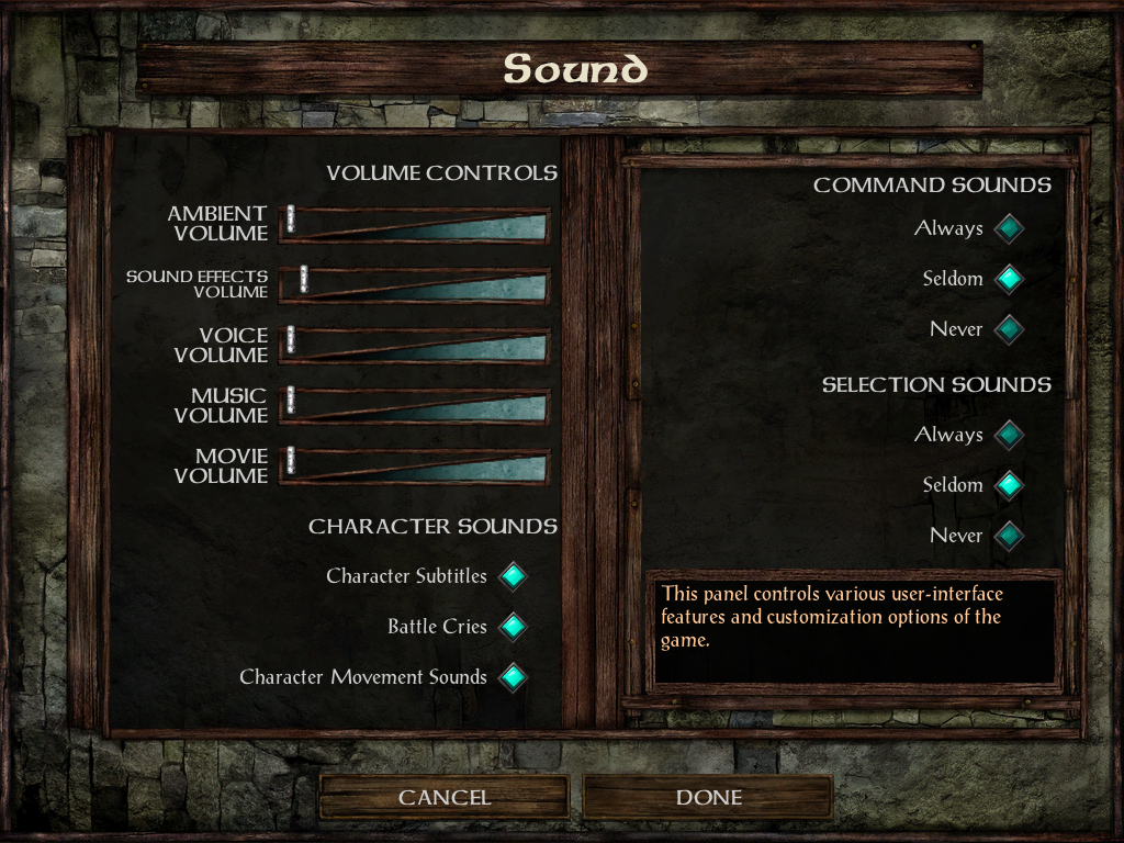
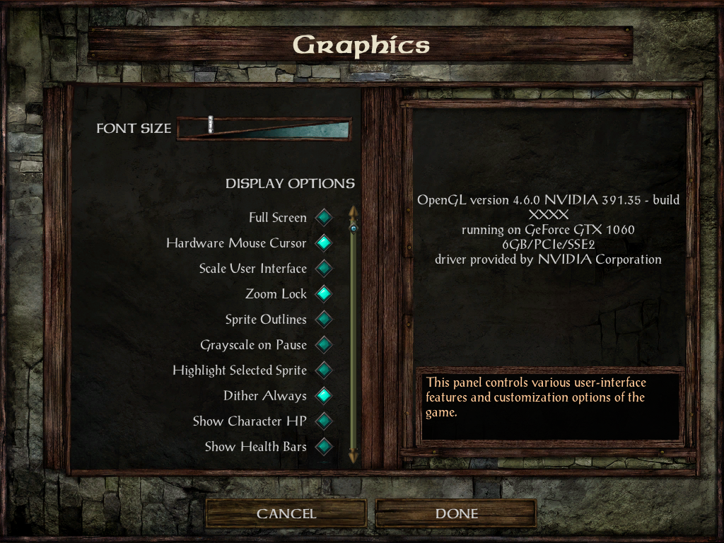
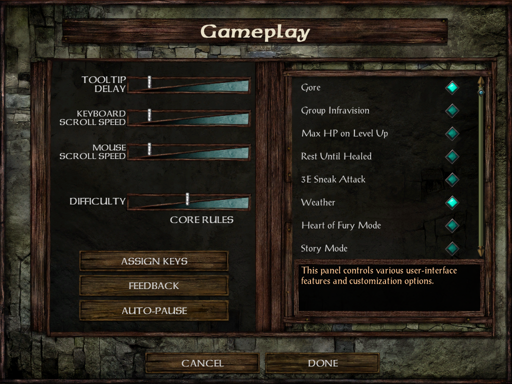
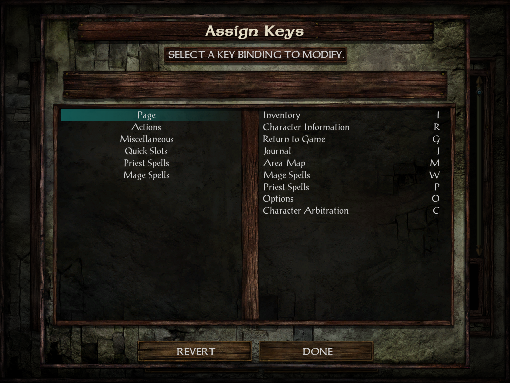
Options
Vanilla:


Modded:


Changelog:
v1.5: Update dialog code.v1.4: Show item name when identifying item in store. Take 'More Confirmation Prompts' into account when removing memorized spells. Tweak text scroll speed in chapter and dream. New dialog code by Adul.
v1.3.1: Update to IWDEE 2.5.17.
v1.3: Add scrollbar when needed in Mage Book and Priest Scroll screens.
v1.2: Fix HLA screen.
v1.1: Tweak Gender and Portrait screen. Add Select All button in Store and Container screens. Add install option to Show Sidebar toggle button, Quicksave button, Help button and Highlight button.
v1.0: Initial release.
Post edited by lefreut on
21

Comments
Thank you so much for this gem!
Picking the Gender and Portrait screen during character creation seems a bit messy. The smaller portrait and gender buttons seem a bit latched on, edging over the UI frames. The portraits on the right side are really dark, making them hard to see, and their names are rather... odd. Perhaps at least show the portraits in the list to the right with their correct brightness?
Secondly, when talking to stores or opening containers, could you add a "Select All" button to the inventory, so one can quickly sell all their junk, or store all viable items into the container?
It never bothered me in BGEE, but perhaps because in BGEE I use a custom image and just quickly find that. In IWDEE I tend not to use custom images, so perhaps it was just more apparent to me.
As for the select all, Pecca's UI had something like that at some point, so it's certainly possible. Not sure if it's easy to pull off, though.
menu
{
	name 'RIGHT_SIDEBAR_BOTTOM'
	align right bottom
	ignoreEsc
	button
	{
		area 0 0 73 55
		enabled "e:IsTouchUI() and worldScreen == e:GetActiveEngine() and showJournal ~= 1"
		toggle selectionButtonToggle
		bam GUILS10
		sequence 14
		tooltip lua "Infinity_FetchString(34764)"
		clickable lua "sidebarsGreyed ~= 1"
		action
		"
			worldScreen:OnSelectionButtonClick()
		"
	}
	button
	{
		area 0 55 73 55
		enabled "e:IsTouchUI() and worldScreen == e:GetActiveEngine() and showJournal ~= 1"
		toggle highlightButtonToggle
		bam GUILS10
		sequence 11
		tooltip lua "Infinity_FetchString(40879)"
		clickable lua "sidebarsGreyed ~= 1"
		action
		"
			worldScreen:SetHighlightEnabled(highlightButtonToggle == 1)
		"
	}
	button
	{
		area 0 110 73 55
		enabled "worldScreen == e:GetActiveEngine() and showJournal ~= 1"
		toggle aiButtonToggle
		bam GUILS10
		sequence 10
		tooltip lua "getPartyAITooltip()"
		clickable lua "sidebarsGreyed ~= 1"
		action
		"
			game:ToggleAI()
		"
	}
	button
	{
		area 0 165 73 55
		enabled "worldScreen == e:GetActiveEngine() and showJournal ~= 1"
		bam GUILS10
		sequence 13
		tooltip lua "Infinity_FetchString(10485)"
		clickable lua "sidebarsGreyed ~= 1"
		action
		"
			game:SelectAll()
		"
		actionDbl
		"
			game:CenterOnGroupLeader()
		"
	}
}
Perhaps likewise for the bottom left submenu. The quicksave menu button can be convenient to have as well, for those using touch screens:
menu { name 'LEFT_SIDEBAR_BOTTOM' align left bottom offset 0 0 ignoreEsc button { area 2 0 73 55 enabled "e:IsTouchUI() and worldScreen == e:GetActiveEngine() and showJournal ~= 1" bam GUILS10 sequence 15 tooltip lua "getTooltipWithHotkey(28,34763)" --37861 tooltip force top clickable lua "sidebarsGreyed ~= 1" action " worldScreen:OnQuickSaveButtonClick(false) " actionAlt " worldScreen:OnQuickSaveButtonClick(true) " } button { area 2 55 73 55 enabled "e:IsTouchUI() and worldScreen == e:GetActiveEngine() and showJournal ~= 1" bam GUILS10 sequence 16 tooltip lua "Infinity_FetchString(34772)" --"getTooltipWithHotkey(16,34772)" tooltip force top clickable lua "sidebarsGreyed ~= 1" action " Infinity_PushMenu('HELP') " } button { area 2 110 73 55 bam GUILS10 sequence 9 tooltip lua "getTooltipWithHotkey(31,11942)" tooltip force top clickable lua "sidebarsGreyed ~= 1" action " e:GetActiveEngine():OnRestButtonClick() " } --begin clock label { enabled "worldScreen == e:GetActiveEngine()" area 0 170 74 80 bam "CGEAR" frame lua "timer:GetCurrentTime() % 59" useOverlayTint "worldScreen:CheckIfPaused()" overlayTint 180 180 180 } button { enabled "worldScreen == e:GetActiveEngine()" area 0 170 74 80 tooltip lua "worldScreen:GetCurrentTimeString()" tooltip force top clickable lua "sidebarsGreyed ~= 1" action " worldScreen:TogglePauseGame(true) " } label { enabled "worldScreen == e:GetActiveEngine()" area 0 170 74 74 bam "GEARMASK" scaleToClip useOverlayTint "worldScreen:CheckIfPaused()" overlayTint 180 180 180 ignoreEvents } --end clock label { --area is preset enabled "gameOptions.m_bRenderFrameTimes" frameTimes } }v1.1:
It looks like the cause is a duplicate createCharScreen:OnDoneButtonClick() on line 18193 of UI.MENU. Removing this line allows the menu to exit properly.
I was playing with IWDEE with some different char configs taking them to their maximum levels etc to see how they look, and noticed that there wasn't any scrolling in the Mage Book or Priest Scroll. When you get time, is there any chance of adding these?
Thanks
Gus
The classic-style dialog box, in particular, is essential - I don't know what Beamdog were thinking with their user-unfriendly EE v2.x dialog box.
Attached is the saved game. So I was playing with different types of characters and different effects. Is this save, there is a RC and FMT (Ignore the fighter) that have been given double spells. For the RC, you can see that he has more than 24 for memorising. For the FMT, I added all spells, and in the spells list there are some that can't be seen due to no scroll.
I also noticed that the compare weapons/armour etc doesn't behave the same as the previous mods (the difference in stats don't show in the inventory record). Is this also easy to add?
Gus
Gus
v1.3:
Gus
Here is what this screen look like:
1. When quitting from an active game, a "quit to desktop" option would be very appreciated.
2. When quitting from an active game, and "quit to main menu" is selected, it would be nice to:
2a. Have the option to quit to desktop from the main menu screen, or
2b. Currently you have to hit the "back" button to get the option to quit to desktop. It would be nice if hitting the ESC key worked the same as hitting back. So the process to quit the game involved at least one less click.
Minor stuff, great work all around.
fake edit: I also just realized that your mod doesn't let us back out of the level up screen - the button is greyed out. If you can support that as well, it would be much appreciated
I would like to get rid of the rectangle that appears when you hide the vertical UI bars (https://i.imgur.com/JD4bQsi.jpg)
What is the easiest way to do this? I assume I could simply delete the asset in NI, or override it with a 0 byte file or a 100% alpha image of the corresponding size and type?
edit: forget about this, I found out about the edit UI option.
Also, I really like how you have replaced the 4 seperate text boxes in the inventory screen with 1 big one. I wish you would do the same in the Character Record screen, however it still looks good enough that it doesn't matter either way. The inventory was horrible originally though, so good work fixing that up from vanilla.