Tutorial: Painting a BG style portrait
 EntropyXII
Member Posts: 656
EntropyXII
Member Posts: 656
Hi everyone,
Over the past few months I have been attempting to create BG style portraits that would fit into the BG series and match the NPC portraits already present. There are a number of excellent portrait packs out there that replace the current NPC's with alternative artwork which would then match addition PC portraits. Please see the excellent work by @jakaminski & @artastrophe @LavaDelVortel here:
jakaminski's portrait pack: http://forum.baldursgate.com/discussion/16864/new-stylized-portrait-pack#latest
PaintBG portrait pack: http://forum.baldursgate.com/discussion/13507/paintbg-for-all-bg-platforms/p1
I created this tutorial in response to a few posts and topics of people who wished to recreate portraits that would fit seamlessly into the vanilla games. To do these type of portraits you will need Photoshop or Paintshop Pro (or any other prestigious art program) - either can be downloaded as one month trial.
What I can say before I begin is this: It is not easy. There is no quick surefire way of recreating the original Baldur's Gate (1&2) images. It will take practice and time. I am still working my way towards something that I am entirely happy with, and I think I have a long way to go yet.
From what I could figure out, through varying amounts of research is that Mike Sass created his BG1 portraits through photo manipulations and airbrushing tones from a grey-scale image. The BG2 portraits are a different monster altogether and are images/photos that have been traced/re-sketched and created from scratch.
As it will be difficult to go through every single point of change in this tutorial I might miss a few things out - if anybody has any questions about any of the below images, please ask and I will answer in due course. @jakaminski has been kind enough to allow me to use the original photo for his portrait. Before we begin part 1: You will need to either find or create brushes that are similar to these:
Part 1: Preparing the face
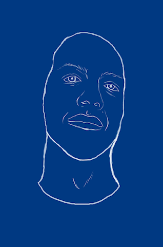
This is Jak - Jak wanted to be baldurised and transformed into a spell-caster of sorts. I begin by taking his photo and applying a standard raster layer to the image. Taking a standard brush I begin to sketch around his face and facial features until I have what I need. Now Edit -> copy the entire raster layer and paste it onto a brand new background of a colour of your choice. For Jak I chose blue.
Using a 'fill' tool I then begin adding grey-scale shades to the sketch. This is essential to the process as it allows the artist to not be influenced by any of the original colours. It gives you more freedom to create what you truly want:
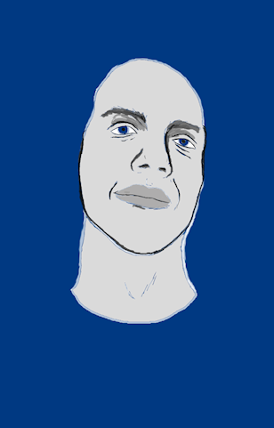
I then start dropping a variety of layers over the grey-scale image. I do this in trial and error with the intention of choosing a skin tone that I would be happy with. The beauty of layers is that if you're not happy with it, you can always remove it and start again. The skin tone you choose here will be your 'base colour'.

Followed by highlights to varying features of the face. Use lighter tones of your 'base' colour. Most painting programs will enable you to stay in a certain colour range in the standard palette - which is fine. This can be too varied for many, and to avoid the risk of applying tones which don't fit, many create their own palette. Using the brushes I indicated above, begin blending tones (using the smudge brush) at varying opacity and strength until you're happy with something simple. Do NOT go overboard - the smudge brush is very easy to overuse. I apply all highlights using layers.
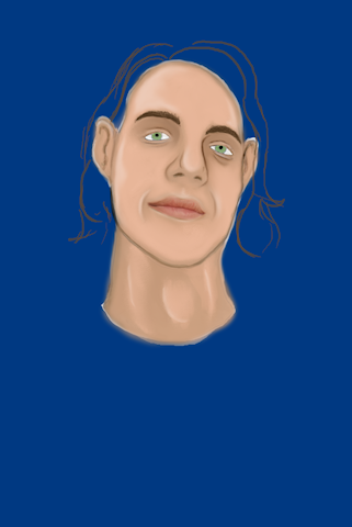
Now after your highlights and base-tones, I decided to give Jak his lovely hair back - I figured he'd get angry if I keep it this way")
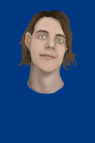
Now you may notice the varying shades of realism which just hit the image all of a sudden. Going back to the original photograph, I took a cut out of Jak's face and applied Photo Effects --> Grey scale. I then copied the image and pasted it into my painting as a new layer. After placing it into the appropriate position I then lowered opacity (to about 15%) before merging the images. This is a personal preference, which I do to keep my mind on focus. By the end of the painting I still want it to resemble jack in someway and this is a good way of keeping yourself on track and giving you defining features to work from.
Part 2: Outfit
Now when moving on to the outfit, it is essential you do this using layers. You will at times be painting over the original face so this makes it easier to start over. I began by painting the hood. Jak likes green and so I used green as a base colour. Hood's are difficult to draw as the folds and creases of the fabric can throw a lot of people off. Practice until you have something you like.
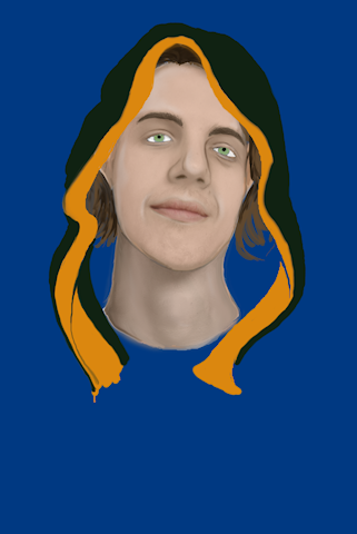
I decided to model this particular robe off the 'Robe of Neutral Arch-Magi' which has an orange trim. I used this image as a reference: http://images2.wikia.nocookie.net/__cb20121222222941/baldursgategame/images/5/5d/Robe3.png
I then begin painting the the base of the robe:
Using layers I add highlights to the robe (greens for the fabric, varying yellows for the metal). I use a basic 'round' brush to blend in the metal tones and a type of 'sketchy' brush for the fabric.
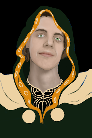
Now time for detail: I begin painting sketched out lines across the defining sections of the robe (trip, metal rims etc). I use a high opacity, very small 'burn' tool for this. I then smooth out the lines using the smudge tool. It is a time consuming and lengthy process (if anybody has any tips to make this easier I'm all ears). For the pattern on the shoulder plates I used the smudge brush and 85% opacity to begin drawing. I did it this way as it allows you to keep your already painted highlights in certain sections - keeping your intended effect.
Part 3: Further detail and lighting
Now here comes the tricky part. Going back to the face I begin adding extra detail to certain features. I apply light and dark tones to defining points of the face (nose, ears etc). I always start at the eyes. The eyes can be an extremely difficult part of the body to paint. You can tell a lot by somebodies eyes. My aim here was to create Jak as Gorion's ward. A 20 year old, thrown into adventuring and has seen much for someone his age. Detailed highlights to the eyes are essential. At this point it is VERY important that you bare in mind where the light is coming from. For this particular portrait the light was coming from below Jak.
I then become a bit adventurous in my skin tones by adding low opacity purple and grey to Jak's face - blending as I go on. To neutralise all of the colour within the portrait (The robe was still very bold) I decrease the saturation on the image by about 15%.
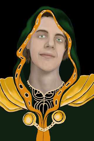
Part 4: A plan comes together
Freehand cutting out Jak from the standard black background I have been using, I move him to a pre-made background of a colour i thought would match the 'magical' feel I wanted to get from the portrait. A few sunburst effects here and there. I always do my paintings larger than the final portrait, thus the smaller more cropped version you see below:
Now this next part may look difficult but its actually quite easy - and my favourite part of the process. It really brings your image to life. LIGHTING!
I begin by going to Layers ---> duplicate and then playing with the hue of my portrait until I am satisfied I have found a colour I like. I then start erasing ALL parts of the portrait until I am left with the highlights you see below. If you struggle with lighting a good tip is to take a torch and look in a mirror. Shine the torch at the side you want your painting to depict and pick out the features of your face which reflect the most light. You will get the hang of it. At some point applying lighting to portraits becomes quite natural.
For the shoulder plates I used the freehand cut out tool to select, copy ---> paste as new layer. Art effects ---> chrome. Then lower the opacity and blend as you see fit.
To complete the background I took a random image of deep space from the hubble telescope I had stored on my computer. I applied the image over my portrait as a layer and then decreased opacity to about 10%. As with the lighting effects I mentioned above, I then begin erasing the parts I didn't need - allowing it to compliment the sunbursts I placed in already. I think this gives a decent magical effect. After refining details to something I was happy with, I was finished.
This process is, from the very best I can figure - the way the BG2 portraits were made with elements of BG1. I am under no illusion that these images are anywhere near as good as BG2, but I think i'm getting there. I hope this helps a lot of people or provides some sense of clarity. If you would like to create a BG2 portrait of yourself and enjoy painting then give it a shot")
Over the past few months I have been attempting to create BG style portraits that would fit into the BG series and match the NPC portraits already present. There are a number of excellent portrait packs out there that replace the current NPC's with alternative artwork which would then match addition PC portraits. Please see the excellent work by @jakaminski & @artastrophe @LavaDelVortel here:
jakaminski's portrait pack: http://forum.baldursgate.com/discussion/16864/new-stylized-portrait-pack#latest
PaintBG portrait pack: http://forum.baldursgate.com/discussion/13507/paintbg-for-all-bg-platforms/p1
I created this tutorial in response to a few posts and topics of people who wished to recreate portraits that would fit seamlessly into the vanilla games. To do these type of portraits you will need Photoshop or Paintshop Pro (or any other prestigious art program) - either can be downloaded as one month trial.
What I can say before I begin is this: It is not easy. There is no quick surefire way of recreating the original Baldur's Gate (1&2) images. It will take practice and time. I am still working my way towards something that I am entirely happy with, and I think I have a long way to go yet.
From what I could figure out, through varying amounts of research is that Mike Sass created his BG1 portraits through photo manipulations and airbrushing tones from a grey-scale image. The BG2 portraits are a different monster altogether and are images/photos that have been traced/re-sketched and created from scratch.
As it will be difficult to go through every single point of change in this tutorial I might miss a few things out - if anybody has any questions about any of the below images, please ask and I will answer in due course. @jakaminski has been kind enough to allow me to use the original photo for his portrait. Before we begin part 1: You will need to either find or create brushes that are similar to these:
Part 1: Preparing the face
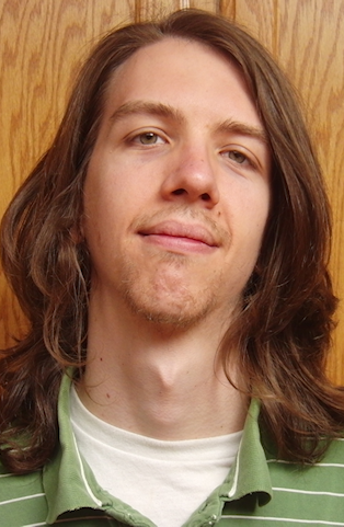
This is Jak - Jak wanted to be baldurised and transformed into a spell-caster of sorts. I begin by taking his photo and applying a standard raster layer to the image. Taking a standard brush I begin to sketch around his face and facial features until I have what I need. Now Edit -> copy the entire raster layer and paste it onto a brand new background of a colour of your choice. For Jak I chose blue.
Using a 'fill' tool I then begin adding grey-scale shades to the sketch. This is essential to the process as it allows the artist to not be influenced by any of the original colours. It gives you more freedom to create what you truly want:
I then start dropping a variety of layers over the grey-scale image. I do this in trial and error with the intention of choosing a skin tone that I would be happy with. The beauty of layers is that if you're not happy with it, you can always remove it and start again. The skin tone you choose here will be your 'base colour'.
Followed by highlights to varying features of the face. Use lighter tones of your 'base' colour. Most painting programs will enable you to stay in a certain colour range in the standard palette - which is fine. This can be too varied for many, and to avoid the risk of applying tones which don't fit, many create their own palette. Using the brushes I indicated above, begin blending tones (using the smudge brush) at varying opacity and strength until you're happy with something simple. Do NOT go overboard - the smudge brush is very easy to overuse. I apply all highlights using layers.
Now after your highlights and base-tones, I decided to give Jak his lovely hair back - I figured he'd get angry if I keep it this way
Now you may notice the varying shades of realism which just hit the image all of a sudden. Going back to the original photograph, I took a cut out of Jak's face and applied Photo Effects --> Grey scale. I then copied the image and pasted it into my painting as a new layer. After placing it into the appropriate position I then lowered opacity (to about 15%) before merging the images. This is a personal preference, which I do to keep my mind on focus. By the end of the painting I still want it to resemble jack in someway and this is a good way of keeping yourself on track and giving you defining features to work from.
Part 2: Outfit
Now when moving on to the outfit, it is essential you do this using layers. You will at times be painting over the original face so this makes it easier to start over. I began by painting the hood. Jak likes green and so I used green as a base colour. Hood's are difficult to draw as the folds and creases of the fabric can throw a lot of people off. Practice until you have something you like.
I decided to model this particular robe off the 'Robe of Neutral Arch-Magi' which has an orange trim. I used this image as a reference: http://images2.wikia.nocookie.net/__cb20121222222941/baldursgategame/images/5/5d/Robe3.png
I then begin painting the the base of the robe:
Using layers I add highlights to the robe (greens for the fabric, varying yellows for the metal). I use a basic 'round' brush to blend in the metal tones and a type of 'sketchy' brush for the fabric.
Now time for detail: I begin painting sketched out lines across the defining sections of the robe (trip, metal rims etc). I use a high opacity, very small 'burn' tool for this. I then smooth out the lines using the smudge tool. It is a time consuming and lengthy process (if anybody has any tips to make this easier I'm all ears). For the pattern on the shoulder plates I used the smudge brush and 85% opacity to begin drawing. I did it this way as it allows you to keep your already painted highlights in certain sections - keeping your intended effect.
Part 3: Further detail and lighting
Now here comes the tricky part. Going back to the face I begin adding extra detail to certain features. I apply light and dark tones to defining points of the face (nose, ears etc). I always start at the eyes. The eyes can be an extremely difficult part of the body to paint. You can tell a lot by somebodies eyes. My aim here was to create Jak as Gorion's ward. A 20 year old, thrown into adventuring and has seen much for someone his age. Detailed highlights to the eyes are essential. At this point it is VERY important that you bare in mind where the light is coming from. For this particular portrait the light was coming from below Jak.
I then become a bit adventurous in my skin tones by adding low opacity purple and grey to Jak's face - blending as I go on. To neutralise all of the colour within the portrait (The robe was still very bold) I decrease the saturation on the image by about 15%.
Part 4: A plan comes together
Freehand cutting out Jak from the standard black background I have been using, I move him to a pre-made background of a colour i thought would match the 'magical' feel I wanted to get from the portrait. A few sunburst effects here and there. I always do my paintings larger than the final portrait, thus the smaller more cropped version you see below:
Now this next part may look difficult but its actually quite easy - and my favourite part of the process. It really brings your image to life. LIGHTING!
I begin by going to Layers ---> duplicate and then playing with the hue of my portrait until I am satisfied I have found a colour I like. I then start erasing ALL parts of the portrait until I am left with the highlights you see below. If you struggle with lighting a good tip is to take a torch and look in a mirror. Shine the torch at the side you want your painting to depict and pick out the features of your face which reflect the most light. You will get the hang of it. At some point applying lighting to portraits becomes quite natural.
For the shoulder plates I used the freehand cut out tool to select, copy ---> paste as new layer. Art effects ---> chrome. Then lower the opacity and blend as you see fit.
To complete the background I took a random image of deep space from the hubble telescope I had stored on my computer. I applied the image over my portrait as a layer and then decreased opacity to about 10%. As with the lighting effects I mentioned above, I then begin erasing the parts I didn't need - allowing it to compliment the sunbursts I placed in already. I think this gives a decent magical effect. After refining details to something I was happy with, I was finished.
This process is, from the very best I can figure - the way the BG2 portraits were made with elements of BG1. I am under no illusion that these images are anywhere near as good as BG2, but I think i'm getting there. I hope this helps a lot of people or provides some sense of clarity. If you would like to create a BG2 portrait of yourself and enjoy painting then give it a shot
Post edited by EntropyXII on
30
Comments
I think it combines BG1 and BG2 to some extent. The lighting in it is incredible. The only portrait I have done which comes anywhere close to this is my assassin portrait. Everything just fell into place nicely. There is still something missing in my work however.. more detail? The more detail I try to include the more I get lost. The more I do, the more I get the hang of it though. I *WILL* master this... bwahahaha!
@jakaminski - yeah give it a shot!
Mike Sass seems to get the skin to shine, I reckon if you can crack that, you've got it.
It could be a software/hardware issue but I hate blaming my tools!
I used your portrait as an example. It's a nice dirty trick that takes like 2 mins.
'Just my take on it. Of course it still doesn't come close to what Mike does, but I also doubt there's any sort of trick to it, besides a borderline-insane focus on detail.
For my next I have gone into insane detail already - but I will try your tactic also.
You don't have to do wrinkles to give it that needed detail either, just try to alter the skin texture the places where the "anatomy pops out" so to speak. Cheeks, chin, brow, jaw etc.
The main thing to look out for, is simply to not make it look too smooth.
I don't do digital portraits myself, only pen&paper and the occasional acrylic paintings. But I did do a lot of retouching of photos back in the day, so I have a bit of experience in that department. 'Don't know if it carries over to what you're doing though.
I have a feeling I might have to conform and go for Photoshop...
But yeah, you could use a layered texture, although that could be seen as "cheating". Get a photo of a an actual person (in your case... the actual person), and just lay it on top in a low opacity, mask it, then paint the skin with a black soft brush. It actually makes a world of difference if done right.
But yeah, it does smell a bit of cheese.
I reckon that for your considerable skill level, Photoshop is the way to go,
http://www.fanhow.com/knowhow:Create_plastic_photo_effect_28062124
Another link to a similar effect:
http://pureromance88.ucoz.com/news/shiny_skin_effect/2010-03-22-44
Has anybody tried Painter 12?
Not sure I can afford 46 quid a month. The 17.50 is more doable but it that what I actually want?
Advice? Tips? Shall I just go for the one off price of Painter 12 instead? I'm itching to try Photoshop but 17.50/46 quid per month forever seems a little... steep?
http://www.adobe.com/uk/products/photoshop.html
but you know, PS can be found on the net for nothing...
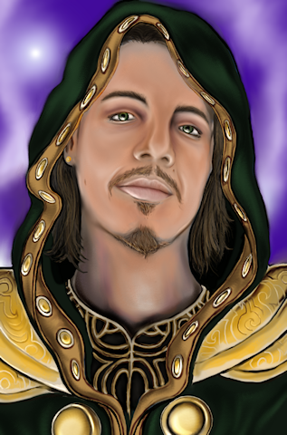
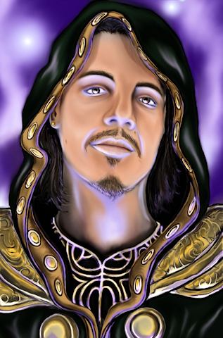
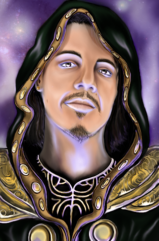
As far as what your work is missing, I don't think it's more detail necessarily. If you look at the BG1 portraits, the colors are quite saturated. Fortunately, upping a picture's color oomph is pretty easy.
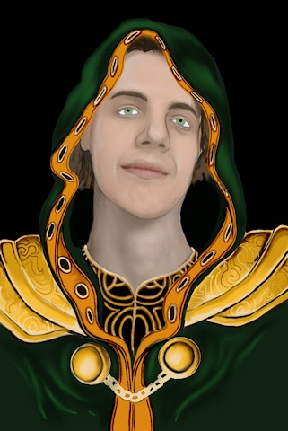
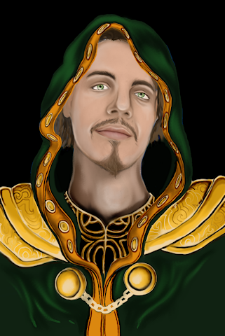
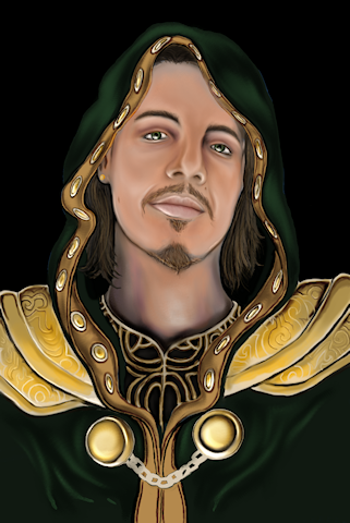
In my example below (used your Jak portrait as a base, hope that's cool!) the first image is the original. In the second image, I used GIMP to increase the contrast of the face and neck by 55%. In the final image I increased the contrast of the clothing by 20%. It's a super simple fix that makes the painting feel more vibrant.
You could stop right there, but another thing that makes the BG1 portraits stand out is the bold use of shadow and light. This is much more time-consuming! One way to add shadows is to make a new layer, and use a soft, round brush to paint them in. (Some people like to set the layer to Multiply mode; I personally don't.) The BG1 art style demands nice dark shadows. So don't wuss out! Do a lot of color-picking to blend out the edges. When you are done, try out different hues for this layer. You might be pleasantly surprised.
For highlights, make one more layer and use the same type of brush. To give skin that hard, shiny appearance, add a final set of higlights using pure white.
Well, that was embarassingly slapdash but hopefully you see what I mean.
There is so much I have learned since my last portrait, I am positively DEVASTATED that I cannot start editing my older portraits at this point. Damn you old laptop -sulks- I lost all my full sized work
I am very close to finishing my next portrait, and I think I am getting even closer. I will post it up soon.
For shiny highlights, I use a soft round brush with 25% hardness and about 40% opacity. (These are the settings in GIMP.) The color is set to plain white. I lightly brush white over the highlit area with a larger-sized brush. Then I reduce the size of the brush and use more pressure to add pure white to the area of greatest reflection. The problem with dodging is that you never get to the complete white which is necessary for the illusion of a slick surface.
Sorry to hear about your lost files! That sucks.
@Autequi @Seldar @Flashheart @Zanian @Jakaminski @Troodon80 @Klonoa @ZelgadisGW @Boozilla
http://forum.baldursgate.com/discussion/18003/exii-baldur-s-gate-portrait-artwork-update-1-new-portrait-aedan/p2
Anyway, good portrait! I especially like all the armor details.
Right now, he (Aedan?) is looking very baby-faced, if you know what I mean. It will help mature his face if you add some furrows and used straighter edges when painting shadows.
Make sure you know where the light is coming from and that the locations of the specular highlights make sense in that regard.
I'm liking what you did with his hair. Detailing is needed in the areas that are just black right now. (Or maybe not; once it's shrunk down to game size it'd be invisible, I guess.) Is he going gray? If not, try using browns (or something funky like blues) for hair detailing. Oh, it's bugging me that his braid just ends right after the hair ornament. Seems like there should be some hair sticking out on the other side. (Ha ha, that's so nitpicky.)
You know I never considered using blue instead of grey. It totally makes sense and I'm dismayed I missed it! The straighter edges on shadows are a bit difficult to do, as I paint them free hand using the burn tool (which doesn't allow for layers). Agreed I could have been a little more careful, but I became a bit impatient.
It is always difficult when I paint using live models as most of the models I have used are young and very fresh faced. I don't want to go overboard on the furrows and age lines when they don't have them in real life incase it deviates to much from their original appearance. I am basing my work around the idea that CHARNAME is around 20 as well.
If @Aedan allows I will post the photo I used as a reference for the painting so you can see what I mean.
I hope you can post the photo.
@EntropyXII
Sure, you can post the photo!
@Autequi - here you go