[Rant] Sad state of the UI and the EEs in general
 klatu
Member Posts: 108
klatu
Member Posts: 108
Maybe a bit late to the party, but here goes...
[WARNING] Bitter ranting ahead. You have been warned.
Beamdog has been working on the infinity engine for at least five years now. And they actually managed to create a worse UI than Black Isle did more than 16 years ago. It's always been a clunky mess, but at least it was functional.
Now, some of the most basic non-combat mechanics of the game either do not work reliably any more or they have become more tedious than ever.
Before you accuse me of whining:
1.) I paid full price for all of Beamdog's IE games. I get to whine.
2.) At least take a look at this stuff first...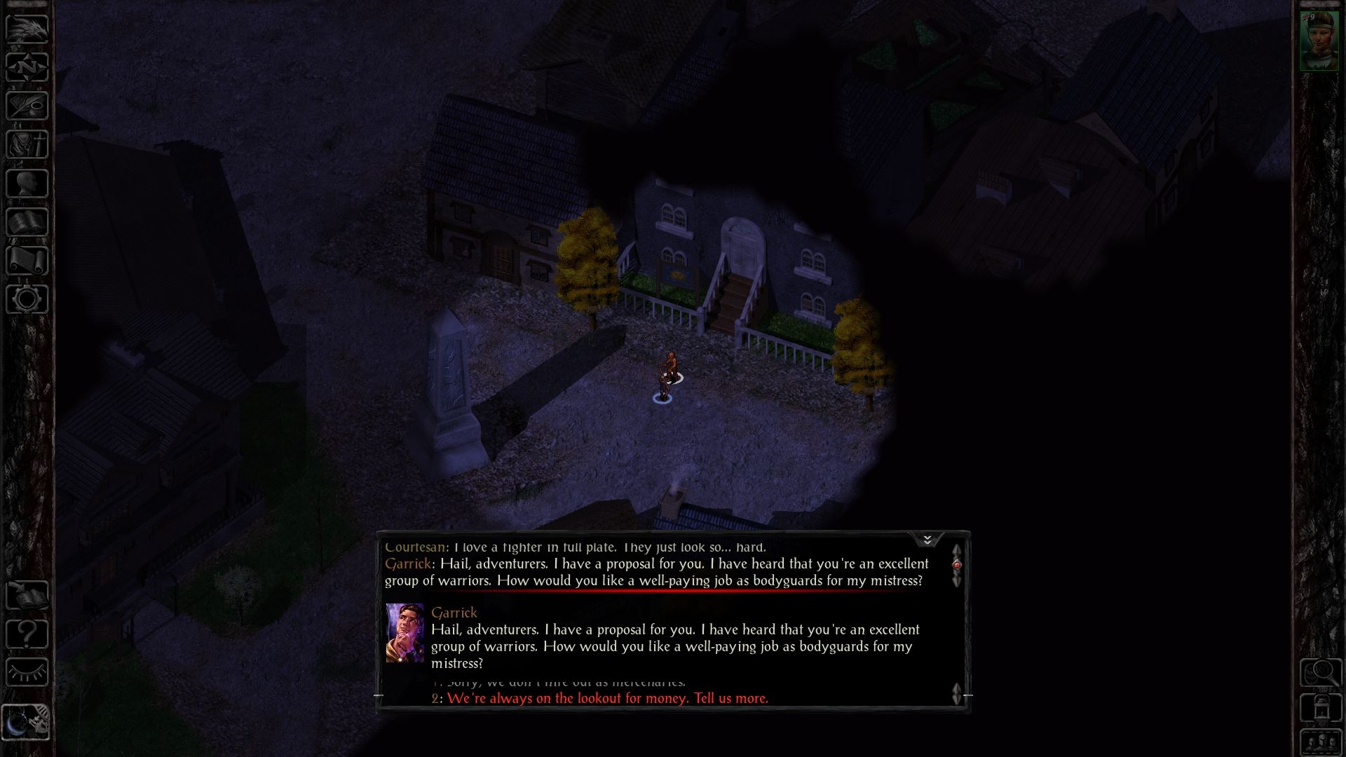
They really only changed two things: They made the NPC's current line unscrollable and they moved the log into a height-adjustable area above that line. This has introduced several serious issues:
Nope. This is the same crap again. In fact, it's kinda worse. Just took at the amount of wasted screen space!
These dialogs were written for a 640x480 resolution. Today, the game runs in 1080p and higher, yet somehow Beamdog has managed to run out of space. This is so pathetic it's almost impressive.
This is what happens with larger fonts:
Now we have three scrollbars. (╯°□°)╯︵ ┻━┻
And Garrick isn't the only case:
This weirdness doesn't happen all the time, but it happens often enough to make the game annoying instead of fun.
The point: This should NEVER happen. In fact, this has never happened prior to 2.0+.
Look, I understand what they were trying to do here. It's a neat idea. Just poorly implemented.
Luckily there's an easy fix, and should be no problem for Beamdog to implement.
Simply nest every single line of dialog inside a scrollbar. Then put the new scrollbars into a master scrollbar. Then decrease the width of the dialog box by around half. Don't forget to remove keyboard input, so people don't accidentally select a reponse with the number keys. But make sure that the same button that pauses combat also closes the dialog. Now that would be elegant design! Oh wait, they already did that one...
Joking aside, this stuff actually worked in 1998. With just one scrollbar.
In fact, this stuff works in every other game with dialog. So why not here?
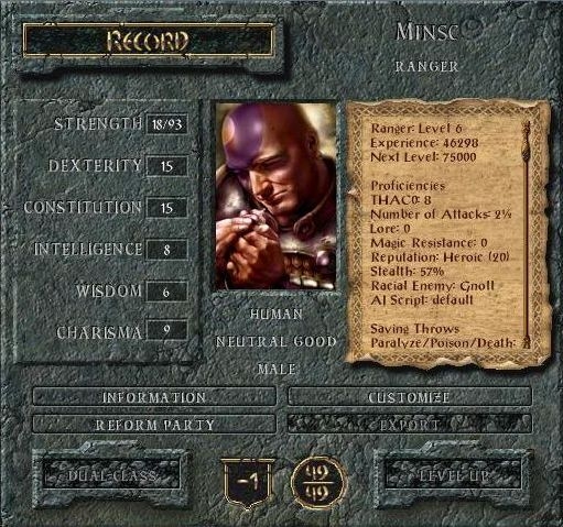
OK, this one screen wasn't great or anything. You constantly had to scroll that huge text area in search of some minor piece of information. But at least all the information could be found in one place.
For the sake of simplicity™, Beamdog decided to spread this information across five different screens (each with its own scrollbar, naturally).

Neat. Should be really simple to find the information you're looking for now:
Wait. Where are the HP and AC stats? They used to be here:
OK, they are listed under "COMBAT STATS". Hmm.
I wonder what the other tabs are for?
Why would you have a tab for that?! And I guess reputation is a skill now.
Whatever, let's break this down.
"CLASS" used to be called "KIT DESCRIPTION". It was simply repositioned. "INFORMATION" is what the character record screen used to be, except it's worse now (we'll get to that). Hidden among the other three tabs are exactly three pieces of information not listed under "INFORMATION":
So, by adding those tabs they actually wasted precious screen estate, that could have been used to show relevant stuff like HP and AC on the main page. Sigh...
And then there is this abomination:
Don't see it? Here:
The damn active effects list is nested in a tiny cursor-sensitive scrollbar! OF COURSE!
Someone moderately talented at desinging UIs might have asked themselves (or preferably the players) when and why the record screen is usually accessed.
I don't know about everyone else, but I primarily need it during heavy combat, when lots of magic is happening.
You know, when my characters are affected by dozens of buffs and debuffs. This effects list shows you maybe four of those effects at a time. Good luck finding out if your Chaos Shield is still active, Neera!
This stuff is still as functional as it ever was, but it's so much more tedious to deal with now. The design decisions surrounding this UI "upgrade" are entirely incomprehensible to someone who has actually played these games.
What really gets me is how trivial it should be for Beamdog to meaningfully improve the UI.
Yes, sifting through decades old pre-OO code is a nightmare. But Beamdog has had five years with this engine now. They should be able to make it do whatever they can dream up at this point.
Here are some things I would want from a UI upgrade:
I had hoped that patch 2.3 would finally fix the issues introduced in 2.0, but so far nothing has improved.
Four years ago I was giddy to see what Beamdog might do with the engine. At this point I have to question why they even decided to upgrade the unholy mess that is the infinity engine if this is the result. I wonder if writing an engine clone up to modern standards would have proved more viable in the long run. Because the way it's looking right now, the current EEs are gonna need another EE in a few years, at the latest when OpenGL 2.0 will no longer be supported by modern GPUs. (Not to mention that some mods just fail to work on an engine level since 2.0).
There are a few improvements since 1.3. The spellbook is more practical, I guess. The journal is... interesting. The map is... not worse. (OK, I could have done without any of these)
The most positive update is of course the new UI modding system. Frankly, however, none of the mods created with it that I have seen have meaningfully addressed the above issues. ETA: And even though mods can help fix these issues, they shouldn't have to.
But all is not bad and I do apologize for the negative and snobby tone. I don't regret purchasing the EEs. I would do it again in a heartbeat.
I'm just frustrated about them still being so broken in so many ways. And dissapointed about them not being so much better than they should be after all this time.
[TOO-LATE WARNING] Bitter ranting ends here. You no longer need warning.
[WARNING] Bitter ranting ahead. You have been warned.
Beamdog has been working on the infinity engine for at least five years now. And they actually managed to create a worse UI than Black Isle did more than 16 years ago. It's always been a clunky mess, but at least it was functional.
Now, some of the most basic non-combat mechanics of the game either do not work reliably any more or they have become more tedious than ever.
Before you accuse me of whining:
1.) I paid full price for all of Beamdog's IE games. I get to whine.
2.) At least take a look at this stuff first...
The dialog boxes
They really only changed two things: They made the NPC's current line unscrollable and they moved the log into a height-adjustable area above that line. This has introduced several serious issues:
- Worst of all, the player responses now exist in a separate scrollable area. This area can end up miniscule if the NPC's line is on the long end. In the screenshot above, the pip on the scrollbar doesn't even show, it's that small. Of course, the mouse cursor has to reside inside that tiny area for scrolling to work.
- Consequently, responses can get cut off below the fold. New players may not even know that more lines exist. Old players may have to search for the missing lines in confusion.
- The same applies to the log above the dialog. Another cursor-sensitive scrollable area. Yay.
- I can't even imagine how awful this would be with a touchscreen.
- Guess what happens when the player responses are several lines long!
- Minor, but the current line should really not be repeated in the log.
- Perhaps most damning, even if this "feature" worked at all times, it would add nothing of value.
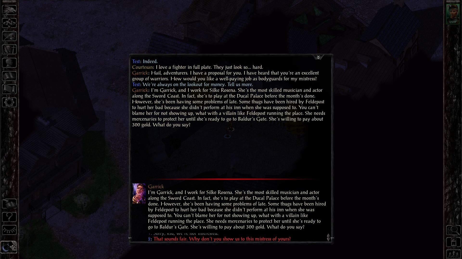
Nope. This is the same crap again. In fact, it's kinda worse. Just took at the amount of wasted screen space!
These dialogs were written for a 640x480 resolution. Today, the game runs in 1080p and higher, yet somehow Beamdog has managed to run out of space. This is so pathetic it's almost impressive.
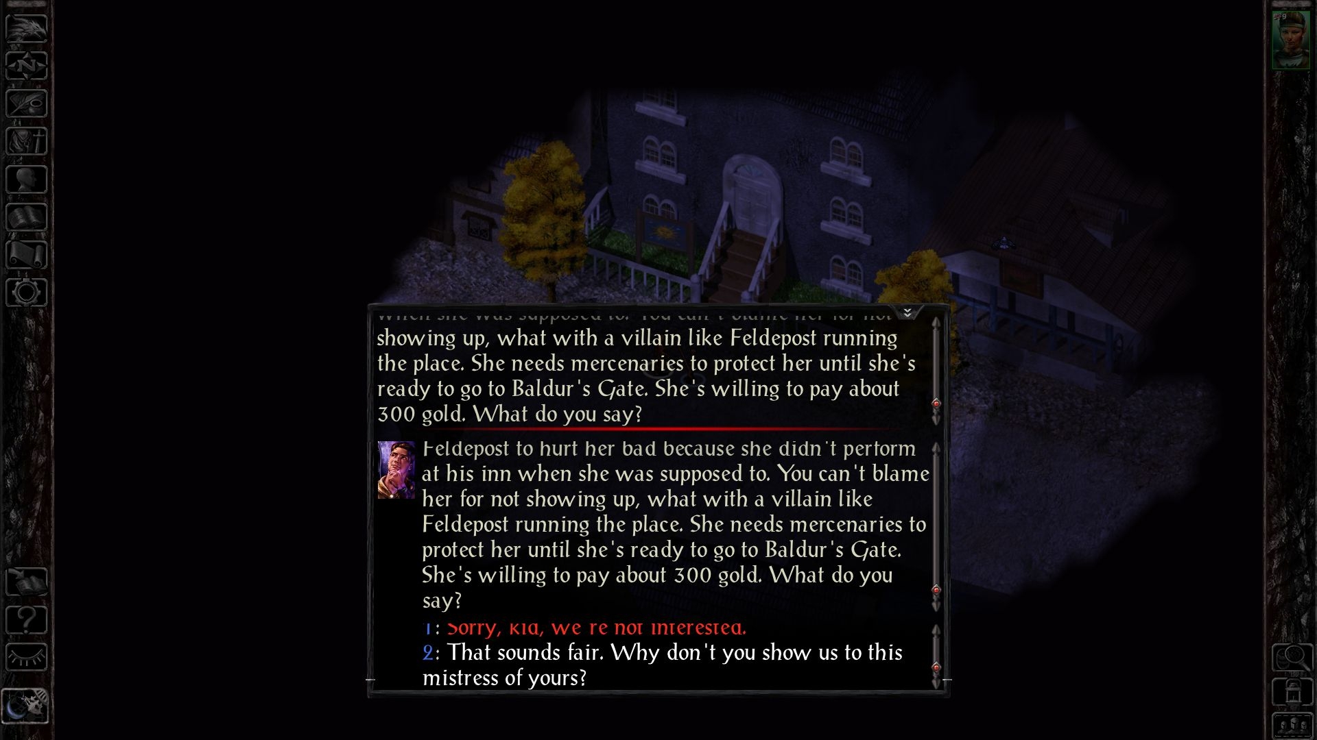
This is what happens with larger fonts:
Now we have three scrollbars. (╯°□°)╯︵ ┻━┻
And Garrick isn't the only case:
This weirdness doesn't happen all the time, but it happens often enough to make the game annoying instead of fun.
The point: This should NEVER happen. In fact, this has never happened prior to 2.0+.
Look, I understand what they were trying to do here. It's a neat idea. Just poorly implemented.
Luckily there's an easy fix, and should be no problem for Beamdog to implement.
Simply nest every single line of dialog inside a scrollbar. Then put the new scrollbars into a master scrollbar. Then decrease the width of the dialog box by around half. Don't forget to remove keyboard input, so people don't accidentally select a reponse with the number keys. But make sure that the same button that pauses combat also closes the dialog. Now that would be elegant design! Oh wait, they already did that one...
Joking aside, this stuff actually worked in 1998. With just one scrollbar.
In fact, this stuff works in every other game with dialog. So why not here?
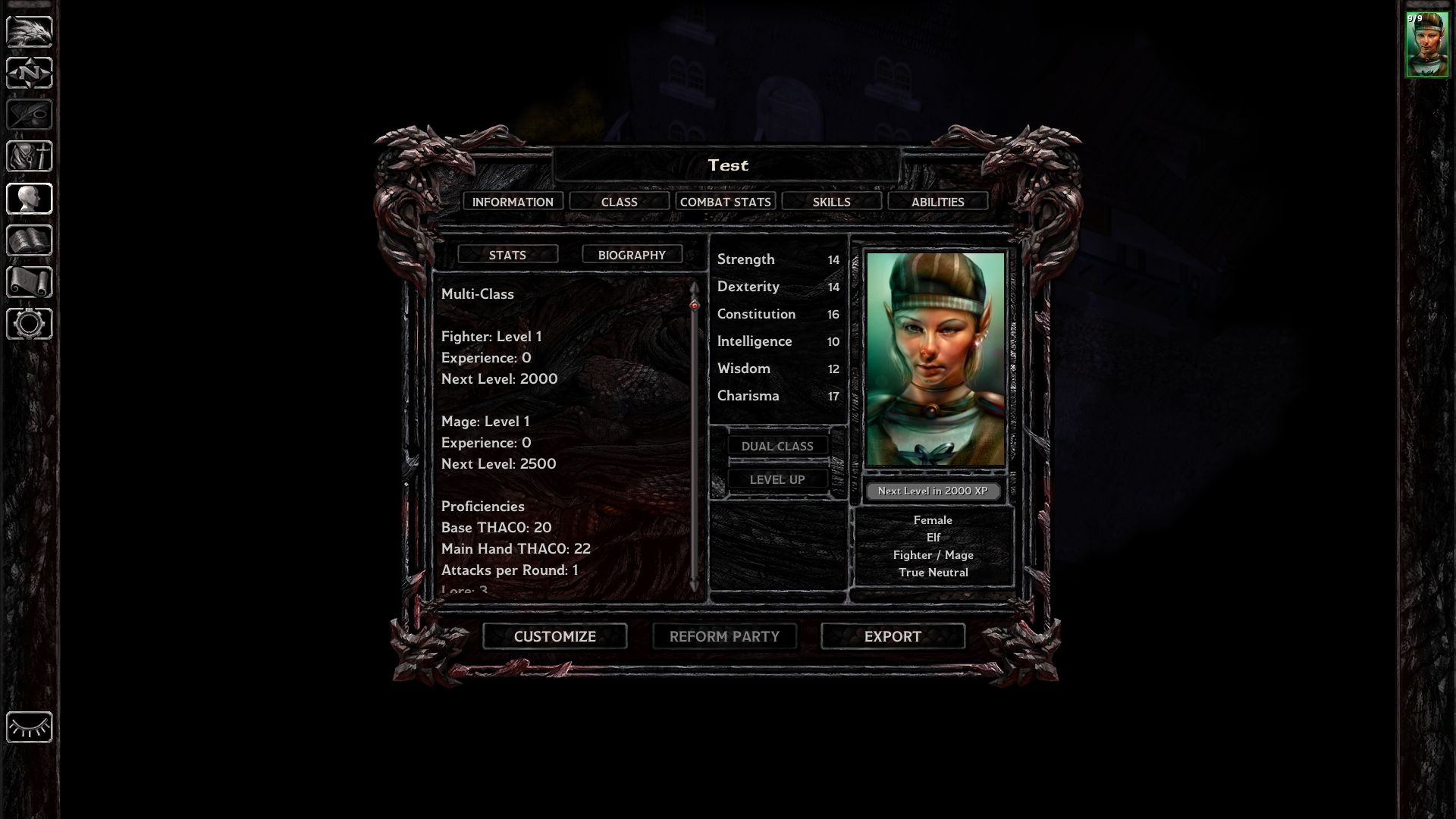
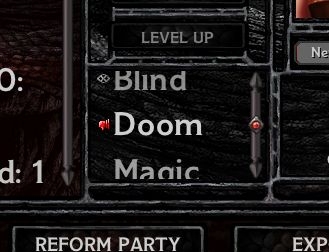
The record screen(s)
Almost the exact same problem plagues the character record screens. This used to be one screen containing all the relevant information about the selected character. There was one scrollbar.OK, this one screen wasn't great or anything. You constantly had to scroll that huge text area in search of some minor piece of information. But at least all the information could be found in one place.
For the sake of simplicity™, Beamdog decided to spread this information across five different screens (each with its own scrollbar, naturally).
Neat. Should be really simple to find the information you're looking for now:
Wait. Where are the HP and AC stats? They used to be here:
OK, they are listed under "COMBAT STATS". Hmm.
I wonder what the other tabs are for?
Why would you have a tab for that?! And I guess reputation is a skill now.
Whatever, let's break this down.
"CLASS" used to be called "KIT DESCRIPTION". It was simply repositioned. "INFORMATION" is what the character record screen used to be, except it's worse now (we'll get to that). Hidden among the other three tabs are exactly three pieces of information not listed under "INFORMATION":
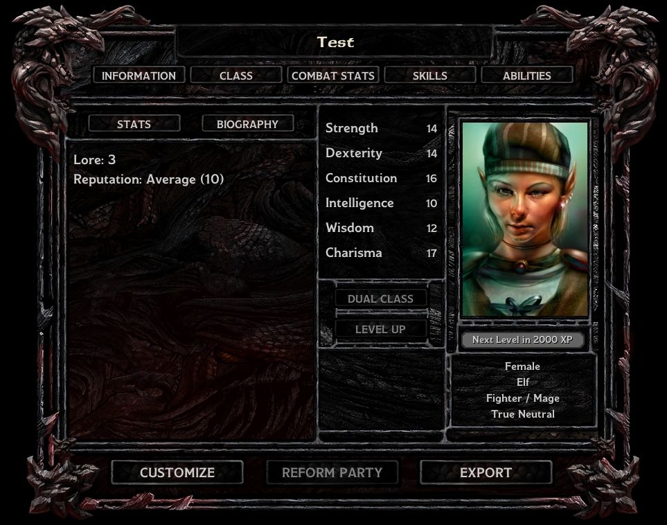
- Current weapon damage
- Class Hit Points/Level
- Max Known Spells/Level
So, by adding those tabs they actually wasted precious screen estate, that could have been used to show relevant stuff like HP and AC on the main page. Sigh...
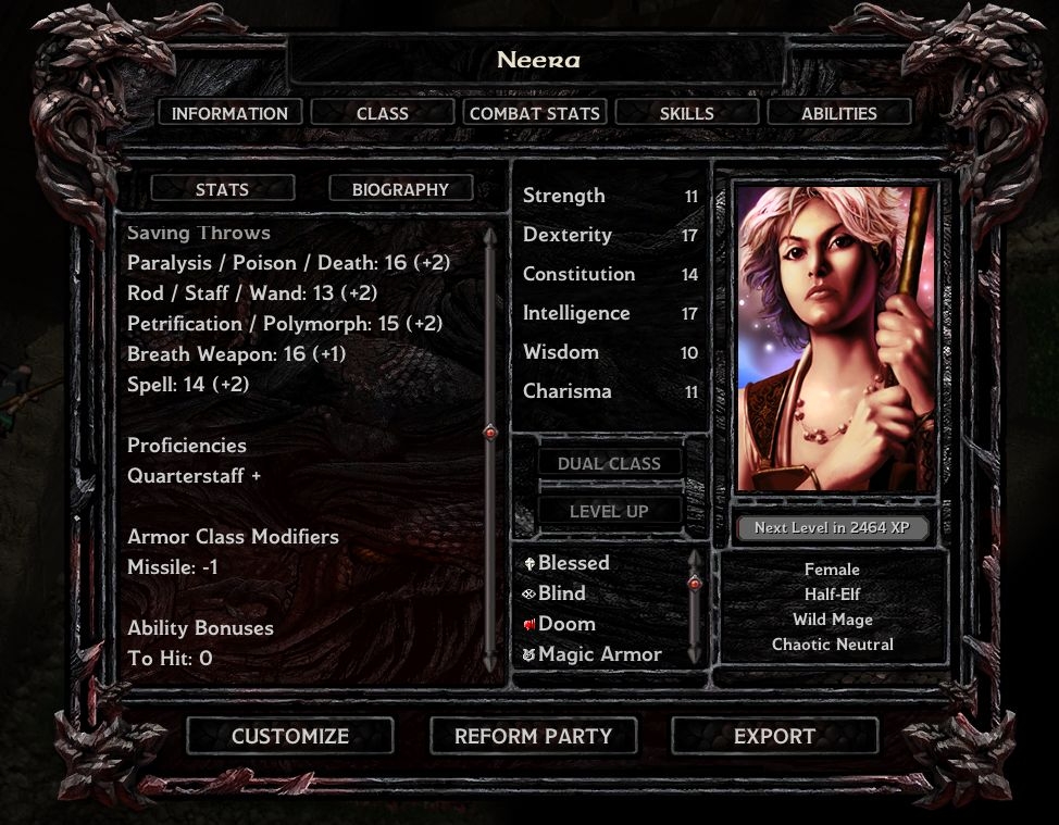
And then there is this abomination:
Don't see it? Here:
The damn active effects list is nested in a tiny cursor-sensitive scrollbar! OF COURSE!
Someone moderately talented at desinging UIs might have asked themselves (or preferably the players) when and why the record screen is usually accessed.
I don't know about everyone else, but I primarily need it during heavy combat, when lots of magic is happening.
You know, when my characters are affected by dozens of buffs and debuffs. This effects list shows you maybe four of those effects at a time. Good luck finding out if your Chaos Shield is still active, Neera!
This stuff is still as functional as it ever was, but it's so much more tedious to deal with now. The design decisions surrounding this UI "upgrade" are entirely incomprehensible to someone who has actually played these games.
Expectations
I think when fans heard "UI Improvements" they were hoping for something different.What really gets me is how trivial it should be for Beamdog to meaningfully improve the UI.
Yes, sifting through decades old pre-OO code is a nightmare. But Beamdog has had five years with this engine now. They should be able to make it do whatever they can dream up at this point.
Here are some things I would want from a UI upgrade:
- Obviously, roll back dialog boxes and record screens to the 1.3 versions, because current incarnations are just garbage. The old ones were perfectly fine.
- If something needs scrolling, it's spell-selection. Mage/Clerics have to click dozens of times to simply cast one higher level spell. No need for radial menus or anything fancy.
- Make all windows resizable with the mouse. Stores should be able to display more than six items at a time.
- Soft-code all the buttons already, so that this Cleric/Thief mess can finally be solved in a reasonable fashion.
- Soft-code store/ground/container and inventory grids. Why are we still stuck with single digit tile grids for a game with thousands of items to manage? If you can conjure up new tiles on the fly for quick-looting, then you can do this as well.
- ETA: Remove the "CLASS" tab. Instead make the class string under the character's portrait a button that shows the kit description. E.g. for Neera, just have the "Wild Mage" string be a button.
In closing
Many of the design decisions surrounding the new UI are questionable at best, haphazard on average and outrageously incompetent at worst.I had hoped that patch 2.3 would finally fix the issues introduced in 2.0, but so far nothing has improved.
Four years ago I was giddy to see what Beamdog might do with the engine. At this point I have to question why they even decided to upgrade the unholy mess that is the infinity engine if this is the result. I wonder if writing an engine clone up to modern standards would have proved more viable in the long run. Because the way it's looking right now, the current EEs are gonna need another EE in a few years, at the latest when OpenGL 2.0 will no longer be supported by modern GPUs. (Not to mention that some mods just fail to work on an engine level since 2.0).
There are a few improvements since 1.3. The spellbook is more practical, I guess. The journal is... interesting. The map is... not worse. (OK, I could have done without any of these)
The most positive update is of course the new UI modding system. Frankly, however, none of the mods created with it that I have seen have meaningfully addressed the above issues. ETA: And even though mods can help fix these issues, they shouldn't have to.
But all is not bad and I do apologize for the negative and snobby tone. I don't regret purchasing the EEs. I would do it again in a heartbeat.
I'm just frustrated about them still being so broken in so many ways. And dissapointed about them not being so much better than they should be after all this time.
[TOO-LATE WARNING] Bitter ranting ends here. You no longer need warning.
Post edited by klatu on
34
Comments
You share some interesting and valid points, they'll be taken into the work. The UI, introduced by the 2.0 patch, is far from completion and/or best state. The QA team will look closely at all your points.
I have to note, though, that this site has certain rules, like PG-13, so I advice you not to use the language some of your paragraphs use.
New players are going to keep this game alive longer and they are much less likely to ever pick up the game in the first place if they have to mod it before they can even try it. Modding comes later, after they first come to love the game.
Though I may not agree with all of the points the OP makes, I do feel that he does a good job of illustrating many of the problems that I too have with the new UI. Especially when it comes to the dialog box. As a role-player for whom the dialog is extremely important, I find this new one downright painful to use.
I have been waiting patiently for a response from the developers concerning this new UI and, unless I have just missed it, the only response I have seen is to say that it is now very moddable. The fact that it is so moddable is wonderful, but it doesn’t answer the question. One of the best things about the EE editions is that you don’t have to know anything about modding to play them.
If I personally was a new role-player picking up the game for the first time I would be put off by the fact that I had to fight with the dialog box in order to experience the game.
I am eagerly waiting to discover what treats the developers have in store for me within the new expansion, but I just can’t get past this new UI. I find it visually unappealing and functionally frustrating.
Please give me the option to use a more classic UI without having to resort to learning to mod it myself.
@Pecca Thanks for letting me know and I appreciate the work you have put in. But I assume Beamdog are constrained by lower resolutions in order for the UI to work on mobile devices. So I don't except them to adopt a UI that actually makes use of the entire screen. However, there is a lot of unused or badly used space on the record screens. I wish they would put more thought into using the existing space more efficiently.
Not to detract from your efforts, but I want the game to work well without mods. Mods should be a matter of taste, not necessity.
@Ravenslight Exactly. The UI just feels rushed and experimental. Not something I would inflict as an end-product on paying customers.
Edit: To clarify, I'm reporting any issues I see here that I know to be bugs.
but I guess the reason why I don't like the new UI is because I have grown accustomed to the original UI, I've been using it for 17 years, and I have grown to love it, it's fast, it's easy, and it was okay in my book, the addition of the damage box on the character screen and inventory page was a great feature, and I was liking the direction new UI additions were doing
then the 2.x patches came out, and I feel like the UI just become butched, I find it so hard to find the information that I am looking for, in the original, all you needed was a quick scroll down the sheet, everything was there, now you have to click through all the tabs looking through tons of info just trying to find what you are looking for
so for me, I find the new UI very unuser friendly, but for some they love it, so my question is; why not make it an option to have either one? it was a very bold statement to add this UI and think that everyone was going to love it, and still, most of the people playing these games are people who have been playing them for years, so to have this UI swap to me raises more questions marks than ease of use
Look, I've played the original (non-EE) titles for years. The UI has alway been pretty awful, to be honest. But at least it worked. Beamdog, however, have replaced an awful working UI with an awful broken UI. Even if all the so-called improvements to the UI were functional, they wouldn't elevate BG's UI to a good UI. It would still be pretty terrible.
Having the option to switch between the UIs seem kinda pointless right now. I mean, why would you ever opt for the broken option?
However, if this new UI were optional I (probably) wouldn't complain. I would recognize it as an experiment. I don't actually expect Beamdog to make BG a "modern" game (whatever that means).
But at the very least, updates should NOT make the game WORSE.
I don't think I'm asking for much...
............................................________
....................................,.-'"...................``~.,
.............................,.-"..................................."-.,
.........................,/...............................................":,
.....................,?......................................................,
.................../...........................................................,}
................./......................................................,:`^`..}
.............../...................................................,:"........./
..............?.....__.........................................:`.........../
............./__.(....."~-,_..............................,:`........../
.........../(_...."~,_........"~,_....................,:`........_/
..........{.._$;_......"=,_......."-,_.......,.-~-,},.~";/....}
...........((.....*~_......."=-._......";,,./`..../"............../
...,,,___.`~,......"~.,....................`.....}............../
............(....`=-,,.......`........................(......;_,,-"
............/.`~,......`-...................................../
.............`~.*-,.....................................|,./.....,__
,,_..........}.>-._...................................|..............`=~-,
.....`=~-,__......`,.................................
...................`=~-,,.,...............................
................................`:,,...........................`..............__
.....................................`=-,...................,%`>--==``
........................................_..........._,-%.......`
Hence the "I guess", I guess...
I'm not here for perfection. I recognize that this old-as-dirt game maybe has some flaws. All I really want is for official updates to meaningfully "enhance" the game. Not make it worse, or unplayable.
I think all in all and in the reality of the situation is, if beamdog wants to change a bunch of things and add a bunch of things, then I say give 'er gas, I don't really care that much, BUT, when they take things away that weren't broken in the first place ( like getting rid of the enter key function in the inventory) that really raises questions of why would they do that?
sometimes I feel when beamdog adds a bunch of awesome things, they take away things that were almost as great, kind of like taking 2 steps forward then 1.5 steps back
for example, some things that I loved what beamdog did was get rid of the +10% bonus XP garbage from SoA engine, making it so if you get level drained its not a complete hassle to reorganize your spell book ( which sometimes it was such a hassle, reloading the game was just plain faster) adding the damage box in the record page/ inventory screen ( although now there is no damage box on the character sheet anymore?)
so they have added some great fixes, but then comes along some mind boggling silliness that makes me scratch my head:
like as I said before, the enter key being disabled ( lol, why?) not being able to go south easily when exiting a map ( I have to press the "H" key to exit and then press it again to have my UI back, kind of annoying) the spellbook, I have kind of mixed feelings about it, I like the fact that now you can fit more than 24 spells known and have more than 12 spells memorized and being able to see them, but for the longest time it took me FOREVER to figure out how to erase spells, infact I found out by mistake, and another that I personally don't like but in reality it really doesn't matter in the grand scheme of things is that I find it a little harder to keep track on how many spells I have known since its in a list, and if you have silly NPCs whose INT isn't 19+ then you really need to keep track on whats going on, and especially if you like doing the erase and rescribe sort of deal, it just makes it a little harder to keep track, but as I said, I can live with it
so in conclusion, im not at all trying to slam beamdog's chowder because as I said before, they have brought some great fixes to the game, but every once in a while they throw me for a loop with the odd bizarre "fix" and all I can say is; really? oi
It would be great to have a discussion about specific ways to fix these problems. Hopefully we could reach some agreements and let the developers bring those ideas to the game. This would require some sort of commitment from Beamdog to take the advice from the community, of course.
The dialog window is getting annoying when you have not much resolution and have to scroll through all replies. It used to be better when we got everything on the same dialog window.
The Journal in my opinion is a big step back. I don't see the point of having it open when playing. I used to check the journal when I was on the inventory, and now that's not possible anymore. I have to go to the main window, pause the game and then open the journal.
Active quests and finished quests are not clearly diferentiated on the journal, Either they should do a new tab for finished quests, or use some other color or something to mark them as finished. Or at least put them at the bottom of the list.
I would go for a tab for Quests, a tab for Finished Quests, a tab for general info that is not related to quests, including added notes by the player, and finally a tab for everything ordered by date (like a real journal), that would also include deleted quests notes.
I would also add an option to auto-pause the game when opening the journal, that would also unpauses when closing it.
that fixes a bunch of these issues. It doesn't have everything you mentioned, but it's much better than the default one and if you haven't done any UI modding, it's a pretty easy install.
If there are specific issues that you think are bugs or need support troubleshooting, you can post there, one issue per thread. (Or you can report the bug directly to Redmine)
I did restore that information and put it all in one box, instead of many. More information at once and less unused space at expense of nostalgia. That was the call I made...
I just wanted to say that that new dialogue box is truly a horror released on this earth, and should be fixed at some point.
Having used the new UI for a few dozen hours already, my biggest gripes are the lack of an easy way to check HPs and AC (outside of the inventory) and the new dialogue window.
I just wish they wouldn't move away from the original UI to the point where it becomes unrecognizable. I feel the new journal is a step in that direction, unfortunately.
But then again, if you ask me, I don't even like that they went for blue and gold instead of the original stone and gold scheme.
I really wonder. Is there a casual player that legitimately says 'this new ui is so much superiour than the 1.3 version, everything is so much better!' I really don't think so. And yes, it can be improved and will be improved, probably, but 1.3 worked just fine, no, worked perfectly for most casual gamer's purposes and tastes.
At the very least they should group the arrow buttons right next to each other, so you don't have to traverse the entire screen if you accidentally clicked one time too often in either direction.
I presume it works similarly to the way the quickloot works (for allocating slots and increasing/decreasing by 10 slots at a time) so it might be possible to change the way the spell casting selection screen works.
For example, I've made a mod that changes the quickloot into a list of items with a scrollbar, and a filter box. A similar approach for spell selection could be taken.
Let's inspect character creation! Yay!
Portraits
Let's say you want to use a custom portrait for your new PC. Most likely you just saved a new BMP in your "portraits" folder for your new character. You named the files "man01M.bmp" and "man01S.bmp". Two different files for two different usages: "man01M.bmp" for the character record screen and "man01S.bmp" for the side-bar in the main game.Previously, it was possible to choose custom portraits freely for each case from a list. You would simply select "man01M" for the medium sized portrait and "man01S" for the small sized portrait from inside that list and be done.
Way too complicated, right? Luckily Beamdog fixed this.
Now, the list is gone. Instead you can have to cycle through each installed custom portrait. What? You installed 500 custom portaits? You fool! Have fun cycling through at least half of those, ***hole!
There no longer is a distinction between medium and small portraits. It'll simply downscale the chosen portrait for the smaller scale (you can't actually assign the smaller portrait separately). Convenient! What? You carefully cropped and resized a larger portrait to fit the smaller scale? You idiot, didn't you know Beamdog is better at this than you?!
To streamline this even further, Beamdog has implemented the following functionality™:
All you have to do is choose any portrait whatsoever, start the game, export your character, exit the game, download and open and set up NearInfinity.jar, open the exported character, edit the portrait strings to point to your custom portraits, save the file, restart BG, start a new game again, import the edited character and you're ready to roll! Easy, right?! I'm impressed with how straightforward this has become!
Abilities
Previously the buttons were arranged like this: STORE | RECALL | REROLLNow they are arranged like this: RECALL | STORE | REROLL
They changed the order. Why? And why didn't they choose a better order?
Logically, there are only three ways to order the buttons in relation to each other. Beamdog chose the worst option:
- 1.) Optimal:
- 2.) Acceptable (old behaviour):
- 3.) Pants (new behaviour):
Clearly it's possible to change the order. They spent time and effort on changing the order. Why then, would they choose the WORST possible order?RECALL | REROLL | STORE (or STORE | REROLL | RECALL)
REROLL is clearly the most frequent action taken. Meaning that the other actions can be seen as a deviations from the norm (default action taken). In an optimal setup, the distance to each deviation is minimal. Additionally, RECALL and STORE (two mutually exlusive actions) require you to navigate either left or right (or any other two mutually exclusive directions). This would actually be intuitive.
STORE | RECALL | REROLL (or REROLL | RECALL | STORE)
The distance between REROLL and RECALL is minimal (good).
RECALL is more likely than STORE and more benign if clicked on accident (a roll that was previously judged worth saving isn't lost).
REROLL | STORE | RECALL (or RECALL | STORE | REROLL)
The distance between REROLL and RECALL is maximal (bad).
Requiring the user to move the cursor over the STORE button in order to reach the RECALL button maximizes the chance for user error/frustration (accidentally overriding a roll that was previously judged worth saving).
Skills
Weapons that the character can't be trained in no longer show up. Why? No justification strikes me as obvious. There are only(!) 27 proficiencies. This is fixed, it will never change. Any reduction in that number is going to be small, because 27 is a small number. In other words, there is little to no benefit to hiding any of them.On the other hand, I as a player, want to know which weapons I am not permitted to use right off the bat.
Let's say I've never played BG before and am completely unfamiliar with the ruleset. I want to play a thief that backstabs with huge two-handed swords. Why not?
Among other things, I see "Short Swords" and "Long Swords". No indication is given that two-handed swords wouldn't count as "Long Swords". You only get this information when you encounter your first two-handed sword. Bad time imminent.
Previously, this information was immediately available and no less intuitive. Fail.
Other Stuff
There is room for actual improvement* here.ABILITIES, as the only random part of the process should be the last choice or better yet, independent of all other choices.
What if I am happy with this character except for their alignment? Or race? Or sex? Why do I have to re-roll stats for that?
Re-rolling stats should only be necessary if the class or race or anything relevant to the stats changes. Changing the portrait/sex should be possible at any point during character creation.
I get that some classes depend on certain alignments and races, etc... but that should be a bridge to cross only when you actually get to it. Unless it conflicts with the current selection, any change to the character should be possible at any time.
* meaning better than the original games. Better than EE is too low a bar to meaningfully set right now.
PS: In case you think I'm just some loser (true) somehow obsessed with finding flaws with this game (wrong), compiling this post took me 30 minutes total after trying to start a new game and noticing all the weirdness on display. I wish Beamdog would spend as much time annually on quality control.