[MOD] Revised Dragon Scale - UI tweaks for SoD and EET (V4)
 Kilivitz
Member Posts: 1,459
Revised Dragon Scale V4
a UI mod for Baldur's Gate: Enhanced Edition with Siege of Dragonspear installed. Now compatible with EET.This is a mod for folks who feel the new UI introduced by Siege of Dragonspear was... almost there.
It's a minor overhaul of SoD's UI with a lot of little tweaks and fixes, as well as some completely reworked screens, which are individual components, for your convenience.
Screenshots and Component Breakdown:
Main Component: SoD UI Fixes and Minor Tweaks
The main component fixes and tweaks a few thing that bugged me about the UI:
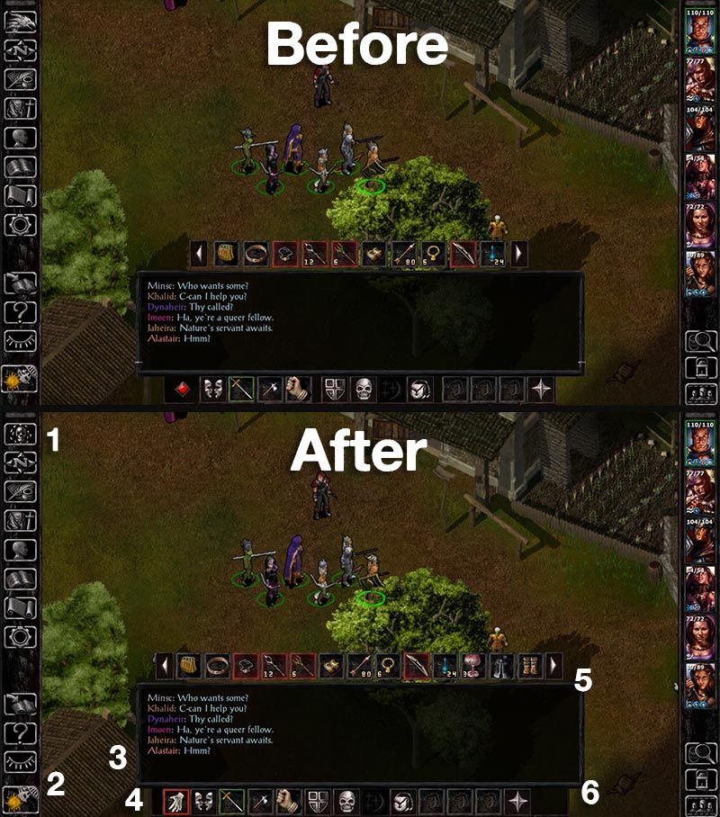
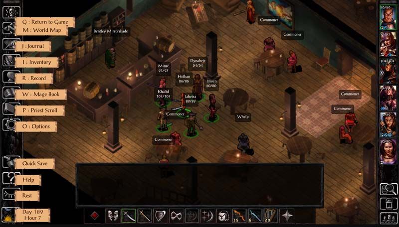
1) The Bhaal logo has been restored as the Return to Game button, which now changes dynamically according to the campaign you're playing, so when playing SoD, you'll still see the original button with the dragon.
2) Buttons on the left sidebar bottom have been slightly repositioned. Clock/pause button is now centered.
3) The little white line on the bottom of the dialogue/gamelog window has been removed. I don't know what it was doing there in the first place.
4) There's a new button for the quickloot toggle.
5) More quickloot slots! There are now 4 extra quickloot slots for a total of 13.
6) Action bar buttons are now equidistant which makes things aesthetically more pleasing. Those buttons used to be grouped in clusters to mimic the distribution of a keyboard's function keys. It made perfect sense back in the day but that particular layout is not as used nowadays, so...
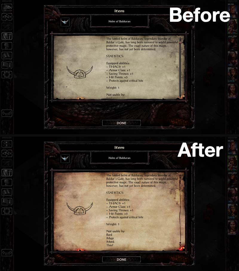
All parchment graphics have been replaced with a more saturated version. I'm not the only one who thought the color was a bit too muted. They also have the proper scrollbar now.
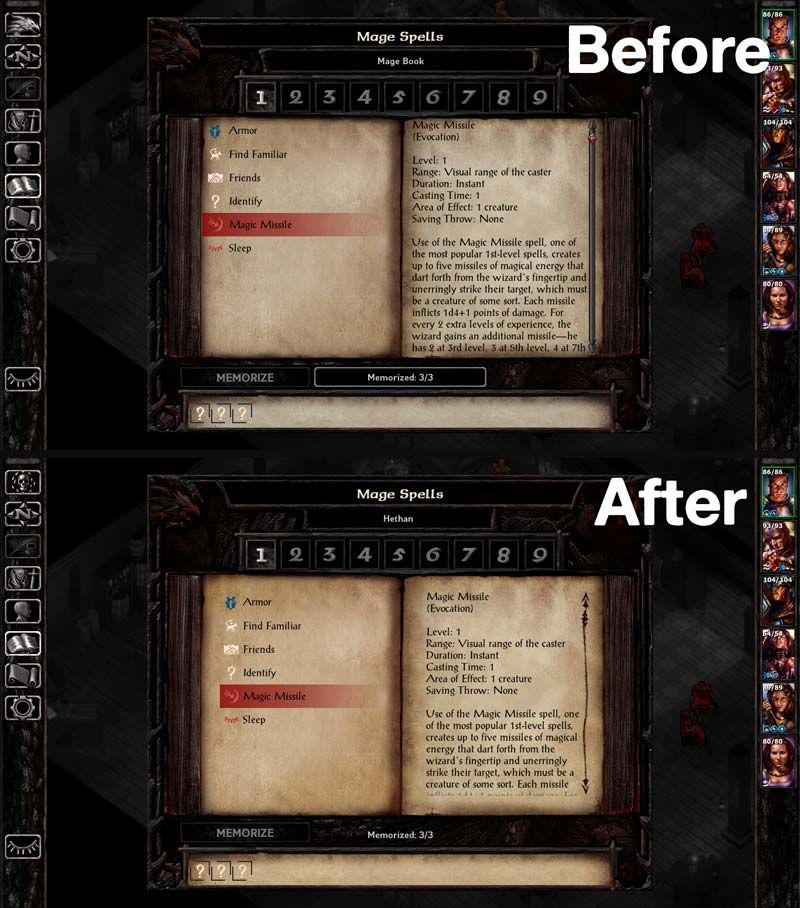
Margins on the Mage Book and Priest Scroll screens were tweaked and are now a bit nicer to look at. This is for people who were sold on the new layout of these screens. For those who miss the old behavior, please keep reading.
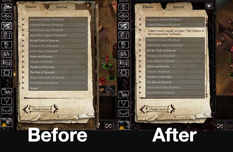
The journal has a new background graphic (offered by Pecca) and close button. I think now it's better integrated with the UI.
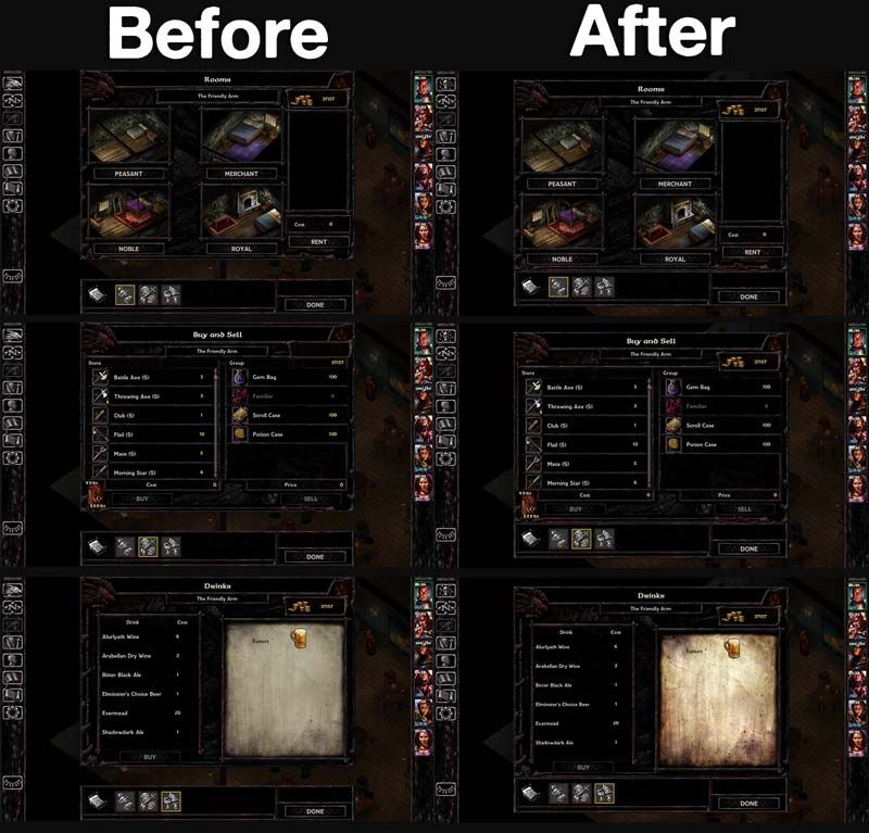
Store panels are properly joined. The headers are also consistent now.
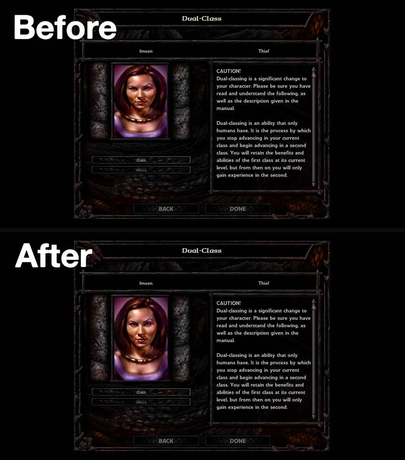
The Dual-Class screen portrait has had it's aspect ratio fixed. How that got past QA is beyond me.
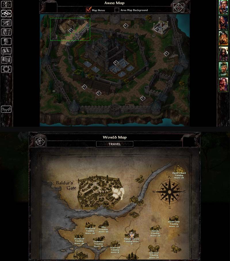
Area Map screen has a new graphic header. The World Map button has also been restored.
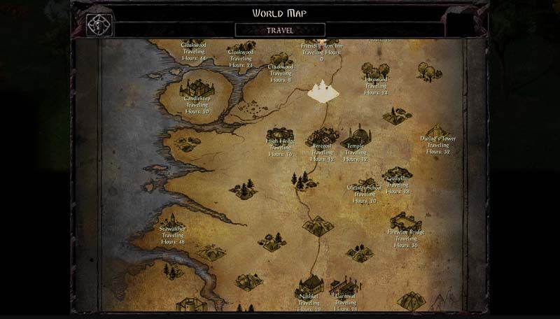
World Map also has a new header. Travel Button has been repositioned.
You may also have noticed the new desaturated/colored worldmap, with a few elements from the original BG1 brought back. It's still not perfect, but at least it's more consistent with SoD's worldmaps.
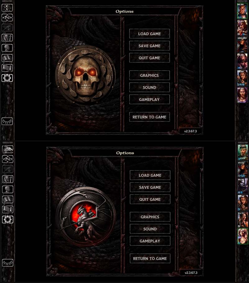
Redesigned Options Screen, including bigger buttons which have also been ported to the Start Menus.

1) The Bhaal logo has been restored as the Return to Game button, which now changes dynamically according to the campaign you're playing, so when playing SoD, you'll still see the original button with the dragon.
2) Buttons on the left sidebar bottom have been slightly repositioned. Clock/pause button is now centered.
3) The little white line on the bottom of the dialogue/gamelog window has been removed. I don't know what it was doing there in the first place.
4) There's a new button for the quickloot toggle.
5) More quickloot slots! There are now 4 extra quickloot slots for a total of 13.
6) Action bar buttons are now equidistant which makes things aesthetically more pleasing. Those buttons used to be grouped in clusters to mimic the distribution of a keyboard's function keys. It made perfect sense back in the day but that particular layout is not as used nowadays, so...

All parchment graphics have been replaced with a more saturated version. I'm not the only one who thought the color was a bit too muted. They also have the proper scrollbar now.

Margins on the Mage Book and Priest Scroll screens were tweaked and are now a bit nicer to look at. This is for people who were sold on the new layout of these screens. For those who miss the old behavior, please keep reading.

The journal has a new background graphic (offered by Pecca) and close button. I think now it's better integrated with the UI.

Store panels are properly joined. The headers are also consistent now.

The Dual-Class screen portrait has had it's aspect ratio fixed. How that got past QA is beyond me.

Area Map screen has a new graphic header. The World Map button has also been restored.
World Map also has a new header. Travel Button has been repositioned.
You may also have noticed the new desaturated/colored worldmap, with a few elements from the original BG1 brought back. It's still not perfect, but at least it's more consistent with SoD's worldmaps.

Redesigned Options Screen, including bigger buttons which have also been ported to the Start Menus.
Optional: Revised Inventory Screen
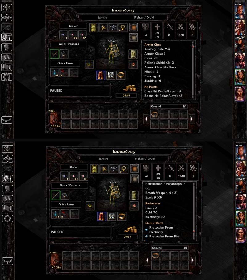
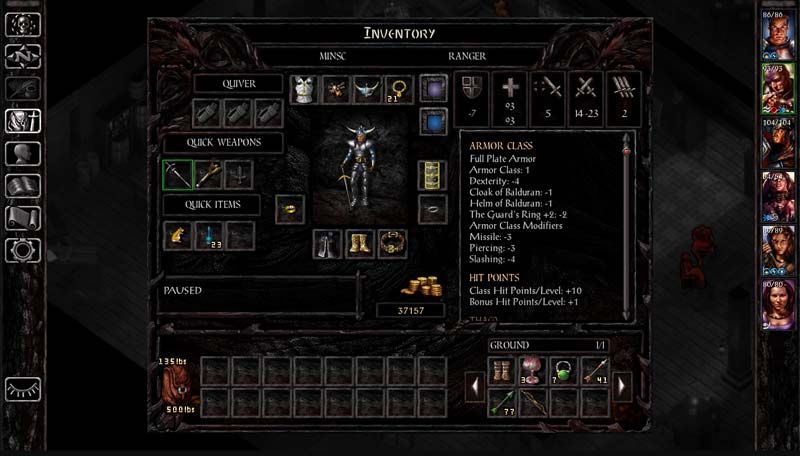
The Inventory Screen has a tweaked layout as discussed here and using the graphics and functionality from this mod by Lefreut.
This version, however, adds saving throws, resistances and status effects to the combat stats window, which should further minimize going back and forth between screens to check how equipped items affect characters.
Optional: Revised Record Screen
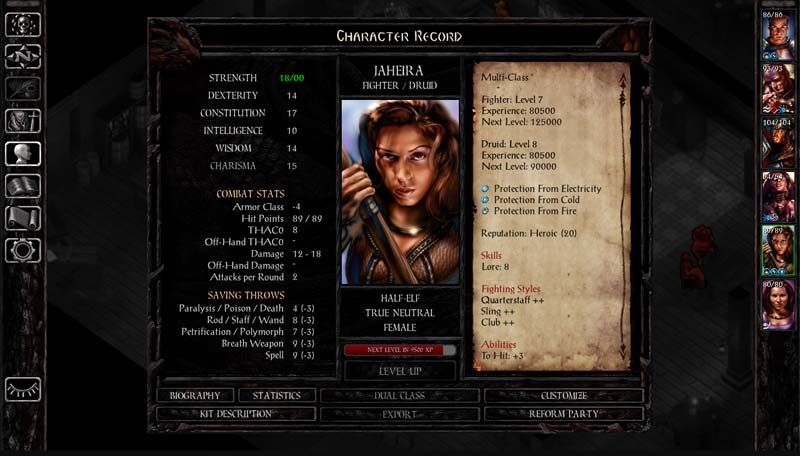
The Record Screen has been completely redesigned, undoing almost every (disastrous, IMHO) change made by patch 2.0. It's a slightly altered version of Lefreut's Improved Record Screen, which didn't have a proper SoD version.
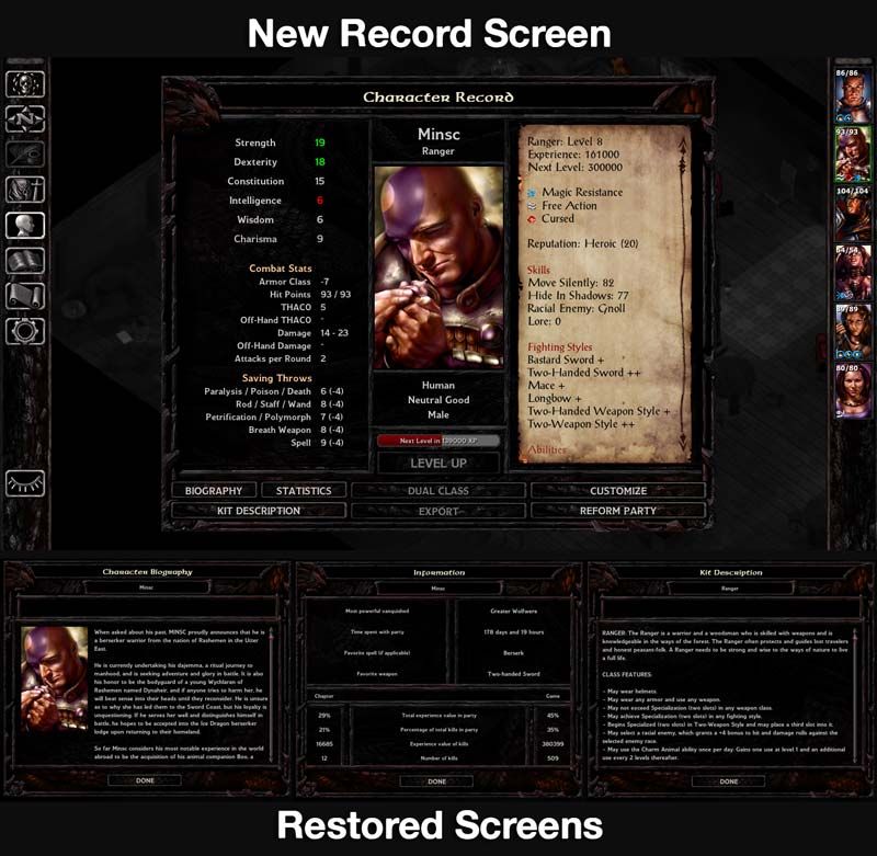
Biography, Stats and Kit Description have their own screens again, the way Bhaal intended.

Biography, Stats and Kit Description have their own screens again, the way Bhaal intended.
Optional: Classic Spellbook
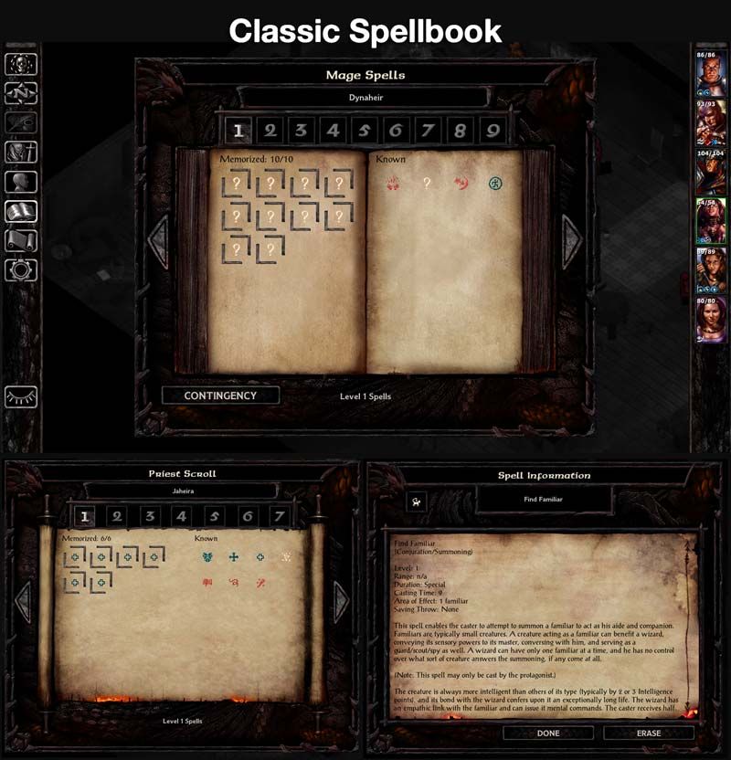
This component makes the Mage Book and Priest Scroll screens behave exactly like they did in the original BG and BG2 (also in the EEs prior to patch 2.0). There are a few very good arguments as to why this is preferable to the new interface, but for those of you who don't agree, this has been kept completely optional.
The basis for this component's code was brought to you by the amazing Lefreut and is also available as a standalone mod compatible with BG:EE sans SoD and BG2:EE.
Optional: Larger Ring Icons
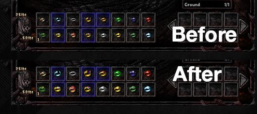
This component ports over the ring icons from BG2:EE, which are larger, just like they were in the original games.
Optional: Alternate Fonts
This component is a major overhaul of in-game fonts, bringing it closer to the original BG1.
Tooltips and floating text now have the same fonts as the gamelog and dialogue window, trading off a little readability for aesthetics.


Tooltips and floating text now have the same fonts as the gamelog and dialogue window, trading off a little readability for aesthetics.
Installation
This is now a WeiDU mod. Download the attached file at the bottom of this post, extract it to your game folder, run CKUISOD.exe and follow the onscreen instructions.Compatibility
This mod is compatible with Baldur's Gate: Siege of Dragonspear or Enhanced Edition Trilogy (if the SoD GUI optional component is installed).(If you're playing either the GoG or Steam versions of the game, please install modmerge before modding your game.)
It's also supported by EEUITweaks Mod Collection as long as you install this one first.
There's a slight compatibility issue with EEUITweaks and the component "Mr2150's Journal Fixes" - if you install this component, it will revert the Journal's close button to its original graphic. It won't break anything,
though, so don't worry about it.
Special Thanks
The WeiDU version of this mod was made possible by the hard work of AncientCowboy and I'm immensely thankful for it.I'd also like to thank Lefreut and Pecca (whose code, artwork and feedback I have used) and Adul and AstroBryGuy for their feedback and insights.
Last but not least, thank you for checking out this mod. I hope you'll enjoy it. Needless to say, feedback and bug reports are always appreciated.
Post edited by Kilivitz on
16

Comments
gamelog: game log and dialogue window.
normal: descriptive text on menus such as options, character generation, etc.
normal_parchment: descriptive text over parchment (spellbook, items, etc).
title: window titles.
parchment: text over parchment (record screen)
button: well... buttons.
label: descriptive text over pop-up windows and prompts.
label_parchment:
button_parchment: buttons over parchment (currently only used in the Journal).
edit: text input fields.
edit_parchment: text input fields over parchment.
list: race/class/kit lists on character generation menus.
list_parchment: list of spells over parchment (spellbook, etc.)
gold: gold values on inventory and store screens.
label_loadname: main character's name next to a save file on load/save screens.
these are new styles introduced by the mod:
label_ck_charname: character's name on record, inventory and spell screens.
label_ck_class: character's class on record/inventory, list of abilities on record screen.
label_ck_num: pretty much every number output in the UI (except gold).
label_ck_inv: inventory titles (Quiver, Quick Weapons, Quick Items, Ground).
label_ck_jour: Journal quest titles.
normal_ck_inv: inventory combat stats and record screen status effects.
soundlist: lists on export and customize\sounds menus.
fonts:
POSTANTI - default game log and parchment font.
MODESTOM - default font for labels and buttons. In this mod, it's replaced everywhere by...
STONEBIG - ...this one.
STONESML - default font for character generation menus. Currently replaced with STONEBIG.
REALMS - Baldur's Gate logo font used in window titles. Currently replaced by...
ELMINSTE - ...this one.
I got from your reply that you know your way around the .LUA file so I hope this reference will help. Let me know if you need any further help.
Thanks for trying out the mod!
- New Record and Inventory Screens
- Revised fonts
- More quickloot slots.
Vanilla SoD:
RDSUIv2:
A temporary solution would be to delete both QUESTBG.BAM and MOS1000.PVRZ from the Override folder. The side effect is that the Journal parchment's tone will be a bit inconsistent with other graphics which are using the new, more saturated parchment.
Thank you very much for your feedback and support. I've ran into some personal life issues (including a busted notebook with all my GUI modding files) which has delayed all my projects, but now I'm back to work on V3, which may end up being a complete revision of the whole mod.
The bad is that V3 is still a few days/weeks away.
The good is that the delay's due to me working a way better version of this mod. I've been revising some of the components and I'm also messing around with WeiDU in order to make it modular (so you can install only the stuff you like) and improve compatibility with other UI mods.
I've also got my eye on EET compatibility but that may not be in the next release.
V3 is now out!
This is a complete rework of the mod. Some changes have been scaled back while some new ones have been introduced.The most important thing is that this is now a WeiDU mod, which means it can be installed and uninstalled with ease. It's also been broken down in components - more control for you.
(Special thanks to AncientCowboy, by the way)
Unless I've missed any major bugs, this should be this mod's last release for a while, at least until the next official patch comes out. I'm now going to focus on my main project, the one Revised Dragon Stone was a warm up for: bringing back BG1's stone UI
See you guys soon.
V4 is now out!
The mod is now compatible with EET. Just remember to run setup-EET_gui.exe first, if you haven't already).Some optional components (Revised Map Screens and Escape Menu) were moved to the main component and are no longer optional. I don't think it's going to piss anyone off.
There's a new quickloot toggle button and a new component that gives all rings in the game larger icons.
Obligatory BG1 GUI promise: it's coming. Seriously. The project has been delayed for a good reason, though: it's now part of a more ambitious project.
Now, you might just think that's a bit weird, and not a big deal, and I'm inclined to agree, except for the fact that I now can no longer select Siege of Dragonspear or the Black Pit. But that's not the worst part. This is:
That doesn't go away. I've tried reinstalling the game, using different versions of the game (I still have my older GOG installers), and using ONLY the main component. Nothing changes. If I use the main component, no matter what, it results in this problem. It's honestly bothering me, because your mod addresses all the problems I had with the UI, yet I can't use the thing. Bah.
EDIT: Two more things: [1] If I don't use the main component, but just the optional ones, the main menu strangely acts like the pre-v2.0 main menu, at least with button placements and the like. It even requires you to select the main game from the list first before giving you BG's main menu, again, just like the pre-v2.0 versions of the game.
[2] I tried to make a new character, just to make sure it wasn't some weird conflict with my save game, for whatever strange reason. It wasn't, and I was greeted within the character creation screen with some problems.
This problem of it trying to emulate the pre-v2.0 UI pervades the entire character creation process. I admit, I can't make heads nor tails of any of this.
EDIT: I haven't been able to reproduce these issues on a clean install of SoD.
One thing I've noticed, though, is that your game is actually v 2.3.67.2, whereas Beamdog's version is 2.3.67.3.
Can you tell me which versions of the game you are using? I'm not sure if Steam or GoG have slightly different builds of the game - that could be what's causing the issues with the Start menu and the Character Generation screens. It seems the resources these menus are pulling aren't the same as in my current build of the game.
And if you'll excuse my obvious question: do you have any other mods installed?
I'm using the GOG version, which, to my knowledge, is supposed to be exactly the same as the Steam version.
The version of the game I took the screenshots of has no mods installed. The version I originally tried it on (my 2.3.67.3 install) does have some tweaks from BG2 Tweaks, but nothing that would affect the UI, and like I said, it does this even on an install with no other mods.
It is possible that GoG has a slightly different version of UI.MENU, the only file which is touched by this mod. I don't currently own the GoG version, so I'll give the mod a go on Steam to see what happens.
Your GoG install doesn't have modmerge. This small modification is required for most mods to work properly with the GoG and Steam versions of the game.
The reason is that these versions have a slightly different file structure, due to SoD being handled as DLC by these platforms.
Please refer to this thread.
I recommend you uninstall all mods (including BG2 Tweaks), install modmerge and then reinstall all other mods. Once you do this, everything should work perfectly.
Let me know if you run into any other issues! And thanks a lot for bringing this to my attention. I'll update the original post with a warning for GoG and Steam users.
Give me a little bit to install ModMerge and reinstall my mods, and I'll be back to say if it works (which it almost certainly does). Thanks in advance, though.
EDIT:
Works like a charm so far. Thank you so much. This was bothering the hell out of me, to the extent that I was thinking of just dropping the game and playing something else.
Now that I'm thinking about it, do you have plans of making a similar UI mod for BG2:EE? It has all of the same problems this game has, and having a consistent UI experience between the two games would be great. Or are you content with just having this be compatible with EET, achieving a similar result?
And to answer your question: I do have plans for a BG2:EE version of this mod. I don't know when it's coming out, but in the meantime, I highly recommend Lefreut's Enhanced UI which is a major improvement over BG2:EE's current UI.
And thanks for the recommendation. I'll use that for BG2:EE for now. Cheers!
Starting to think that I'm destined to just not have a UI mod. This is the 4th one I've tried that has just not worked on my machine for whatever reason.
I really enjoy it, it very much captures the feel of the original BG UI and does away with a lot of the SoD UI annoyances while staying away from some of the things that made the original 1998 UI clunky. Great work, and sorry for the false alarm!
@Arthas the mod should work with any resolution larger than 1024x768, which is the minimum required for BG:EE.
@Ratatoskr I was not aware of Photobucket changing their policy on direct links. I'll try to find a new place to host the screenshots and will let you know when they're back up.
It seems the screenies from the OP are gone. Could someone upload them again, please?
Thanx a bunch!