UI Improvement Suggestions Thread
 Pecca
Member Posts: 2,279
I've seen some posts on the forum asking for a general thread to express people's problems with the current state of game's user interface and suggestions about how to make it better. So here it is. Feel free to describe any issue you have with the UI and say what solution you'd like to see.
Edit: As the discussion went forward, some specific topics were split from the main thread:
Record Screen
Dialogue Window
UI Skin
Inventory Screen
Worldmap
I'll start with a rather extensive list of things I've gathered so far.
Area map
-Introduce an option to disable zoom animation in order to smoothen the gameplay. Previously it was possible to use the map screen to shift to another location on map in just about a second, now the time is unnecessarily prolongued.
Worldmap
-First out of two times in this post I'll say turn it back as it was pre 2.0. The extra text clutters the screen, traveling became clumsier. There is also no way to know travel times to unnamed areas.
-Plus, when the worldmap area is stretched by modding, it creates a scrollable gap underneath, which of course shouldn't be there.
Journal
-Finished and unfinished quests are very badly unrecognisable from each other, use another color (like black) for the finished quests headings.
-Introduce filters to show only finished or unfinished quests.
-All in all, do everything what Mr2150 did with his journal mod, he pretty much perfected it.
-And more than that, introduce an option to have a center based modal journal, which would act like other screens (and pre v2.0 journal) for those who prefer that rather than one sitting in the corner of the screen.
Inventory
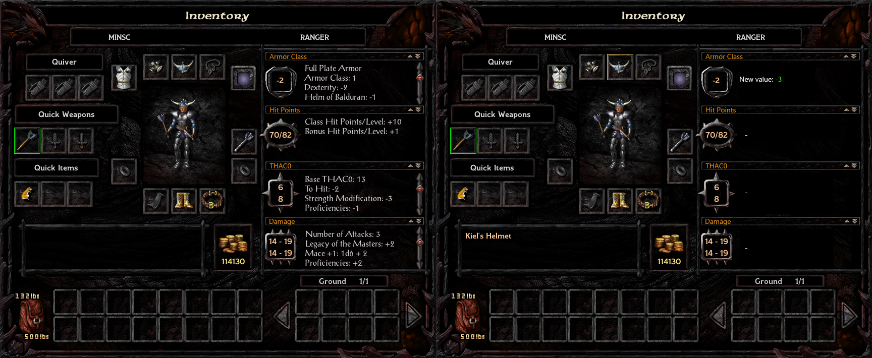
-A large portion of the inventory graphics shifting everytime an item is picked up to show item comparison is very distracting and rather clumsy. Use available space to just change the text, like in this photoshop mockup:

-Introduce an option to turn the yellow portrait hightlight suggestion off for those who find it too distracting (currently it's not possible to disable even by modding).
Spell screens
-Introduce a toggle that would shift between a list of know spells and icon based group of known spells (as in pre v2.0) for players to choose their preference.
-Display memorized spells in order in which they have been memorized, instead of alphabetical order, which makes the spell management more confusing.
-In the list of known spells, introduce a fitting graphics for selected spell instead of the red shade. It looks inappropriate on a "paper" background.
-Reintroduce arrows that shift between spell levels (next to the spell level buttons is an appropriate space).
-There is no need for two similar labels "mage spells" and "mage book" just for the sake of contingency, it looks odd. Replace the "mage book" string with character name, keep the contingency string.
-Memorizing spells from the list is confusing. Either explain clearly in the rightside tooltip, that spell icon, not the text, needs to be pressed or make the spell description display on hovering over the spell and have the text memorize the spell too. Now you can get rid of the memorize button. (this must happen for icon based group of known spells anyway)
Escape menu
-Make the logo change depending on the campaign.
Store screen
-Make it centered for heavens sake!!
-Allow escape to close the store screen.
Dialog window
-The second time I'll say revert it back to the pre v2.0 state. If the idea behind the change was to allow the height to be stretched for longer dialog texts, I can only say it is absolutely not worth loosing the ability to conveniently go through the log history with just a scrollbar. That functionality is being gravely missed.
-Introduce an option to turn off spacebar advancing the dialog.
Main menu
-Introduce SoD style main menu into non-SoD games, namely the option to continue the last save, load game, new game and shift between campaigns all from the first screen.
Character Generation
-Change the way custom portraits are selected. There are many ways, just pick one that displays more than one portrait at the time. Currently, having more than a dozen custom portraits makes it a real pain to choose.
-Introduce button graphics to the lists of elements instead of the red shade. It will look better.
Load screen
-(this is not exactly UI related but still) If possible, introduce the option to select a number of quick saves. Also make the chapter saves optional.
Record screen
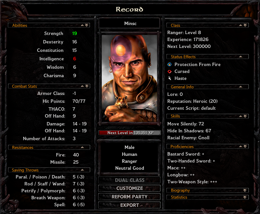
-In all other cases I have a pretty solid vision of how the UI should look, except this one, so I'll present a possible vision, rather than suggestion.
-First thing though, unite the design (mainly in SoD case, but BG2EE graphic is kinda out of place too). Dragon heads look cool, but either give the edges to all other ingame windows, or none. Otherwise the UI gives a non compact feeling.
-Now, the problem at first sight is that there are too many buttons at too many places (plus "abilities" and "stats" being rather improperly named). Also the space for status effects is way too small. Overall it looks chaotic.
-On this screen, it is especially important to save space and use it modestly and intelligently, since we want to show much information at the same time and in orderly fashion, so it must not confusing for the player.
-So for the vision - two big lists with information contained in collapsible paragraphs based loosely on the old familiar (pre v2.0) design:

-Those paragraphs can be collapsed to make more space for information below them (kinda like the journal works now). Ideally it should be possible to customize which paragraphs would be collapsed by default.
-Some of these paragraphs would also have a button to show more information (double arrow). That would substitute the tab buttons. Double arrows would also collapse all other paragraphs to make a clear space for the desired information.
Anyway, I don't actually know if it's possible to have many expandable/collapsible paragraphs (and with button graphics) inside one list of items, so this is just an idea. But I would recommend to keep a design familiarity with the old record screens.
So, this is my input about what I think would help to percieve the UI more positively overall.
P.S. All pictures here are only rough photoshop mockups to serve as an inspiration.
Edit: fixed typos, added another worldmap bug.
Edit: As the discussion went forward, some specific topics were split from the main thread:
Record Screen
Dialogue Window
UI Skin
Inventory Screen
Worldmap
I'll start with a rather extensive list of things I've gathered so far.
Area map
-Introduce an option to disable zoom animation in order to smoothen the gameplay. Previously it was possible to use the map screen to shift to another location on map in just about a second, now the time is unnecessarily prolongued.
Worldmap
-First out of two times in this post I'll say turn it back as it was pre 2.0. The extra text clutters the screen, traveling became clumsier. There is also no way to know travel times to unnamed areas.
-Plus, when the worldmap area is stretched by modding, it creates a scrollable gap underneath, which of course shouldn't be there.
Journal
-Finished and unfinished quests are very badly unrecognisable from each other, use another color (like black) for the finished quests headings.
-Introduce filters to show only finished or unfinished quests.
-All in all, do everything what Mr2150 did with his journal mod, he pretty much perfected it.
-And more than that, introduce an option to have a center based modal journal, which would act like other screens (and pre v2.0 journal) for those who prefer that rather than one sitting in the corner of the screen.
Inventory
-A large portion of the inventory graphics shifting everytime an item is picked up to show item comparison is very distracting and rather clumsy. Use available space to just change the text, like in this photoshop mockup:

-Introduce an option to turn the yellow portrait hightlight suggestion off for those who find it too distracting (currently it's not possible to disable even by modding).
Spell screens
-Introduce a toggle that would shift between a list of know spells and icon based group of known spells (as in pre v2.0) for players to choose their preference.
-Display memorized spells in order in which they have been memorized, instead of alphabetical order, which makes the spell management more confusing.
-In the list of known spells, introduce a fitting graphics for selected spell instead of the red shade. It looks inappropriate on a "paper" background.
-Reintroduce arrows that shift between spell levels (next to the spell level buttons is an appropriate space).
-There is no need for two similar labels "mage spells" and "mage book" just for the sake of contingency, it looks odd. Replace the "mage book" string with character name, keep the contingency string.
-Memorizing spells from the list is confusing. Either explain clearly in the rightside tooltip, that spell icon, not the text, needs to be pressed or make the spell description display on hovering over the spell and have the text memorize the spell too. Now you can get rid of the memorize button. (this must happen for icon based group of known spells anyway)
Escape menu
-Make the logo change depending on the campaign.
Store screen
-Make it centered for heavens sake!!
-Allow escape to close the store screen.
Dialog window
-The second time I'll say revert it back to the pre v2.0 state. If the idea behind the change was to allow the height to be stretched for longer dialog texts, I can only say it is absolutely not worth loosing the ability to conveniently go through the log history with just a scrollbar. That functionality is being gravely missed.
-Introduce an option to turn off spacebar advancing the dialog.
Main menu
-Introduce SoD style main menu into non-SoD games, namely the option to continue the last save, load game, new game and shift between campaigns all from the first screen.
Character Generation
-Change the way custom portraits are selected. There are many ways, just pick one that displays more than one portrait at the time. Currently, having more than a dozen custom portraits makes it a real pain to choose.
-Introduce button graphics to the lists of elements instead of the red shade. It will look better.
Load screen
-(this is not exactly UI related but still) If possible, introduce the option to select a number of quick saves. Also make the chapter saves optional.
Record screen
-In all other cases I have a pretty solid vision of how the UI should look, except this one, so I'll present a possible vision, rather than suggestion.
-First thing though, unite the design (mainly in SoD case, but BG2EE graphic is kinda out of place too). Dragon heads look cool, but either give the edges to all other ingame windows, or none. Otherwise the UI gives a non compact feeling.
-Now, the problem at first sight is that there are too many buttons at too many places (plus "abilities" and "stats" being rather improperly named). Also the space for status effects is way too small. Overall it looks chaotic.
-On this screen, it is especially important to save space and use it modestly and intelligently, since we want to show much information at the same time and in orderly fashion, so it must not confusing for the player.
-So for the vision - two big lists with information contained in collapsible paragraphs based loosely on the old familiar (pre v2.0) design:

-Those paragraphs can be collapsed to make more space for information below them (kinda like the journal works now). Ideally it should be possible to customize which paragraphs would be collapsed by default.
-Some of these paragraphs would also have a button to show more information (double arrow). That would substitute the tab buttons. Double arrows would also collapse all other paragraphs to make a clear space for the desired information.
Anyway, I don't actually know if it's possible to have many expandable/collapsible paragraphs (and with button graphics) inside one list of items, so this is just an idea. But I would recommend to keep a design familiarity with the old record screens.
So, this is my input about what I think would help to percieve the UI more positively overall.
P.S. All pictures here are only rough photoshop mockups to serve as an inspiration.
Edit: fixed typos, added another worldmap bug.
Post edited by Pecca on
28

Comments
and also, the inventory, why oh why, did they add unnecessary lag to it? every time you pick up an item in the inventory screen you have to at least wait a full second before you can drop it again, ( and this is at 60 fps, couldn't imagine how much a nightmare this would be at 30) so they need to get rid of that unnecessary lag, some complaints people have about bg is the inventory management, and now it is even worse when trying to move items through it, its almost so bad I don't even want to play the EE's anymore because of it
speaking of inventory, lets talk about selling stuff, every time you go to sell something, why did they make it so if you have a stack of something it sells ONE AT A TIME, this is a colossal pain in the bunions, because EVERY SINGLE TIME you want to sell a stacked item, you have to double click it first and then press okay, unnecessary button pressing for nothing, 100 times out of 100, if you are selling stuff, and its a stack of more than one you want to sell the whole stack, if you didn't you would give a stack to someone else, so this "double clicking on stacks to sell the whole stack" garbage really needs to go
so if they could fix those 2 options, then I would be content, although I like your map idea as well Pecca, but the inventory thing, is driving me banana sandwich and if I could I would play this game at 120 fps, and when im forced to wait half a second for nothing, my brain neurons start exploding
another one of those "fixing things that aren't broken" sort of deals
I would certainly second the suggestion to revert the dialog window back to the pre v2.0 state. This one is a deal breaker for me.
I would also like to add that I think the artwork and the colors used for the UI should be consistent with what was used in the original games. If this was suppose to “bridge” the gap between BG and BGII, why was it made to stick out like a sore thumb? The overuse of dark colors and black in the SoD UI is especially unpleasant to try to look at for any period of time. I find it downright depressing.
When playing BG:EE using the new SoD UI, The scrolling text chapter screens (for example travelling to werewolf island) should not use the older Blue UI
Also scroll speed with mouse should be much more sensitive at higher settings. It's still slower than its keyboard scrolling equivelent
The chapter screen thing sounds like a bug, if it's what it sounds like. I would go ahead and report that on Redmine. Same thing with any screen that used to have Esc/Enter functionality but doesn't anymore. Those are all separate issues and will need to be fixed separately, but making sure they're reported is the first step to fixing them.
On a broader note, this thread is a great idea; thanks to @Pecca for starting things off! Have a Promote.
I don't want to tell people how to discuss or offer feedback, but part of the difficulty in filtering through the feedback so far has been that it frequently bleeds over into ranting (Why would they ruin this feature on purpose? The answer is usually, "Obviously we didn't ruin it on purpose.") and hyperbole (I can't believe they took the perfection that was the old way and replaced it with this pig slop of a Record screen! This effectively conveys that you liked the old way and that you don't like the new way, but doesn't give us any useful information beyond that).
While both of those things are healthy things to do, and I don't want to discourage them, I would recommend formatting specific requests (like what seems to be the purpose of this thread) in a way that makes it clear what you're suggesting and why. Bullet points help; headings help even more. (@Pecca's post at the top, for instance, is super easy to sift through, which means I'm more likely to read his suggestions in greater detail.)
So I'll say again what I've said in other threads: If you don't like something in the UI and you want to propose an alternative or an improvement, take a few minutes to think about what specific thing it is you don't like, and why.
If you can articulate that, not only will you help us better understand what needs to be changed, but you'll also develop a better understanding for yourself of what it is you're looking for in a game's interface. You may discover that the things you're looking for are also missing from other games--or you may find that they exist in games you hadn't tried before, which might be worth playing. Everybody wins!
About the lost ESC and ENTER shortcuts for various screens, we should put together a list of screens that lack this I think. The store screen was the only one I could think of from the top of my head. The next would be the level-up screen, which needs a bug to be fixed before it can happen though. Another is the ground container. Those three should be able to be closed by ESC. I never actually used enter so I don't know which screen should have it.
Pressing Enter is 'confirm', 'ok', 'next', 'done', etc - the positive response
Pressing Escape is 'cancel', 'no', 'back', etc - the negative response
The existing shop screen setup could be used (if it were bigger, so it showed all 16 slots) and you simply select which character you want on the left, which you want on the right...
This thread isn't what did 1.3 do better than 2.0+ it's what improvements would you like to see...
Not exactly what you're asking for, but offered as a bandaid.
As for your idea itself, how would you recommend opening this NPC to NPC interface? I think it's tricky to implement this in an intuitive way.
@Thels - yeah, that's a good suggestion as a band aid...
On how to open the interface - it could be a button inside the inventory screen (maybe double-clicking the backpack), click it when in character x and it opens up the swap interface with character x on the left hand side.
You then have the 6 portraits on the top of the screen and you right-click one to bring their inventory on to the right hand side. After that it works just like the shop/bag screen so you can transfer items back and forth... Why right-click? Because left-clicking when in this interface would change the current left-hand side inventory.
So you start in character 1's standard inventory, double-click the backpack symbol, and it opens the swap inventory screen. Right-click portrait 3 and you can start swapping inventories between 1 and 3, left-click 2 and you can now swap between 2 and 3, right-click 5 and you can swap between 2 and 5....
EDIT - Since left-click / right-click wouldn't work on tablets and phones maybe a solution of dragging the required inventory to each pane would be better (or could also be used)...
I can totally understand why people who didn’t like things about the old UI are happy about the developers opening it up to all kinds of modifications. I am honestly happy for them.
What I really don’t understand is this tendency I’m seeing for people who want these changes, to bash anyone who mentions the fact that they liked things the way they were.
As popular as this game has remained, despite it’s age, do you really believe that everyone hated the old UI? I can assure that is not the case.
You can only toss out so much of the old before you start loosing some of the feel of the old experience as well.
For me, at this point it is starting to feel more like some modders personal realization of how they would like their game to look, rather than an “enhanced edition” of an old classic.
I fully expected that there would be some changes made to the EE editions that I might not personally like. It is inevitable that when a new developer takes over they will bring in some changes that fit with their own vision.
I personally didn’t like the use of blue in the 1.3 UI, rather than using the tones found in either of the original games. I said nothing. I didn’t like the changes they made to the way thieving works, or some of the decisions that were made to how some of the spells worked or the “rebalancing” of certain weapons. I could go on, but I won’t.
I said nothing about these changes, accepted them all. But this new UI, as it stands now, is the final straw for me. It not only makes radical changes to the look and feel of the original games, it tosses them out the window.
I think that the focus of this thread should be about opening up the possibility to mod whatever parts of the new UI there are that can’t currently be modded. At least this way there is the possibility for everyone to have something that they are comfortable with.
Making such radical changes, then not allowing them to be modded, feels very unfair to me.
I made a similar suggestion for something I think would improve things and the immediate response was 'it works the same way as it did in 1.3' ... well 1.3 isn't the only way of doing things... and maybe 1.3 and 2.0 both do it wrong.
About the inventory. I originally aimed for PoE like inventory screen in my mod (screenshot below), but the slots functions are hardcoded (in fact awfully lot of inventory is hardcoded). If I could put slots of all party members into one screen, that would make the inventory management totally awesome.
Since we now have the main character's name on the saves (great idea, BTW), it would be nice if we could get: "Chapter 3 start - Michael" and "Chapter 3 start - Guilliem" so we could keep the full record of the run.
That way everything gets read left-to-right, with the most important information on the top left.