[MOD] Bubb's Spell Menu (v5.1)
 Bubb
Member Posts: 1,012
Please Note: EEex is required to use this mod — EEex is (at the time of writing) only available on Windows platforms.
BG:EE (no SoD) :
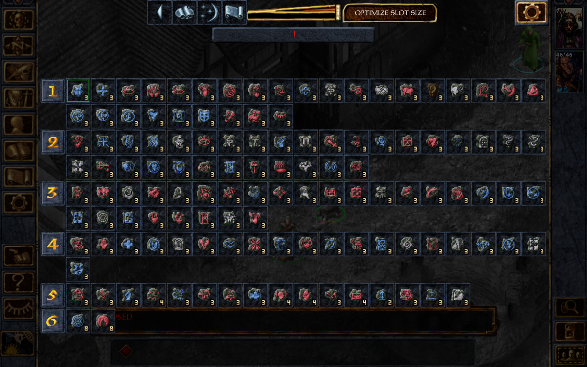
BG:EE (with SoD) :
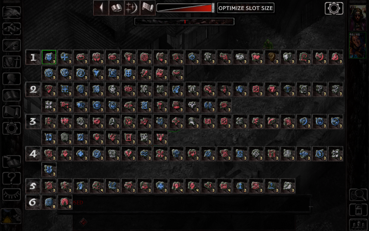
BG2:EE :
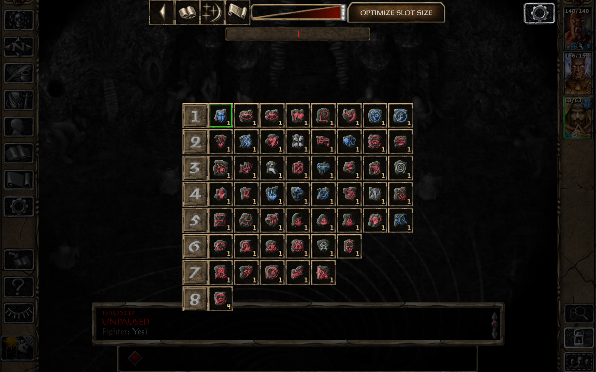
IWD:EE :
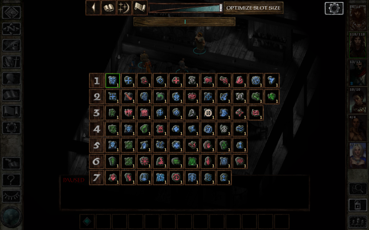
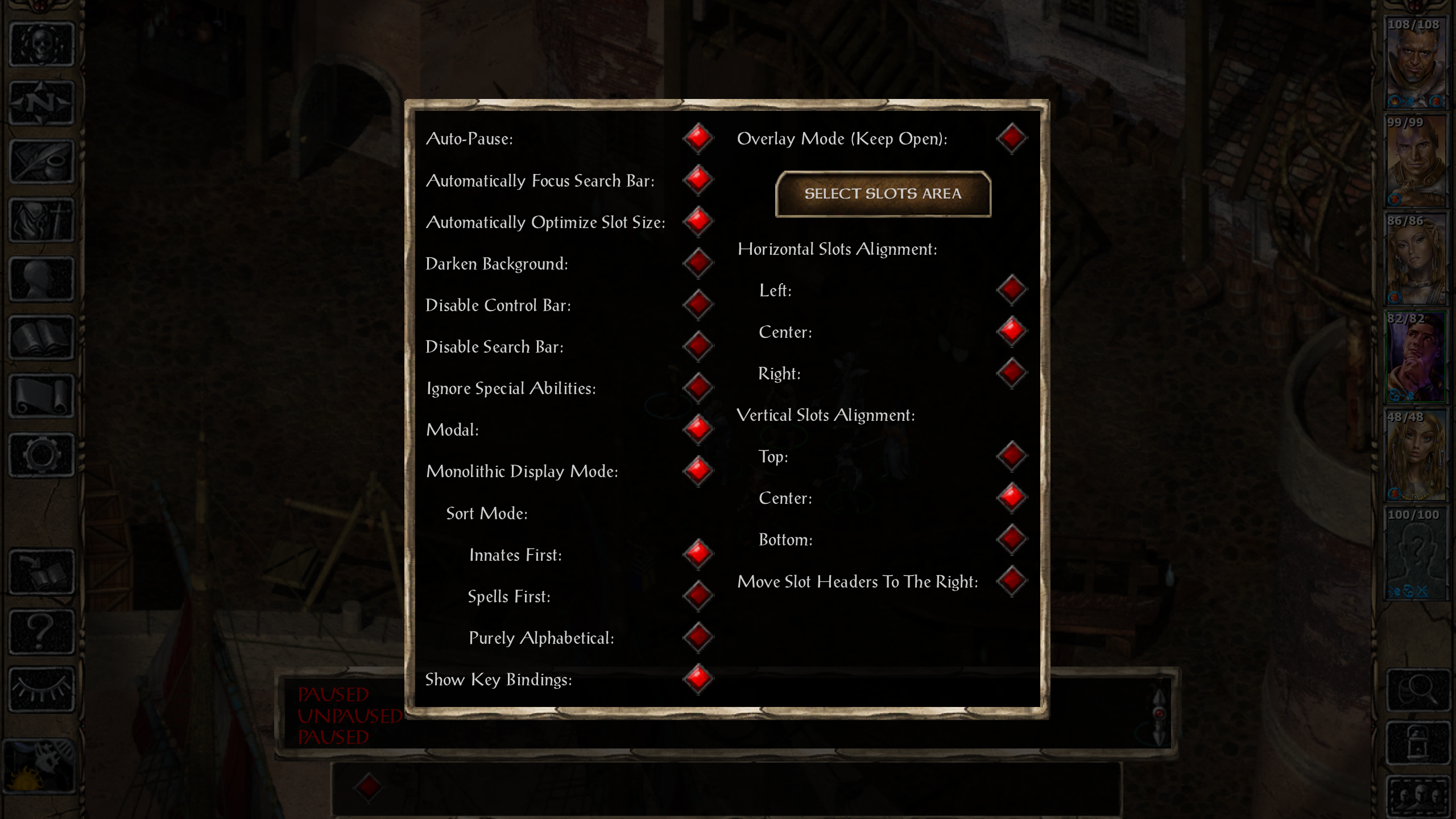
Options screen :
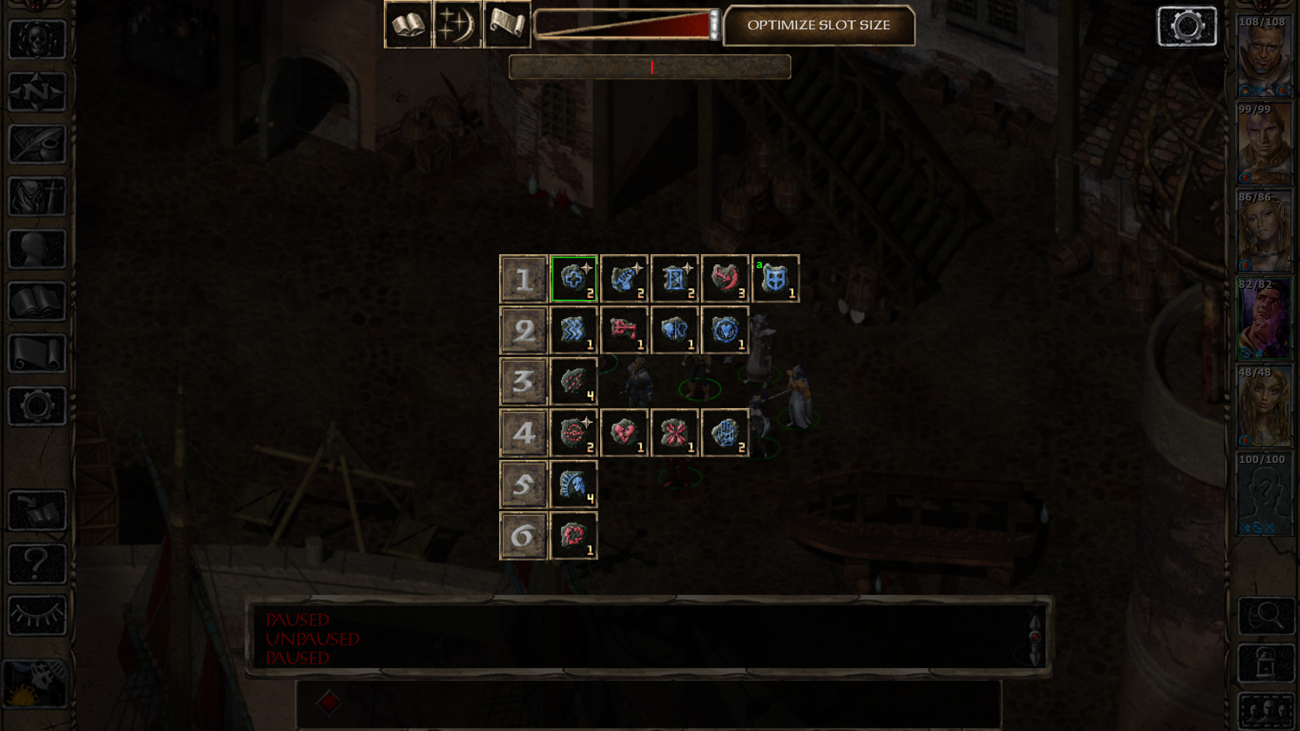
Monolithic Display Mode :
Overlay Mode :
Overview:
This mod seeks to replace the standard actionbar spell selection with an alternative that is more convenient for the player. The primary enhancements over the default spell selection include:- Displaying all available spells at once, (categorized by level). No more endlessly clicking the right-arrow to get to your 9th level spells!
- A searchable spell list. Know which spell you want to cast? Just type the first couple of characters and press enter.
- The ability to narrow view to only Mage or Cleric spells; useful for Mage/Clerics.
Screenshots:
BG:EE (no SoD) :

BG:EE (with SoD) :

BG2:EE :

IWD:EE :

Options screen :

Monolithic Display Mode :

Overlay Mode :

Installation:
Download: Here- Install EEex (forum).
- Download the zip file above and copy the contents into your game's base folder.
- Run setup-bubb_spell_menu.exe and follow the prompts to install.
- Make sure to run the game with InfinityLoader.exe after installing EEex.
Mod Compatibility:
Compatible with the following UI overhauls, (when installed after):- Dragonspear UI++, (at the time of writing, the latest version can be found in this comment by artyfox; this version is required for compatibility)
- EET, EET_GUI
- Infinity UI++
- LeUI, LeUI-BG1EE, LeUI-IWDEE, LeUI-SoD
Post edited by Bubb on
20

Comments
Version 1.0:
Changelog:v1.0: Initial release.
Version 1.1:
Changelog:v1.1: Added Type category. Fixed alignment issue with search bar. Refactored code.
New Version: Light
I'm sure some have felt like the normal version of this mod goes over the top. The menu is big, it's bulky, and it is somewhat intrusive to the world screen. In consideration to this feeling I've made a "light" version of this mod, which only includes a search bar. This version is much more integrated with the vanilla GUI, as the search results are displayed in the hotbar itself; nice and tucked away on the bottom of the screen.Standalone features:
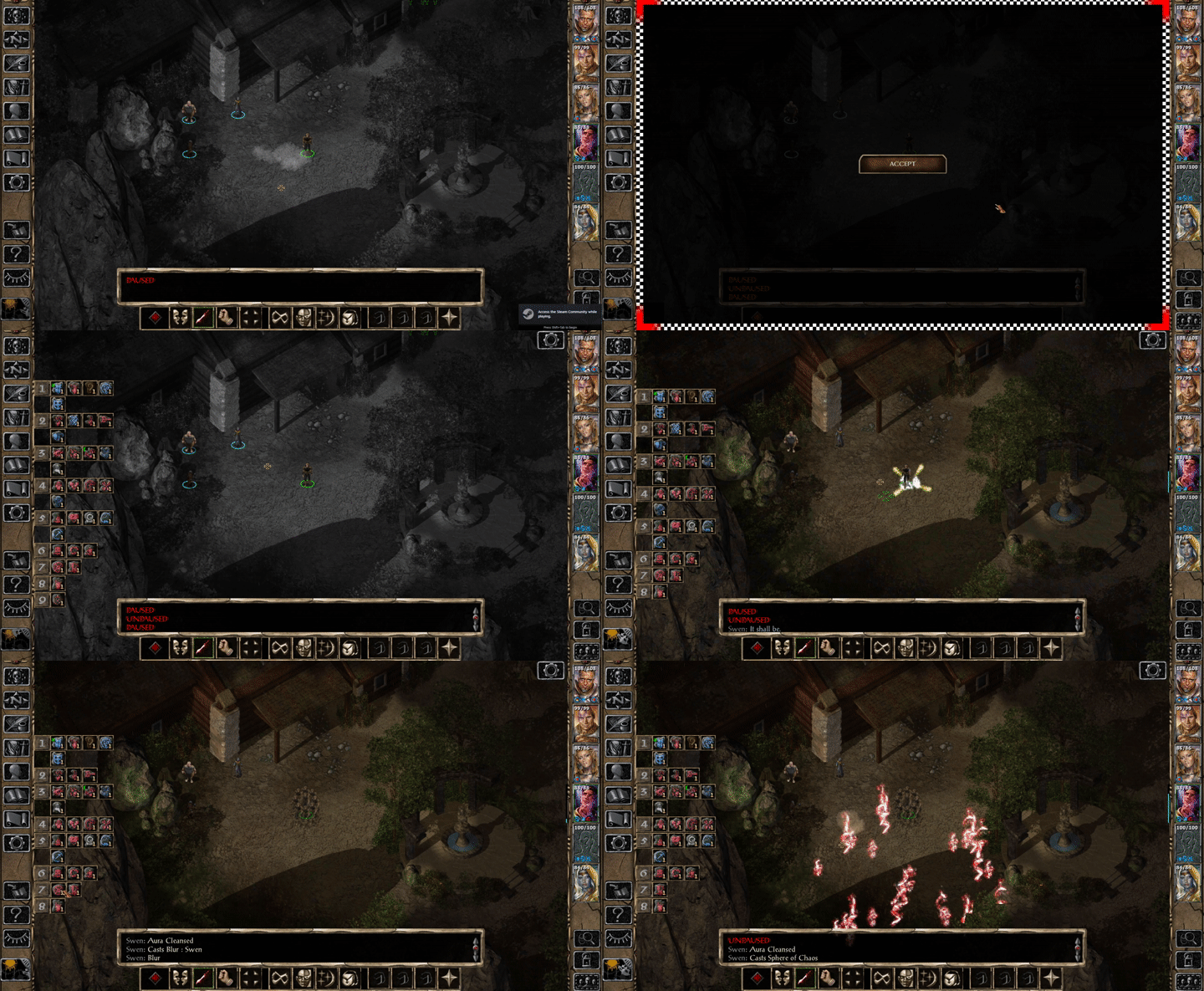
The spell selection uses the default behavior until a term is inserted into the search bar. Once a search term is entered the hotbar transforms into a list of search results; these results mimic the default spell selection behavior.Note: The green slot in the search results is the slot that will be picked if "enter" is pressed while typing in the search field. This is useful for quickly picking a spell when you've typed enough characters to narrow the list down to one entry.
Screenshots
Searching for "Summon"
Searching for "Protection from"
Changelog:
v1.2: Reverted unintentional edits to message box. Cleaned up code.
v1.1: Critical fix regarding a failure to pick spell when hotbar was moved before inputting search term.
v1.0: Initial release.
Also it seems that there are way less players willing to try UI mods compared to other mods
I only want to say, if you enjoy working on UI mods or tweaks, please keep doing it and post them here, there will always be some people that will use them (even if they don't comment on the topics)
One thing that prevents me from using this, is the loss of spell counts, and AFAIK your correct that there is no way to fix that given how the UI currently is.
Getting Beamdog to open up the action-bar is a long overdue request. Recreating, if not improving, the action-bar of IWD2 is, IMO, the real goal. You could probably get very close with what you doing here, but the implementation of Modal Abilities and the spell count would be the main issues.
I agree with everything you said. It is quite unfortunate how hardcoded some of the UI items are, and how little is exposed to the LUA environment in general. Even when we get comprehensive data that is exposed, it's only exposed when the engine "deems" it to be; just like how the characters table, (which has a TON of information about the party), is only filled with the information of the party members that are selected.
I already use an ugly hack in which I have to change the spell names to UUIDs and then replace them dynamically at run time, and this is just to identify which spells the character can currently cast! (It has to be this way so summons and the like work with the menus). I've tried to come up with some hacky way to track the number of times a spell can be cast, but alas I always hit a wall
Hopefully Beamdog listens and improves the exposure of currently hardcoded items to the LUA environment, it would make so much more possible.
Version 1.2:
Changelog:v1.2: Fixed bug where duplicate spell entries were being shown. Cleaned up code.
Version Light 1.2:
Changelog:v1.2: Reverted unintentional edits to message box. Cleaned up code.
Could you please stop this nonsense of putting last mod release inside new forum post every time? Use first post with single archive or look for better ways/hosting
Heh, yeah, I had an inkling that wasn't right; I'll look into archiving them on the first post and using a different host. This is the first time I have done something like this, so I didn't know what the standard was. Sorry for spamming the forums!
Edit: I've reworked the OP a bit, hopefully this version puts everything in one place!
You can use new comments for explaining changes, and incorporate them into the OP.
If it's possible, please make it so that all the spells are visible at once without scrolling, searching, switching, etc.
And if they could be categorized by level, preferably in a horizontal way, that would be something.
I'm glad you like the mod! If I separate the spell levels into horizontal rows, like you suggest, I could get close to complete coverage, but characters with a large amount of spells would still need *some* horizontal scrolling of some kind. This is because I can't dynamically size the spell BAMs, they are the size they are. I think I could probably fit ~15 unique spells per level on the screen horizontally, (screen aspect ratio might affect this?). I don't think that number is reached anywhere in the vanilla game, so this should be workable. Of course players will almost always have less than 15 spells, I just have to account for the extreme cases. As I think about it, this could work; I'll look into implementing a version of it.
(I know the mod is currently only for BG2EE, but if you plan to port it to BGEE and IWDEE, the above should be considered.)
Normal Case:
Extreme Case:
Thoughts?
New Version: Extended
Overview:
If the list view from the normal version of this mod doesn't strike your fancy, this version very well might. This version emulates the slots from the default spell selection, and arranges them in such a way that all spells will be visible at once. This is useful for players who are irritated by the lack of visibility in the default spell selection.Screenshots:
Wizard's Spell Selection
Changelog:
v1.3: I was an idiot and accidentally changed something in WeiDU that broke the mod when you cast a spell, all is fixed now.
v1.2: Added spell type filtering. Added optional left align.
v1.1: Fixed Spell UUIDs appearing in the priest spell selection in character creation.
v1.0: Initial release.
This is a fresh BG2:EE install with just the extended version of this mod installed and nothing else. Mage spell selection was just fine.
Thanks for the report. If you see these strings anywhere else in the game, please let me know. I've updated the main archive in the OP with v1.1 of the extended version, which should fix this issue. Also, in your case replacing your UI.MENU is all that is required to update to the new version.
The Extended version looks lovely! I am sorely tempted to use it now because it resembles NWN2's quickcast menu. If you could filter between priest, mage, and all spells (perhaps via 3 icons at the top of the menu), I think it would be perfect!
And this is just my opinion, but I think it looked better when the menu was aligned to the top-left of the screen instead of the center. Unless you can drag it freely, in which case, my mistake.
I'm glad you like the extended version! I looked up NWN2's quickcast system that you mentioned, and it is eerily similar! I honestly had no idea any other game had a selection like this, but it must mean it's a good system, right?
Right now the menu is fixed, and I think it would be too difficult to make it draggable, but maybe I could put some buttons somewhere that aligns it to zones around the screen. Also, I think your suggestion of filter buttons is great; I already know of some great BAMs I could commandeer for them
Version Extended 1.2:
Screenshots:
Cleric / Mage All Spells
Cleric / Mage Filter By Mage Spells
Cleric / Mage Filter By Cleric Spells
Cleric / Mage Left Align
Note:
This version requires any old versions to be uninstalled, please do so before attempting to install this version.Changelog:
v1.2: Added spell type filtering. Added optional left align.
Version Extended 1.4:
Changelog:v1.4: Fixed quickspell selection. Fixed spell uuids showing in temple healing services.