New 2.0 Record Menu HYPE!
 00zim00
Member Posts: 267
00zim00
Member Posts: 267
Dee asked me recently if they could use my UI design as inspiration for a redesign they were working on after getting feedback from the community. This is right now how the UI looks in the new patch update! As dee told me "We have ideas for how to improve it in general, but making it function better for this release is important."
I think Dee will be posting more information about it when the full 2.0 patch notes are released that they are now working on but I just wanted to spread the good news! Great work Dee on the UI and thanks Beamdog for listening to us all!
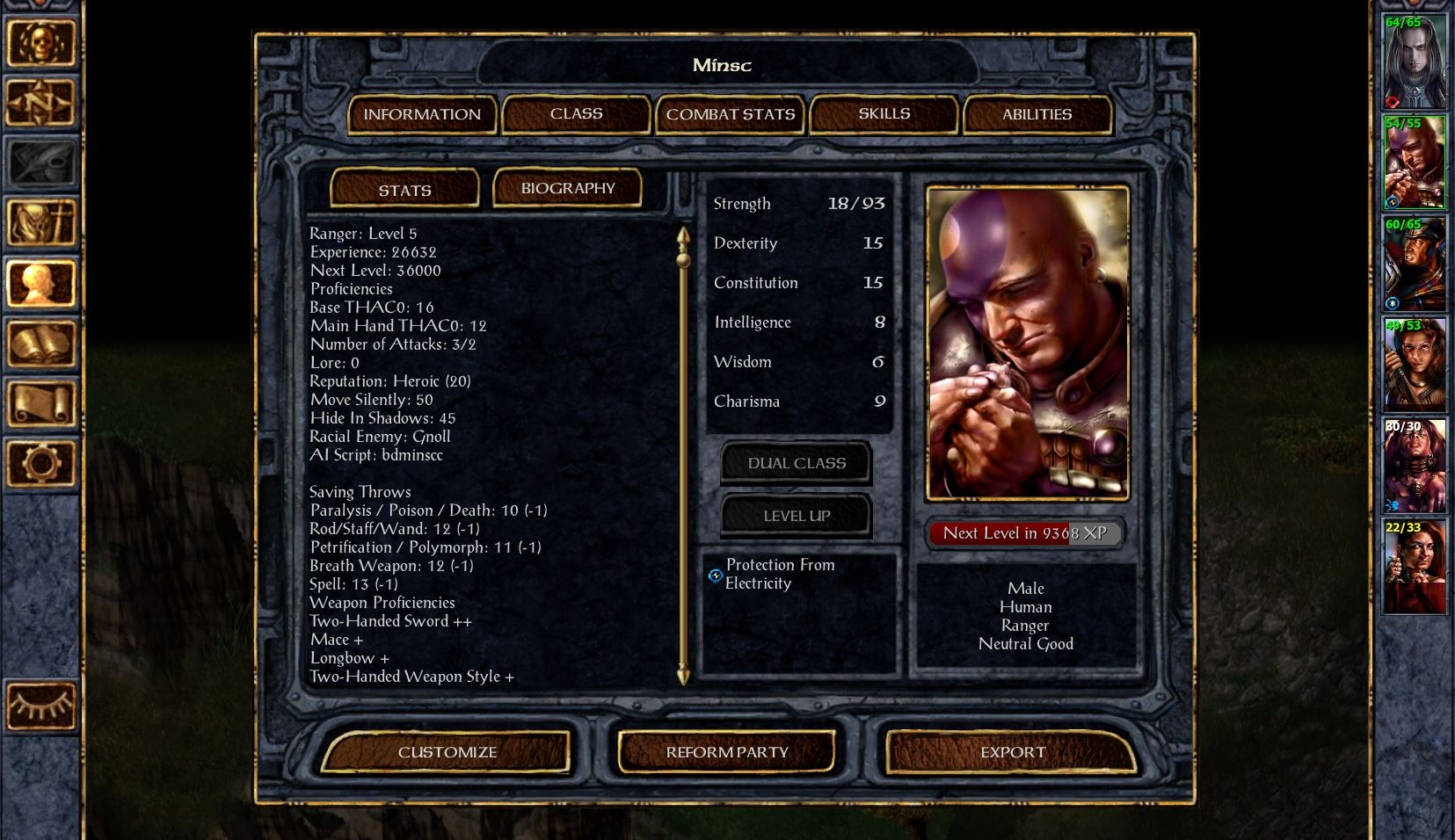
[Original Thread that was made if anyone was interested]
https://forums.beamdog.com/discussion/48436/comparing-the-old-and-new-character-record-ui-is-it-final
I think Dee will be posting more information about it when the full 2.0 patch notes are released that they are now working on but I just wanted to spread the good news! Great work Dee on the UI and thanks Beamdog for listening to us all!
[Original Thread that was made if anyone was interested]
https://forums.beamdog.com/discussion/48436/comparing-the-old-and-new-character-record-ui-is-it-final
46
Comments
Nice work, @00zim00 - This won't be the screen's final state, but we all agreed that your layout was a big improvement over the one that we had before.
Couldn't have done it without the community!
Edit: Please also everyone give thanks to @Dee and the team at Beamdog. They are the people who listened to us and did the leg work
The start of this beta revealed a new UI, of which a lot of players even hadn't thought before, and it brought a lot of discussions. There were a lot of excellent ideas shared on this forum, and @00zim00 managed to create a UI which had a BG feel about it and still included the UI improvements brought by the improved code.
I'm happy to see that the developers gave it a lot of thoughts and the new beta build looks much different than the first.
This is what we could call a dialogue between players and developers.
Kudos to @00zim00 for his efforts and kudos to decision-making staff at Beamdog for reconsidering things and in the end choosing to change the first plans.
Mmmmm. Boo is proud.
@Dee: When the UI is going to be developed further, what will be used as the basis of that development? 00zim00's suggestion, or the Record screen that we've seen during the last few weeks.
Personally, I liked the UI that we saw during the past few weeks (or perhaps more accurately, I liked what it could become), but I'm keenly aware that I'm in the minority about that, so I'm curious what the plans are.
Sure it will be answered soon
https://forums.beamdog.com/discussion/49638/is-v2-0-62-0-the-final-release-or-another-beta#latest
With that said, the latest update to the beta is not showing on my Beamdog client. Is it being sent in waves or something? EDIT: nevermind, I've got the update now.
I liked the first beta character sheet, but I didn't like its aesthetic. The stone and metal theme is much more appropriate to Baldur's gate.
NICE! That looks waaayyy better than the previous version. And I agree with @BillyYank, you should get something out of this.
With the time we had left, we only had the resources to put together art for BG:EE and SoD. BGII:EE's Character Record will probably be updated when we revamp all three of them with the final design.
Now, send your application to Beamdog!
(bug in Strength display of 18 for non-fighters reading 18/0, I'm sure you know that already)
Still liked the 2.0betaphase UI for some of the general design concepts, just didn't like the change of visual style. And there is still inconsistency and some things contradicting common 2016 UI rules in 00zim00 screenshots shown above, but this is Baldurs Gate, a super modern would not fit either, and it's a big improvement for sure and a good compromise.
(i'm sure beamdog planned this all the way, shining as the good guys listening to their community now ...)
http://www.rpgcodex.net/forums/index.php?threads/baldurs-gate-siege-of-dragonspear-beamdogs-expansion-for-bg-ee.96369/page-68#post-4458223
That and somehow bring the tab scrolls back and I'll be happy.
Thanks @00zim00 for the awesome record screen! You did a great job!
Jumped in game and saw the new record screen just now.
So awesome. Pretty much put an end to my complaints pertaining to the record screen.
My one nitpick is that it would be great if there was a space between the last saving throw score (spell) and the start of the weapon proficiencies in the 'text blob', but apart from that I'm onboard.
(Now if only we could get the original spellbooks back..)
So much more looking forward to SoD now.
It shouldn't be terribly difficult to modify that in ui.menu.