[MOD] Dragonspear UI++ (v2.42)
 Pecca
Member Posts: 2,297
Pecca
Member Posts: 2,297
Dragonspear UI++
Download the latest release with fixes for 2.6 version (by meowdog)
Download the latest original release
This mod (previously named SoD GUI Overhaul) makes many changes to the user interface, while keeping the dragon-ish graphics to it. Most notably, majority of GUI screens now have size of 1365x756 pixels (main menu screens have size 1444x818 with size of the main body window without edge graphics 1365x756 pixels). It is designed with unscaled interface full HD resolution in mind, so it might lack some intuitive funcionalities when played on scaled/low resolution.It is compatible with BG:SoD and BG2:EE.
Beside from general change of GUI screens, I have added numerous tweaks made by myself and other people on this forum. Special thanks goes to Mr2150 for ideas, sharing code and general testing.
One big warning: DO NOT PRESS F5! It messes with elements that are positioned based on screen resolution (or simply use Infinity_SetArea), it caused major problems for me. You can use F11 without a problem.
About languages: Newly introduced GUI text is stored in lua files instead of dialog.tlk. As of version 2.03, each language has a modified version of its "L_xx_XX.LUA" copied to the override during the installation, with all the GUI texts there. The new text will stay in english until translated of course. WeiDU installer and "Update Strings" component have the text stored in a standard "english.tra" file as it updates dialog.tlk, so for complete tranlation you need to translate your language's "L_xx_XX.LUA" file in mod's "language" subfolder and the "english.tra" file in the "tra" subfolder. The new texts contain names of new labels, autoroller, portrait picker, UI setting option screen and Proficiencies/Skills tab in the record screen.
WeiDU components are:
-Backup M_BG.lua file: If you have this file manually edited (see Portrait Picker bellow), you want to backup this file before reinstalling the core component, which will erase everything. The backed-up file is in „sod_gui_overhaul\backup-M_BG“ folder.
-Core Component: This will install the mod
-Transparent Tooltip Background: This will make the tooltip (when pressed TAB) background transparent instead of dark.
-Update Strings: This will shorten several strings in worldmap and record screens. „Traveling hours“ to „Hours“, „Destination Unreachable“ to „Unreachable“, shorter saving throws lines and text in statistics tab.
-Select Number of Quicksave slots: You can choose number of quicksave slots from 1 to 6.
-Update Portrait Picker: This component will update the M_BG.lua file (see Portrait Picker bellow) with portraits currently presented in the portraits folder, without changing anything manually edited. There needs to be at least one portrait that remains same for updating to work, otherwise install the Core component instead.
Core component tweaks are following (screenshots are below):
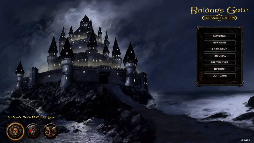
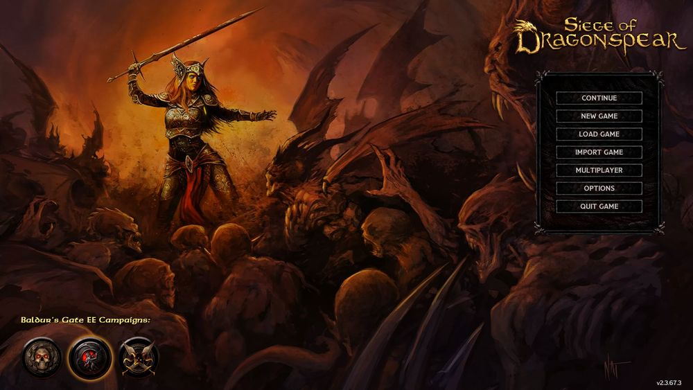
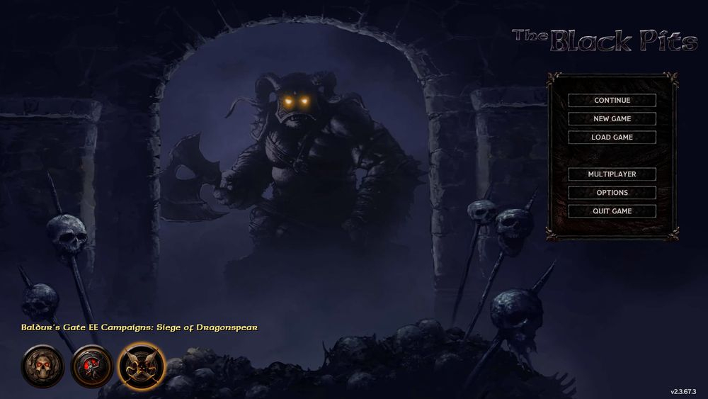
Main Menu
- New background images that resize to the screen’s resolution, new main menu panel, tweaked Black Pits logo.- It is possible to add custom background images by putting pictures in PNG format to the override folder named „RGBACK1.PNG“ for Baldur’s Gate main campaign background, „RGBACK2.PNG“ for SoD campaign background and „RGBACK3.PNG“ for the Black Pits campaign background. These images do not resize themselves to fit the screen resolution, you must do it in some editor if needed.
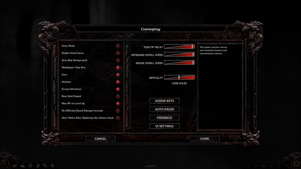
Options
- Bigger screen size, no scrollbars.- New option screen in the Gameplay – „UI Settings“. There is a list of options introduced by this mod. „Left-side Main Menu“ will move the main menu panel from the default right to the left (this may be handy if you want to play with custom backround menu images, that don’t fit with the right side menu). „Cheat Mode“ will enable autoroller in Character Generation screen and will also allow to ExploreArea by pressing and holding the „Reveal Details“ button on the main gameplay screen. „Quickloot Mode“ offers more advanced customization for quickloot and „Journal Mode“ allows to choose between small and large journal.
- In-game option screen is overhauled with new graphics.
Character Generation
- Bigger screen size, individual screens are more organic, red shade selection is replaced with button graphics.- Portrait Picker (by Mr2150): Portraits are now displayed in a scrollable list. Custom portraits are added to the list by WeiDU installation and stored in M_BG.lua file. They now must be no more than 7(!) characters long, ideally lowercase, (but the last letter of size identification – "L" or "M" must be uppercase if you want to have different portraits for record screen and the right sidebar - portrait with "L" will be displayed in the record screen and the portrait with the same filename except the last letter being "M" will be displayed in the right sidebar). If you name the portrait with prefix „m#” (for male) or „f#” (for female) before WeiDU installation, they will be automatically sorted by gender in the list (just as default portraits) otherwise you can assign the gender in M_BG.lua file (or specialized tool which will be coming soon). If you don’t assign gender, custom portrait will show both for male and female characters. In said file, you can also type a description to the portrait that will show in the list (default description is item filename), it is the first column in M_BG.lua file. Reinstalling the WeiDU core component will wipe all the changes, reinstalling the WeiDU update portrait picker component will update the file while keeping all the changes. To keep the changes before reinstalling the main component, either manually back-up the file or use the WeiDU backup M_BG.lua component.
- Autoroller (by Mr2150, based on work by Faydark): If you toggle CheatMode On, in the options “UI Settings” screen, you will be able to use several methods to ease the rolling stats process.
- Stored values are visible and more view options are available in the stat rolling screen (by Mr2150).
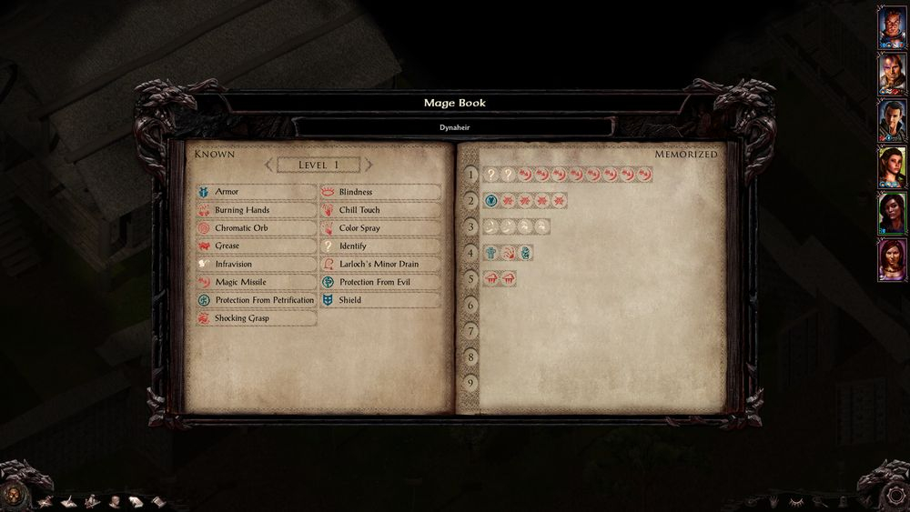
- Spell selection screens show just spell icons that are all visible at the same time without a need to scroll down.
- Random Character Generation (by Mr2150): Pressing on the “Random Character” button will generate a completely random character. Only the portrait will always be the same “random male” or “random female”.
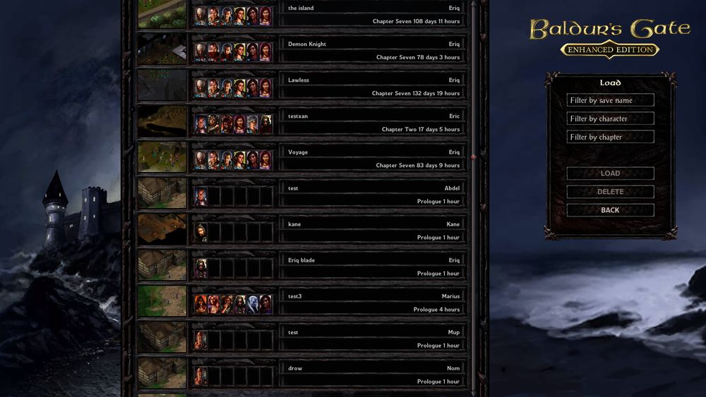
Save/Load Screens
- Save slots list in the Load screen is stretched to fit the height of the screen, save slots are thinner, double click on the save slot loads it as usual.- There are three filters in the Save and Load screens that allow searching for saves by save name, character name or by chapter.
Multiplayer Screen
- Bigger screen size.Main Gameplay Screen
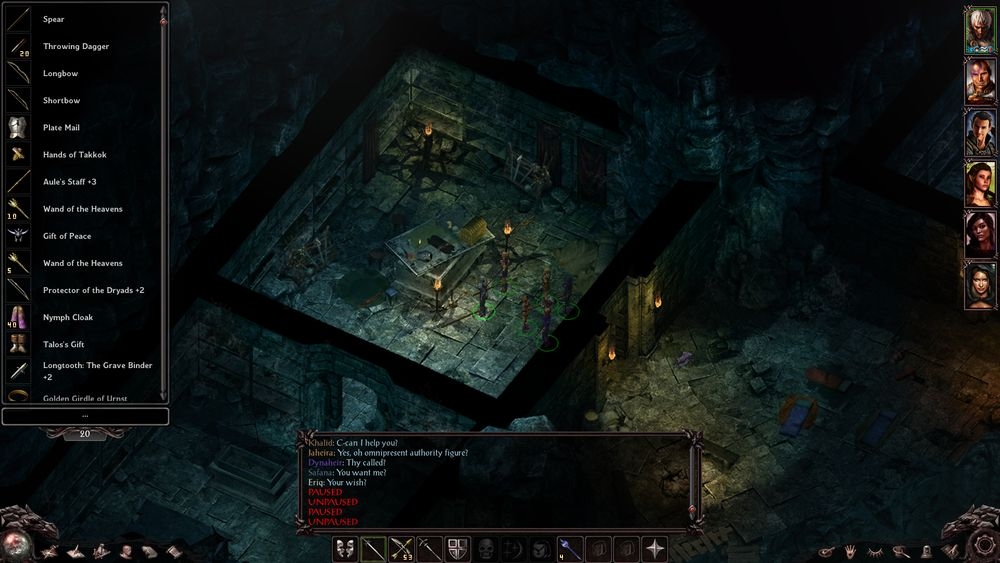
- Sidebar graphics and button positions are overhauled and put to the bottom of the screen.- Pressing and holding the „Area Map“ button will open a Worldmap screen. Pressing and holding the „Reveal Details“ button while Cheat Mode toggle is On will explore the area as per „C:ExploreArea“ command.
- Actionbar graphics and slot positions are altered, quickloot button is now on the right side with hand icon.
- Quickloot bar is overhauled. There are two modes now - advanced and expert. Advanced mode displays ground items in expandable list with item names (press "E" button for quick expanding/collapsing), while expert mode shows up to 60 item icons at the same time in the customizable area. Go to UI Settings menu within Gameplay options to customize it.
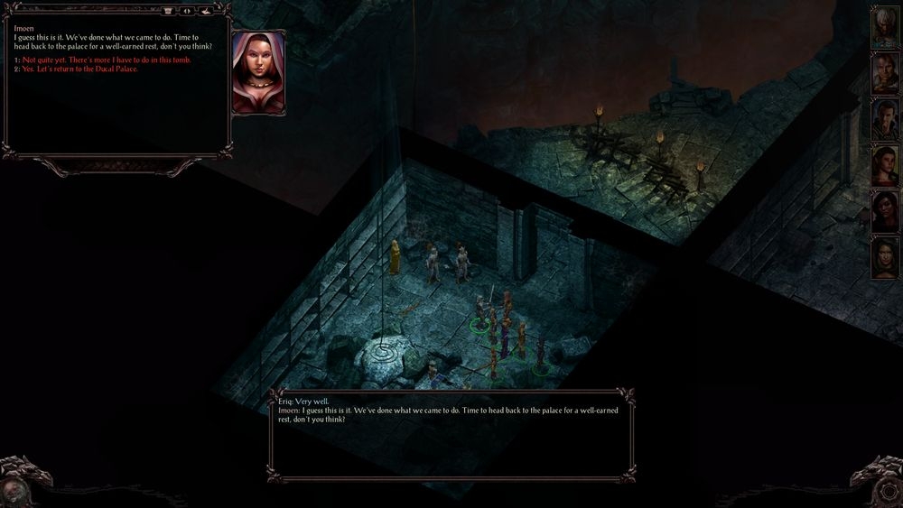
Dialog Box
- Dialog box is completely overhauled. It now appears on the top of the screen and resizes depending on text content. You can also hold its upper bar and drag it (or use "left/right arrow button). The "Old messages" box is separate in place of usual "world message log" box and you can toggle it on/off with a button and the game will remember the toggle. You can also use "journal button" to copy the current text to the journal as user notes.- Pressing pause will not advance the dialog.
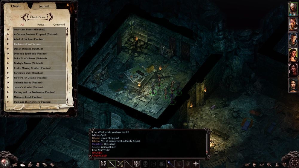
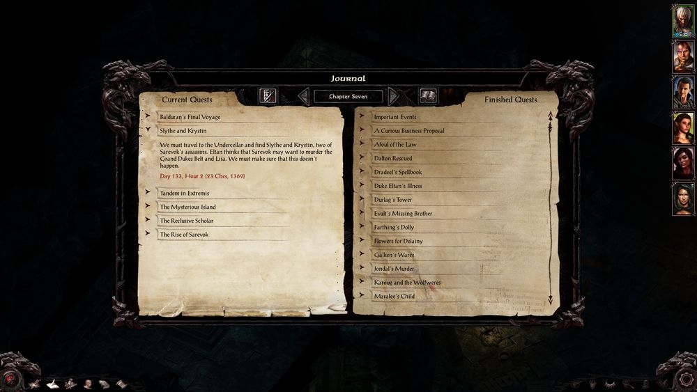
Journal
- There are two journal modes now available for toggle. The small flexible one from an unmodded game and a large one, that resembles other in-game screens, it is paused with darkened background.- Both journals have many convenience tweaks and filters (from Mr2150's "Journal Fixes" mod) and are toggable by pressing "chapter" button. Default mode, that is remembered, must be selected in UI Setting options menu.
- Clicking on the Journal popup now opens a journal and expands the quest it refers to.
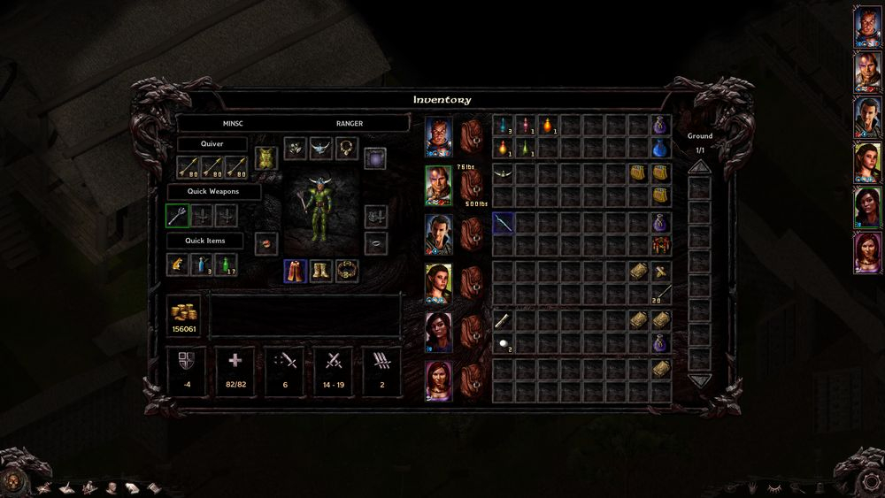
Inventory
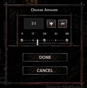
- Bigger screen size, positions of elements are altered. Combat statistics boxes area larger and are not replaced by comparison boxes when an item is picked. Number of Attacks line is in the damage text box.- Split stack window now shows a slider for more convenient choosing of amount.
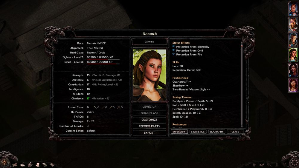
Record
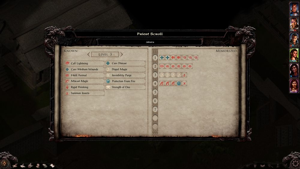
- Bigger screen size, there are five main columns now displaying as much information as possible at the same time. There is an expand/contract button at the bottom of the first column that expands/contracts combat information details. There is also a new tab „Proficiencies / Skills“ in the fifth column that shows detailed information about proficiencies and skills.Mage/Priest Spellbooks
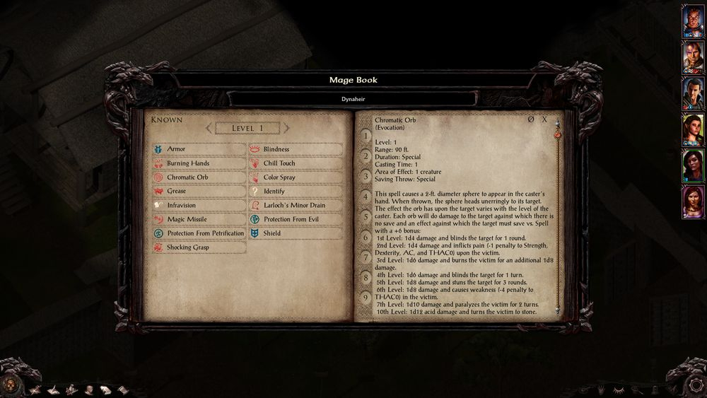
- Bigger screen size, spells are shown as slot icons and are all visible at the same time without a need to scroll the list. Hovering over a known spell icon will display it’s description- Arrows for incrementing/decrementing spell levels are reintroduced.
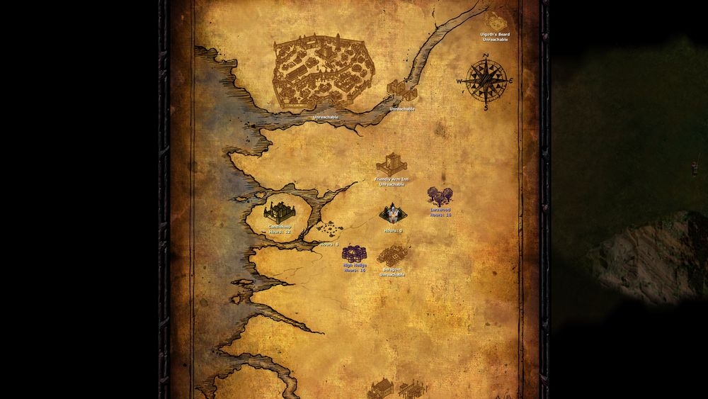
Worldmap
- Worldmap screen is stretched to fit the height of the screen. Travel button is removed, use double click to travel.- All map icons in the original BG campaign now show travel times (with the WeiDU „update strings“ component it just shows „Hours:“), you must start a new game for this change to apply.
- Note, there is currently a bug which shows an empty scrollable space beneath the world map when the size is stretched from the default, I have reported this and hopefully it will be fixed.
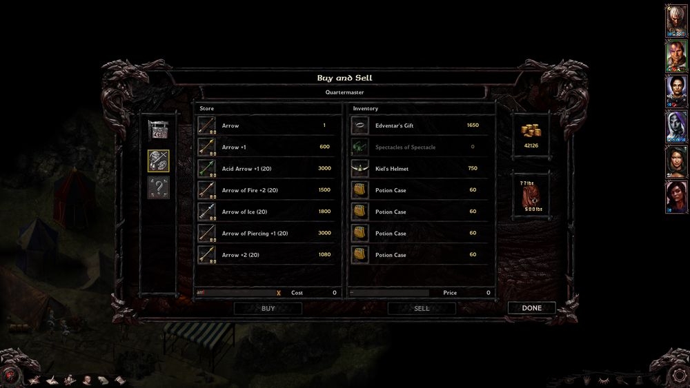
Store/Containers
- Bigger screen size, bigger store item list, bottom store icons are placed on the left.- Store item list filters allow to search by name for specific items (by Mr2150).
- Identify screen item list only shows unidentified items (by lefreut).
- Stealing multiple items at the same time is allowed (by lefreut).
Chapters
- Chapter screens now stretch over the entire screen. The chapter images are overhauled.Changelog:
v1.0
- Main gameplay screen tweaks
- Journal background image tweak
- Inventory screen tweak
- Record screen tweak
- Mage/Priest spell screens tweaks
v1.1
- Spell description screen tweak
- Opening/closing Journal pauses/unpauses the game
- Journal "finished quest" font color is black
- Dialog box opens "older messages" with click on the text instead of special button
- "Older messages" box is bigger
- Number of attacks shows in the inventory "damage details" box
v1.11
- Fixed greyed out inventory screen for dead characters
- Change color button in the inventory now shows major color
v1.12
- Fixed 4th weapon slot coordinates in the inventory
- Character name labels in priest a mage screens should have same height
v1.2
- Mage/Priest spell screens tweaks revised
- Record screen tweaks revised
- Item description screen tweaks revised
- Level-up screen tweaks
- Button graphics in Character Generation menu
- Journal doesn't unpause the game if it's paused before opening
- Save Game screen tweak - bottom buttons switched
v1.3
- Store screens tweaks
- Updated graphics of all screens (original images were slightly horizontally asymetrical)
- Scrollbar in the Item description screen changed
- Journal now shows all information, when a quest is selected
- Hovering over a spell icon shows the spell description in the Mage/Priest spell screens (by Mr2150)
- Split stack tweak (by Mr2150)
- Identify section in shops only displays unidentified items (by lefreut)
v2.0
- Main Menu tweak
- Character Generation tweaks
- Save/Load screen tweaks
- Option screens tweaks
- New option screen - UI Settings
- Multiplayer screen tweak
- Journal overhauled
- Worldmap tweak
- Third bottom buttons re-enabled
- Record and spell screens more tweaks
- Quickloot tweak
- Dialog Box tweak
- Portrait picker by Mr2150
- Autoroller by Mr2150, based on work by Faydark
- Store and Load filters by Mr2150
- Multiple stealing in shops by lefreut
- Proper campaign logos in main game option screen
- Several small fixes
v2.01
- Bug fix - Main menu panel appears on the right side now
v2.02
- Bug fix - Escaping the Worldmap travel should not pop it over and over again
v2.03
- UI text is stored in just one lua file (the basic L_xx_XX.LUA), switching languages should work now
- Polish translation added
- Bug fix - "UI Settings" label added to L_xx_XX.LUA file
- Bug fix - Character Generation label is added to portrait picker screen
v2.04
- Italian translation added
v2.05
- Bug fix - Mage screen label and character name fixed
v2.06
- Bug fix - error in italian language file fixed
v2.1
- Quickloot uppgraded
- Journal upgraded
- Dialog screen upgraded
- In-game Option screen overhauled
- Chapter screens overhauled
- Main gameplay screen overhauled
- Tooltip scroll image updated
- Tooltip scroll without sound (thanks to Kerozevok)
- Transparent TAB tooltip background as WeiDU option
- Selectable number of quicksaves as WeiDU option
- Inclusion of the "Restore missing potraits" mod by lefreut
v2.11
- "Journal note" button in dialog screen now works properly
v2.12
- Ground container works with quickloot properly
- Unsellable items in shops are greyed
- Inventory has custom greyed graphics for dead characters
- Italian translation added
- "My Notes" label is now in the Large Journal
v2.13
- M_BG.lua works correctly now, all custom portraits are properly registered
v2.14
- Polish tra file bug fixed
- Italian tra file updated
- Werewolf Island chapter screens fixed
v2.21
- New enhanced inventory screen with all six backpacks
- New enhanced record screen
- New enhanced spell screens with all memorized spells visible at once
- Store screen tweaks by Adul added
- Option to toggle on a classic dialog window based on lefreut's tweak added
- Slightly redesigned main menu, removed left side menu
- Fixed MP button during dialogs
- Quickloot button tooltip added
v2.3
- Portrait picker based on BillyYank's Multi-portrait mod added as an option
- Added an option to have larger portraits on main gameplay screen
- Added an option to put a permanent thieving button on main gameplay screen (on the right panel)
v2.31
- Compatibility with 2.5 patch
v2.32
- Fixed contingency screen
- Fixed missing Charisma value for bards in the record screen
- The mod moved to github
v2.4
- Compatibility with BG2:EE, including new menu images by Seldar
- Several minor fixes
- Chapter screens converted to BAMs to save space
v2.41
- Fixed bug - store/healing and store/identify screens crash
- Fixed bug - class and biography scrollbar not draggable
v2.42
- UI.menu fix for 8. and 9. memorized mage spells not being shown
Screenshots:

Installation: Download the mod from github and extract the zip file in the game's core folder (the one with a file "chitin.key" in it) and run "setup-dragonspear_ui++.exe".
Important: If you purchased your BG:EE game from Steam or GoG and you have a SoD expansion installed as well, you need to first install DLC Merger before installing any mod.
Post edited by Pecca on
95
Comments
Thank you very much. I adore your work. Downloading it right now
My sugestion atm would be to change the inv. screen a bit. While it looks quite good having the info at the bottom and the other stuff at top like that, I doubt it feels good once you start inventory management etc, the inventory should imo be closer to the characters equipment slots.
And something I thought about just now, maybe even add small party portaits (I would guess thats possible with the new UI system) close to the inventory so you more easily could give items between party members.
Basicly instead of having stuff widespread and seperated top/bottom which is harder to get a clear overview of. Concentrate things and seperate them left/right.
Just a side note - Distributing UI.menu is not really effective as a solution in the long term however as it requires the user to replace their existing UI.menu with a modded version thus losing any changes they've already made.
I liked the last update to the final v2.0 UI but this feels even better.
Also, I'm playing with scaled interface and it seems to work fine. On 1920x1080 the portraits and left bar overlap with the interface windows but it's still more than usable. Um, it's actually great.
Some feedback:
Any chance to make the XP progress bar fit the colours of the rest of the menu so it doesn't look so much out of place?
All the windowns (e.g. character sheet, cleric spells) open behind the rest of the UI (portraits, left bar) except the mage spells page. Would be great to move that to the back, the same as the others so different portraits can be clicked while it's open.
Mage spells:
Also, if the general windows were just a little bit narrower everything would fit without the edges looking crowded, as they do here:
Just a tiny bit of resizing (e.g. 10-20px per side) would make it great with scaling on 1920x1080, so the text doesn't start from the buttons. That said, even in its current size it's great and that's what I'll be using.
@cdx: I'm planning on revising the XP progress bar after I play with it for a while and see how I feel about it. Also, at this point, I'm not going to support scaled interfaces, sorry, maybe in the future. I'm not sure what controls the magescreen being on the top (it may be due to a contingency screen) but if you want to try and play with it, it's controls start on the line 7646 in the current UI.menu file
RE: my earlier comment... Notepad++ has a nice compare plugin allowing you to compare two files side by side and makes installing updates and new UI.menu changes more easily. At least this way the changes are highlighted
First, the UI screen shows the minor armor color as a button to change the colors. Any chance you could make this the major armor color, as the major armor color also determines the color of other things, such as the selection circles.
Second, most windows have the name of the window in in large letters at the top, and then the name of the active character underneath. The record screen has the name of the active character in large letters at the top, and then the classs underneath.
It would be more consistent if all character unique windows had the name of the character at the top. It doesn't need to list Inventory anywhere, as it's clearly the inventory page. Priest and Wizard spells could have that listed where the name is currently listed. (Priest spells also have the character name in a slightly larger font than Wizard spells.)
Alternatively, the Record page could have Record at the top, and have the character name where the class currently resides. The class is also always listed directly right of that, so it shouldn't be a problem.
@cdx: Are you sure you're running the game at 1920x1080? While I'm running at 1920x1200, the game looks a lot wider on my screen, and I have no problems with the windows coming anywhere near the portraits.
I've also edited in a second thing I noticed. Not sure if you saw that, since you posted mere minutes after.
Is it possible for you to implement a WeiDU style installation where we can pick which screens to install? Also, is there any way to make the item description window less wide? That much width isn't comfortable for reading line after line of text, it's why Beamdog restricted the width and centered the combat/dialogue console.
Lastly, in 1440 x 900, the container window itself is immediately butted up against the top of the screen, with a lot of space under it. It would be nice if that container window were more centered. I've attach two pictures, the gem bag and the three kegs bar.
@Mr2150: That is very strange, it really is black in current version. Check the line 18910, if there is "0xFF000000" color code.
@agris: Component customization is not really convenient at the moment, we have to wait and see. I made the item description screen wide on purpose to fit more text there, I don't have a problem reading it. The store screens are a TERRIBLE mess, however the fix is specific for each resolution, so, again, it requires the existence of a patch tool or manual fix.
I'm just saying, give it a thought.